BACKGROUND
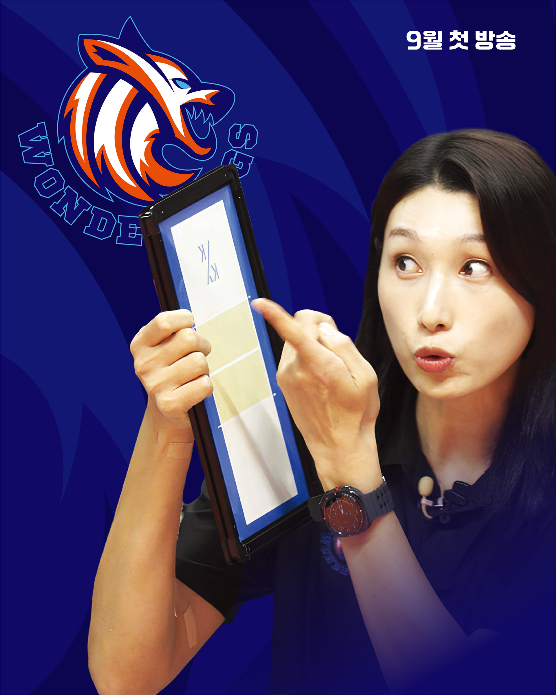
MBC <WONDERDOGS (원더독스)>는 배구 스타 김연경 선수가 감독으로 데뷔하여
언더독 선수들을 원더한 결과를 낳기까지 함께한 여정을 온에어한 프로그램입니다.
스튜디오 텐저블은 프로그램을 넘어 스포츠 팀으로 공고히 브랜딩 하기 위해 국내외 유수의
스포츠팀과 차별화할 수 있는 브랜드 아이덴티티를 개발하고자 했습니다.
언더독 선수들을 원더한 결과를 낳기까지 함께한 여정을 온에어한 프로그램입니다.
스튜디오 텐저블은 프로그램을 넘어 스포츠 팀으로 공고히 브랜딩 하기 위해 국내외 유수의
스포츠팀과 차별화할 수 있는 브랜드 아이덴티티를 개발하고자 했습니다.
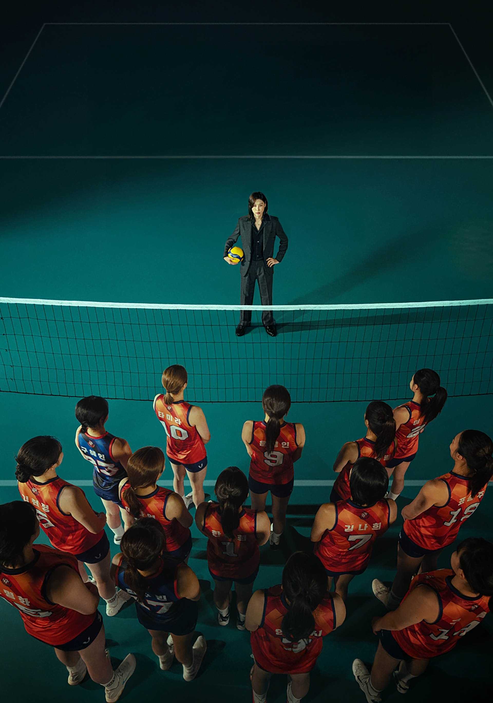
MBC's <WONDERDOGS> is a program documenting the journey of volleyball superstar
Kim Yeon-koung as she makes her debut as a head coach,
leading "underdog" players toward "wonderful" results.
To establish the program as a legitimate sports team rather than just a broadcast show,
Studio Tangible aimed to develop a unique brand identity that stands out from prominent
domestic and international sports organizations.


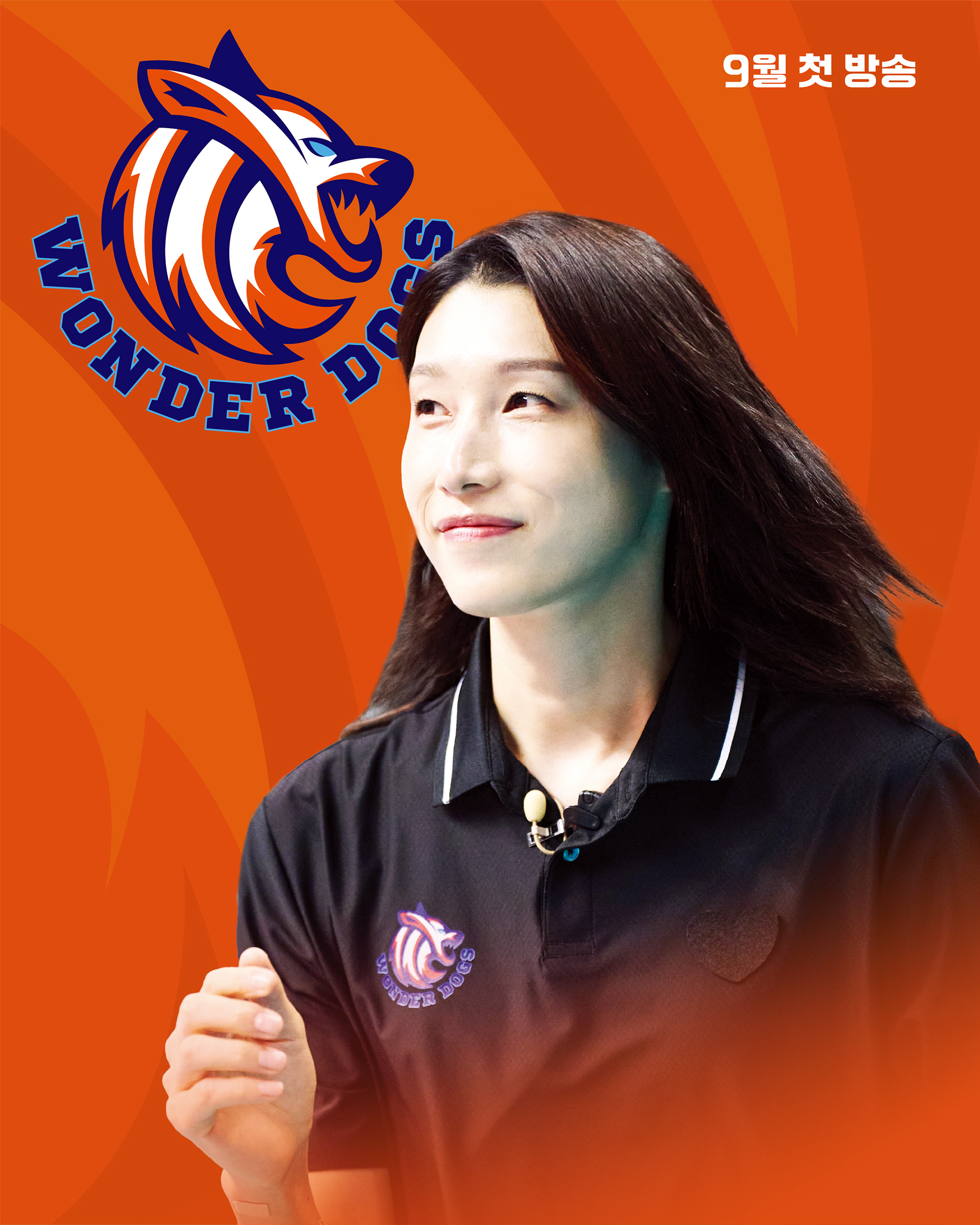
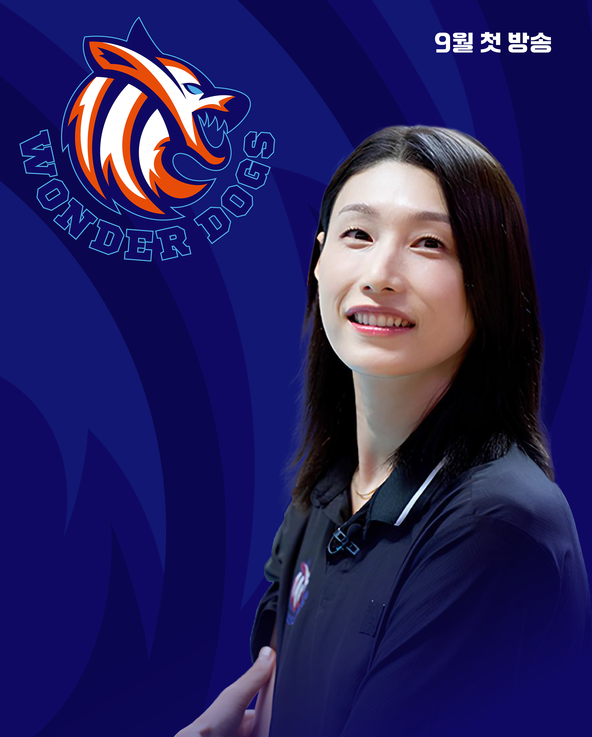
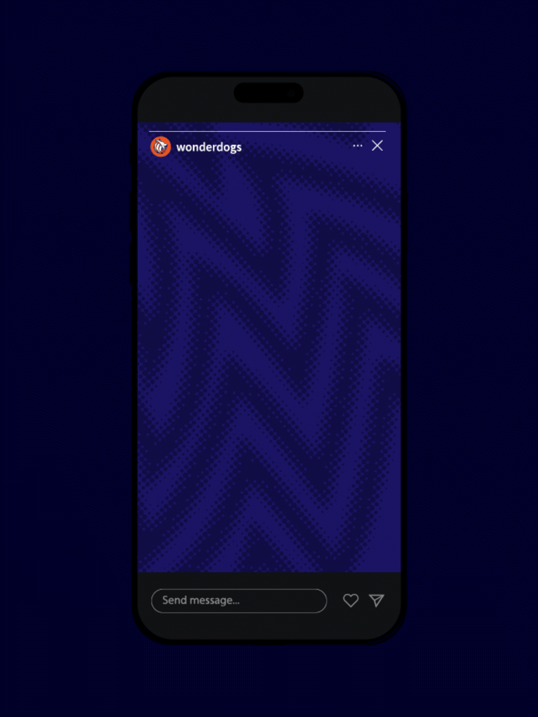
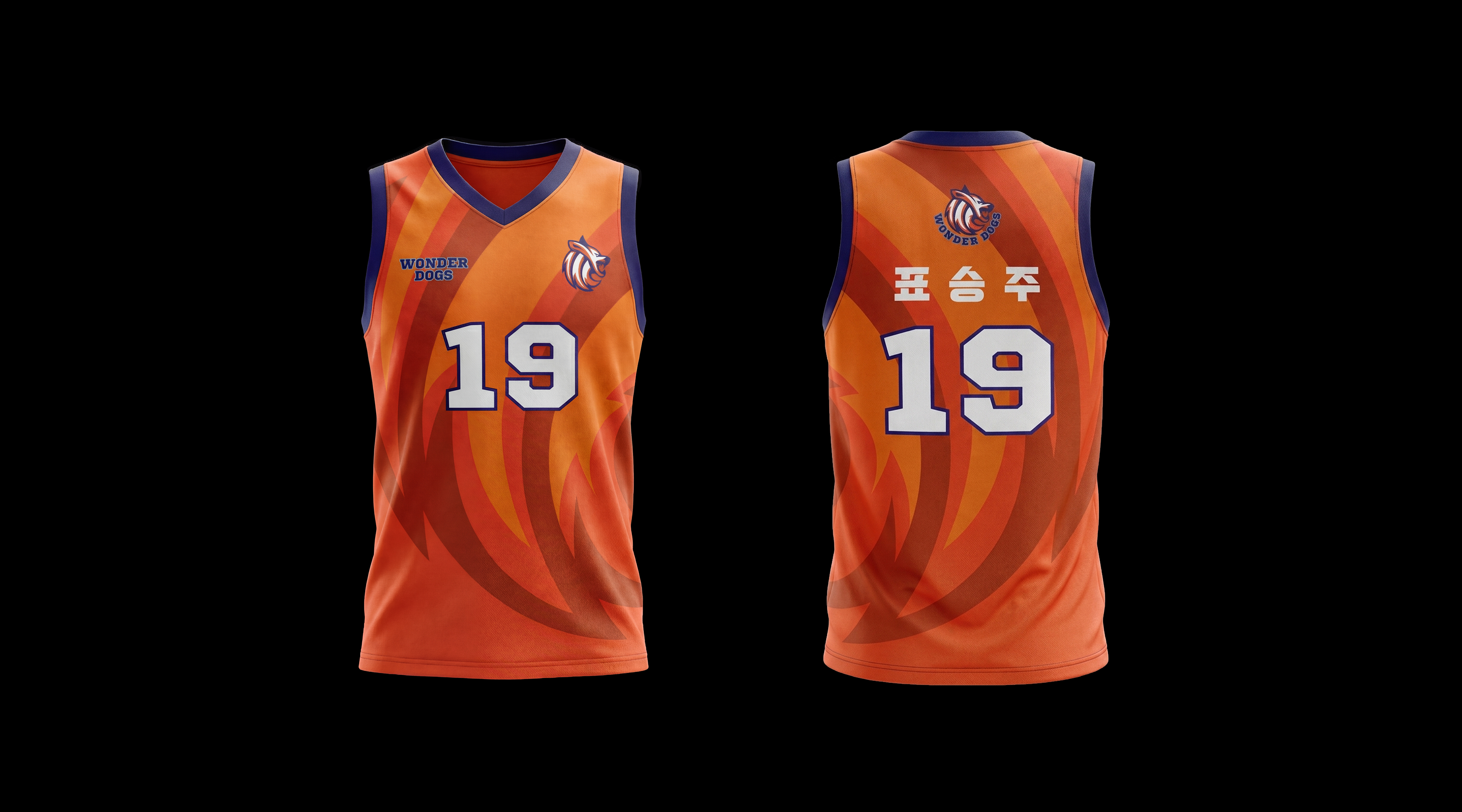
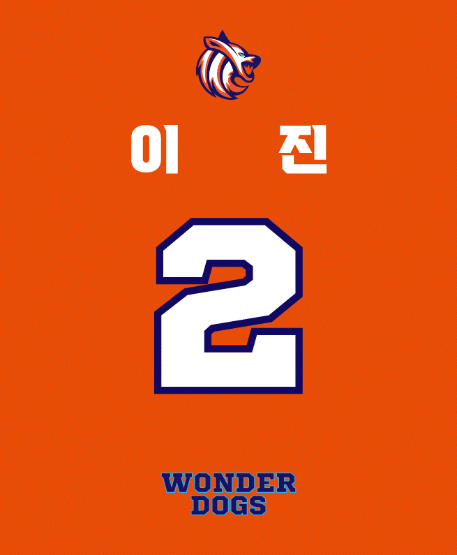
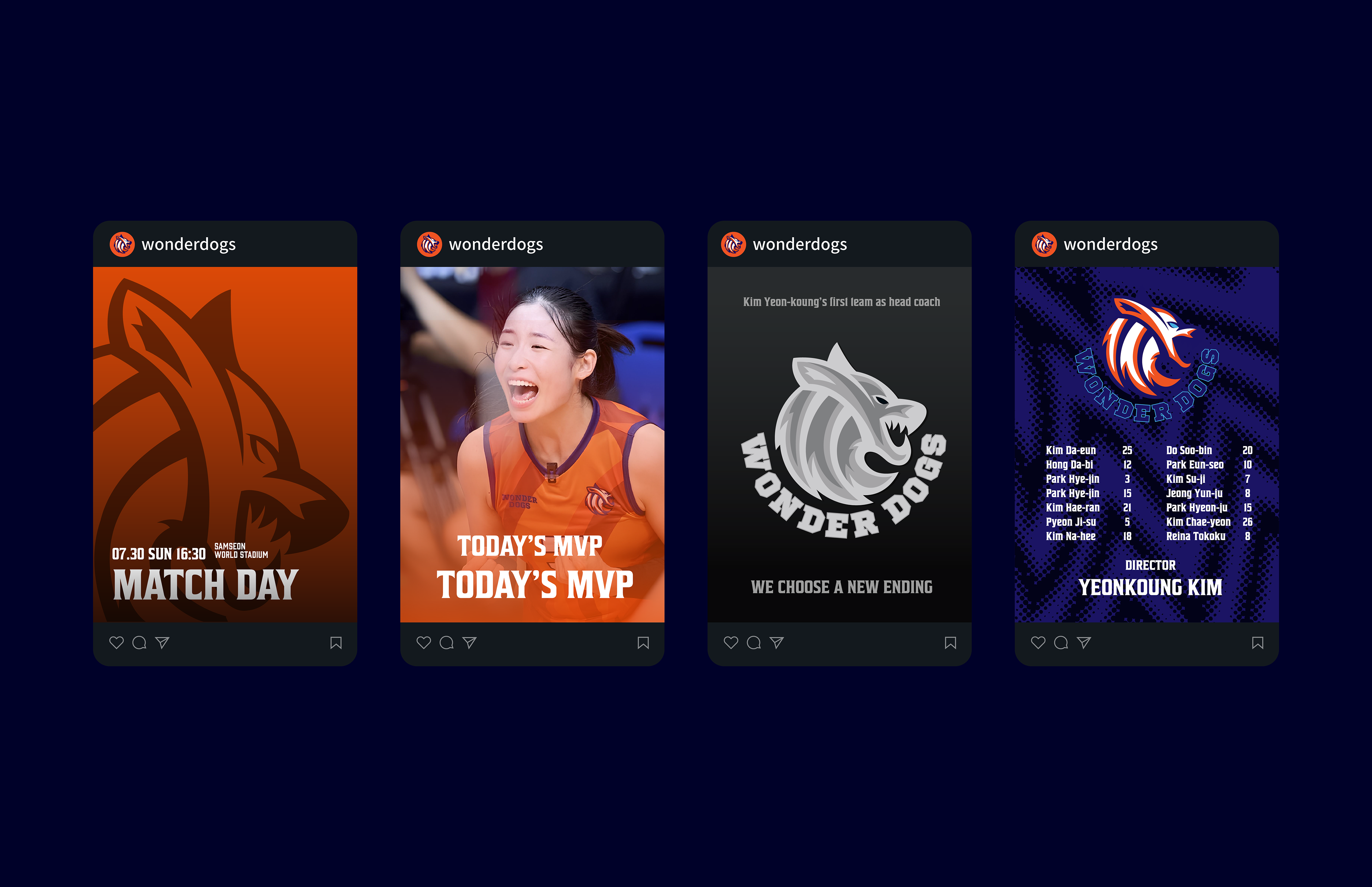
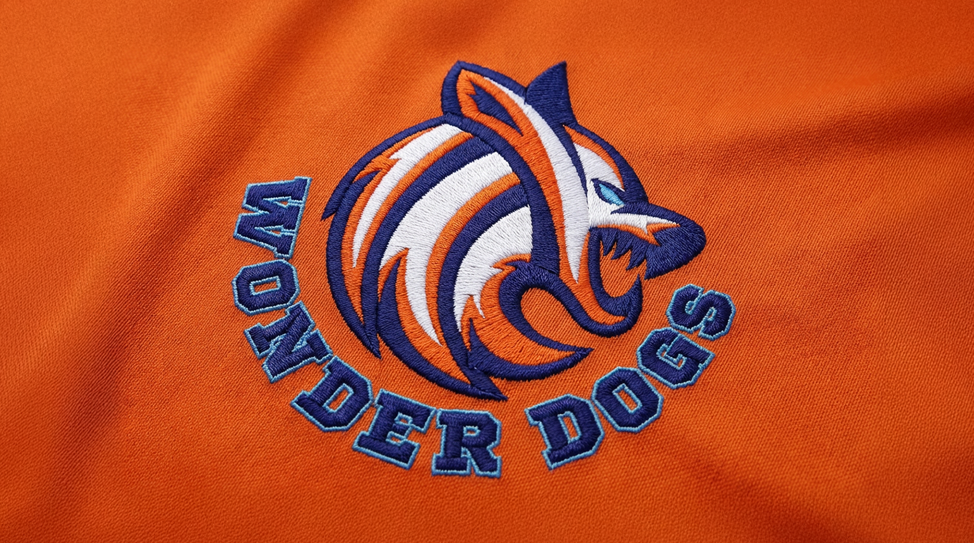
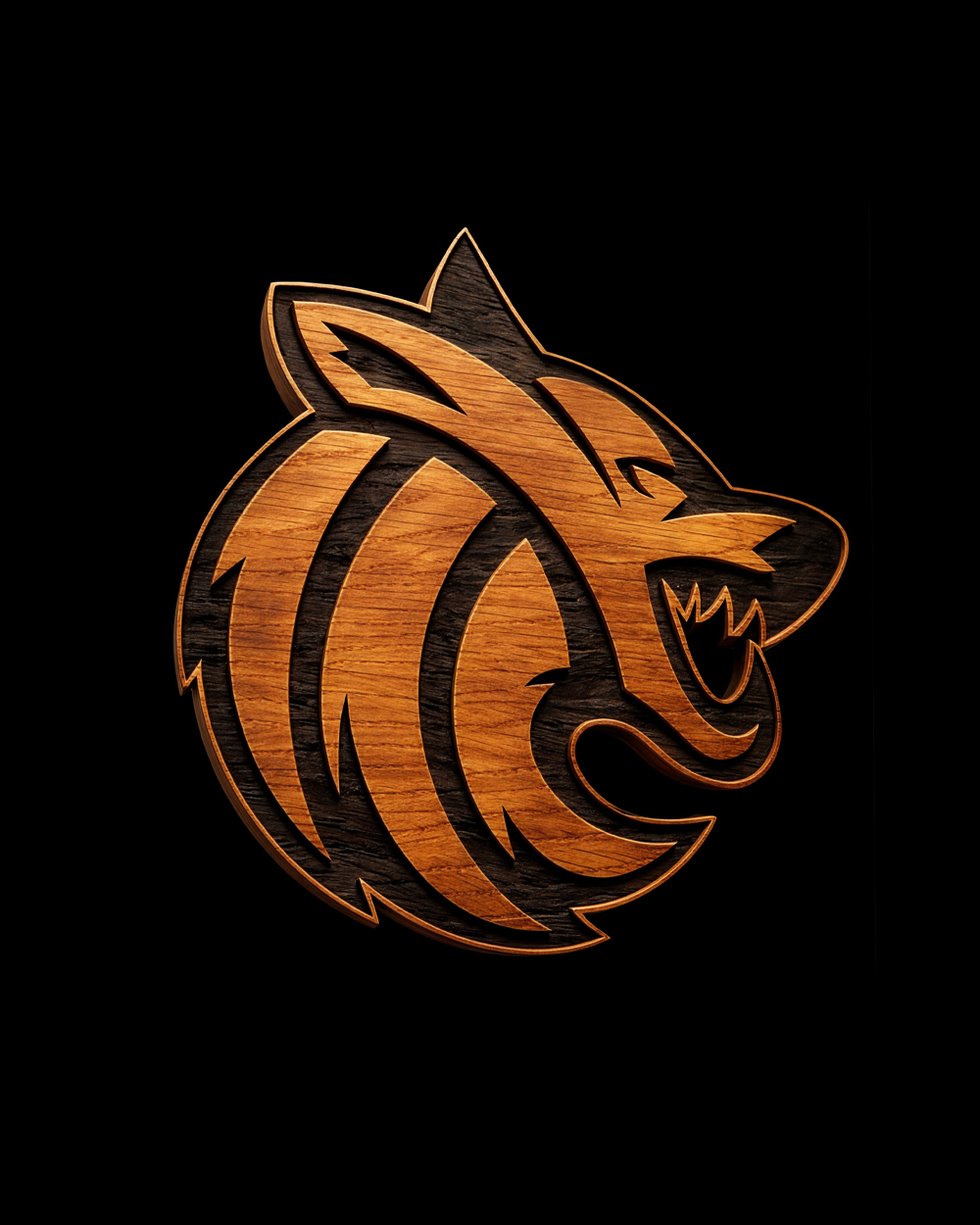
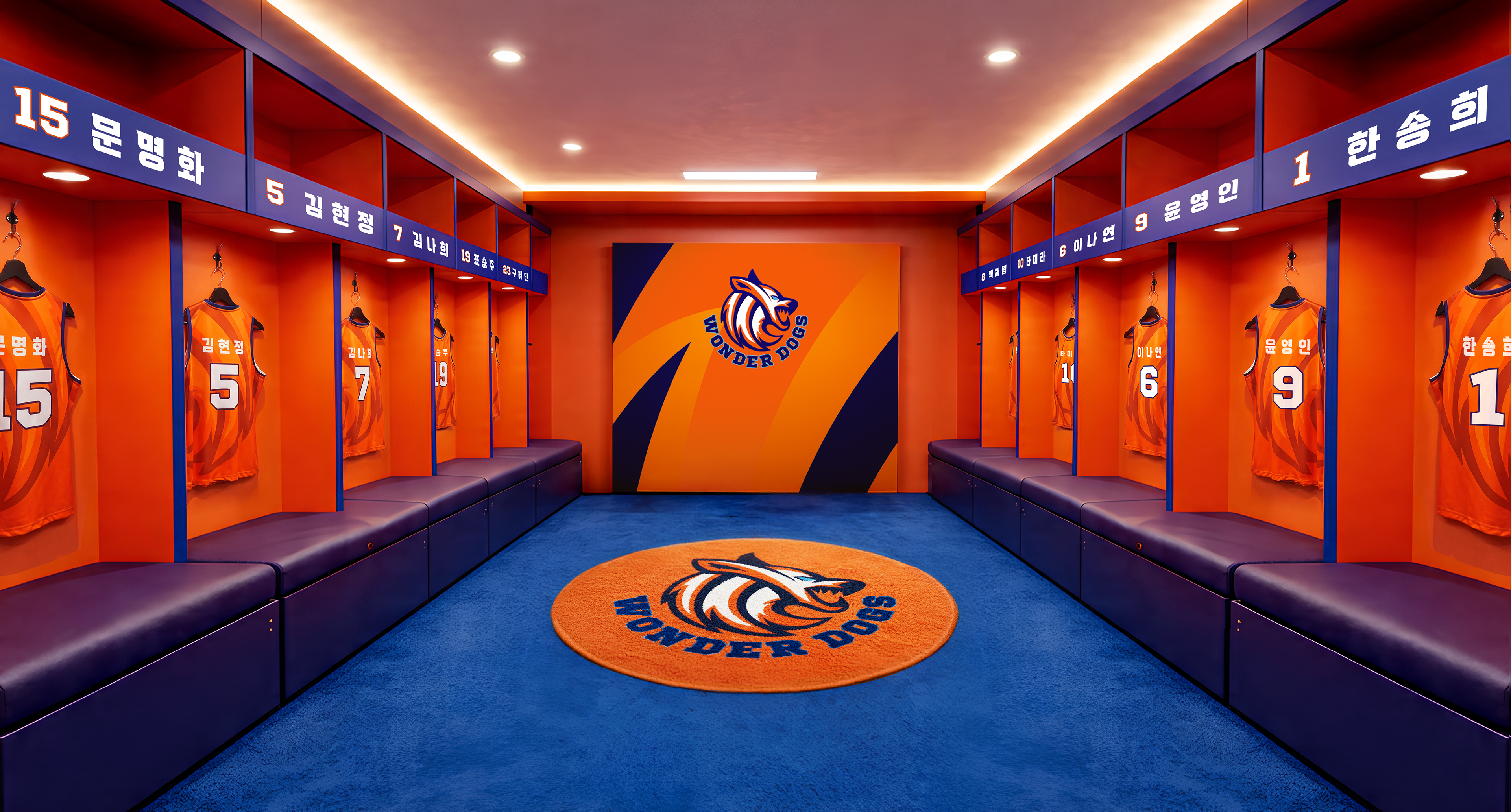
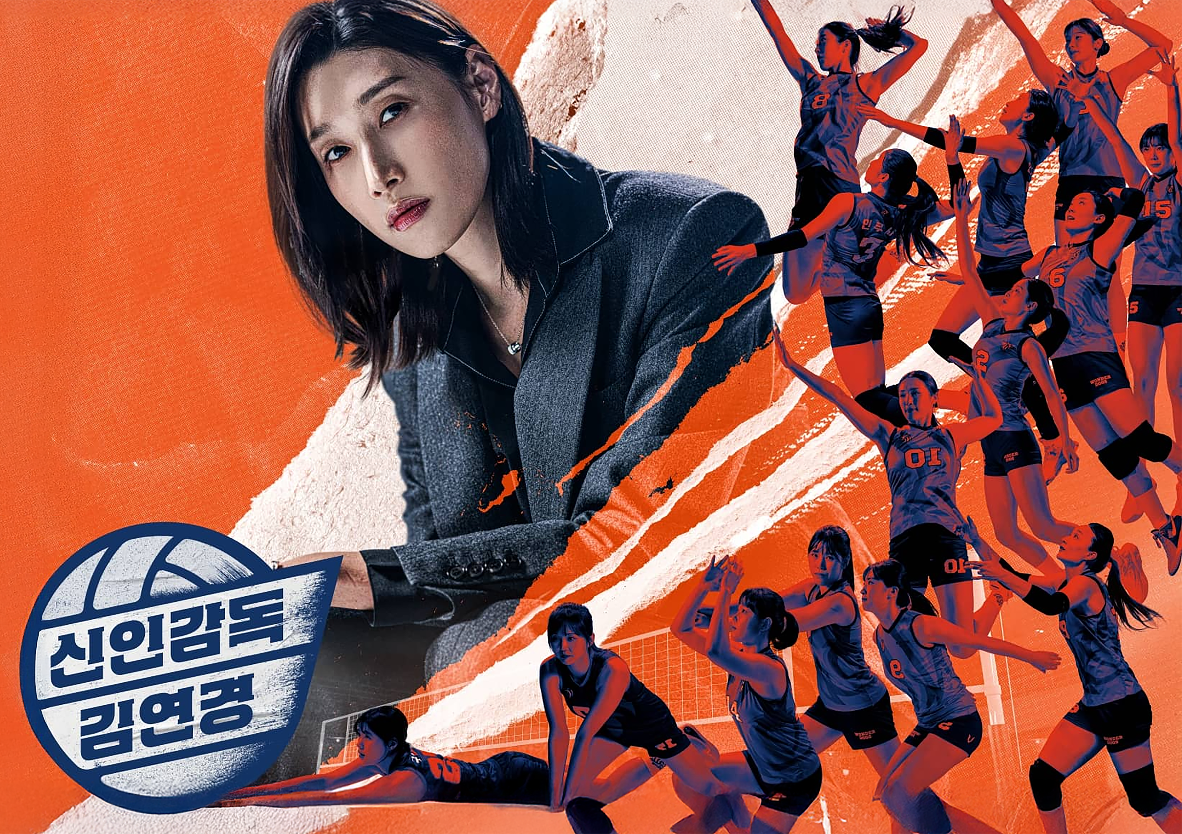
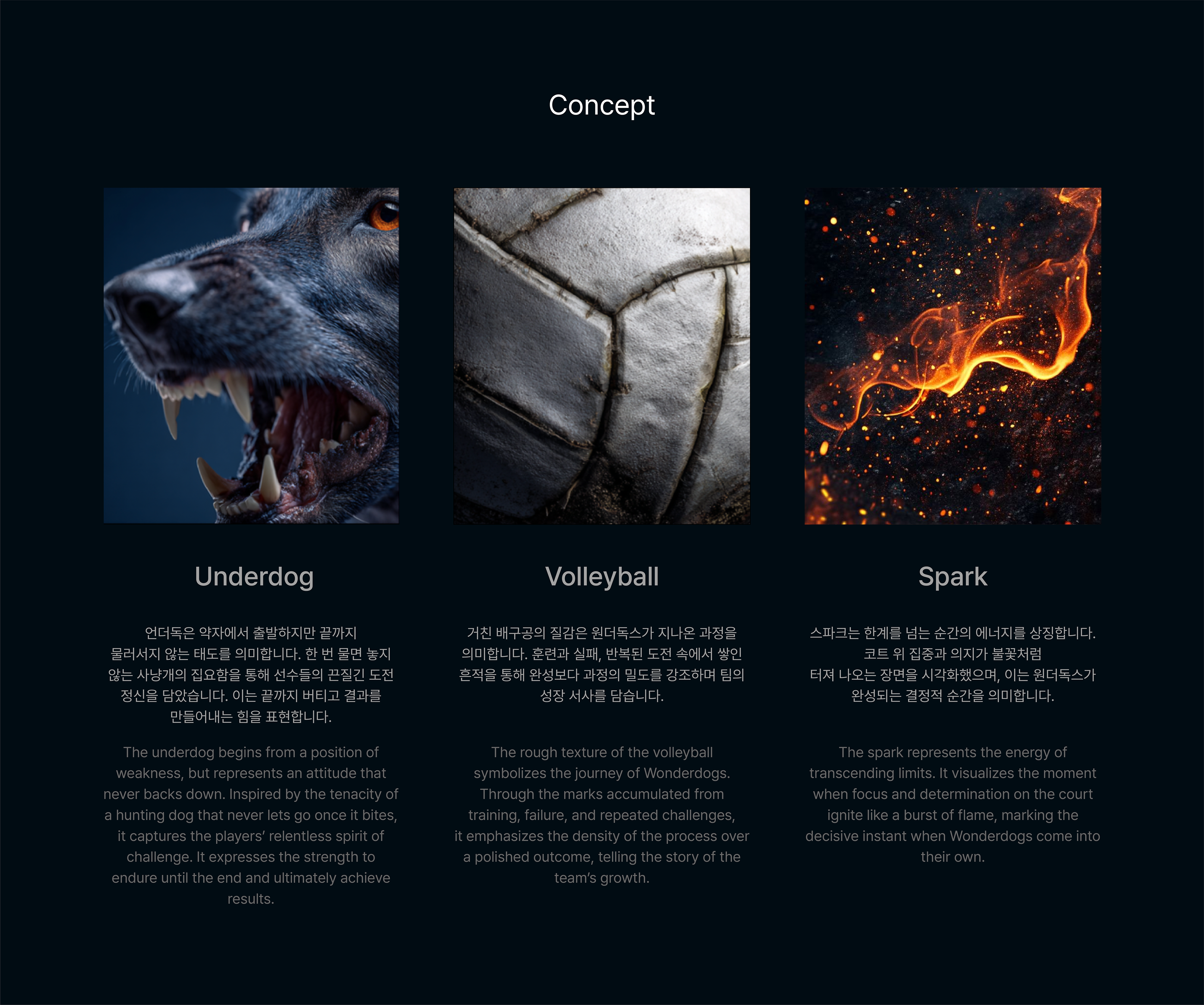
신인 감독 김연경의 로고를 시작으로, 진정성과 열정을 기반으로 언더독 정신을 보여줄 선수들을
상징하는 원더독스를 표현하기 위해 한 번 물면 놓지 않는 사냥개의 강인함을 배구공에 중의적으로
담아냈습니다.
상징하는 원더독스를 표현하기 위해 한 번 물면 놓지 않는 사냥개의 강인함을 배구공에 중의적으로
담아냈습니다.
Beginning with head coach Kim Yeon-koung's personal logo, the Wonderdogs identity
was crafted to embody the underdog spirit of the players—channeling the tenacity of a
hunting dog that never lets go into the form of a volleyball.
was crafted to embody the underdog spirit of the players—channeling the tenacity of a
hunting dog that never lets go into the form of a volleyball.
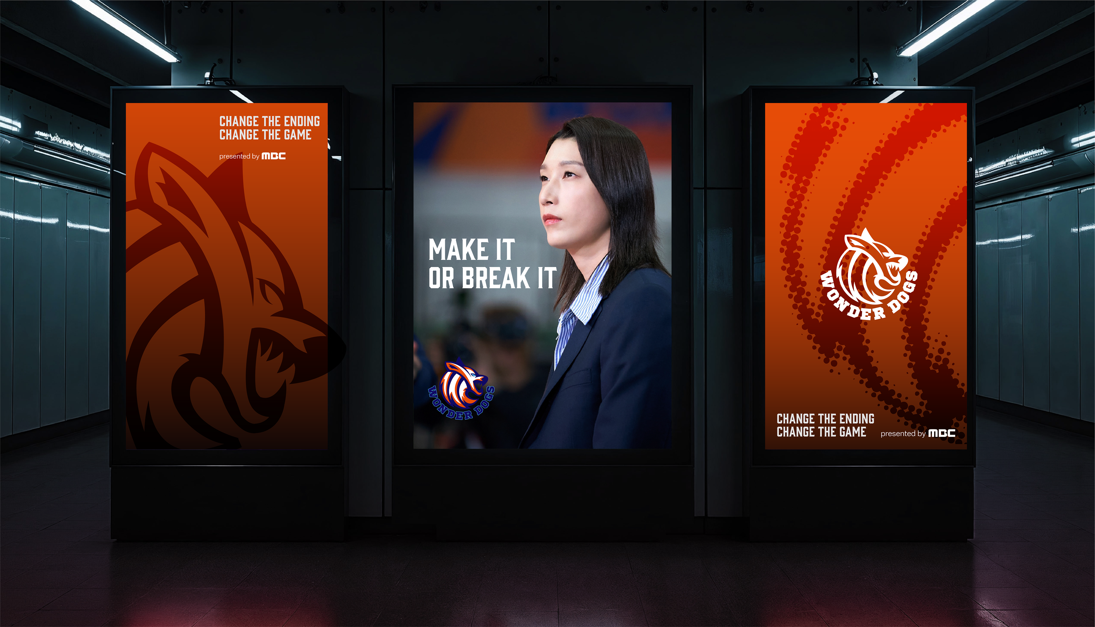
BRAND IDENTITY
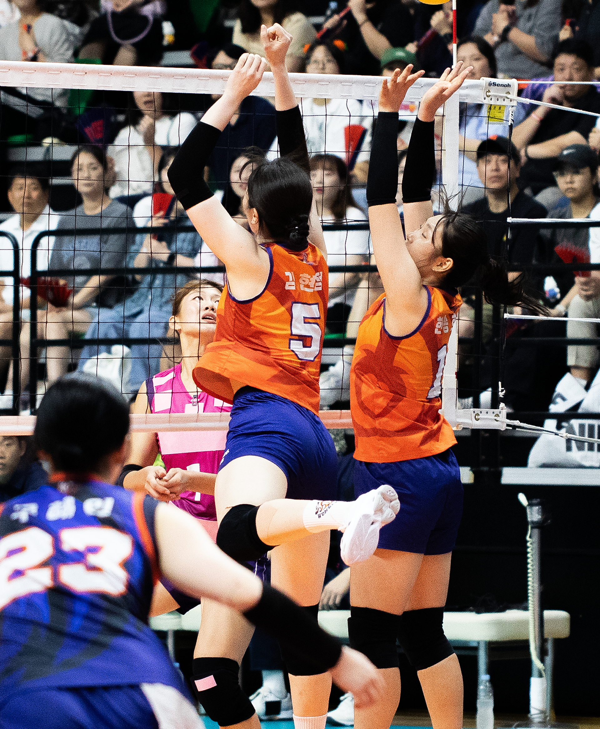
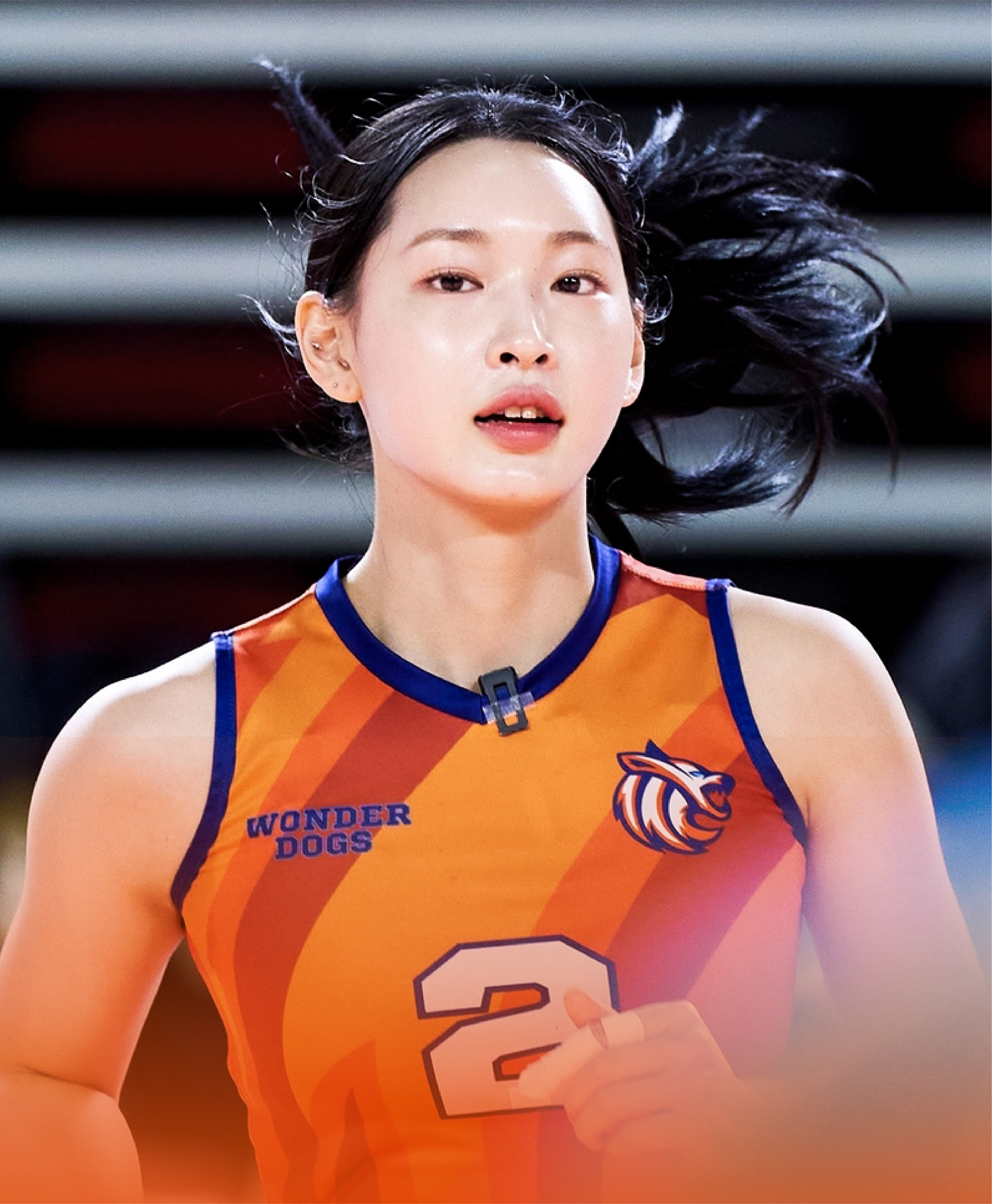
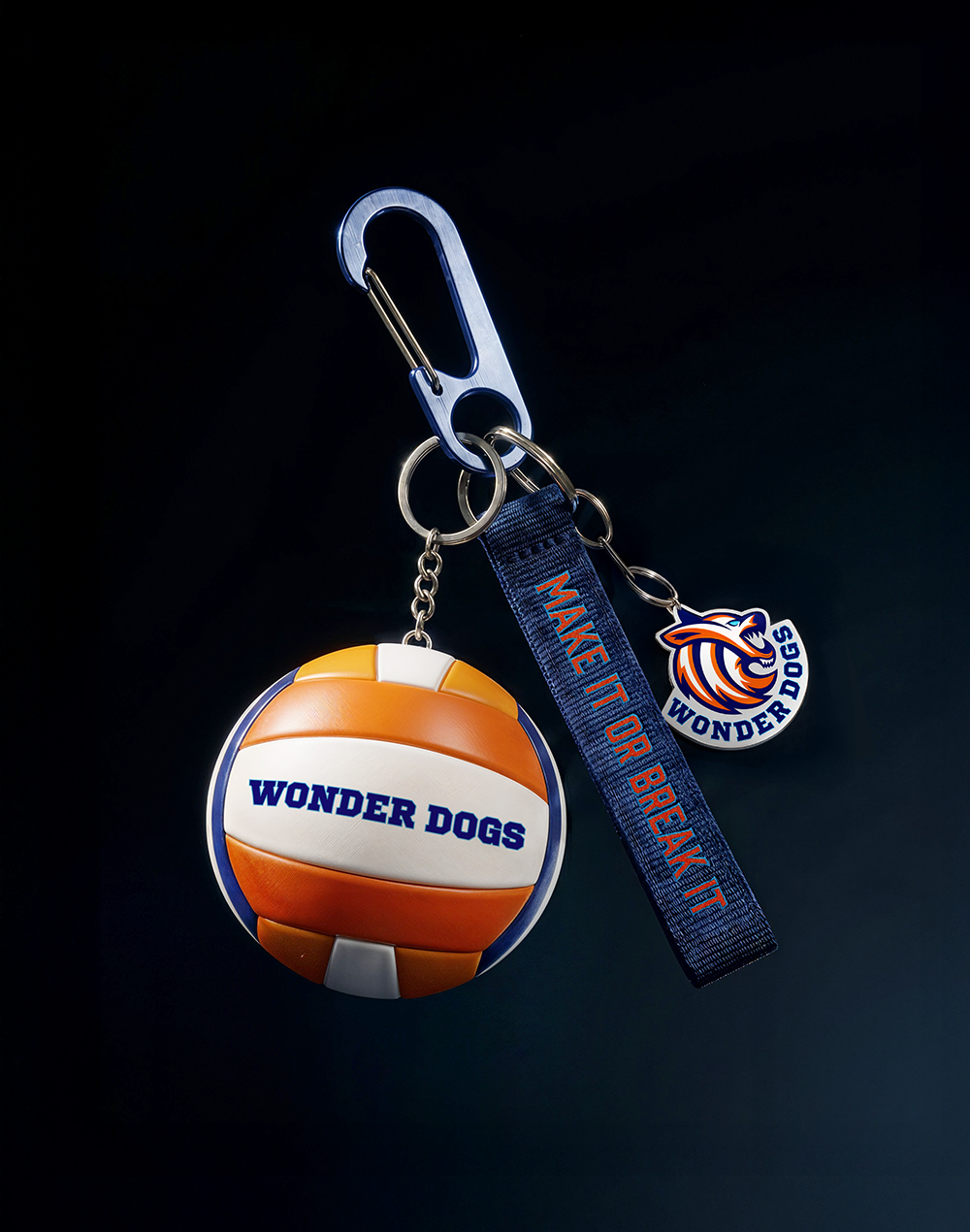
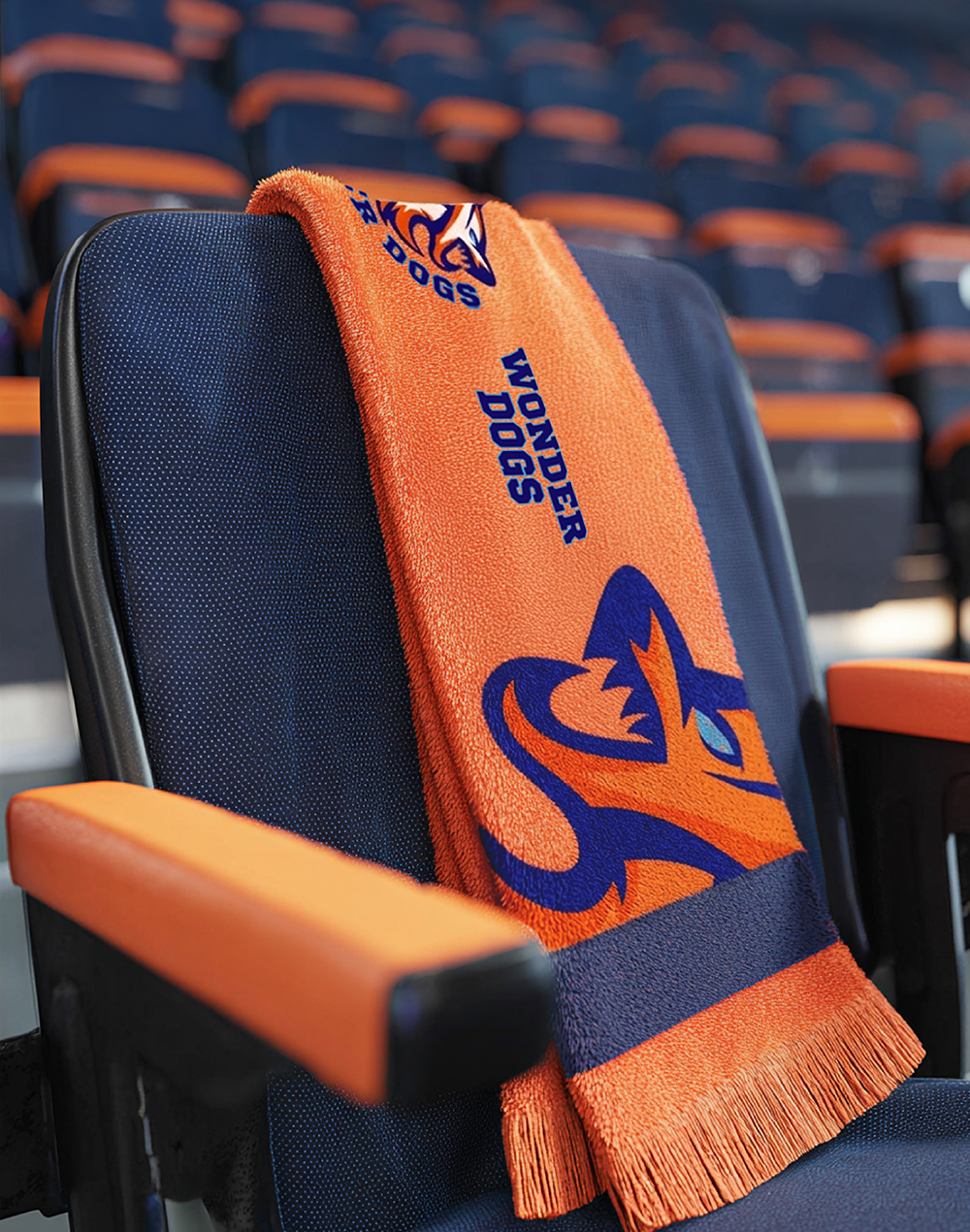
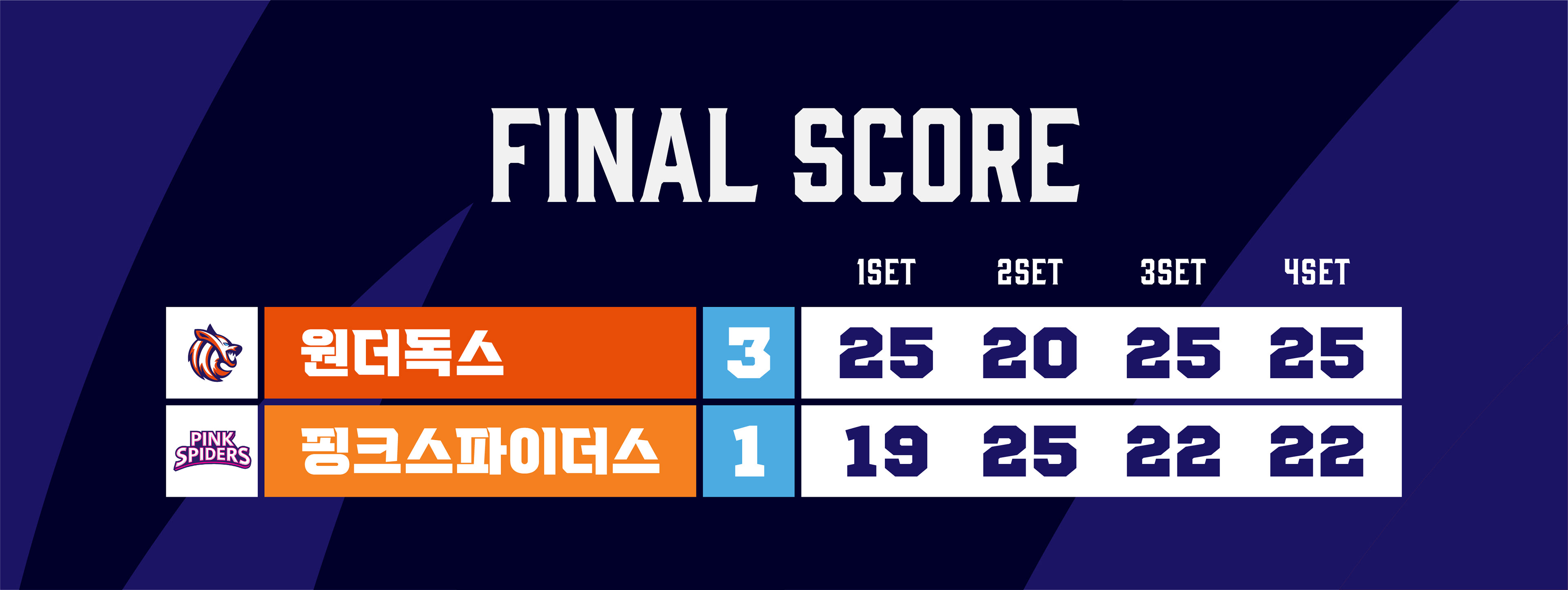
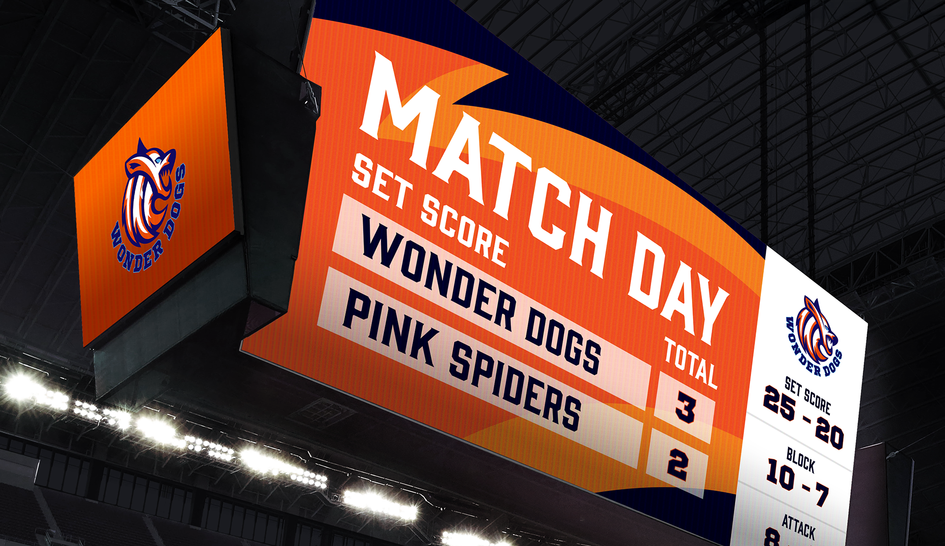
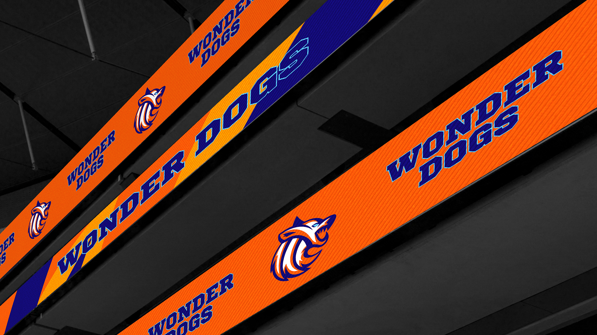
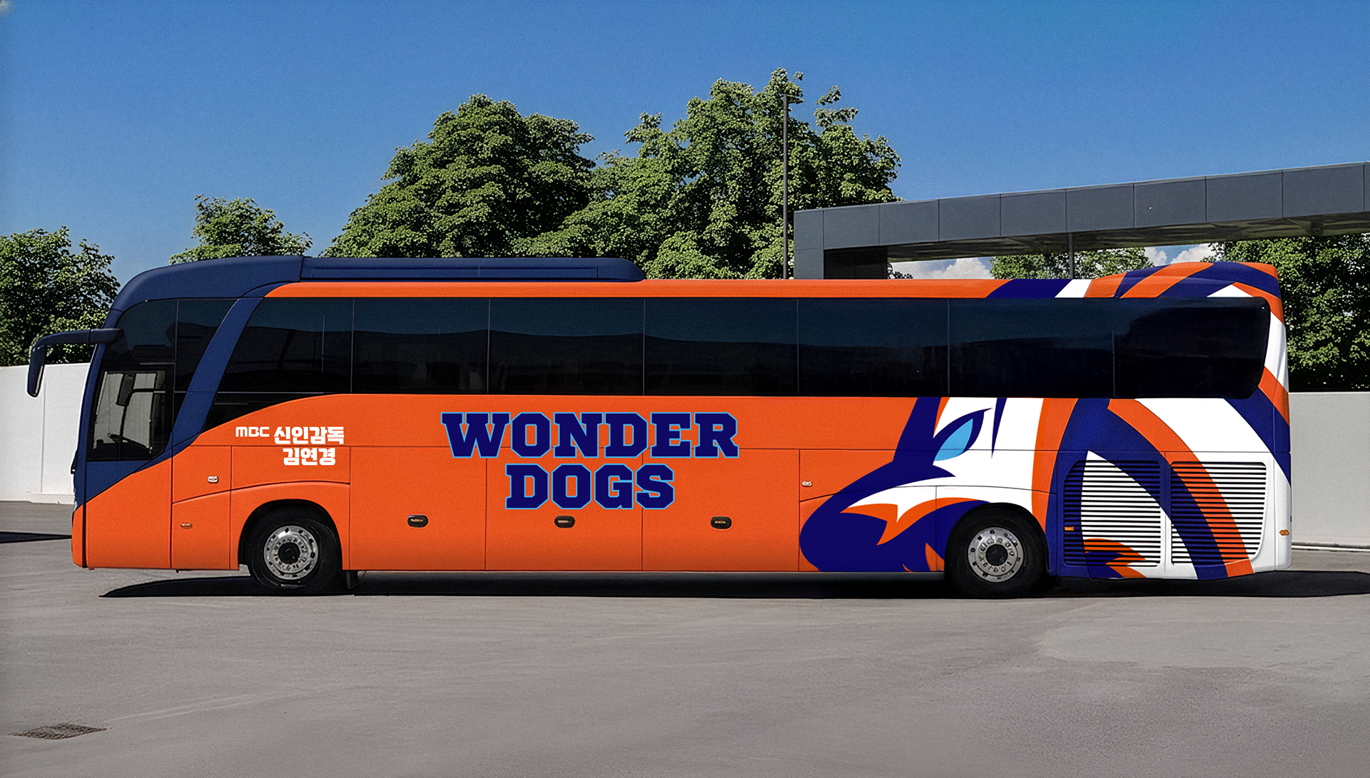
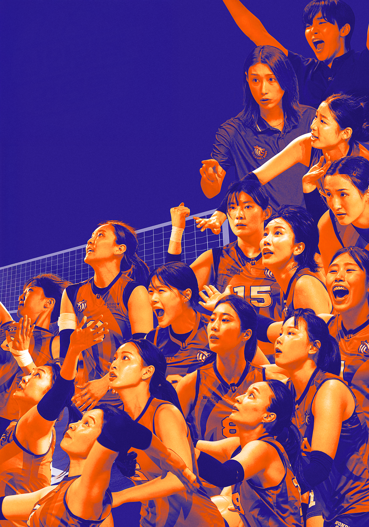
브랜드 색상은 강렬한 오렌지, 그리고 희망과 스포츠 정신을 상징하는 블루 색상으로 구성했습니다.
이는 배구의 역동적인 무드를 표현하는 데 그치지 않고, 브랜드가 지향하는 비전과 철학을 나타냅니다.
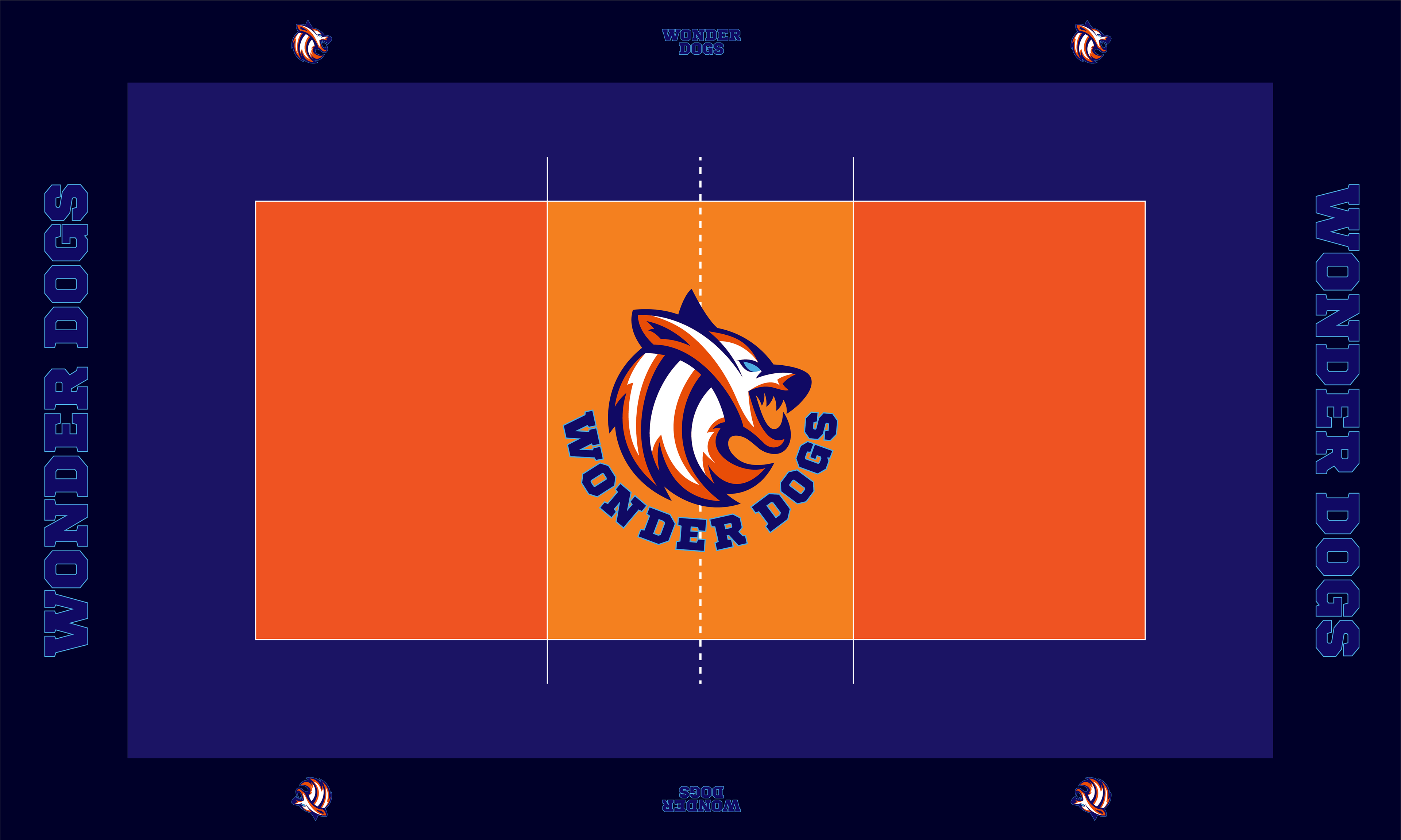
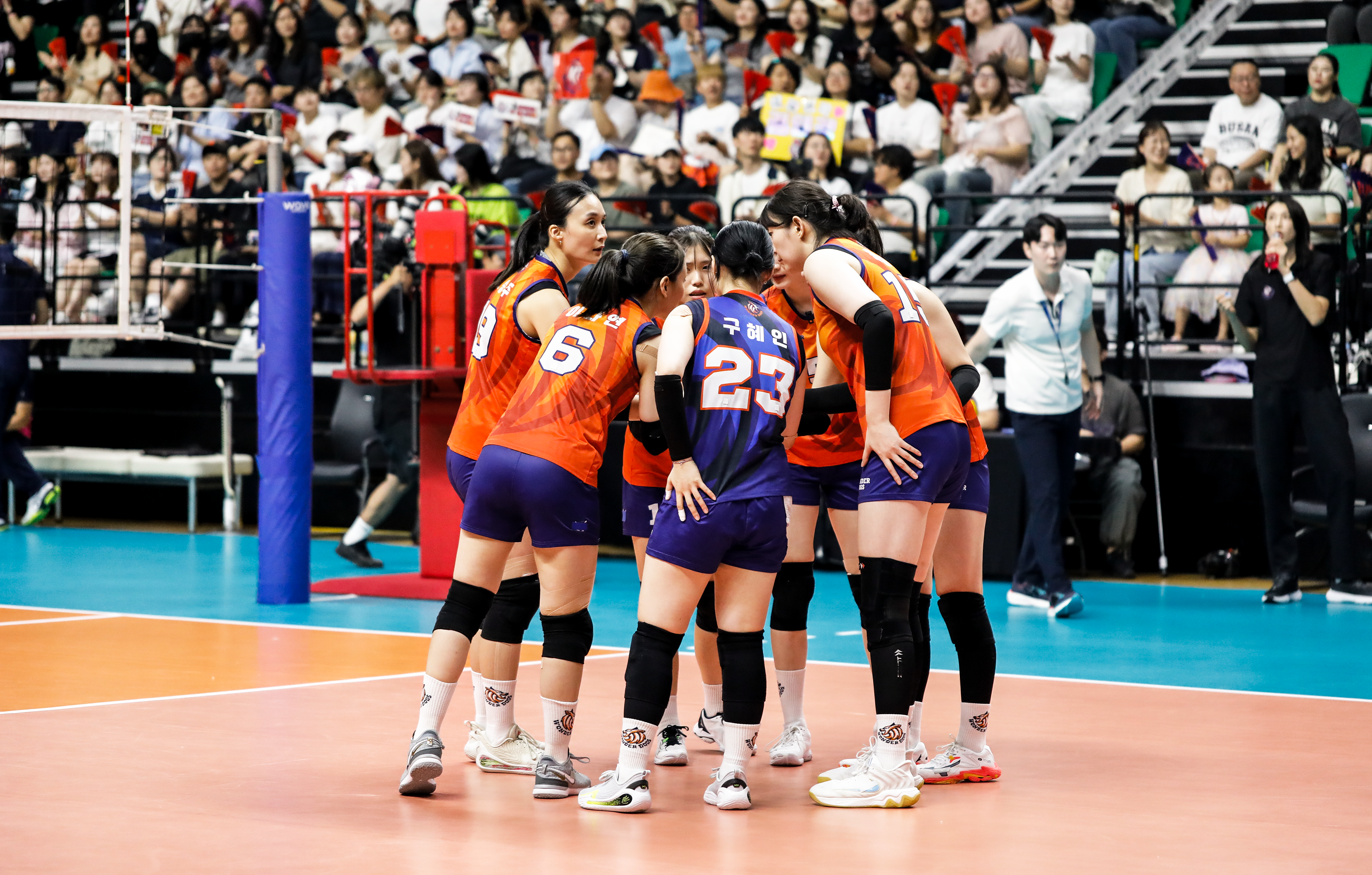
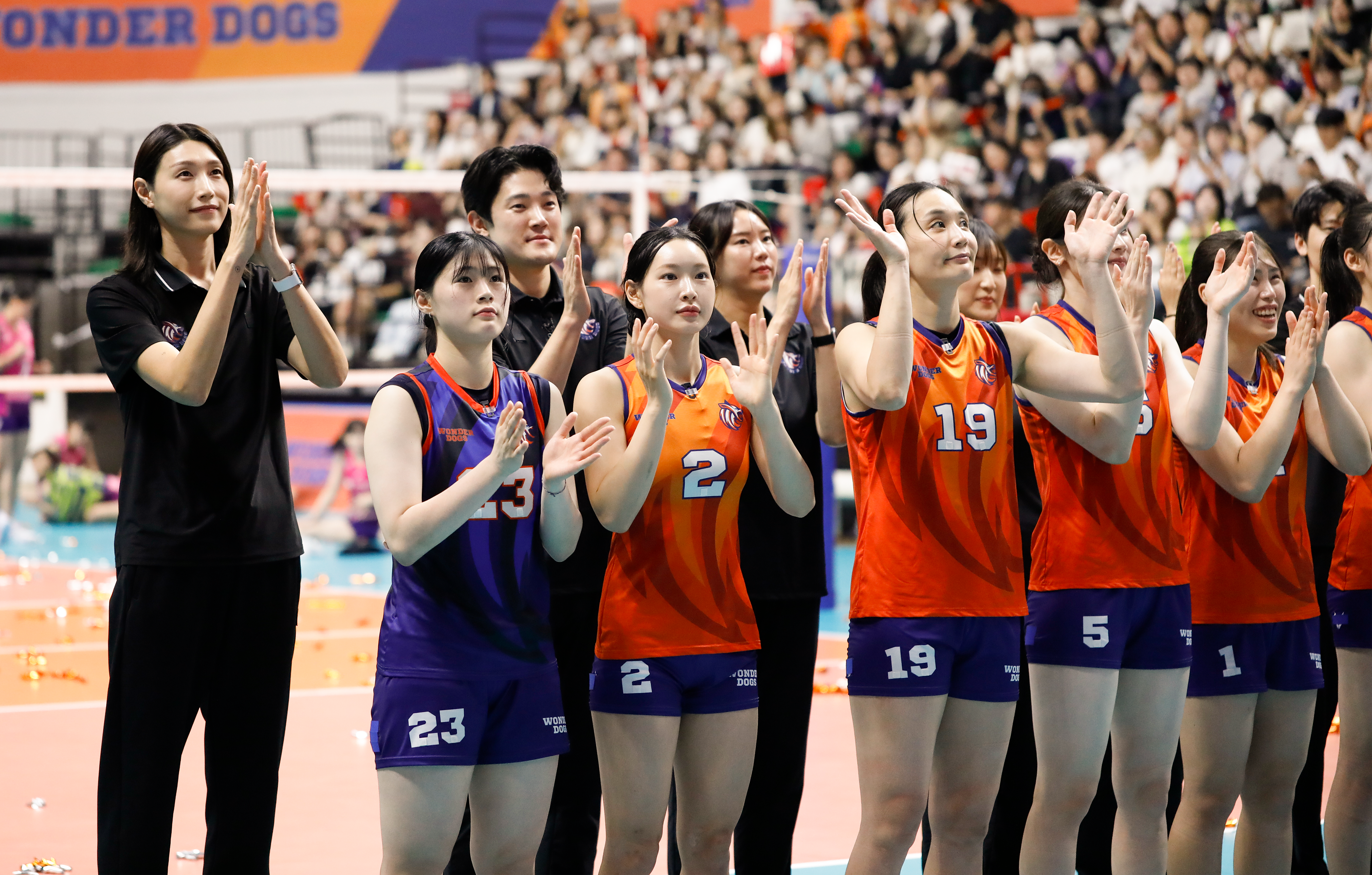
선수들이 하나의 팀이 되어, 그리고 한계를 넘어 승리를 향해 가는 여정 속 열기가 코트 밖으로
고스란히 전해질 수 있도록 모든 그래픽 요소에 강인한 언더독 정신을 담아내고자 했습니다.
원더독스는 50일간의 여정 동안 언더독의 반란을 입증하며, 수많은 사람들에게 원더(Wonder)를
선사했습니다.
이는 배구의 역동적인 무드를 표현하는 데 그치지 않고, 브랜드가 지향하는 비전과 철학을 나타냅니다.
선수들이 하나의 팀이 되어, 그리고 한계를 넘어 승리를 향해 가는 여정 속 열기가 코트 밖으로
고스란히 전해질 수 있도록 모든 그래픽 요소에 강인한 언더독 정신을 담아내고자 했습니다.
원더독스는 50일간의 여정 동안 언더독의 반란을 입증하며, 수많은 사람들에게 원더(Wonder)를
선사했습니다.
The brand colors consist of an intense orange and a blue that symbolizes hope and sportsmanship. These colors go beyond simply capturing the dynamic mood of volleyball;
they represent the brand’s overarching vision and philosophy.
To ensure the heat of the players' journey—becoming one team and pushing past their
limits toward victory—was felt vividly beyond the court, every graphic element was
infused with a tenacious underdog spirit. Over their 50-day journey, the Wonderdogs
proved the power of the underdog's rebellion, delivering a sense of
"Wonder" to countless people.