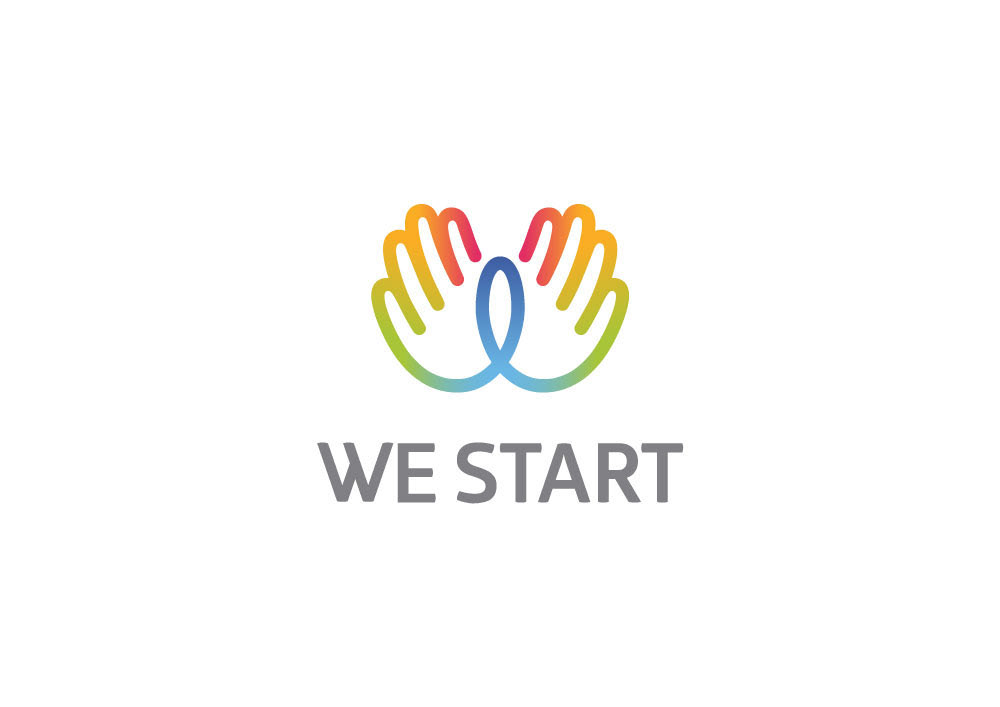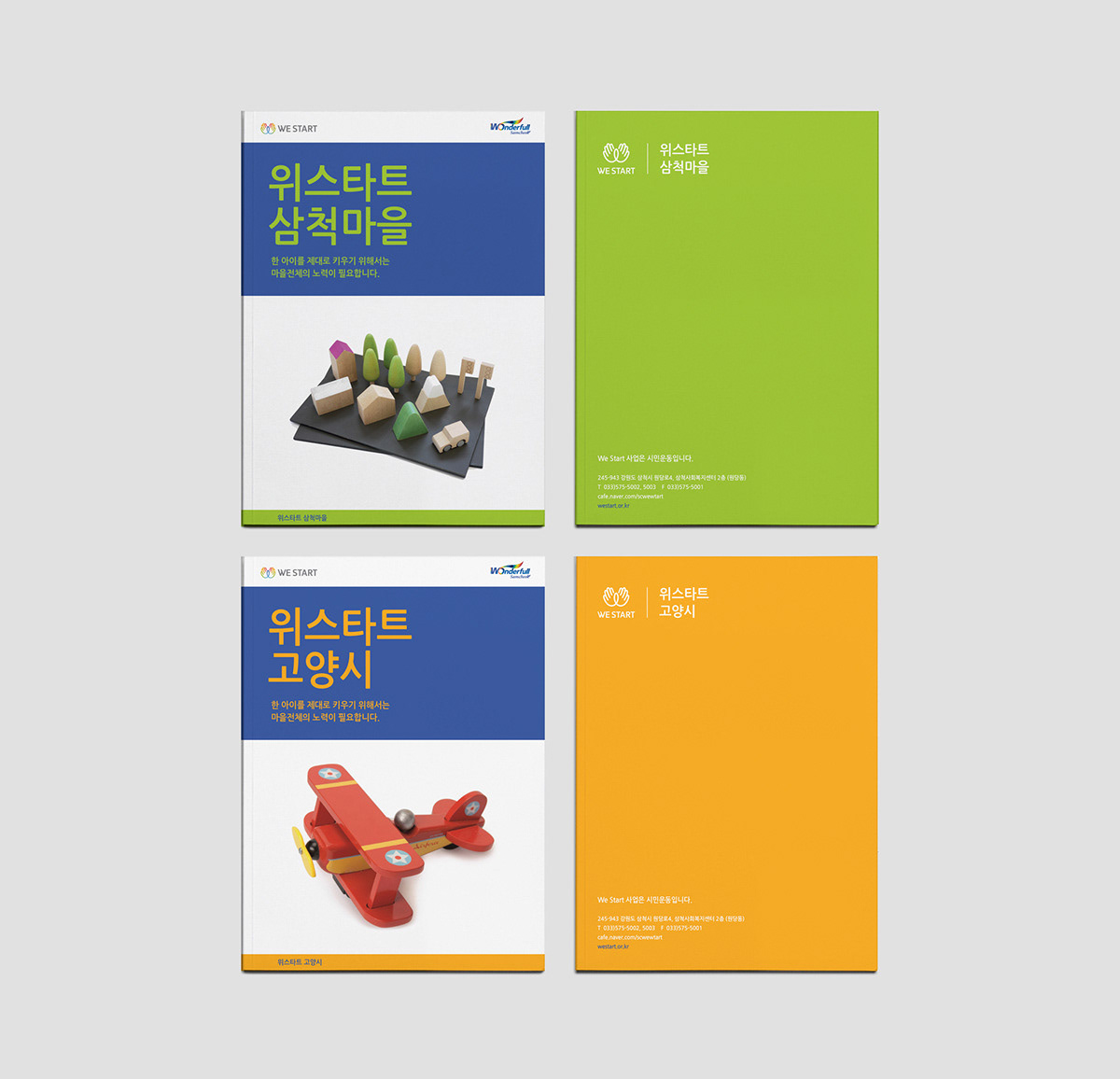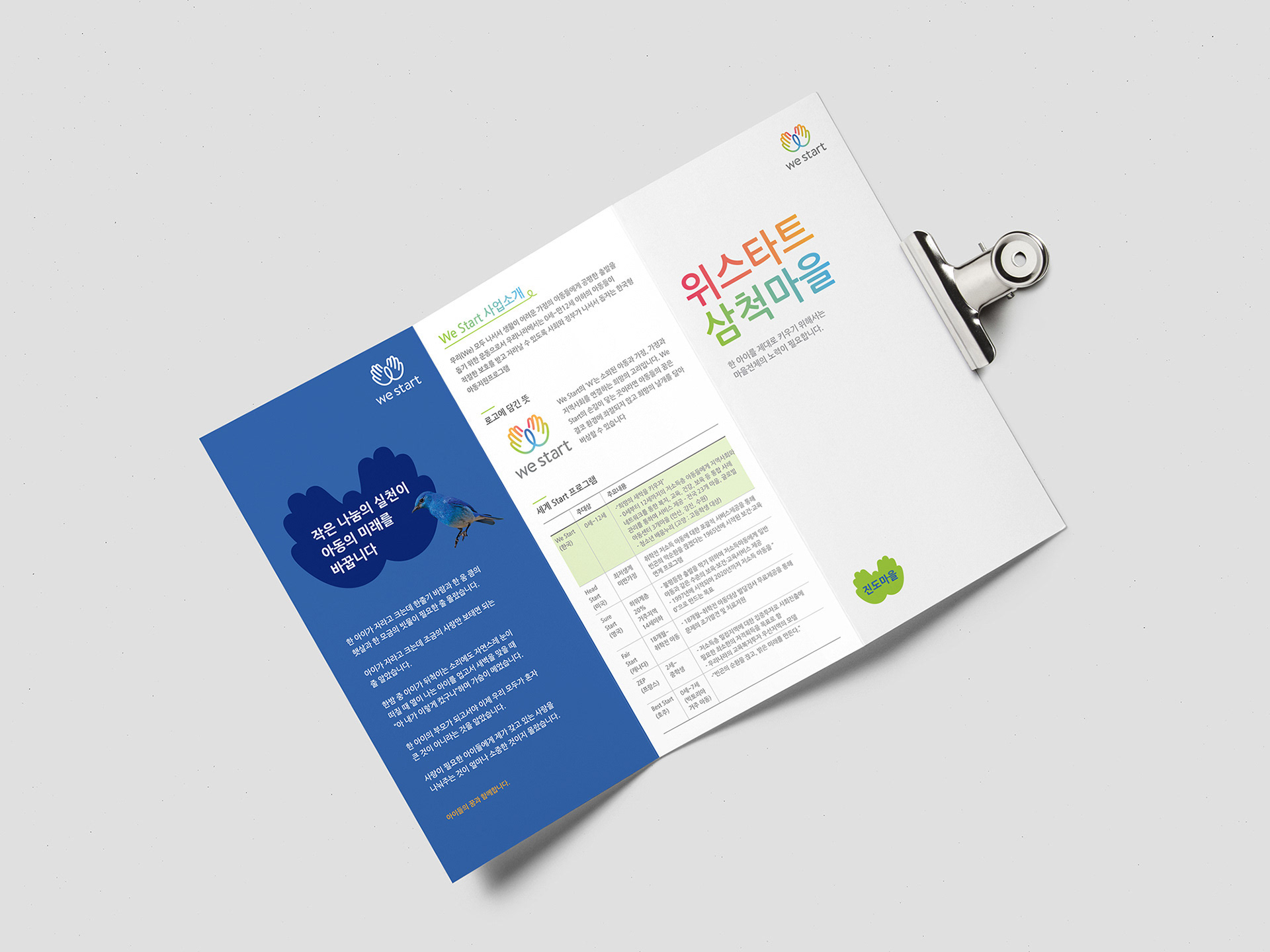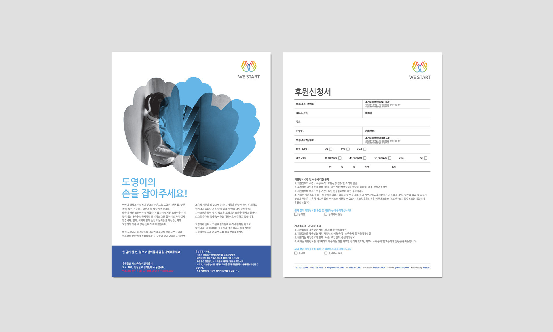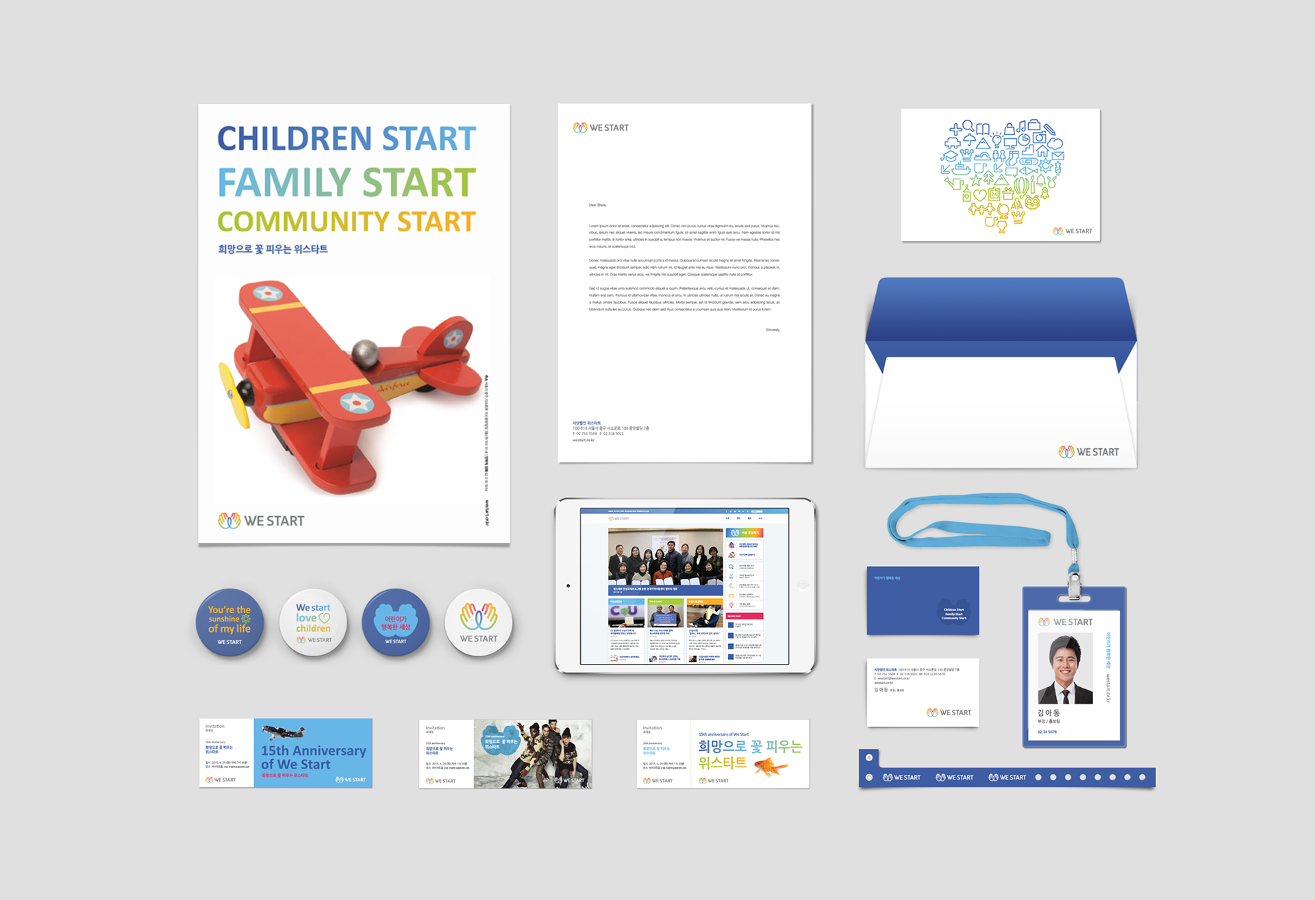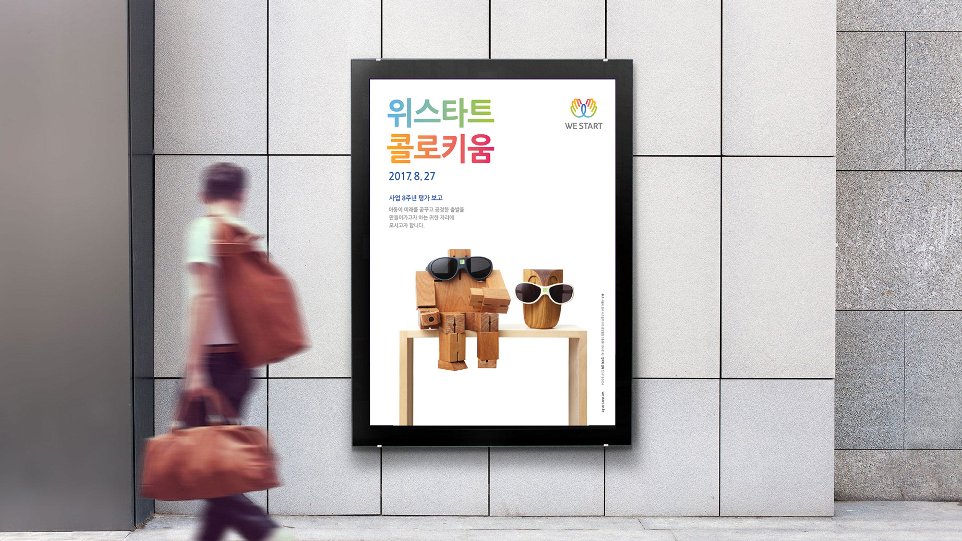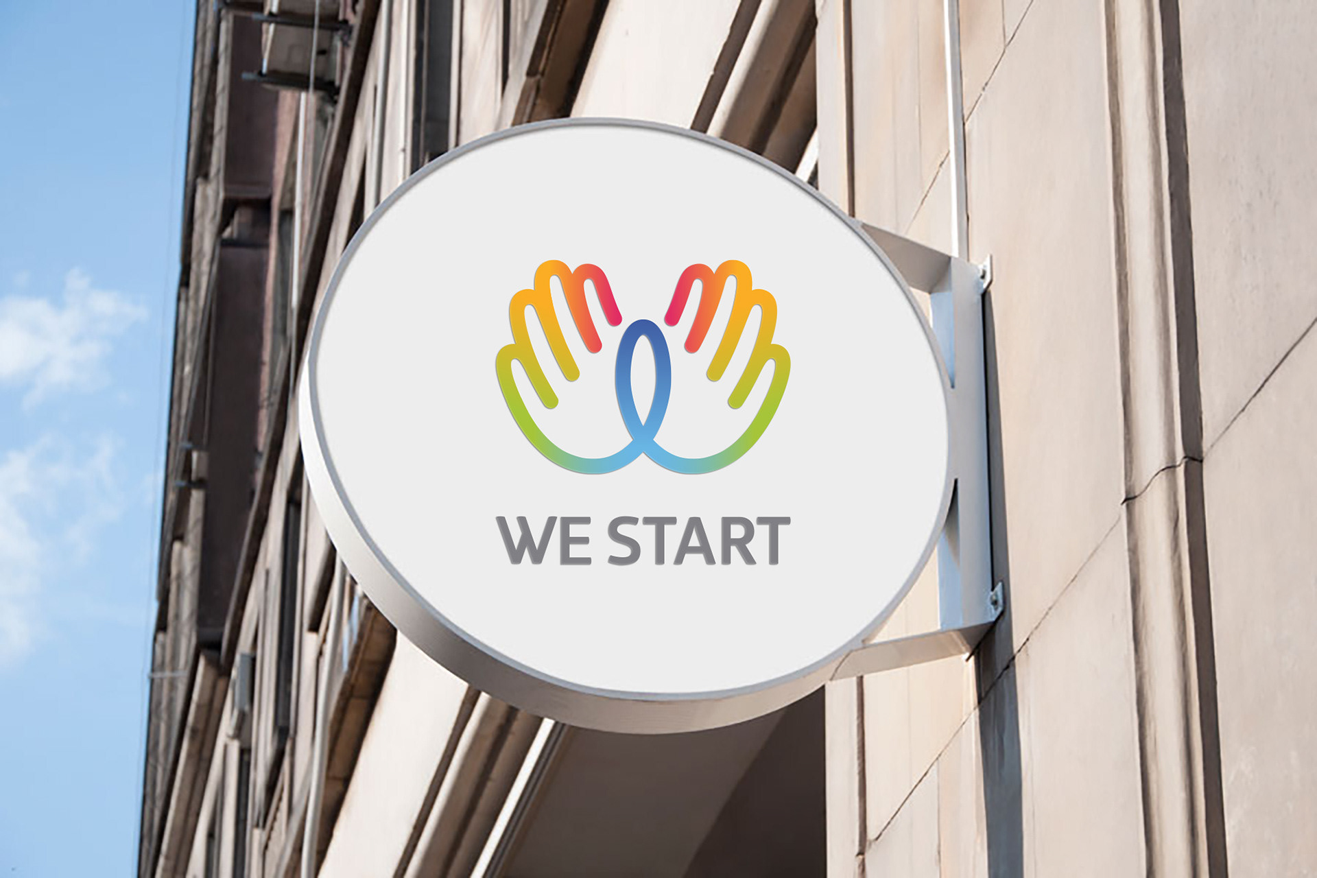
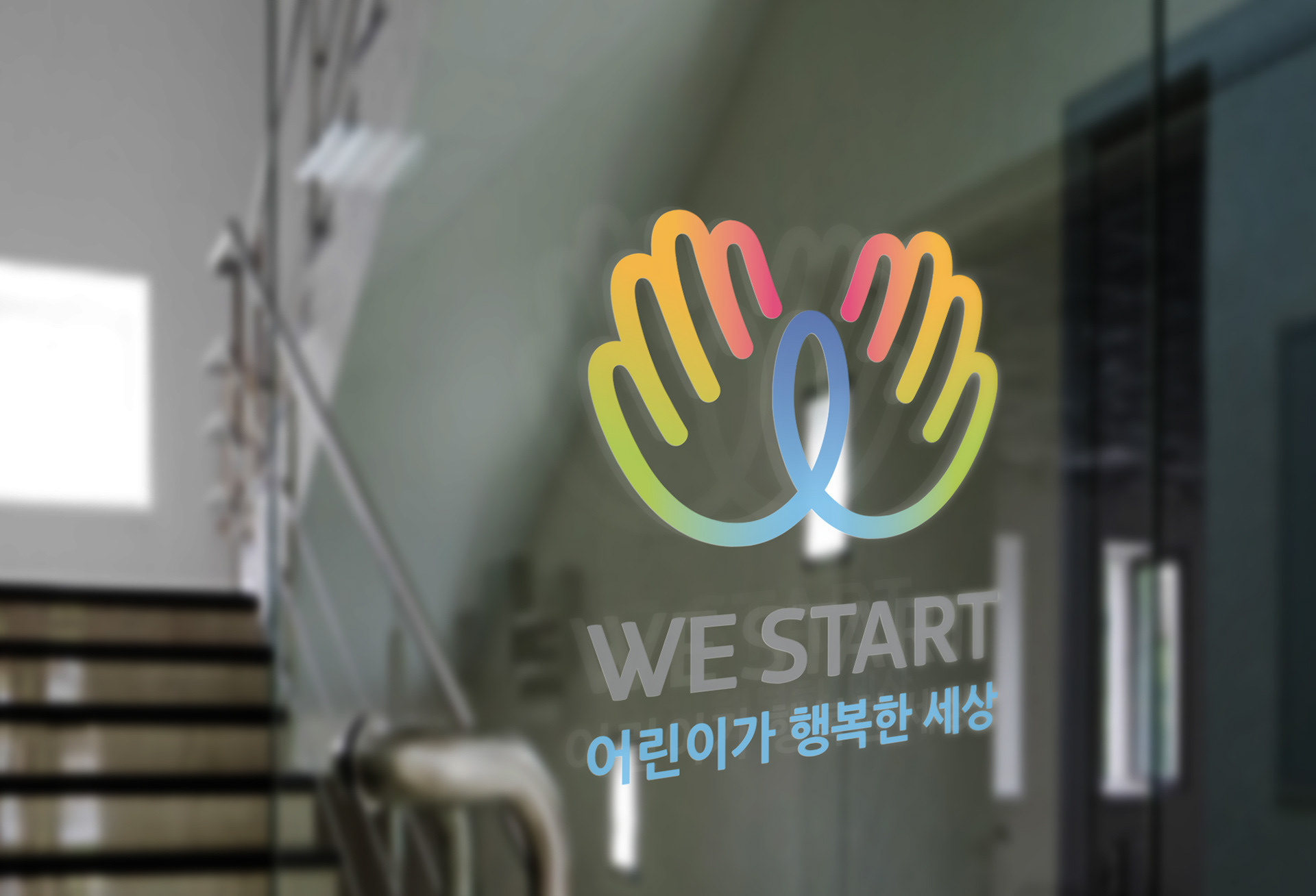
WE START
The CI of WE START, a brand that supports low income children and local communities,
was newly developed.
he existing CI was not able to appropriately express the business model and the lack of rules
on the CI had led to an unclear and inconsistent image. As such, the objective of the project
was to develop a symbol that can raise awareness of the WE START Foundation in an intuitive
manner. The two hands that symbolize the letter W also stand for wings of hope, care, help
and dreams.