SELCTO COFFEE
A project to renew the brand identity of Selecto Coffee and develop a new visual identity
was carried out.
The task was to maintain the existing brand image as much as possible, but bring out the status
of a leading coffee brand through a modern image.
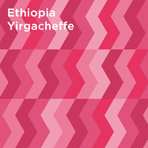
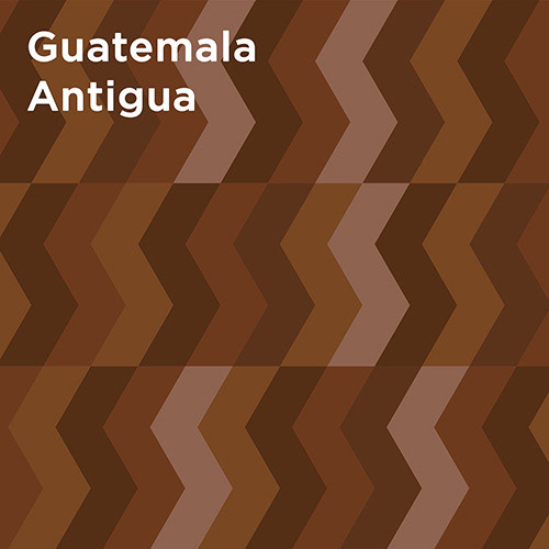
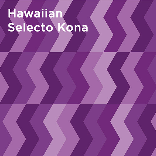
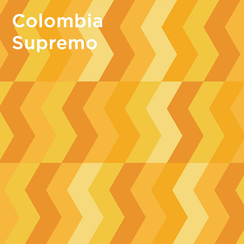
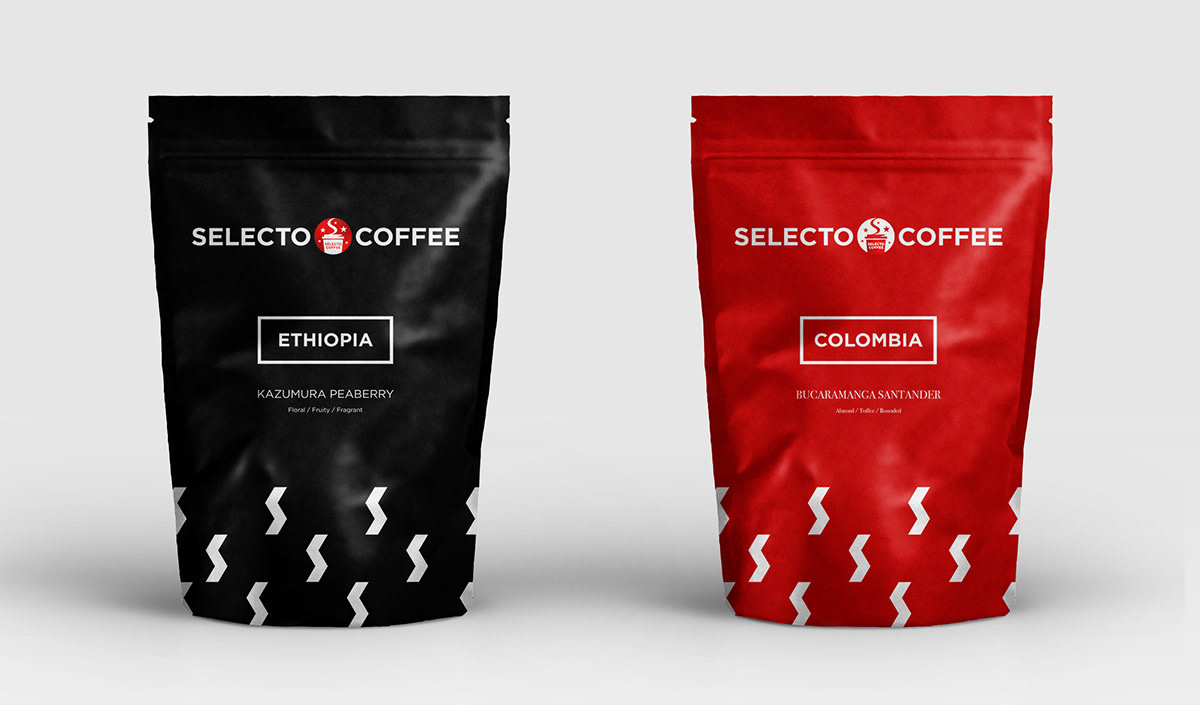
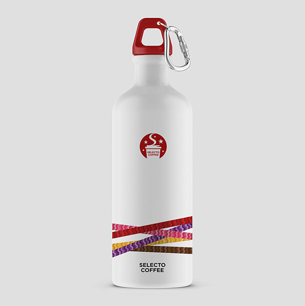
Next, patterns that represent the five key products were developed and applied consistently to
the package design.
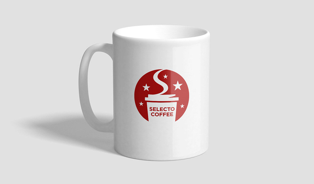
The overall line in the brand identity was renewed and the initial “S” was expressed to look like
the aroma of coffee drifting into the air.
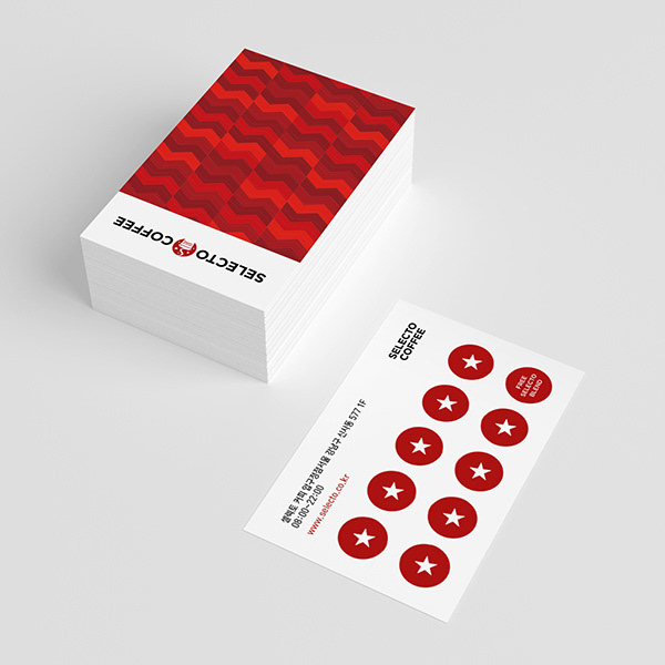
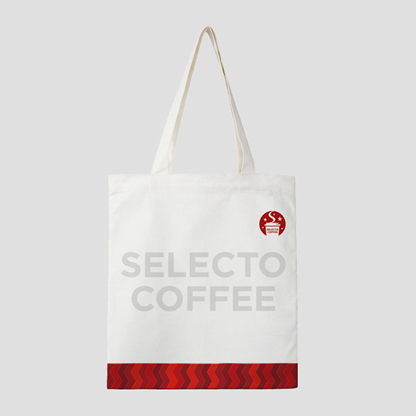
The initial “S” was re-interpreted in a modern way by applying a zig-zag form. The color is also
reminiscent of the taste and aroma of coffee.
