


TKG
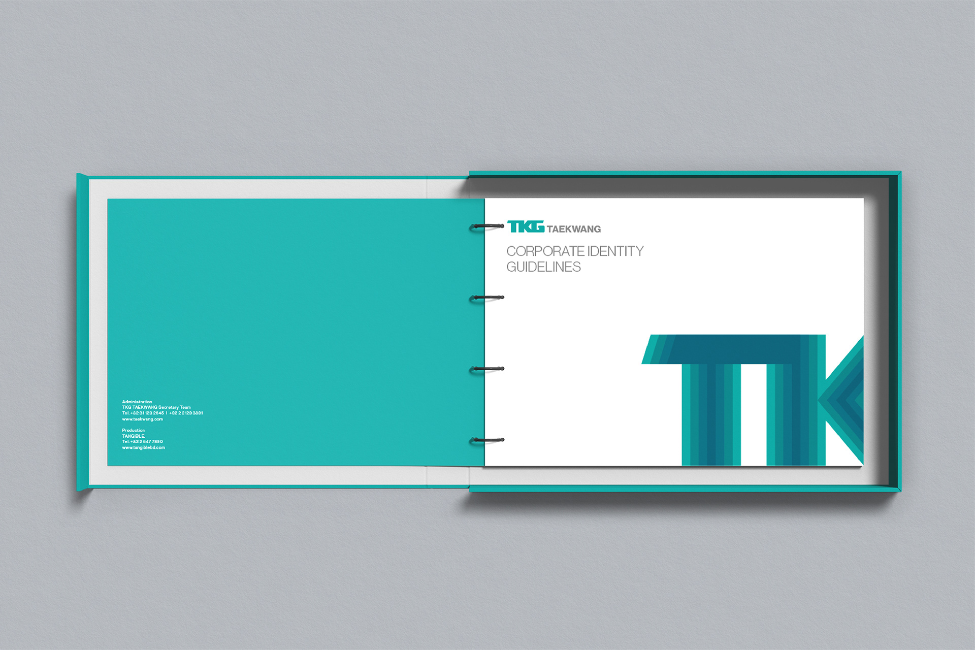
Corporate Identity Branding
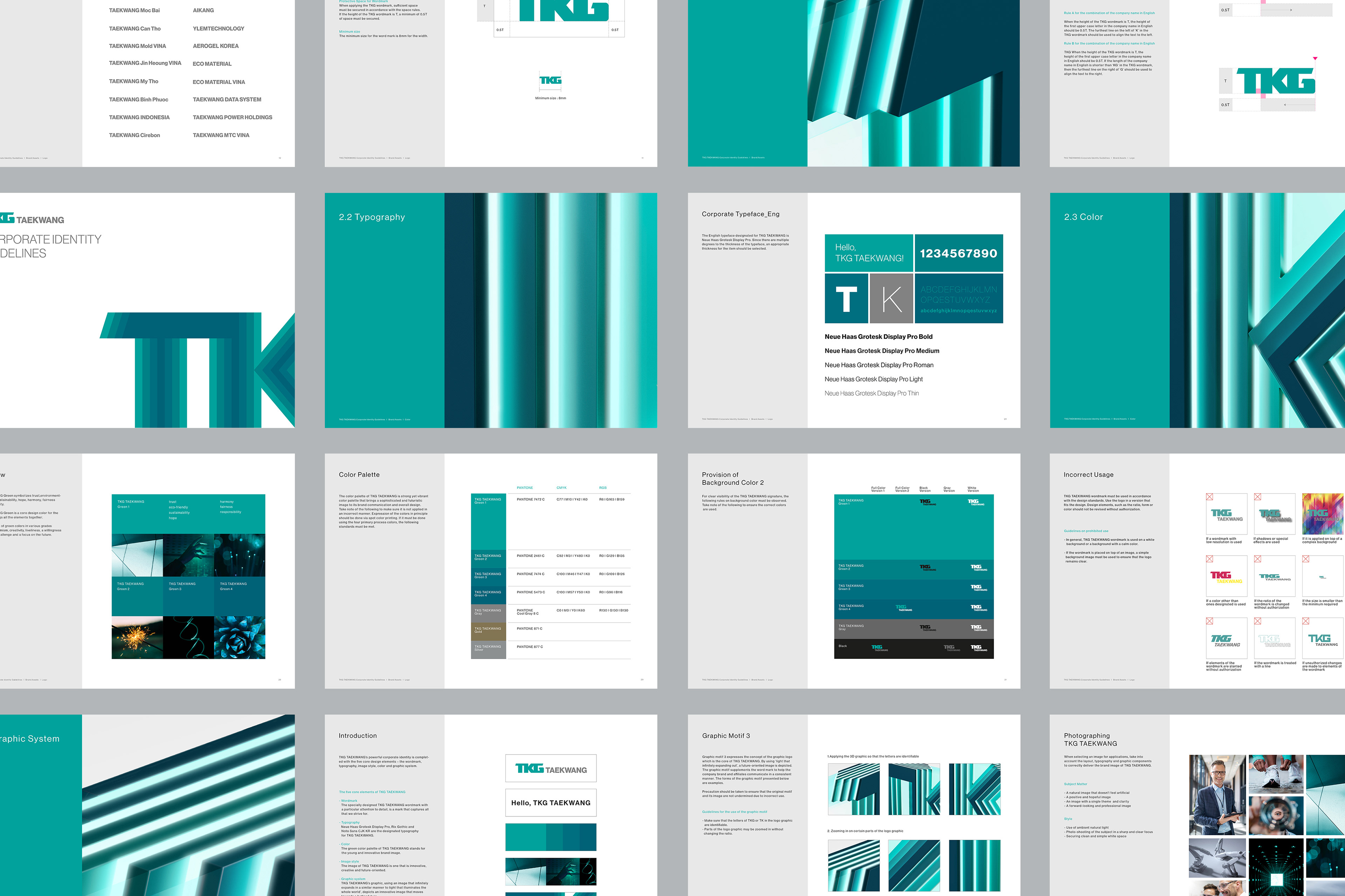
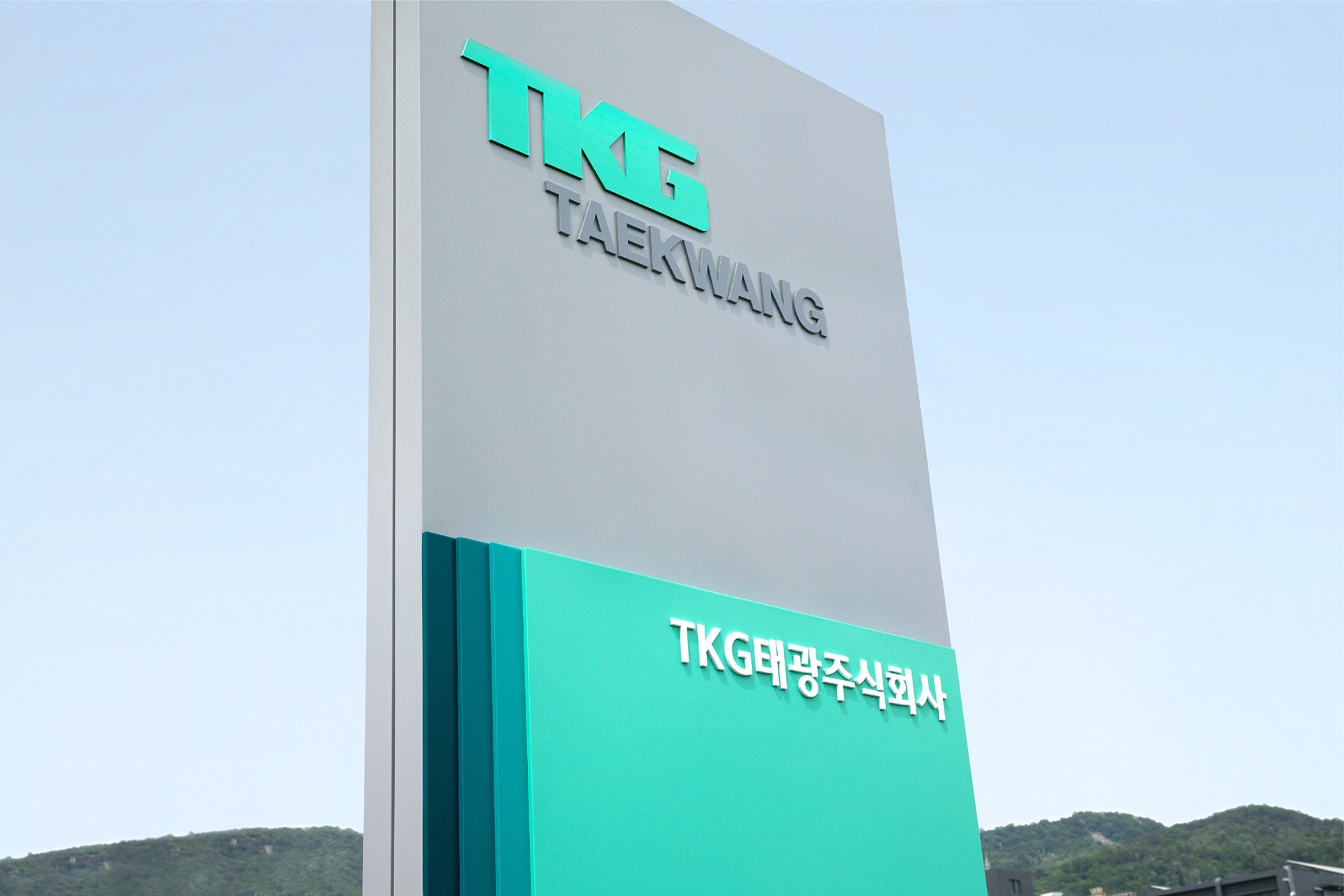
The purpose of the rebranding Taekwang group’s CI was to reorganize the system as an integrated group by developing a new brand image that could encompass various affiliates.
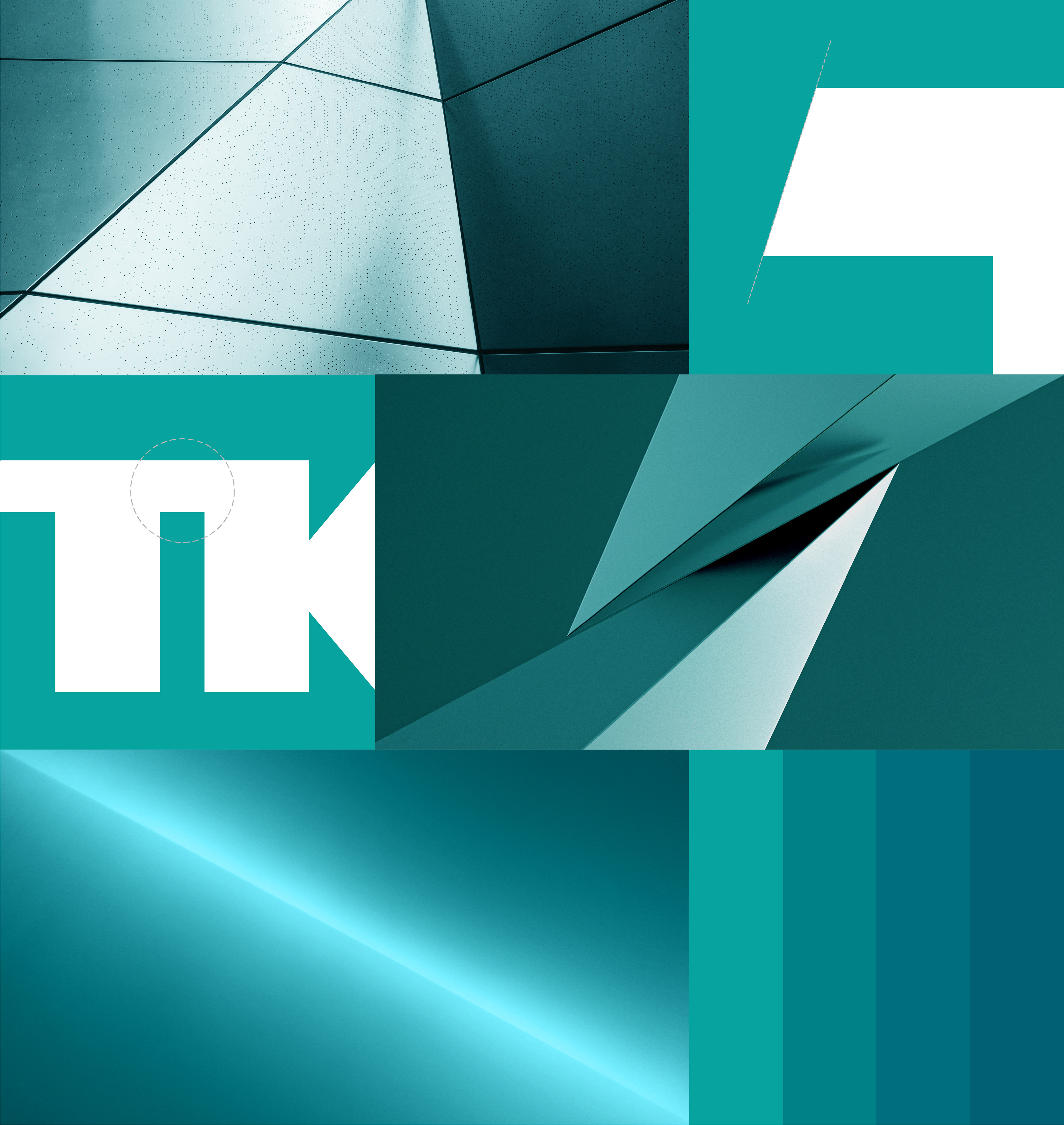
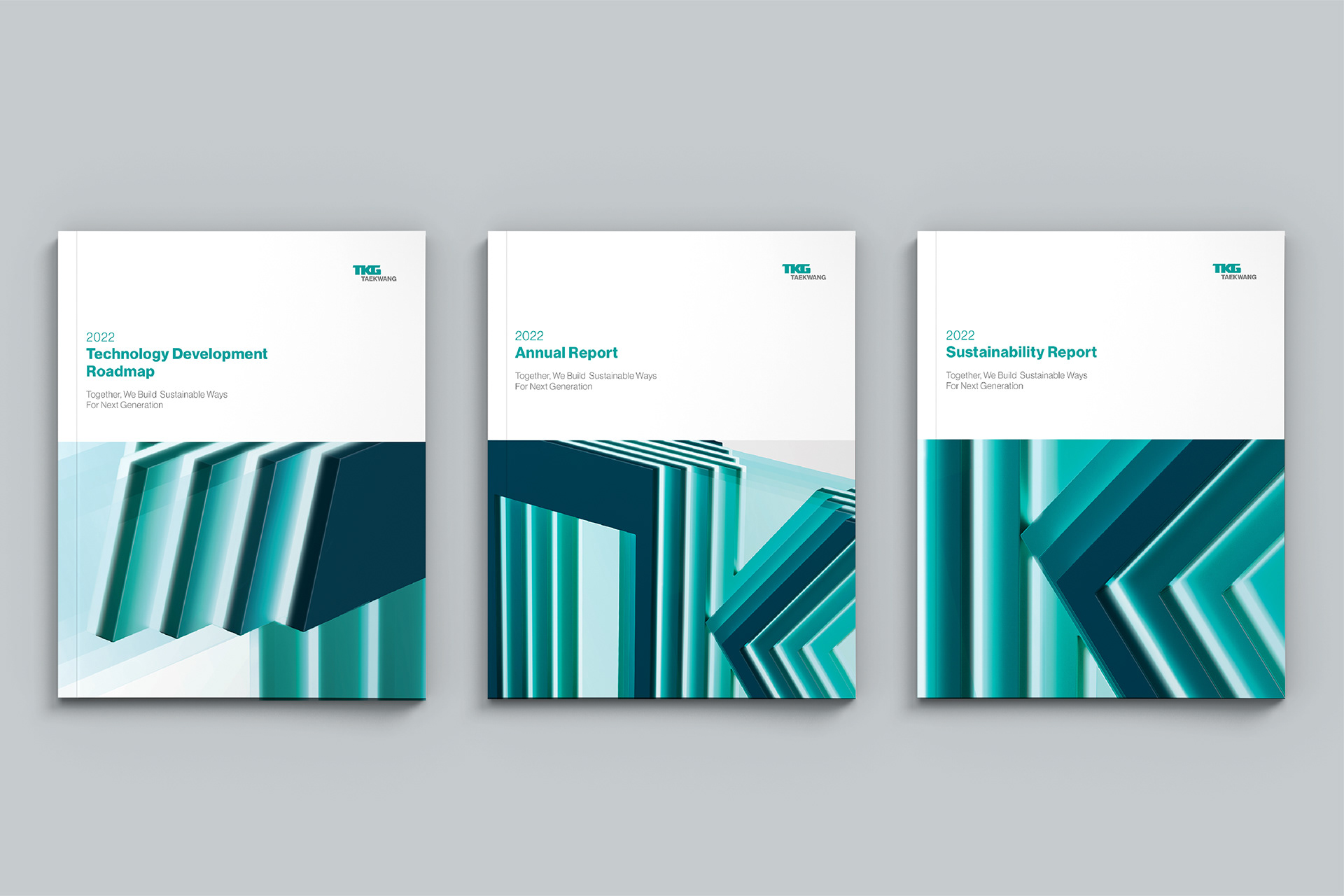
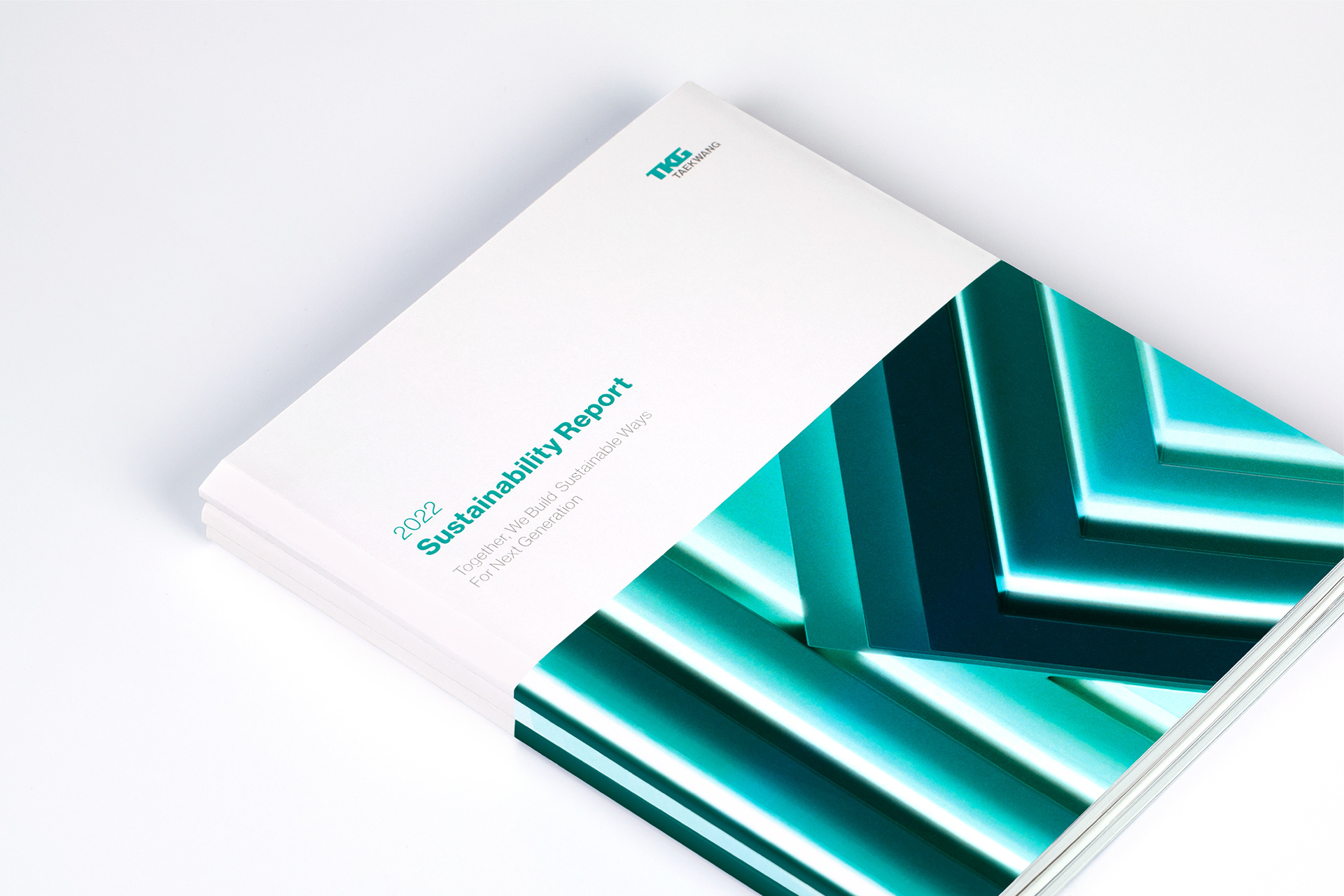
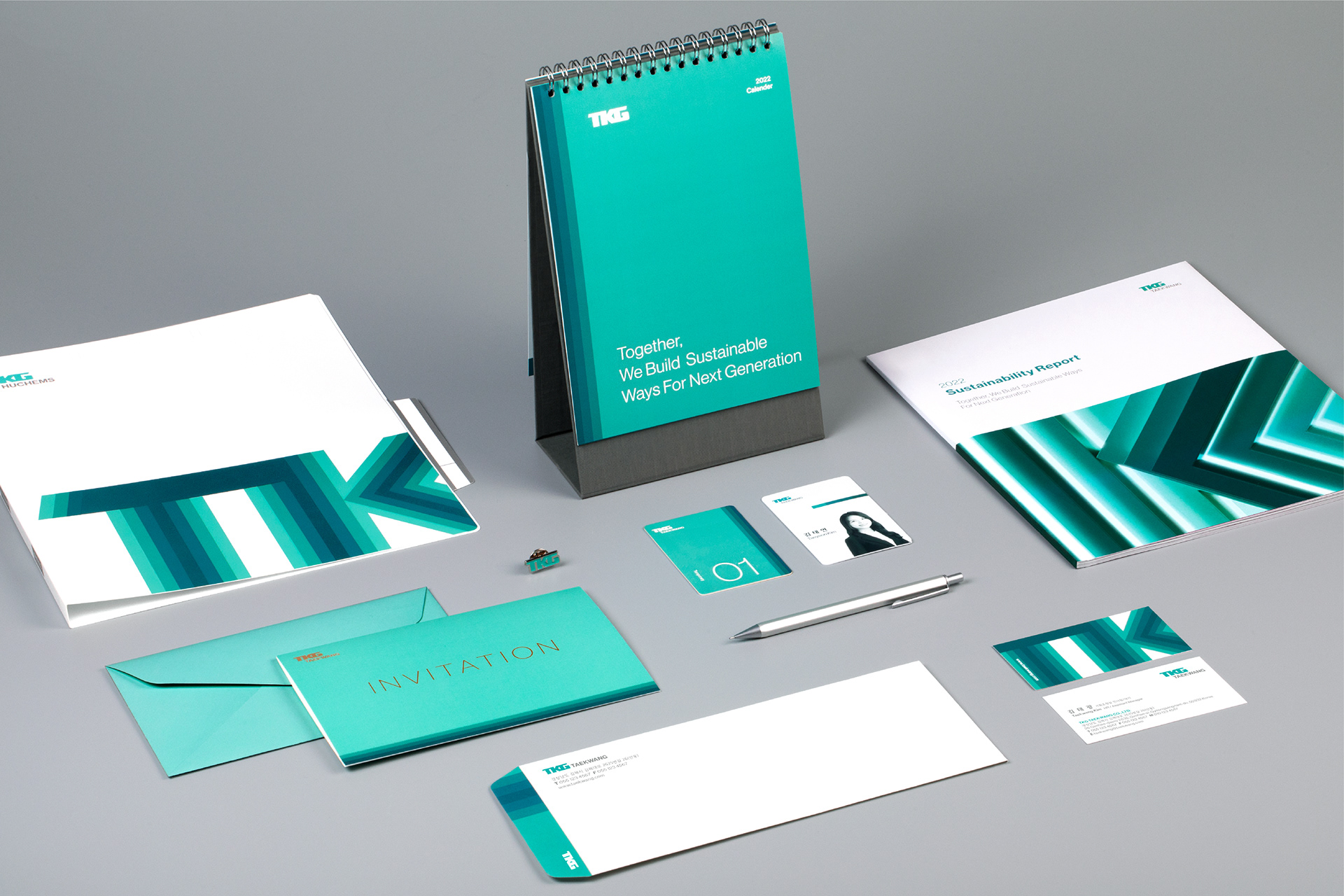
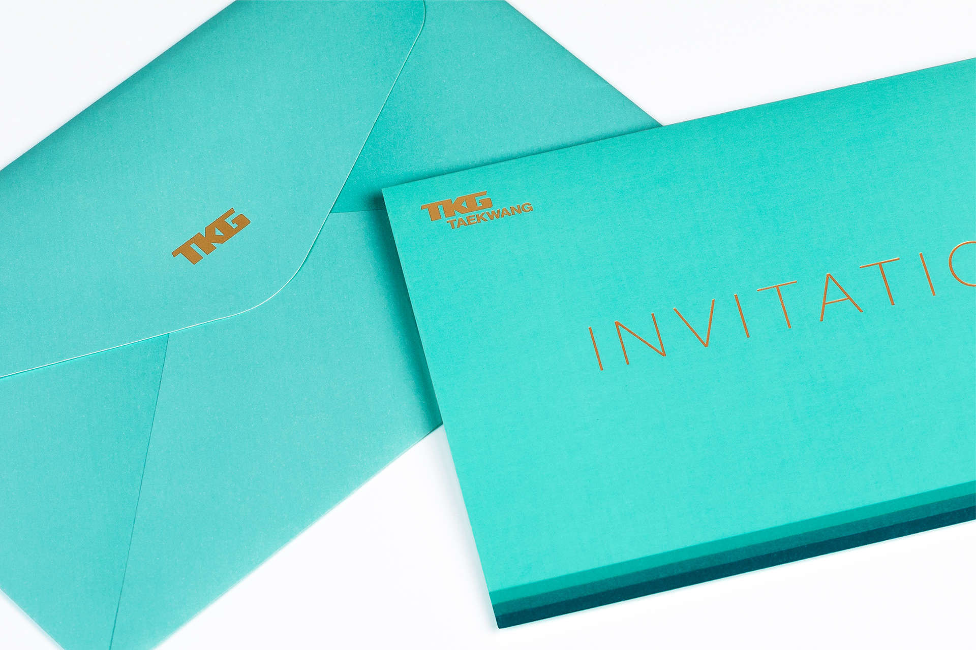
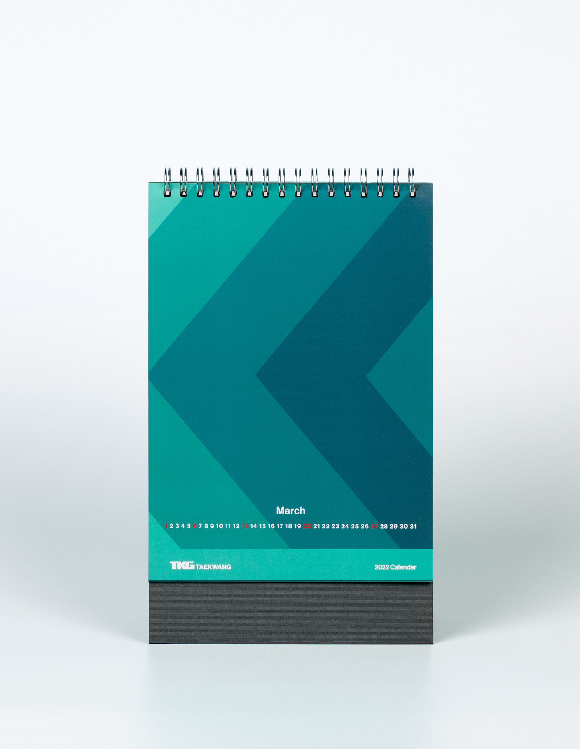
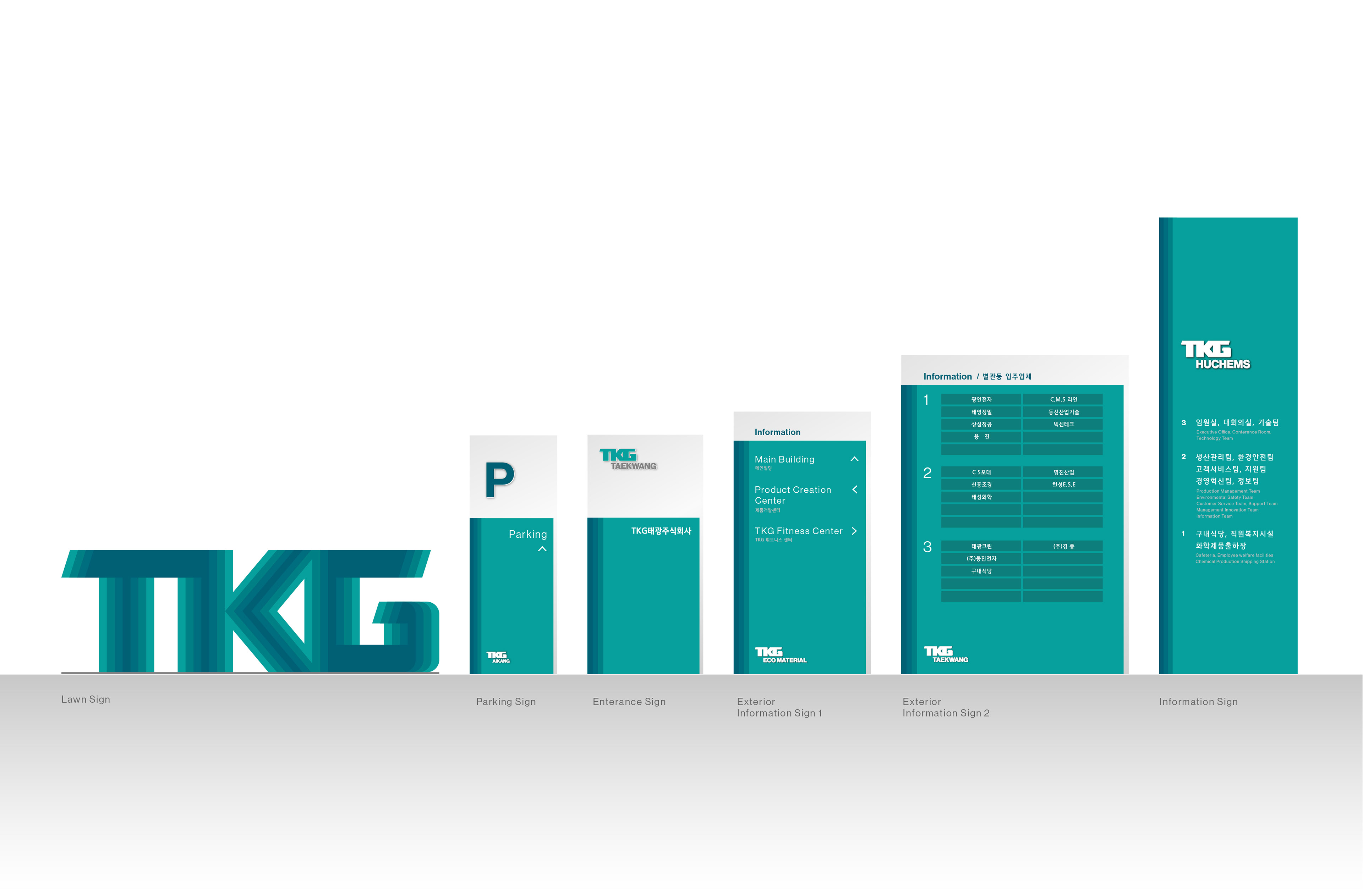
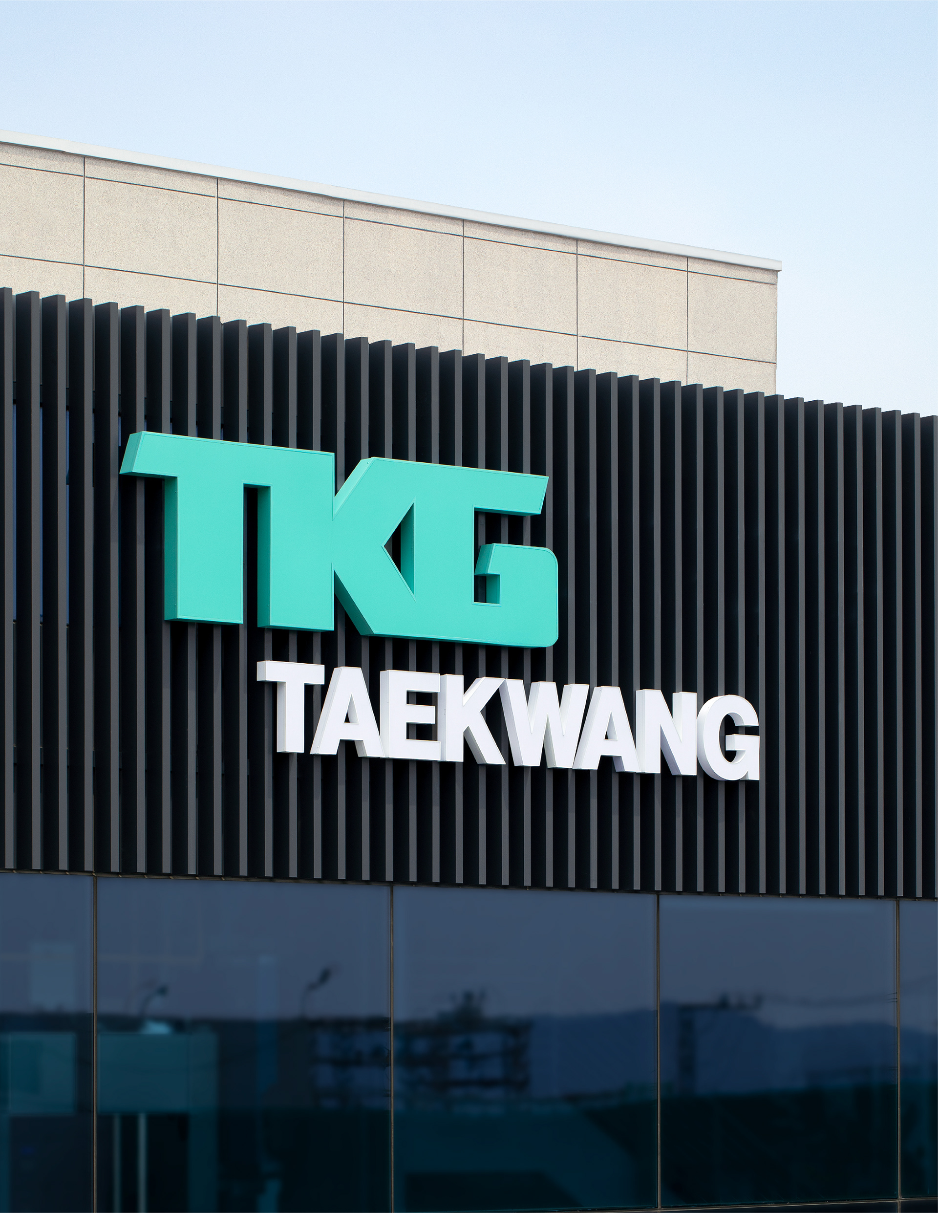
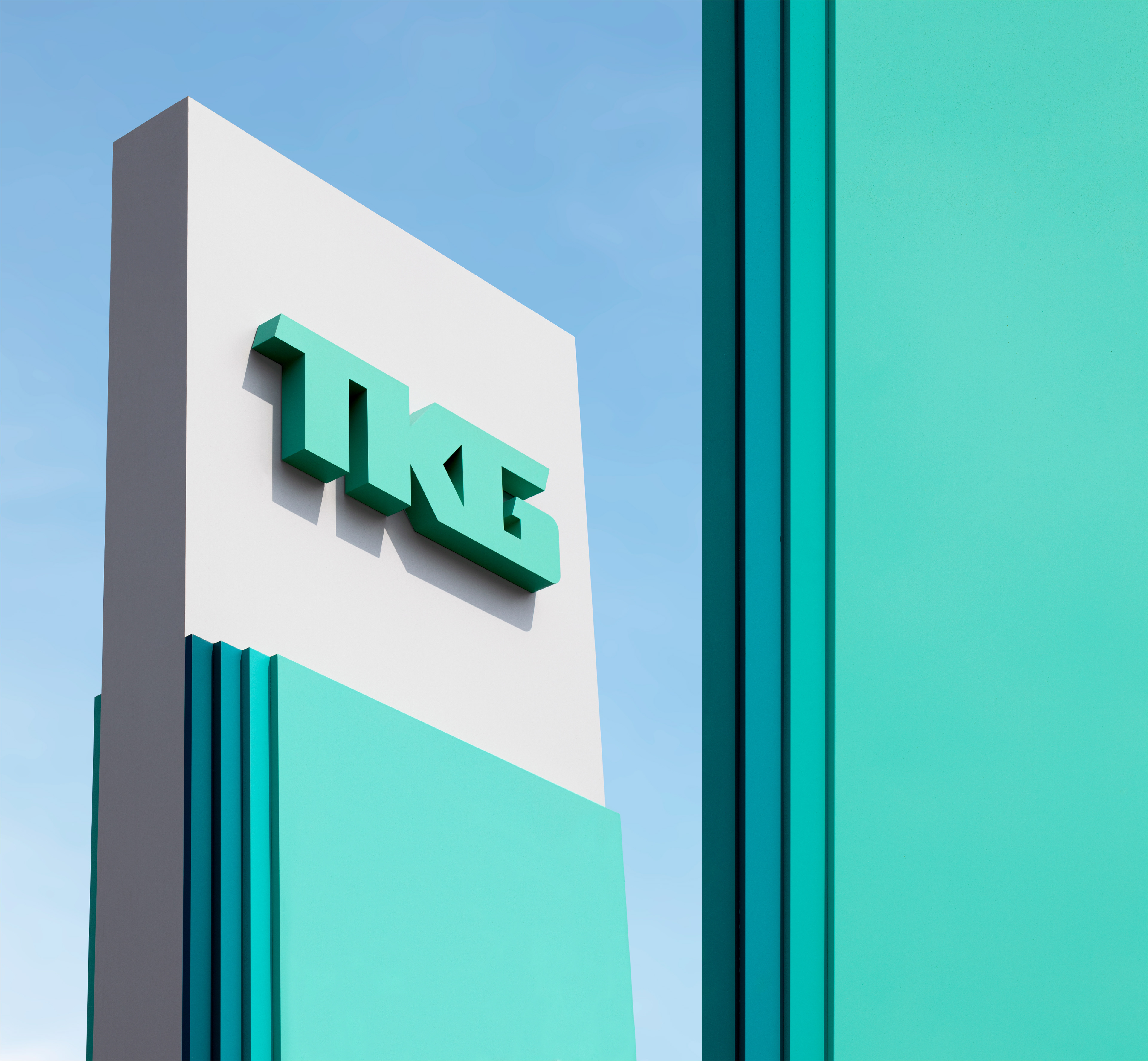
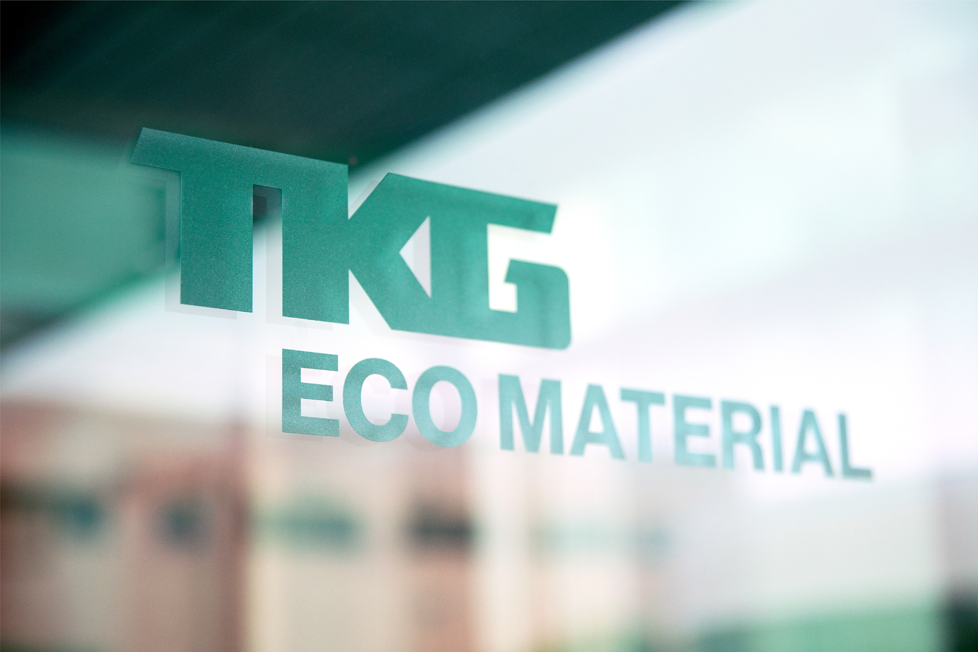
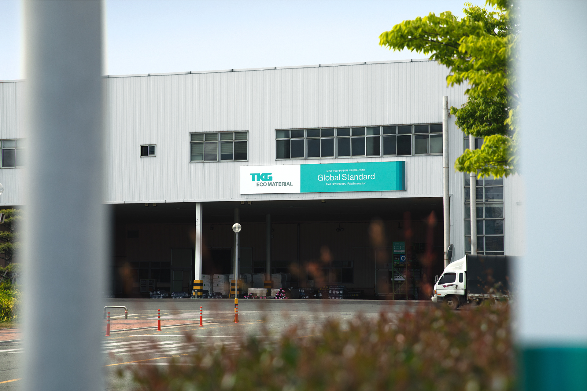
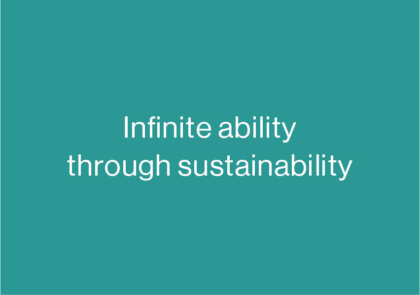
TKG’s new CI uses ‘light’ as a motif to deliver a creative and innovative image. ‘Light’ that stretches out to a sustainable future represents the infinite creativity and innovation of TKG
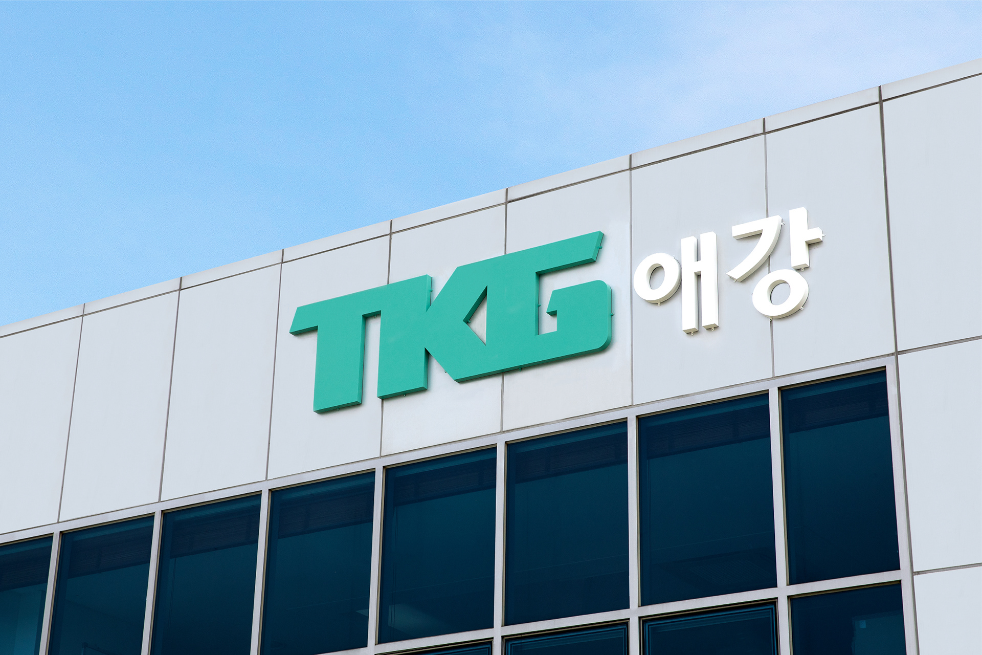
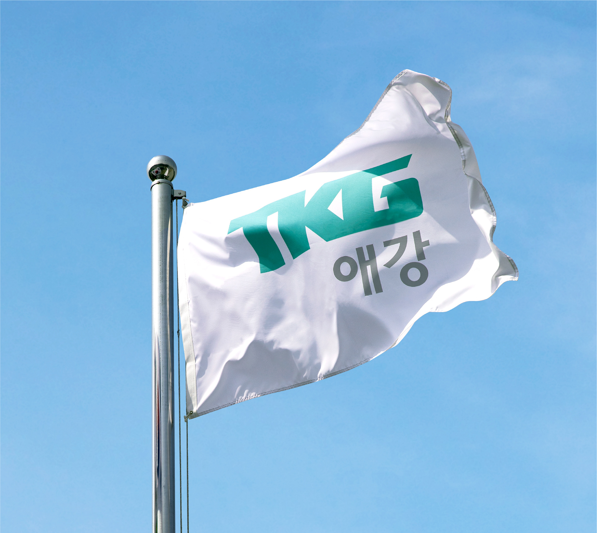
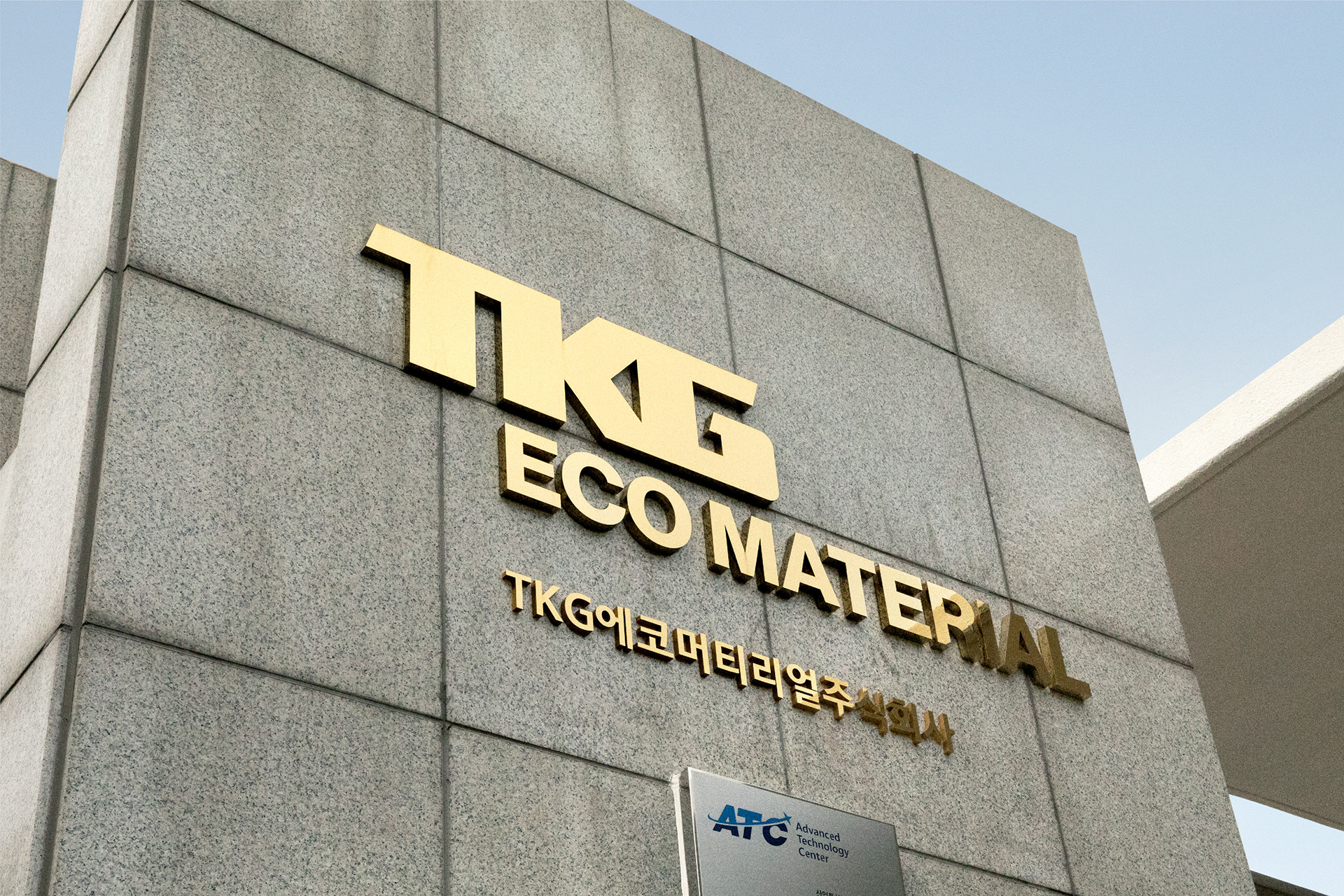
that constantly rises up to the challenge. This is symbolized in three intuitive concepts. The first concept is ‘the diagonal line’ representing TKG’s willingness to rise to the challenge in a dynamic way towards a sustainable future. The second concept is ‘connection’ which expresses the corporate culture of TKG and the value of sharing. The initials of TKG that are interconnected stand for a communal culture that creates a fair environment through empathy and open-mindedness. The third concept is ‘infinity’ which stands for the sustainability that TKG works towards for the benefit of the future environment and progress of humanity. Similar to the light that infinitely spreads out, an image that spreads and builds is applied to the various categories of CI, depicting a vision for a better future. TKG TAEKWANG Green symbolizes trust, environment-friendliness, sustainability, hope, harmony, fairness, and responsibility.
TKG’s new CI uses ‘light’ as a motif to deliver a creative and innovative image. ‘Light’ that stretches out to a sustainable future represents the infinite creativity and innovation of TKG
that constantly rises up to the challenge. This is symbolized in three intuitive concepts. The first concept is ‘the diagonal line’ representing TKG’s willingness to rise to the challenge in a dynamic way towards a sustainable future. The second concept is ‘connection’ which expresses the corporate culture of TKG and the value of sharing. The initials of TKG that are interconnected stand for a communal culture that creates a fair environment through empathy and open-mindedness. The third concept is ‘infinity’ which stands for the sustainability that TKG works towards for the benefit of the future environment and progress of humanity. Similar to the light that infinitely spreads out, an image that spreads and builds is applied to the various categories of CI, depicting a vision for a better future. TKG TAEKWANG Green symbolizes trust, environment-friendliness, sustainability, hope, harmony, fairness, and responsibility.