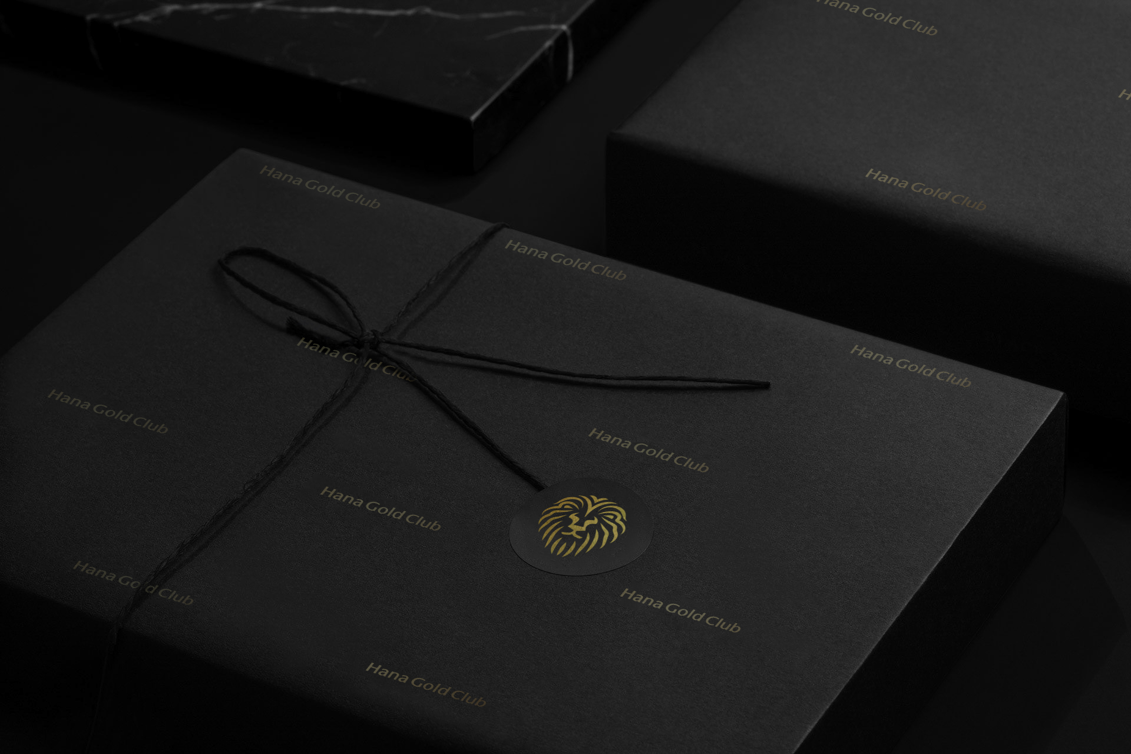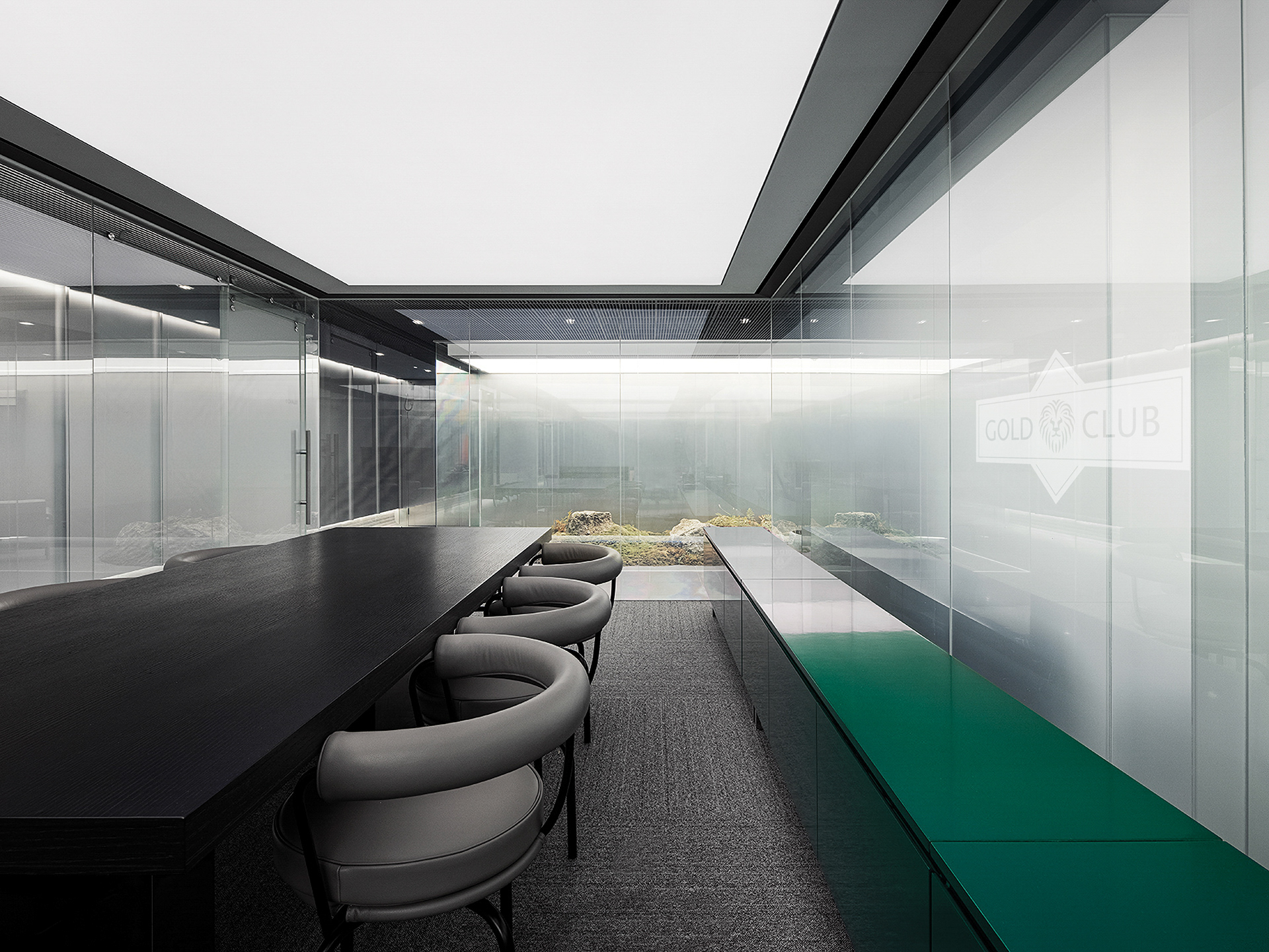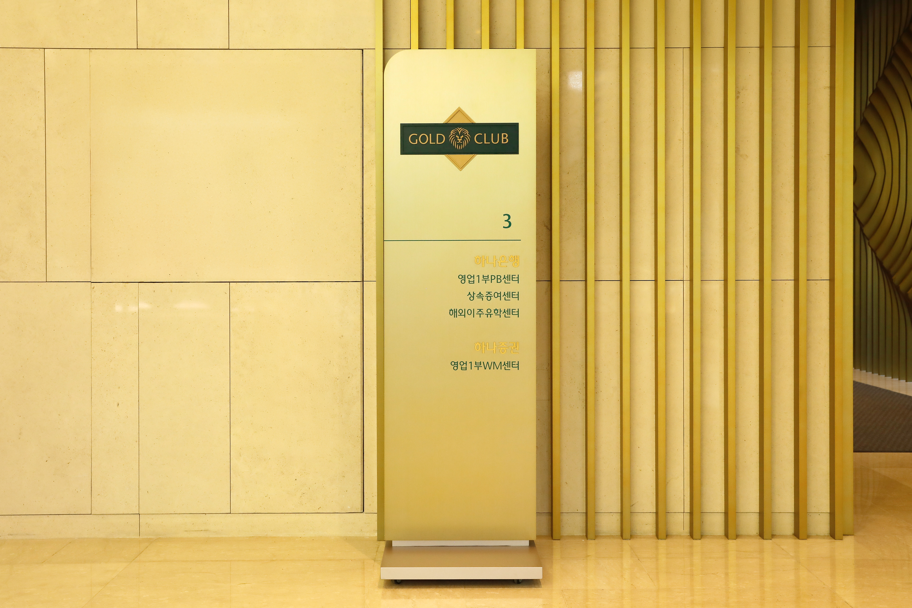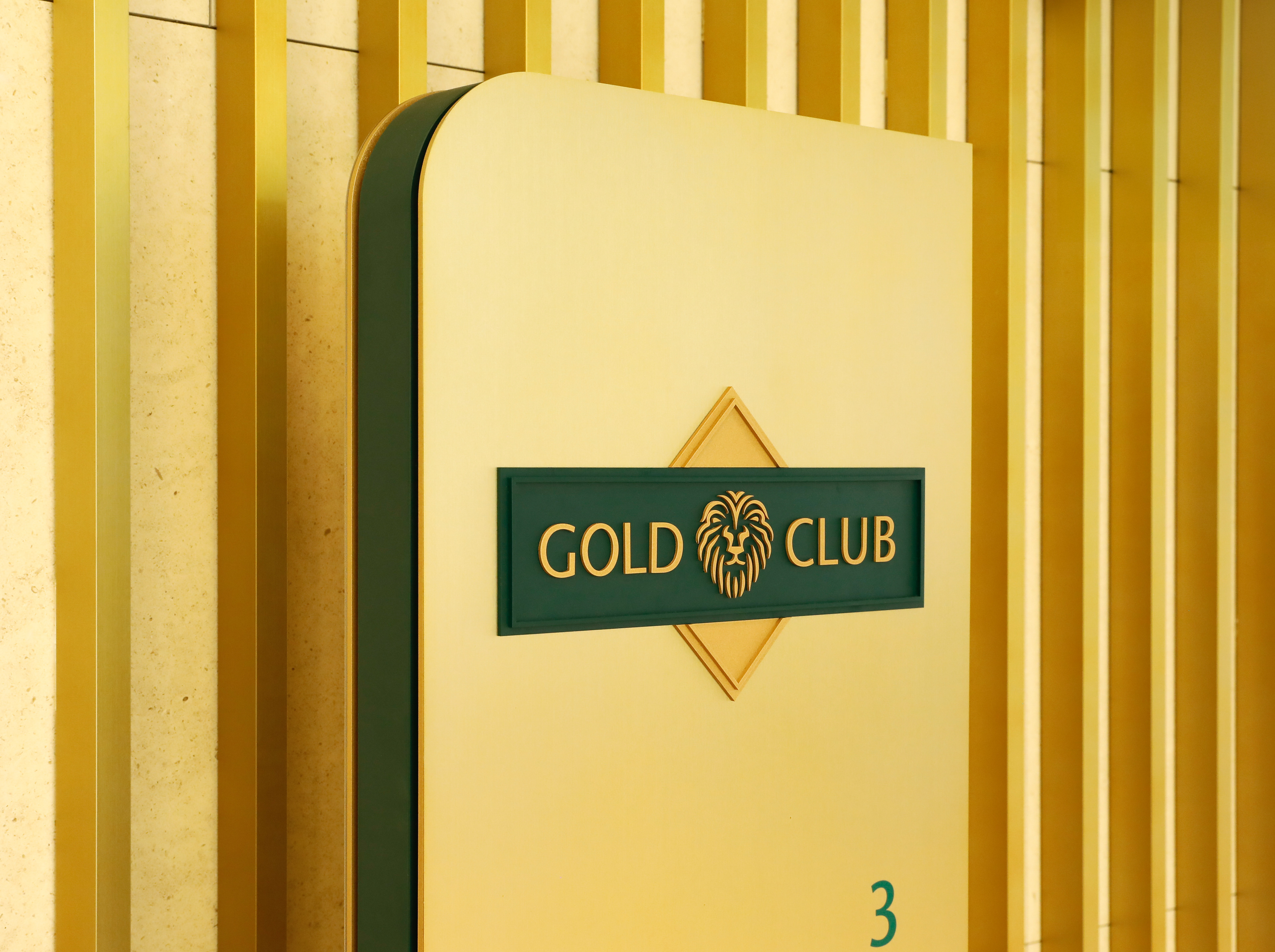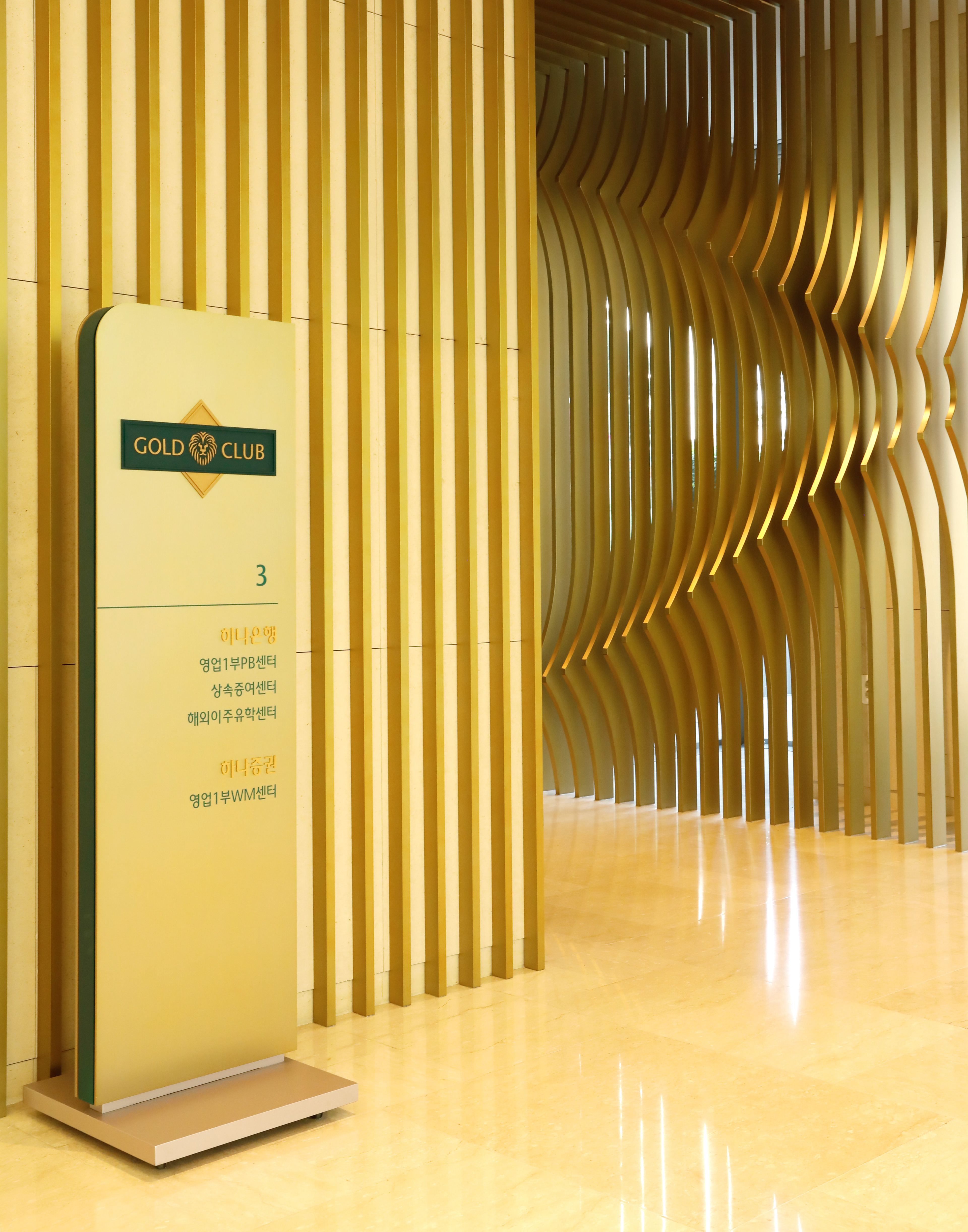
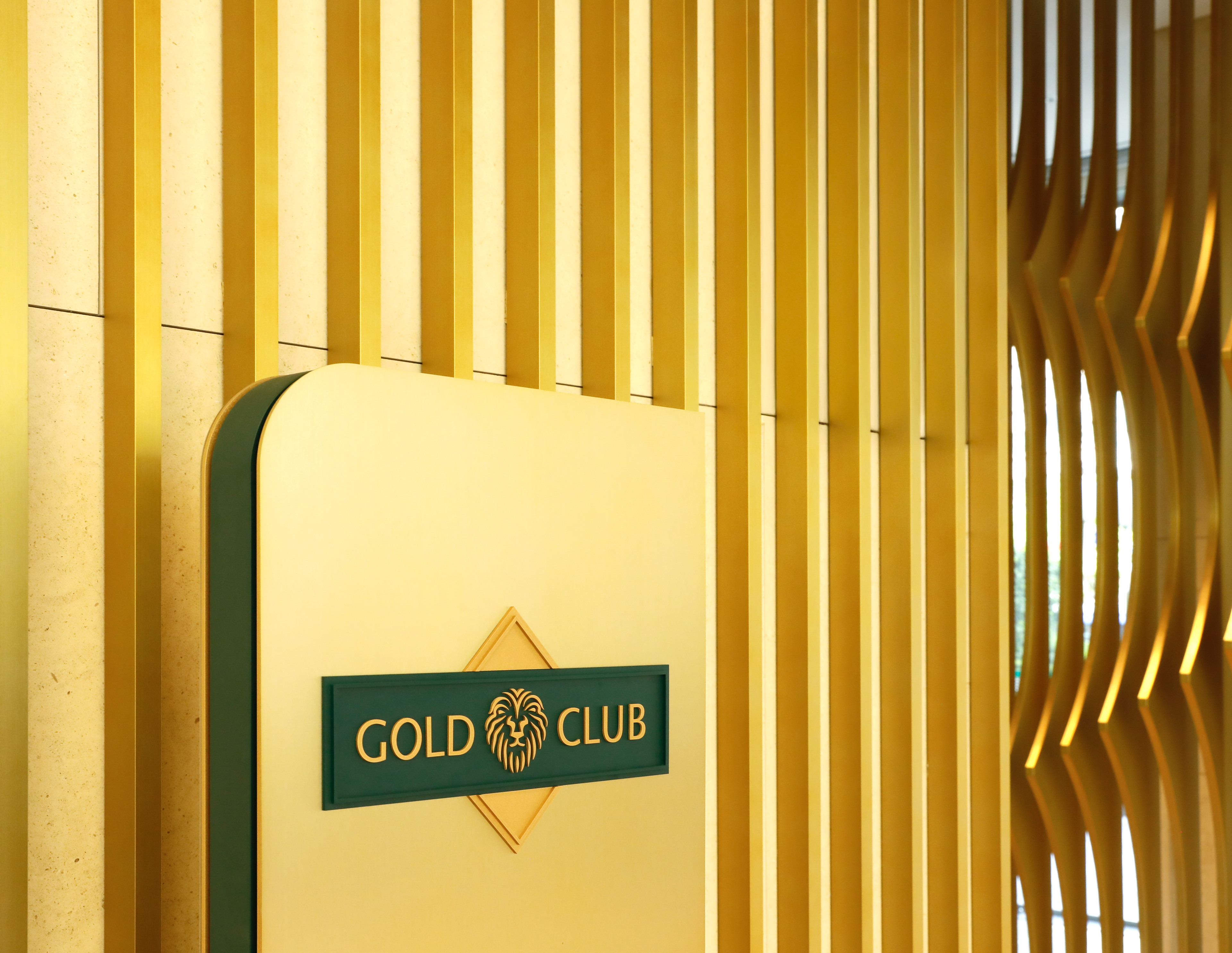
Hana Gold Club
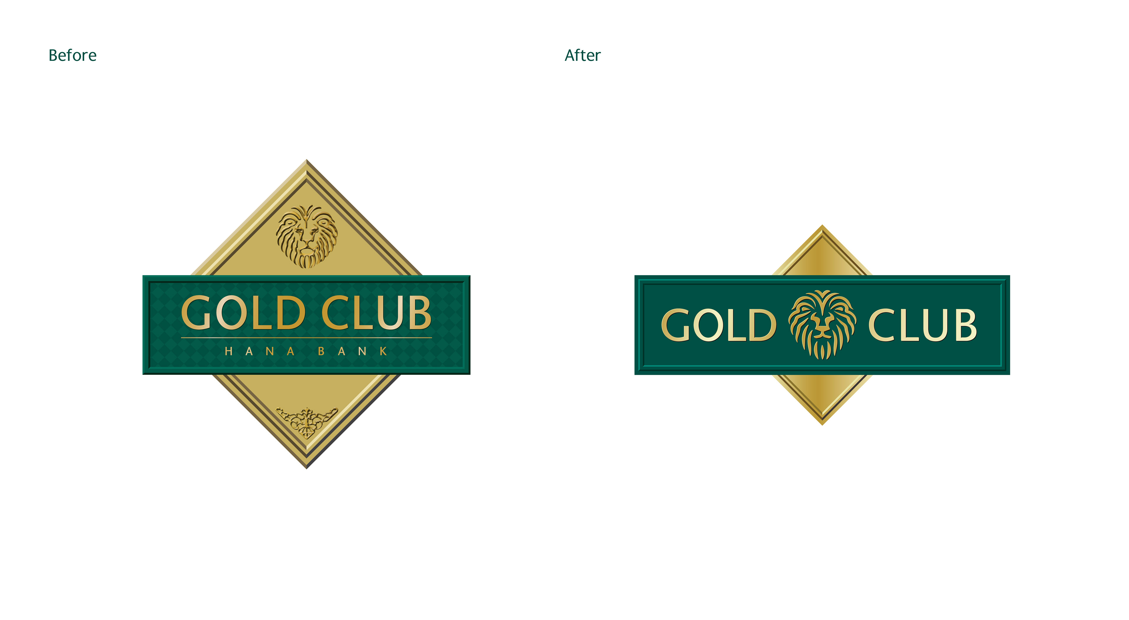
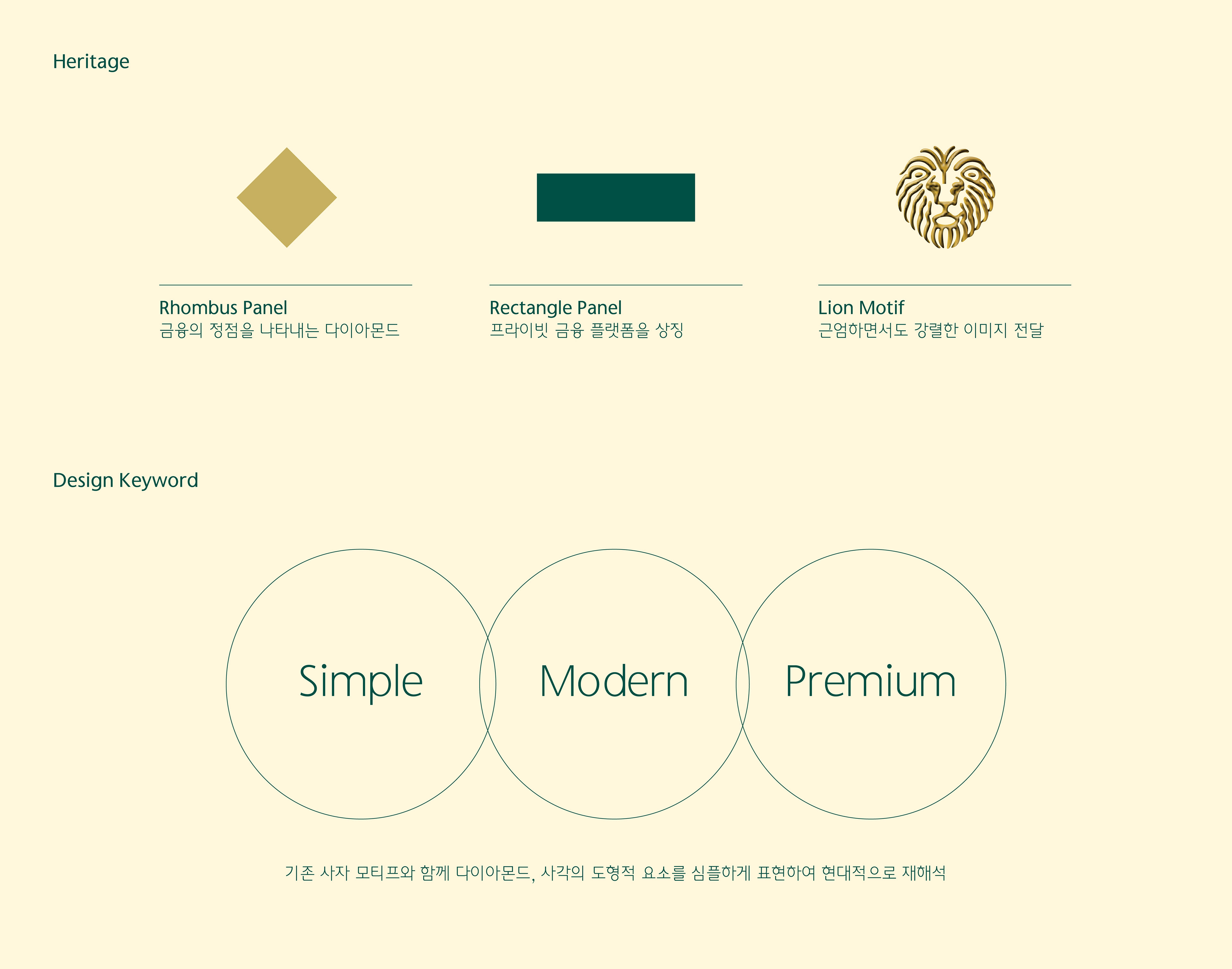
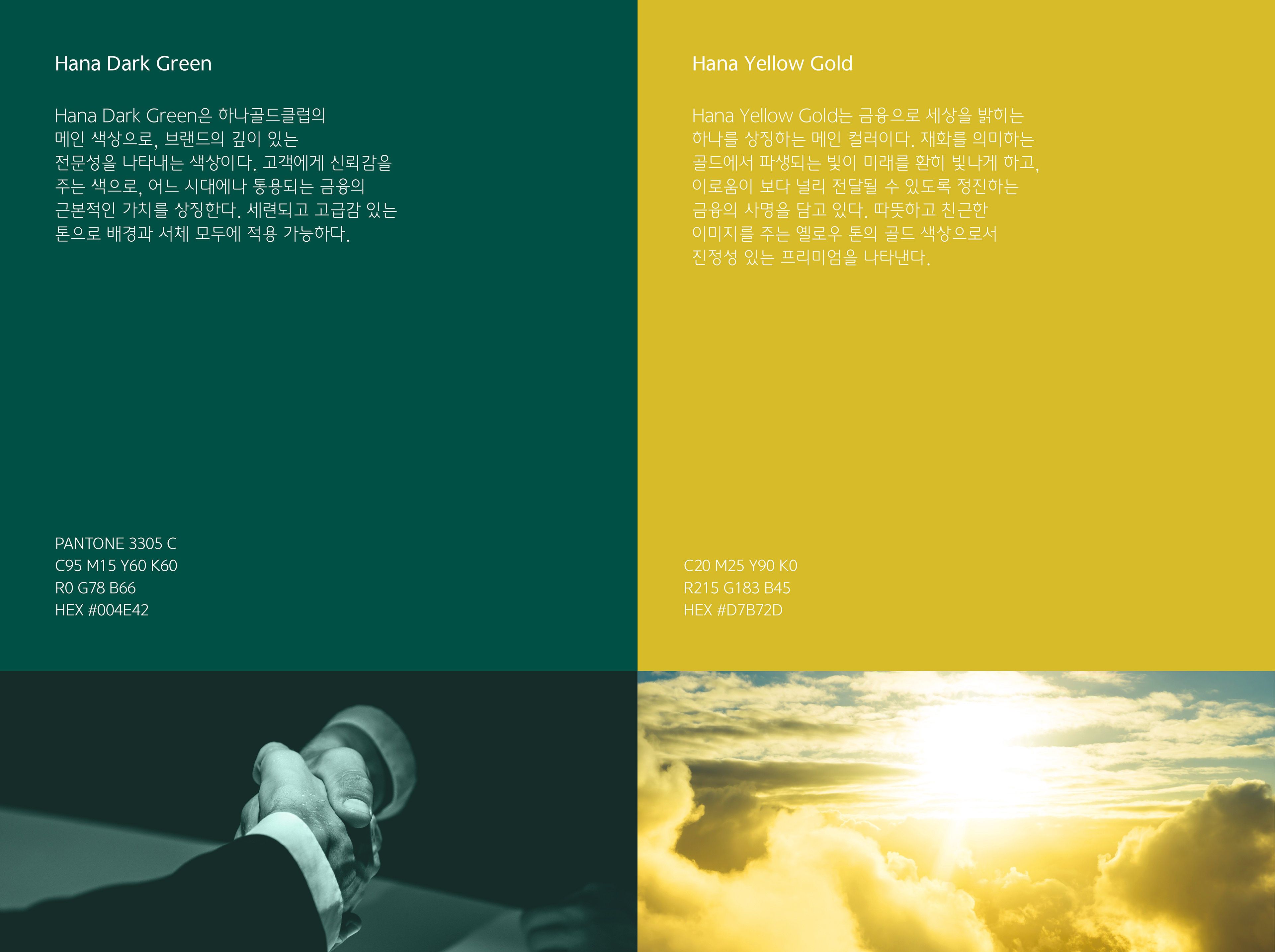
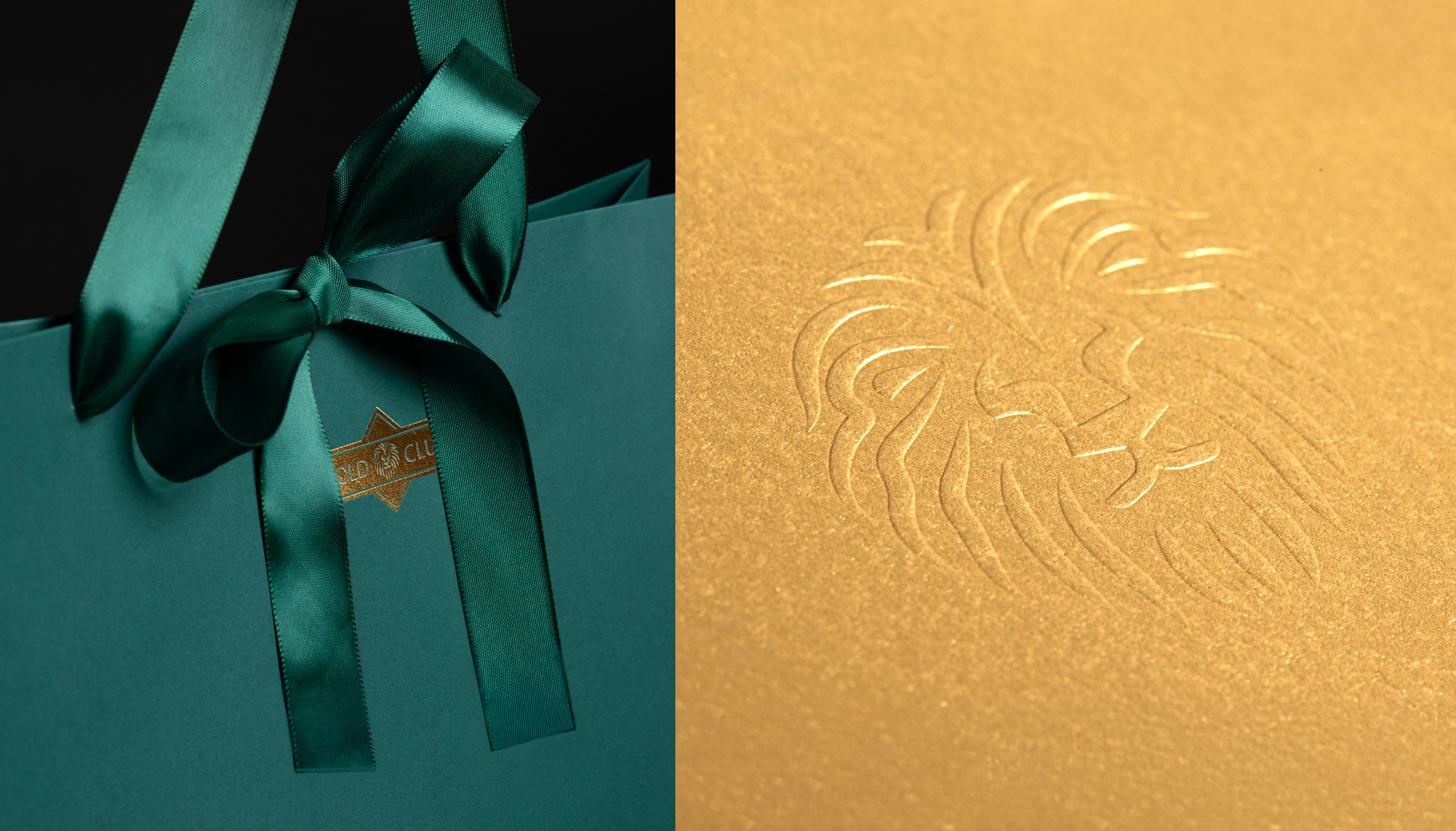
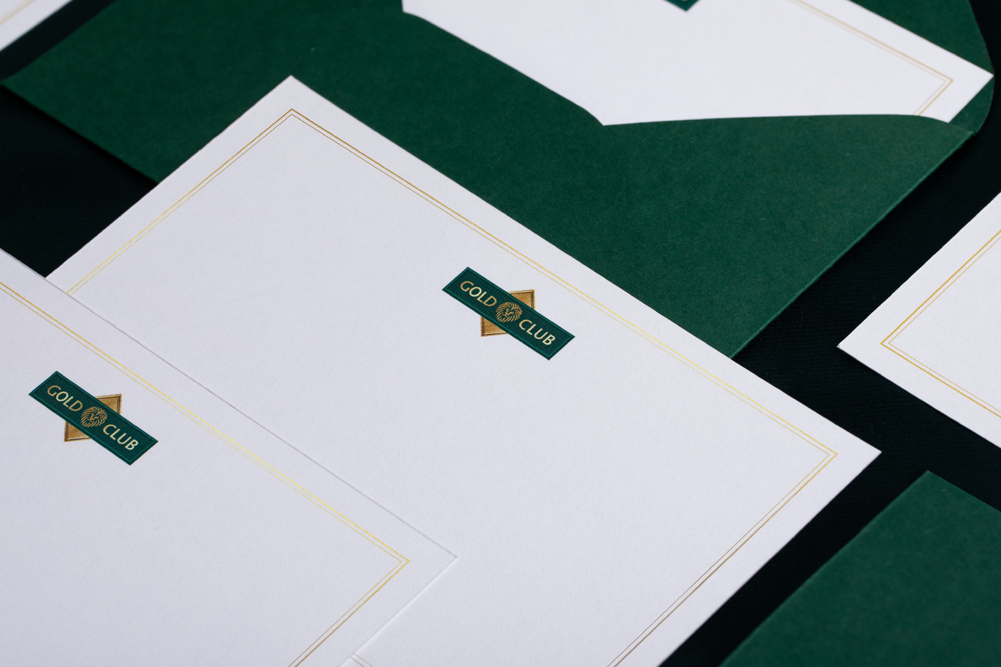
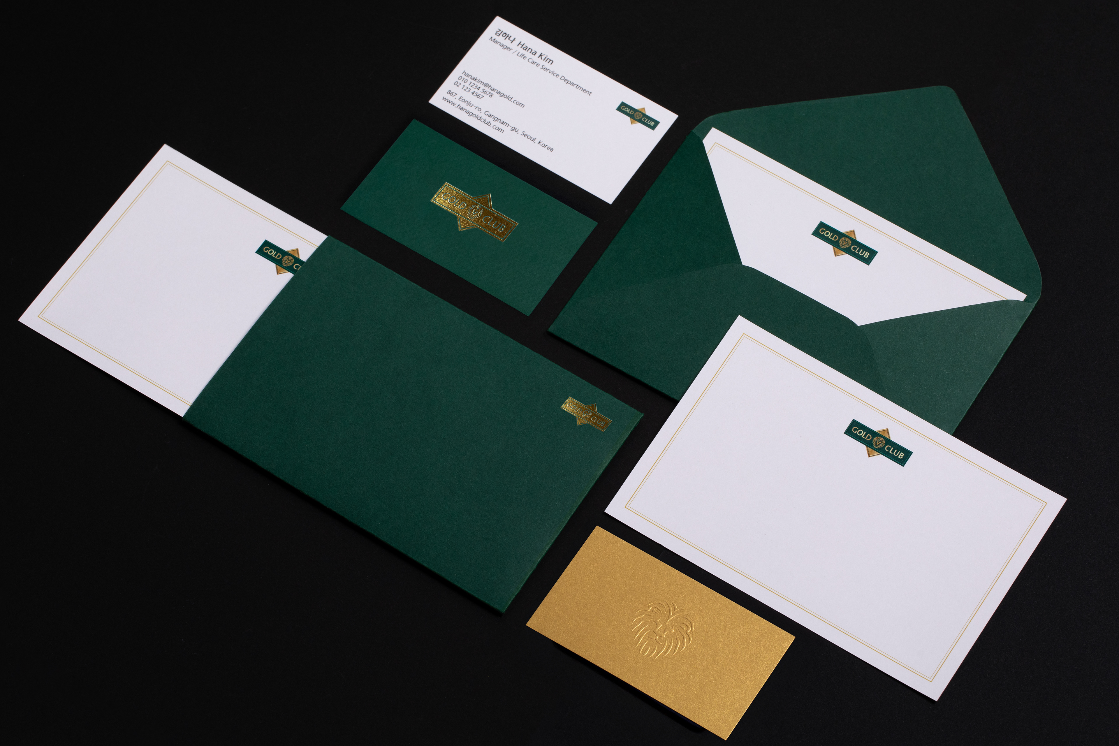
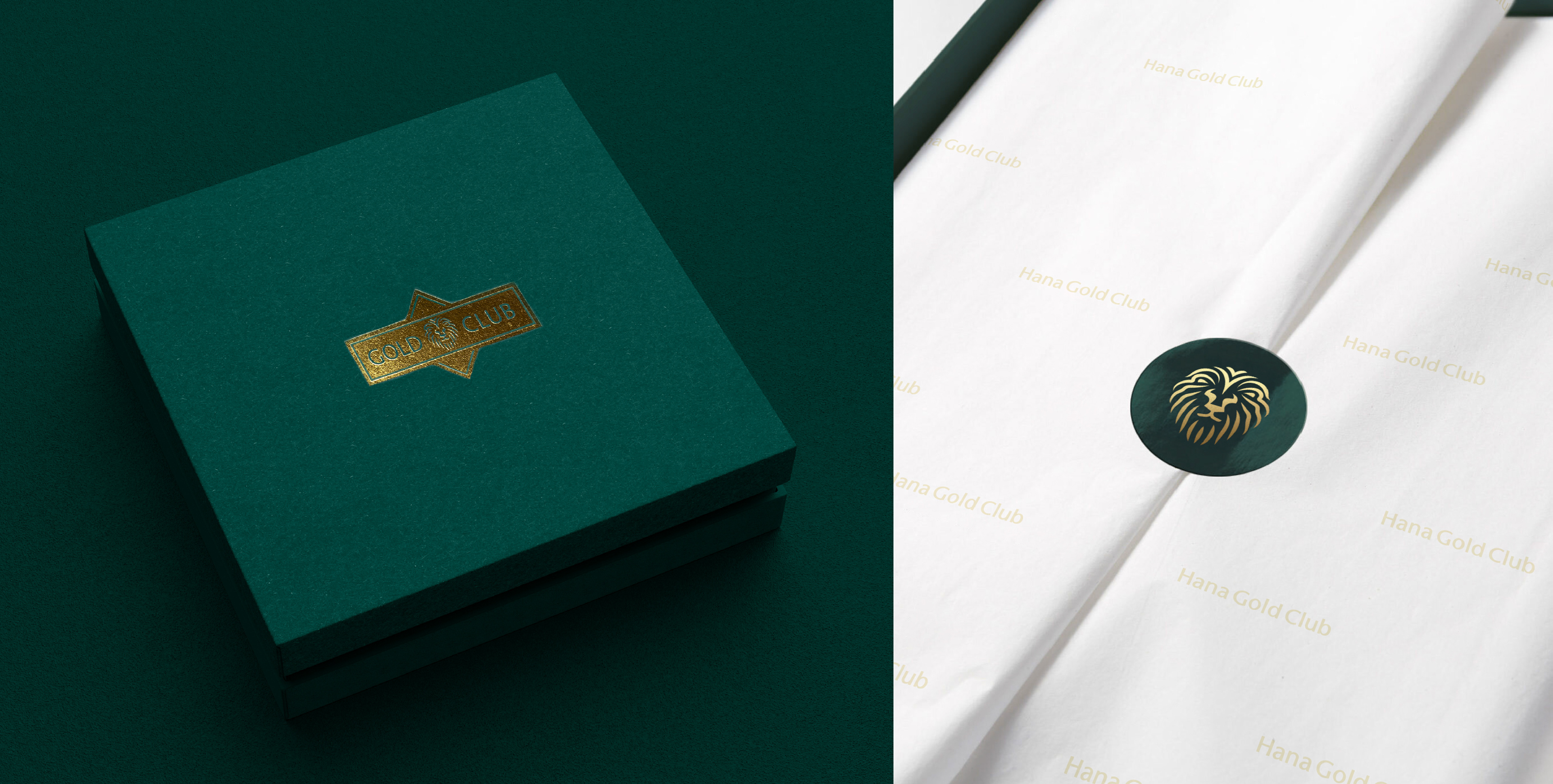
Studio tanGiBle has redefined the identity of Hana Bank GOLD CLUB, the pioneer of private banking in Korea. Hana Bank GOLD CLUB has traditionally used the lion and diamond as symbolic motifs, representing both wealth management services and leadership in asset value. Studio tanGiBle sought to express a lion that sits at the intersection of modernity and premium, embodying Hana Bank’s leadership in providing integrated and innovative services ahead of its time. Additionally, the imagery of continuous ascent was conveyed through an elegant dark green and yellow gold color palette, ensuring timeless relevance.
Hana Bank GOLD CLUB not only enhances its premium image but also harmonizes with Hana Bank’s new identity, reinforcing the brand’s overall cohesion.
_
스튜디오 텐저블은 한국 프라이빗 뱅킹의 시초인 하나은행 골드클럽의 아이덴티티를 새롭게 개발하였습니다. 하나은행 골드클럽은 자산관리서비스와 자산 가치의 리더를 중의적으로 상징하는 ‘사자’, ‘다이아몬드’를 상징적인 모티프로 사용해 왔습니다. 스튜디오 텐저블은 모던과 프리미엄의 접점에 있는 사자를 표현하여 통합적, 혁신적인 서비스를 한발 앞서 제공해온 하나은행의 리더십을 나타내고자 했습니다. 또한 끝없는 상승의 이미지를 어느 시대에나 통용될 수 있는 세련된 다크 그린, 옐로우 골드 색상으로 표현하였습니다.
하나은행 골드클럽은 프리미엄 이미지를 제고함은 물론, 하나은행의 새로운 아이덴티티와 조화를 이루며 브랜드의 통합성을 공고히 하는 데 기여하고 있습니다.