Seoul Bread Palette
Cafe Branding
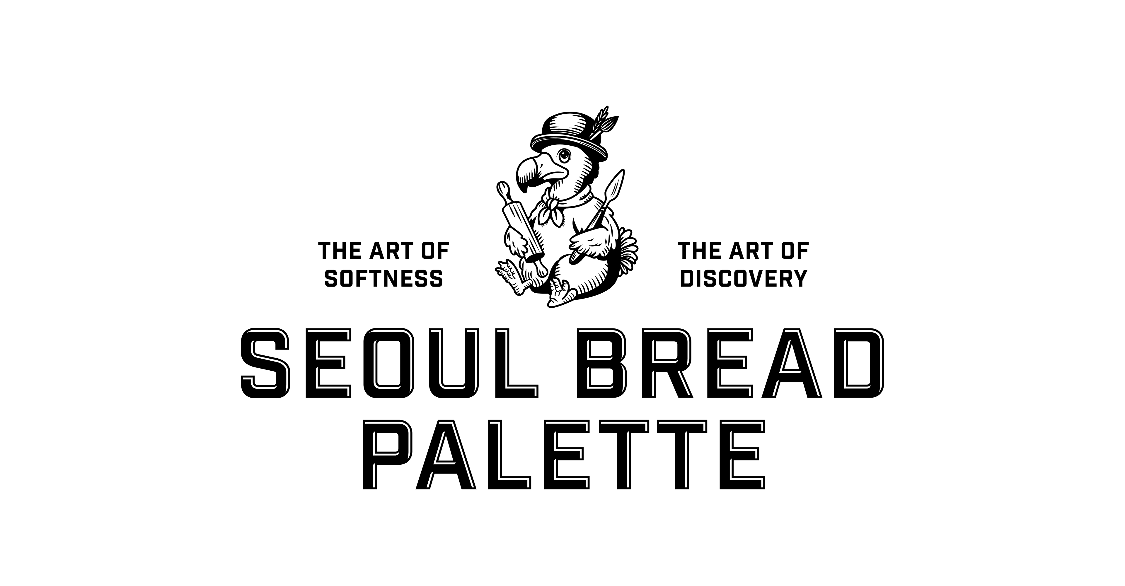
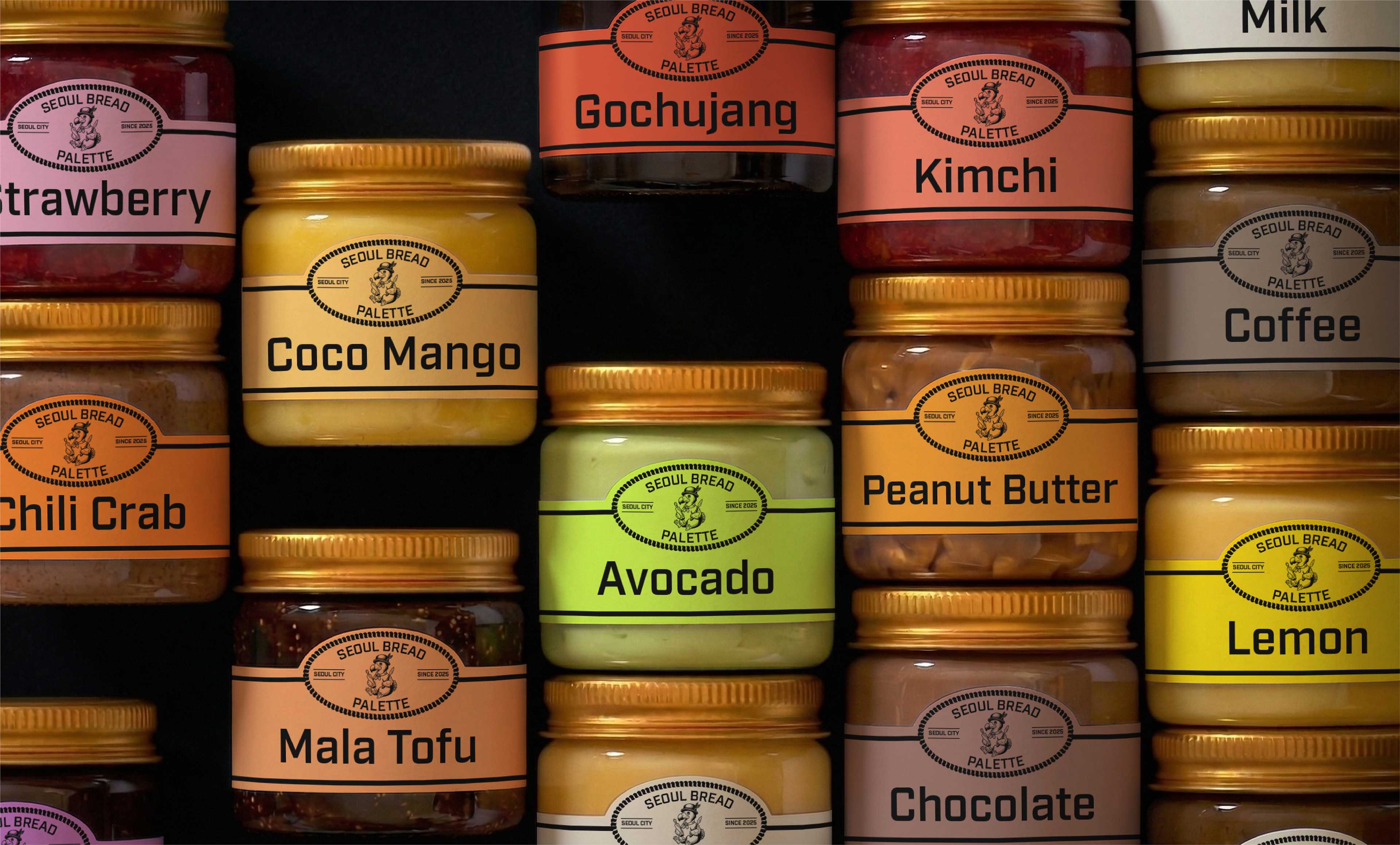
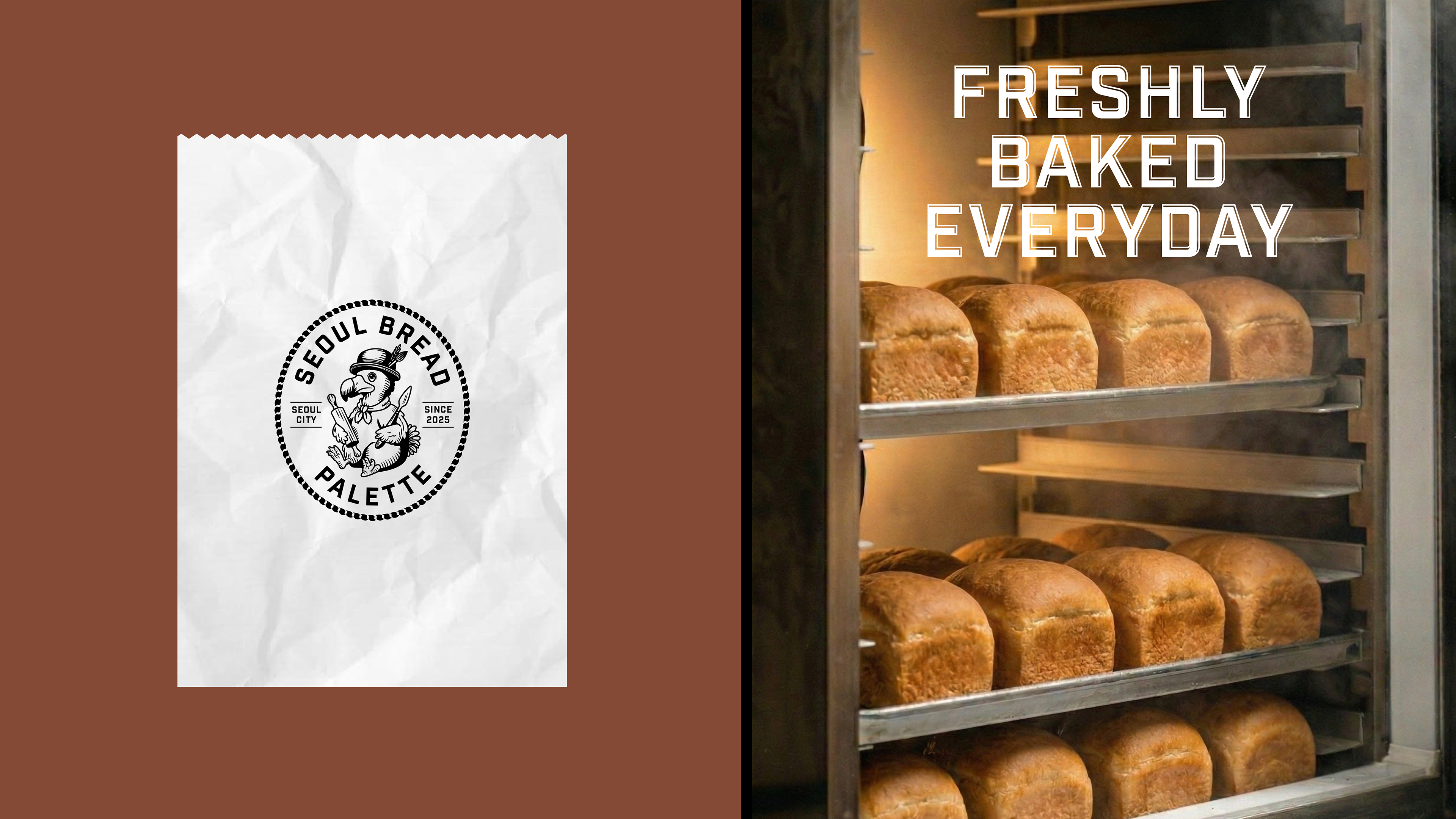
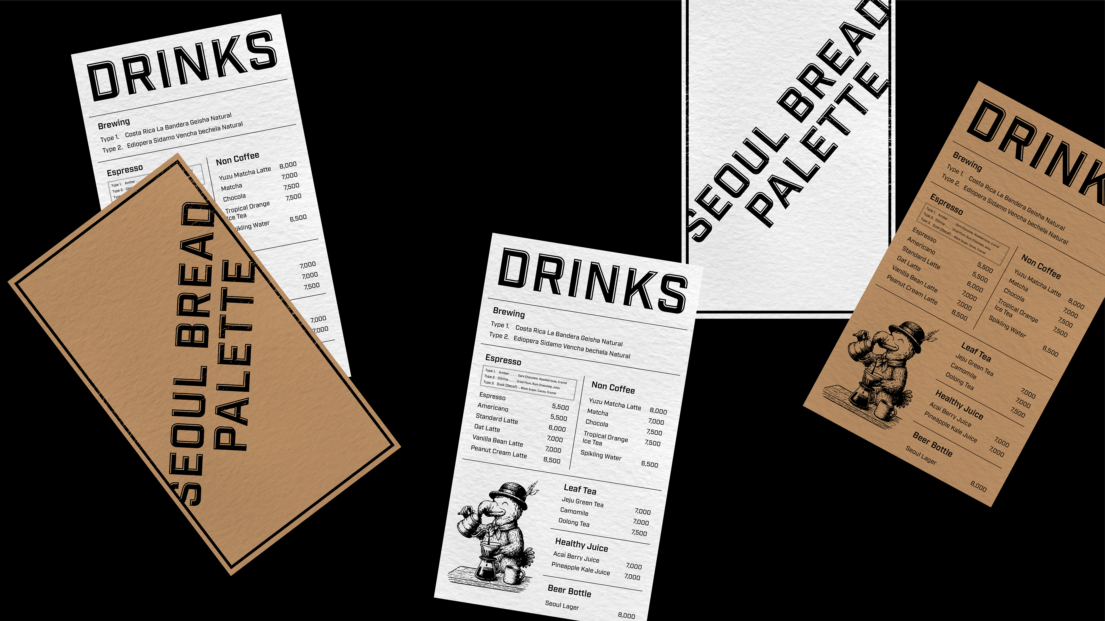
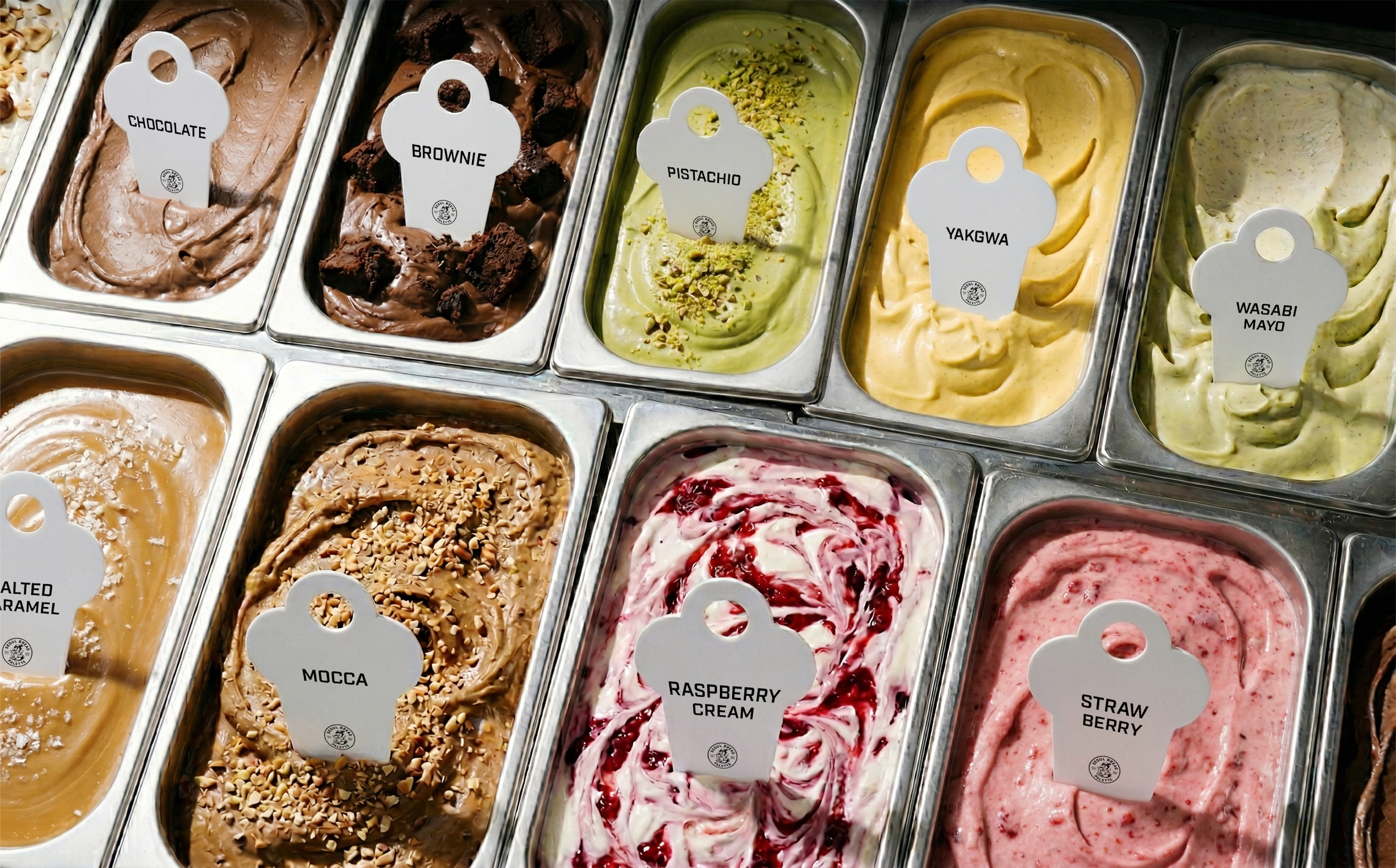
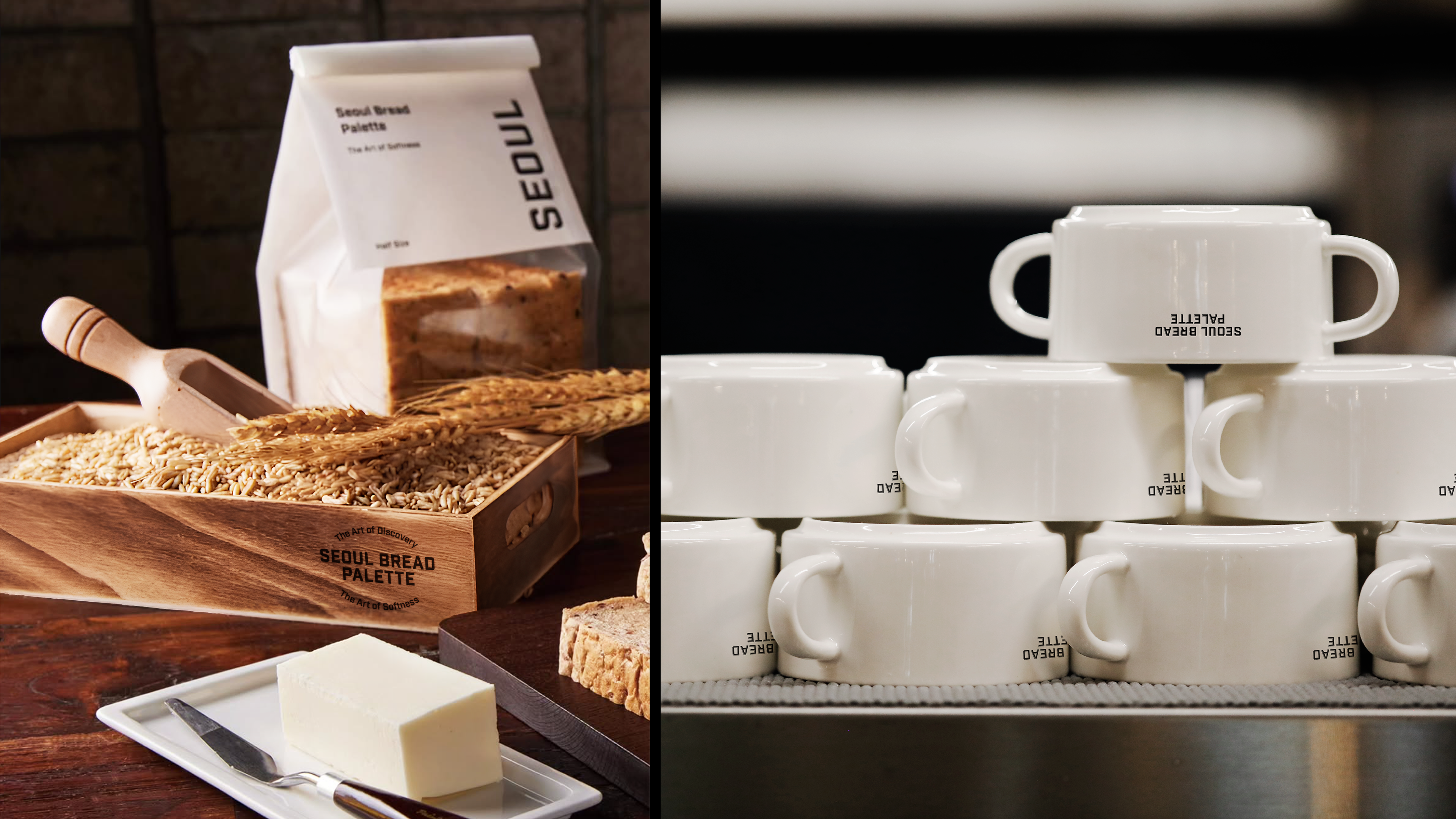
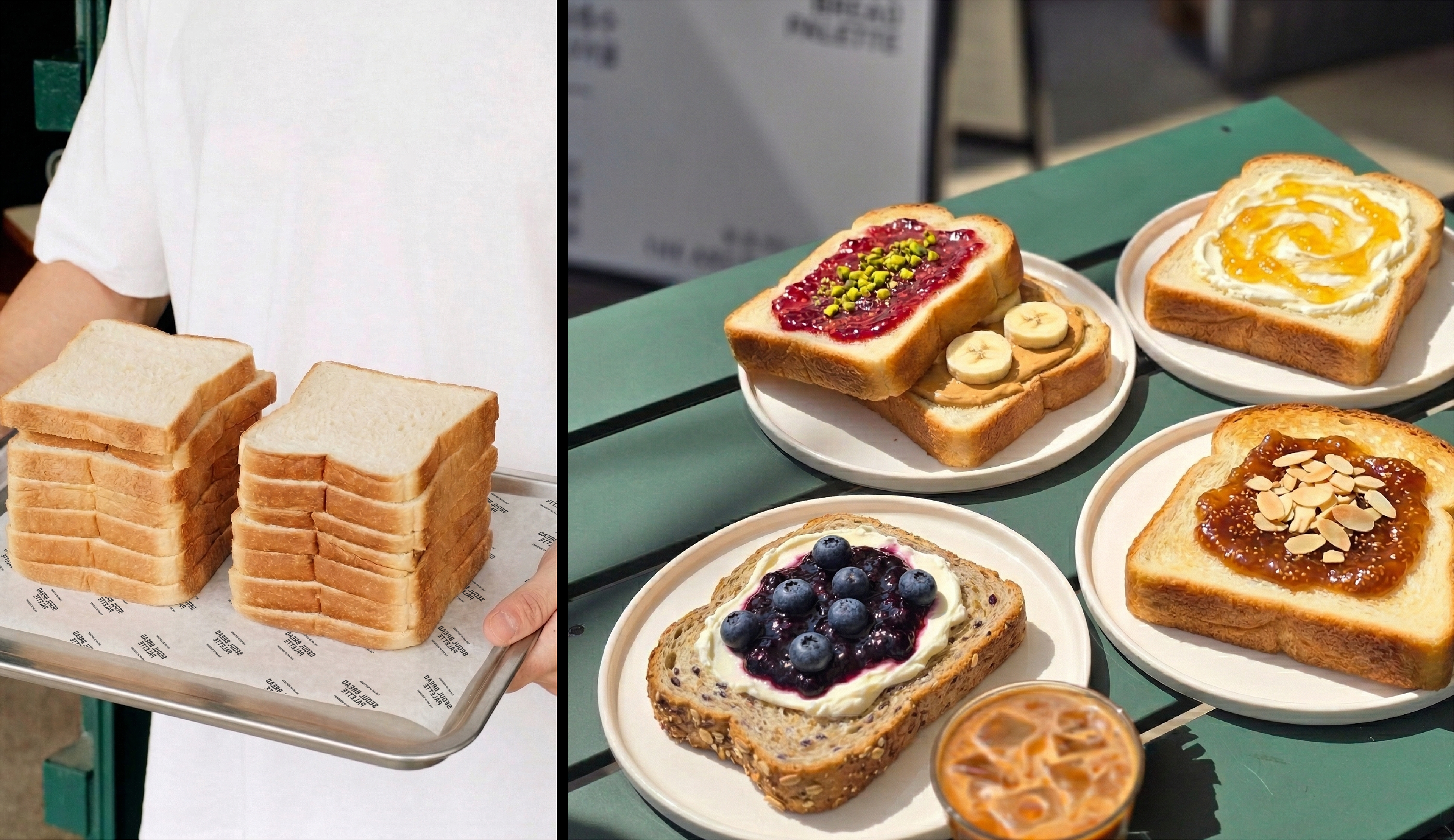
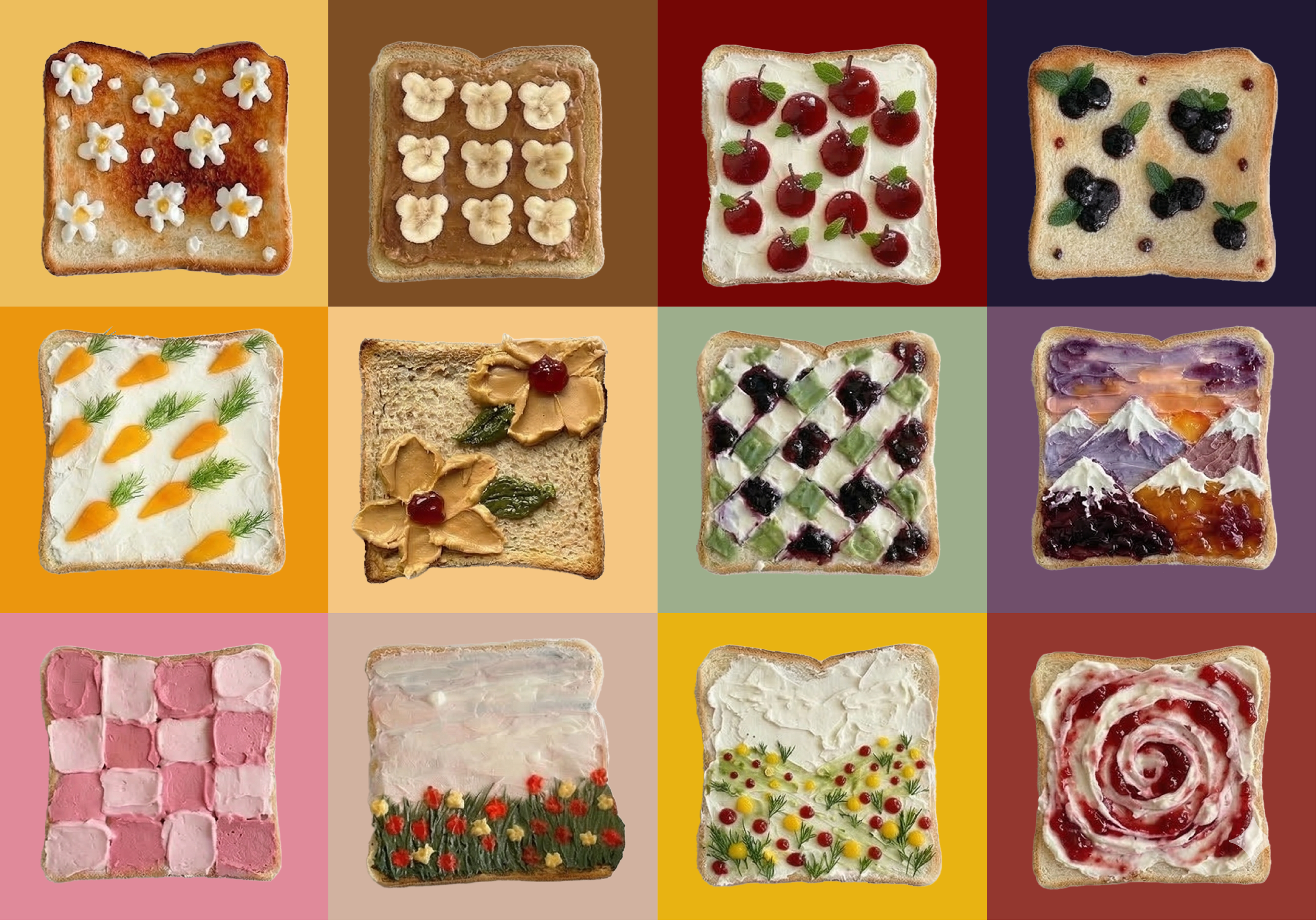
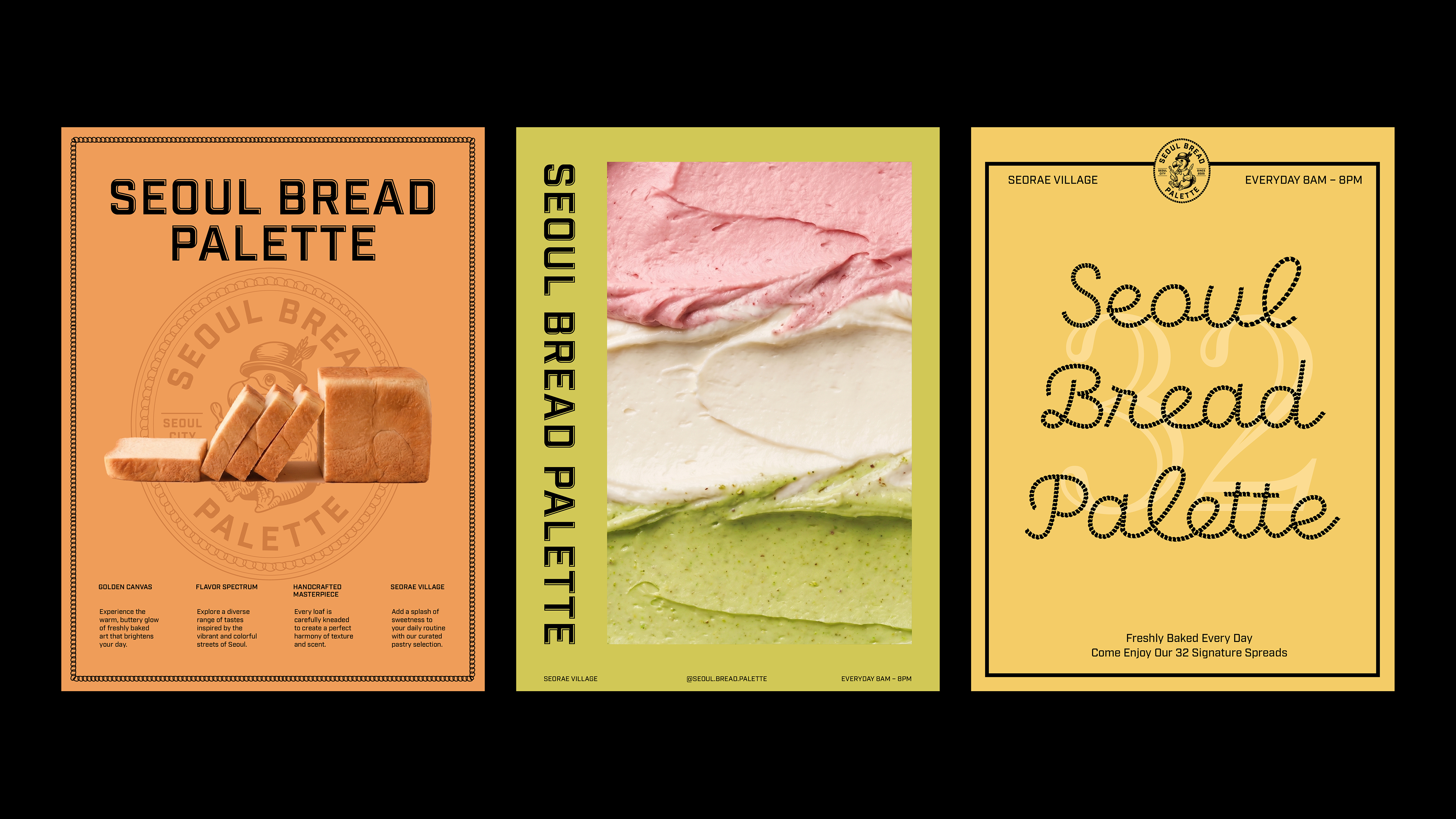
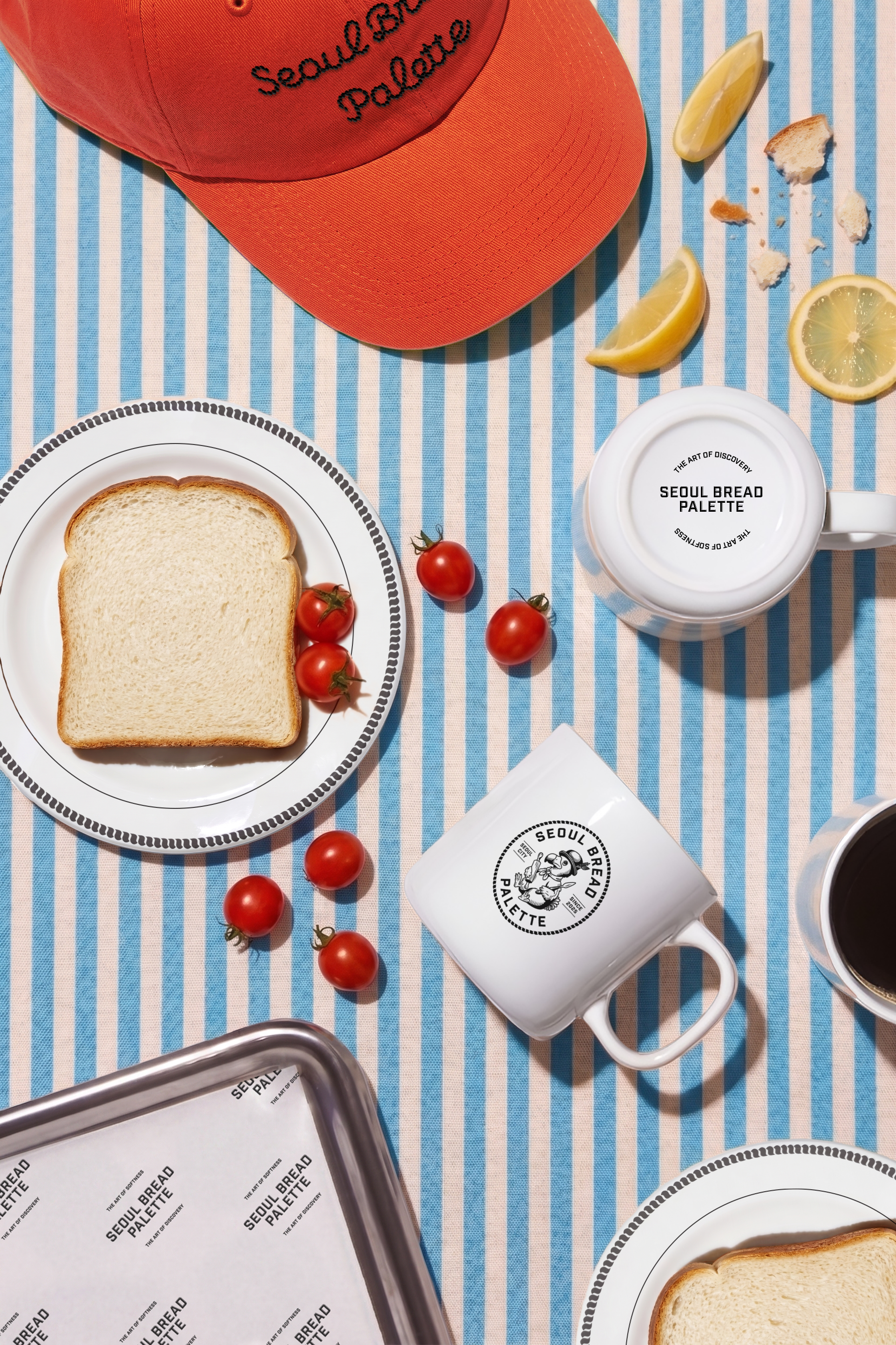
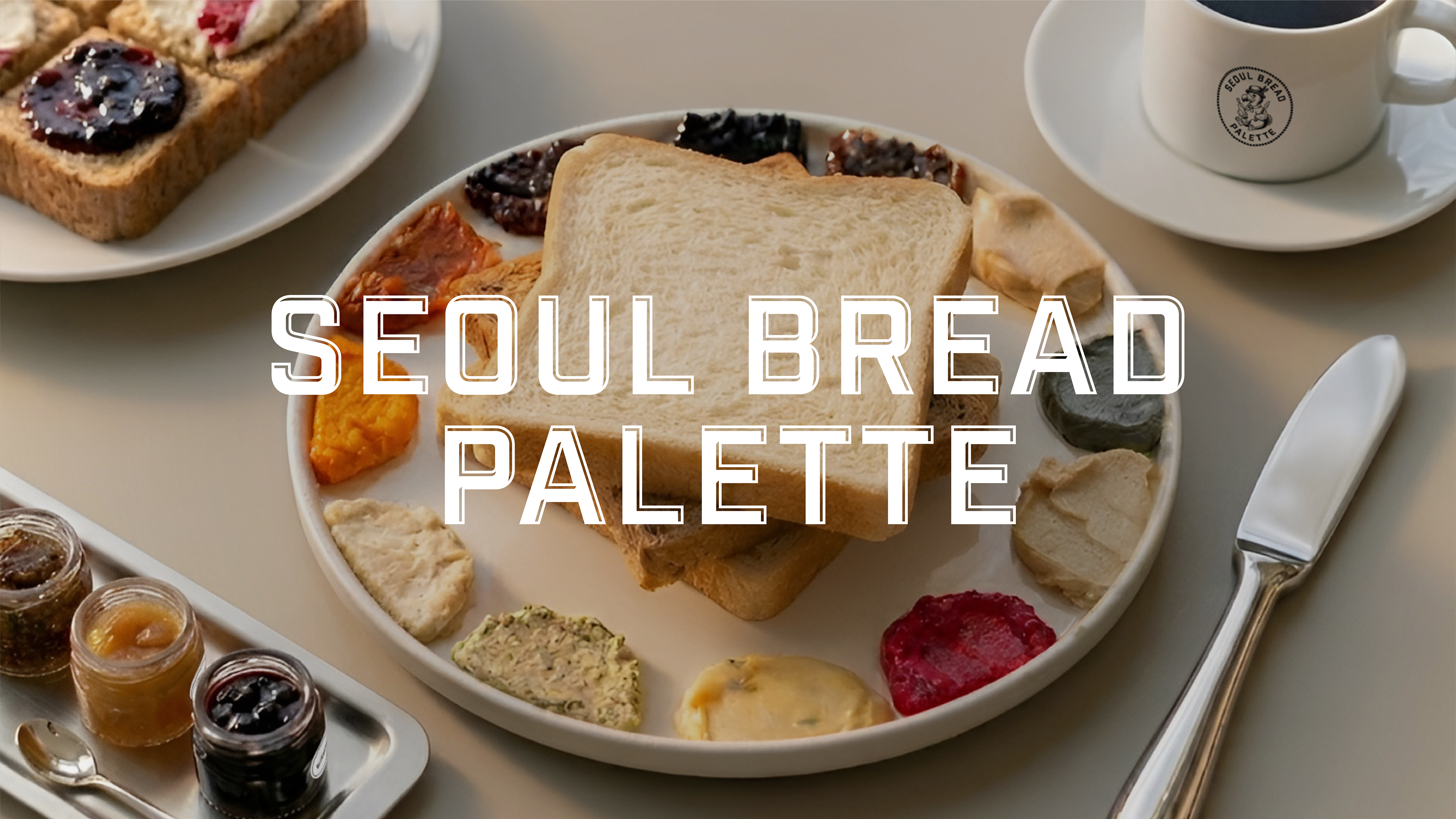
Seoul Bread Palette is an F&B brand that features Milk bread and dozens of varieties of spreads as its core products, with Studio Tangible leading the naming and brand identity project. Designed for a bakery cafe with a unique concept where customers "paint" on their bread with jam, the name was crafted by directly utilizing the locality of "Seoul"—a city whose presence has grown significantly due to the K-wave—and combining it with the main product, "Bread," and the brand's key differentiator, "Palette."
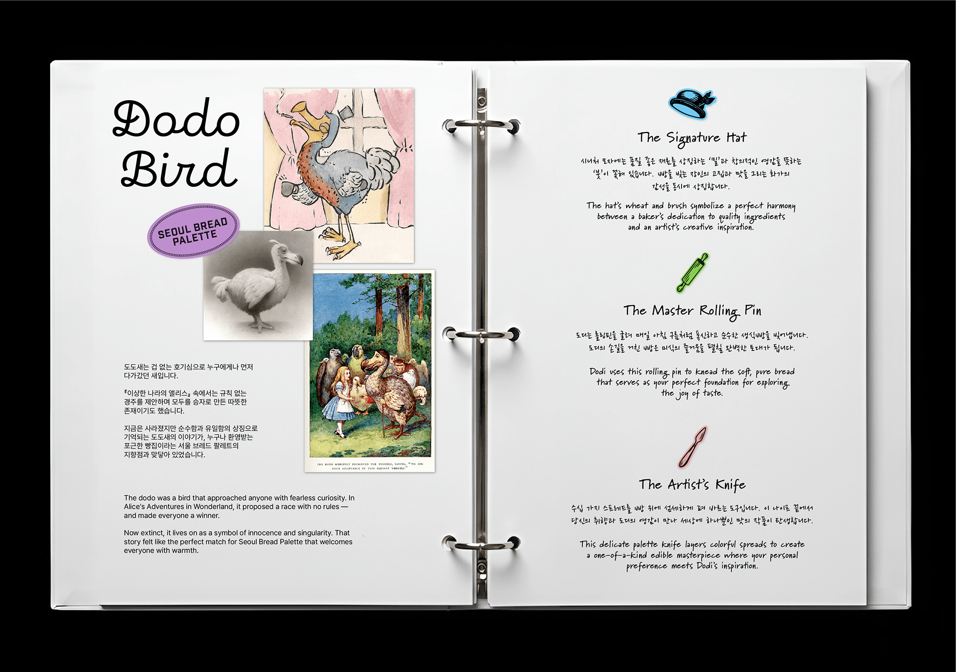
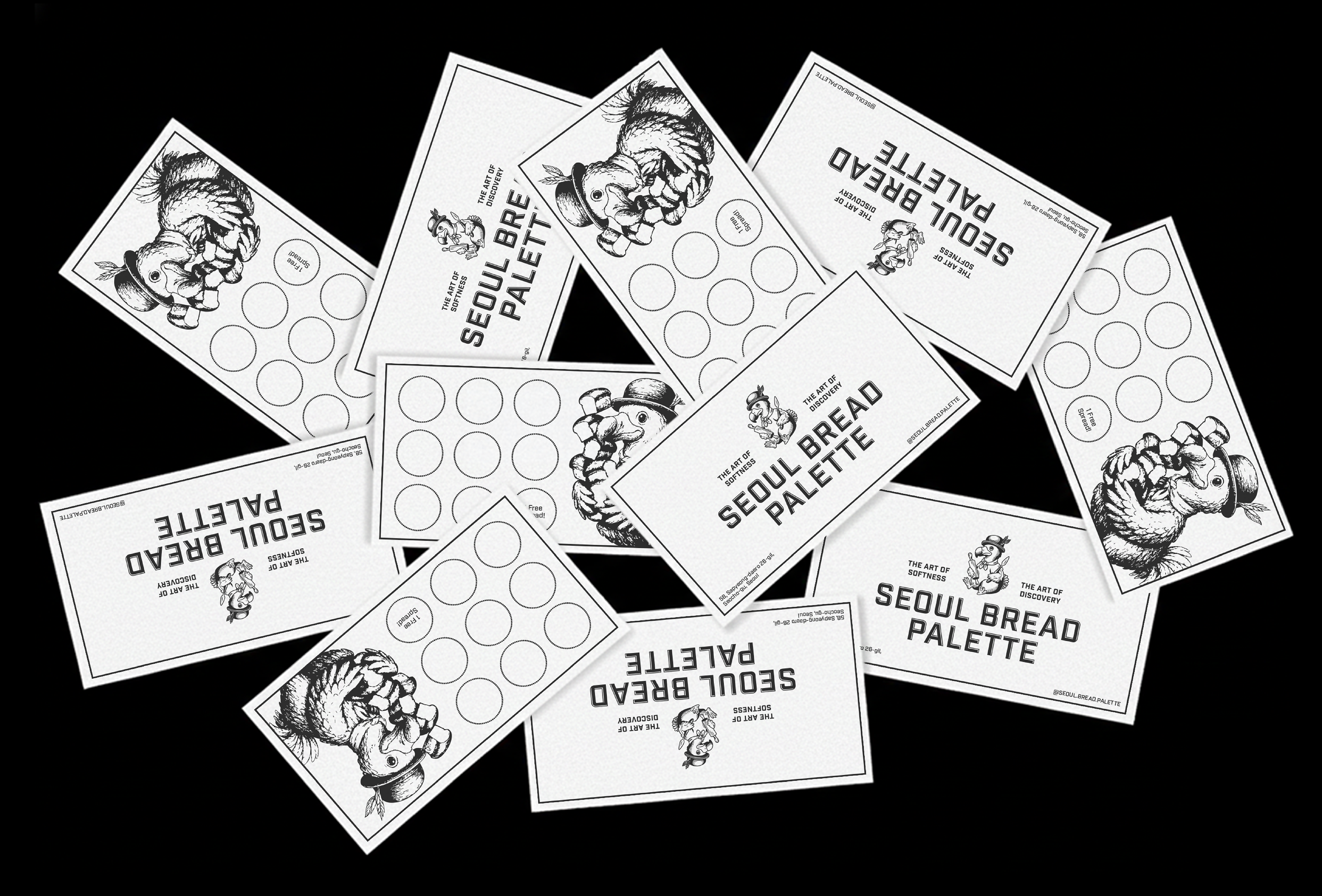
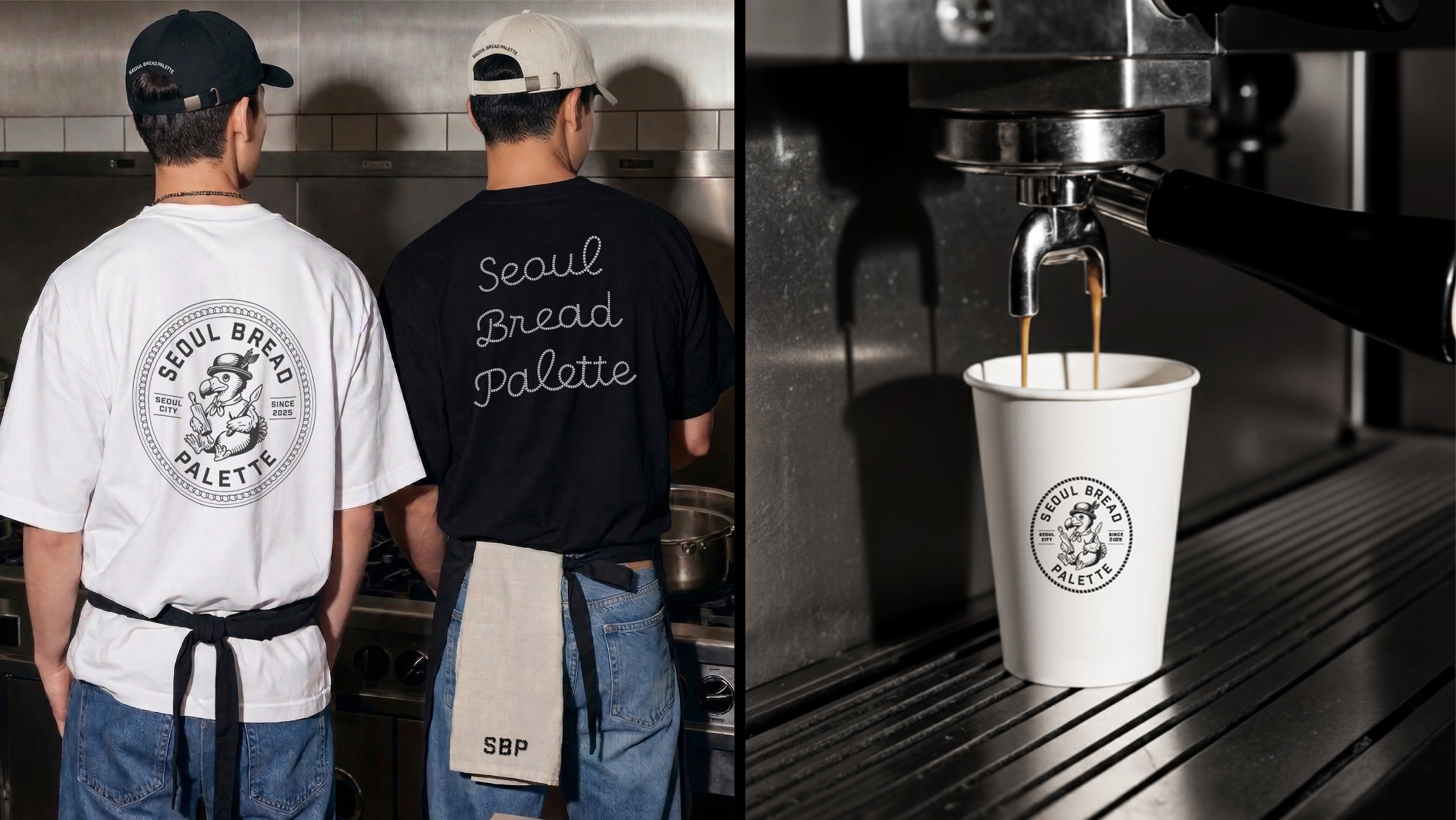
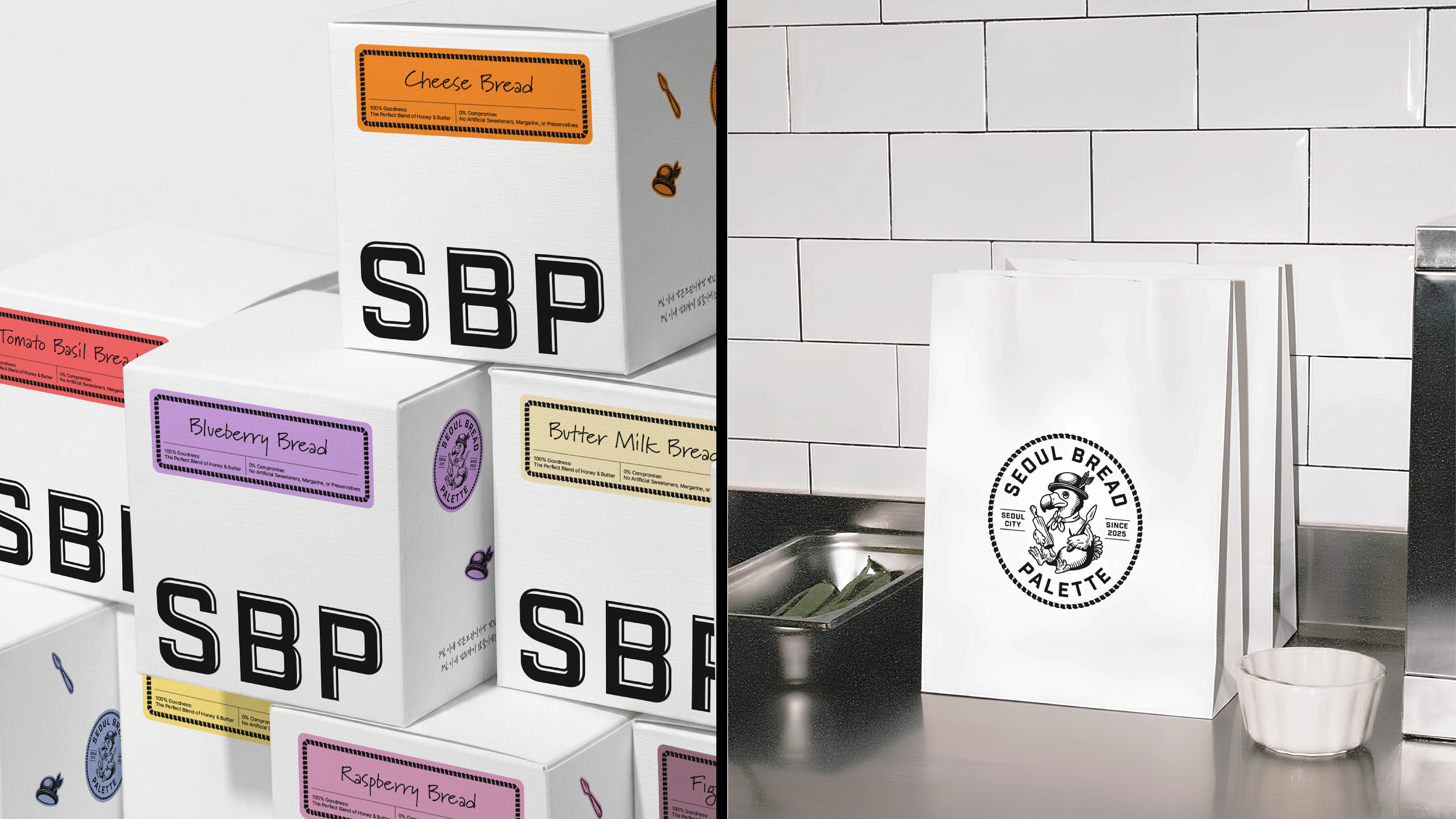
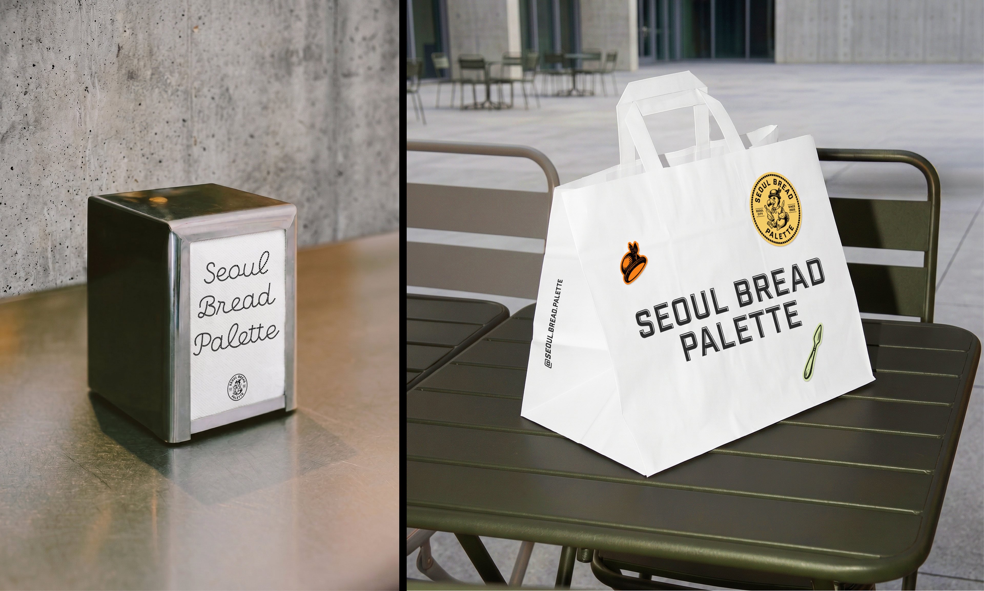
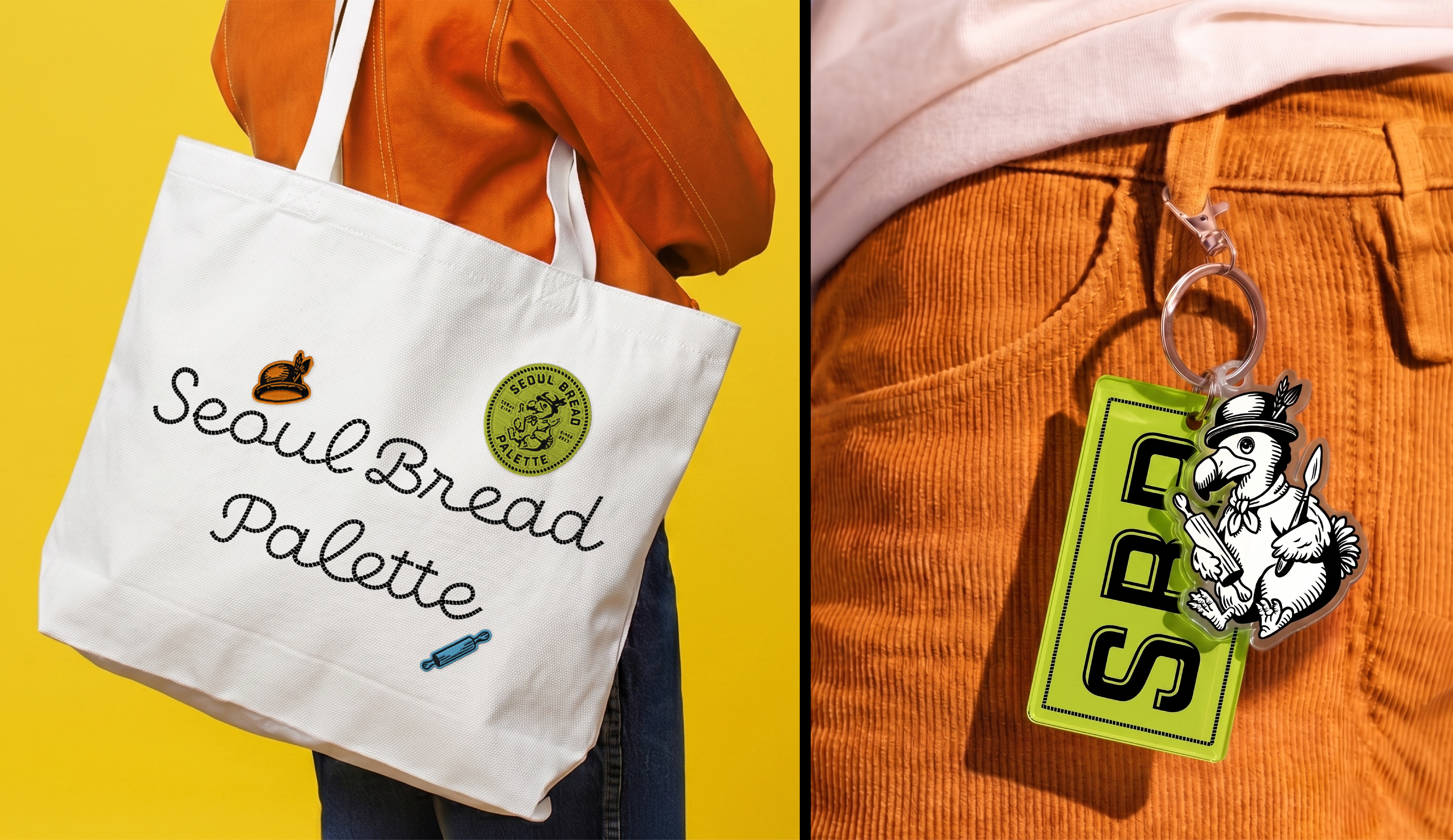
Additionally, to evoke the tone and mood of an atelier where a palette is used, an emblem logo with an overall hand-drawn aesthetic was developed. The brand icon, the Dodo bird, refers to the bird discovered by explorers during the Age of Discovery; it represents the brand’s mission to be a "bakery that discovers new flavors."
The brand colors, black and white, serve to make the diverse range of spreads stand out while simultaneously allowing customers to focus entirely on the purity of the shokupan. Having nested in Seorae Village, Seoul Bread Palette is a space where you can join the Dodo bird in painting a palette of new flavors upon a canvas of bread.
–
서울브레드팔레트는 생식빵과 수십여 종의 스프레드를 주 제품으로 하는 F&B 브랜드로, 스튜디오 텐저블이 네이밍과 브랜드 아이덴티티 프로젝트를 진행했습니다. 생식빵에 잼으로 그림을 그려 먹는 이색적인 컨셉의 베이커리 카페를 위해 네이밍은 K 열풍으로 브랜드 존재감이 커진 ‘서울’의 지역성을 직접적으로 활용하고, 브레드라는 메인 제품, 그리고 차별점인 팔레트를 결합한 단어로 완성했습니다.
또한 팔레트가 사용되는 아틀리에 톤앤무드를 표현하기 위해 전체적으로 핸드드로잉 느낌을 주는 엠블렘 로고를 개발했습니다. 브랜드 아이콘인 도도새는 대항해 시대 탐험가들이 발견한 새로, 브랜드가 지향하는 ‘새로운 맛을 발견하는 베이커리’를 나타냅니다.
브랜드 컬러인 블랙&화이트는 다양한 스프레드를 돋보이게 하는 역할을 하는 동시에, 생식빵의 순수함에 오롯이 집중할 수 있도록 하는 기능을 합니다. 서래마을에 둥지를 튼 서울브레드팔레트는 도도새와 함께 빵 위에 새로운 맛의 팔레트를 그려가는 공간입니다.