NiLS MILES
Branding
Branding
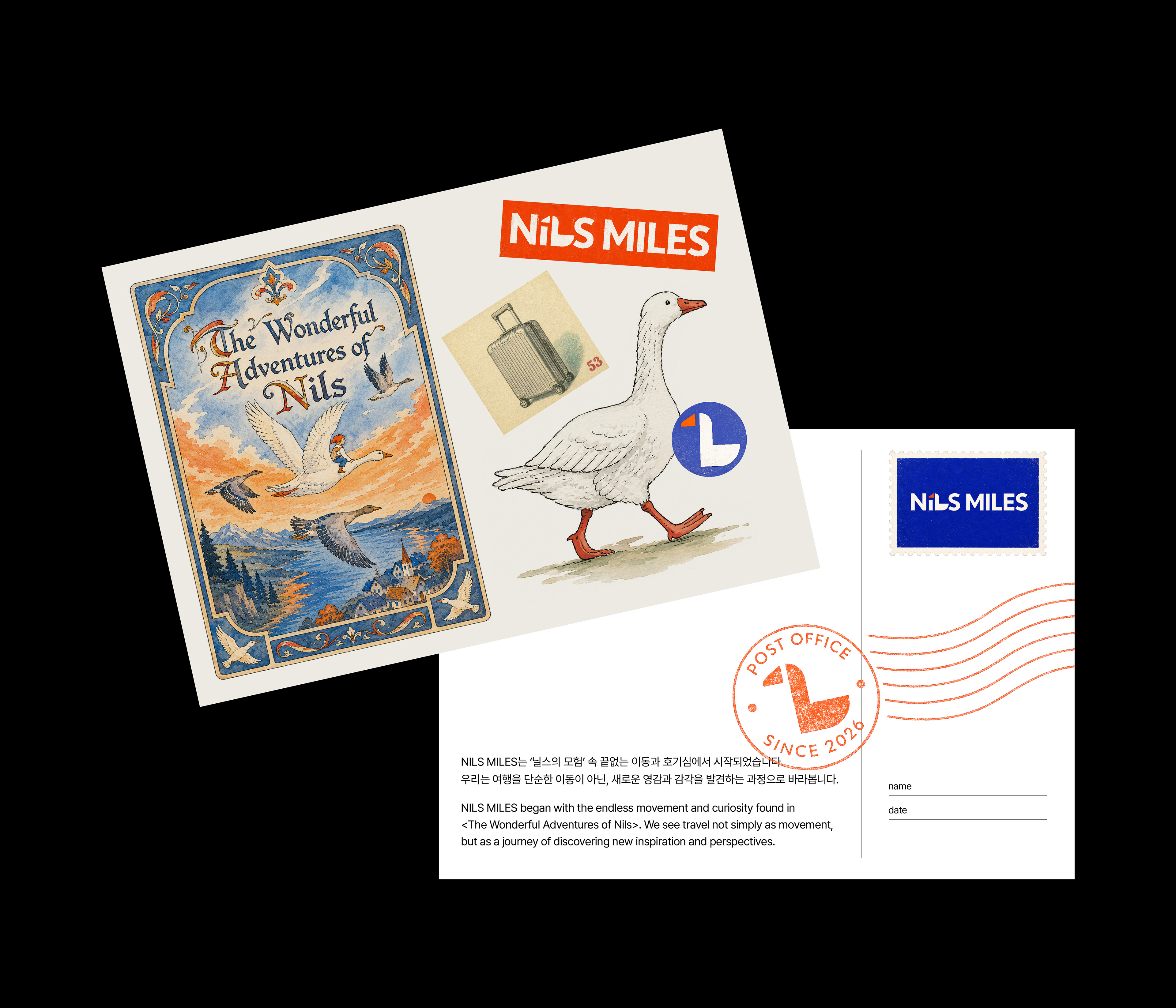
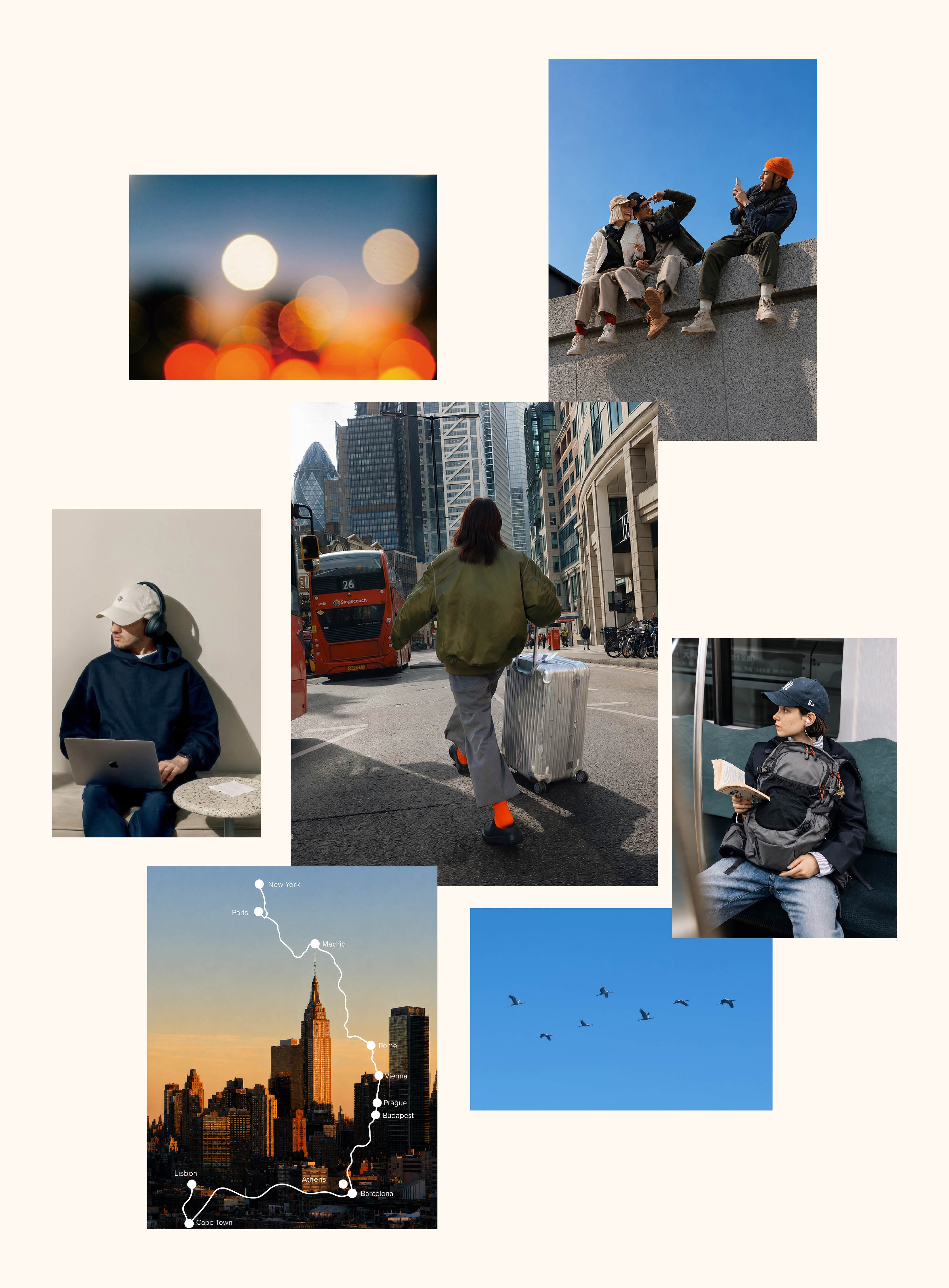
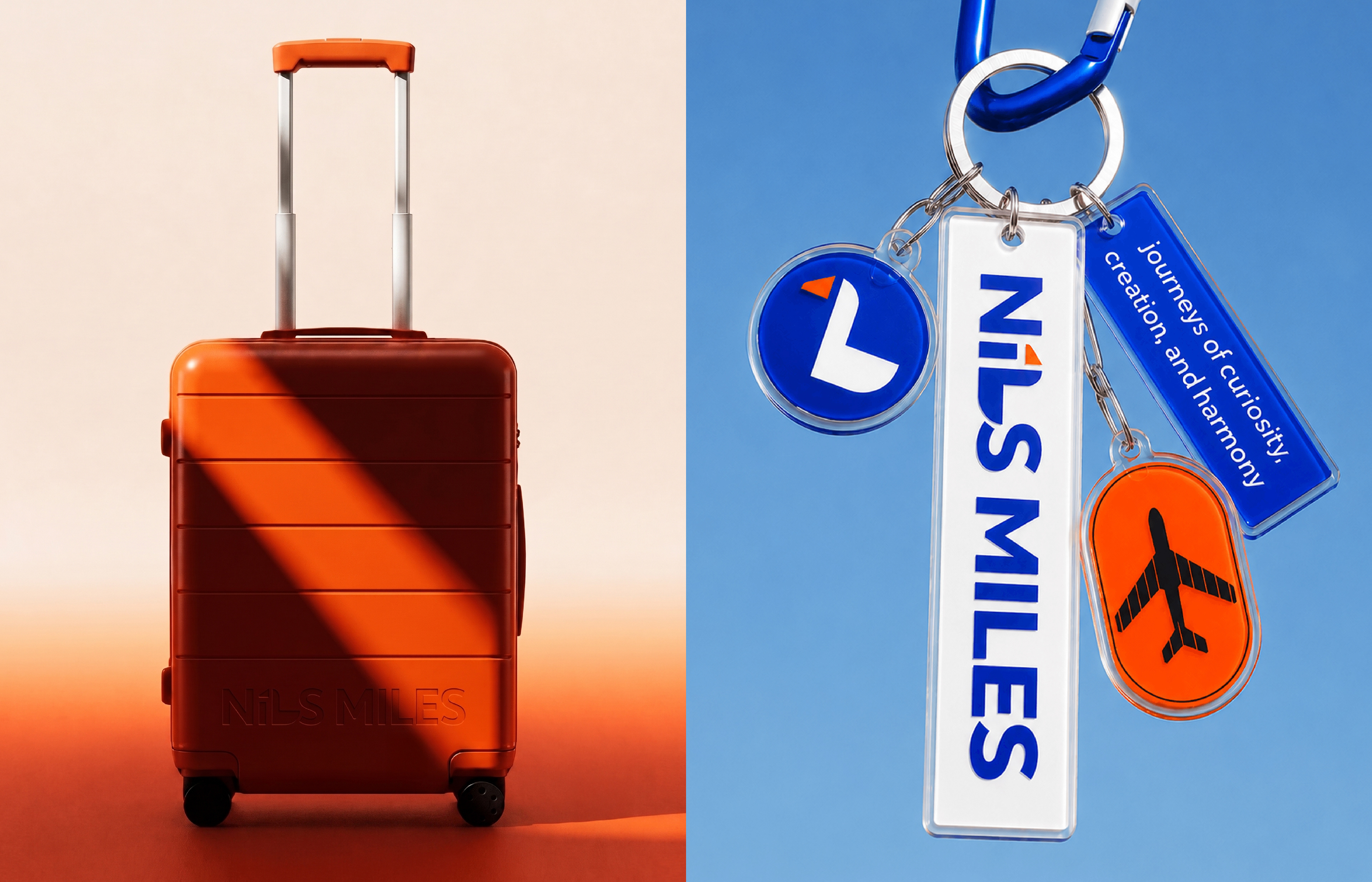
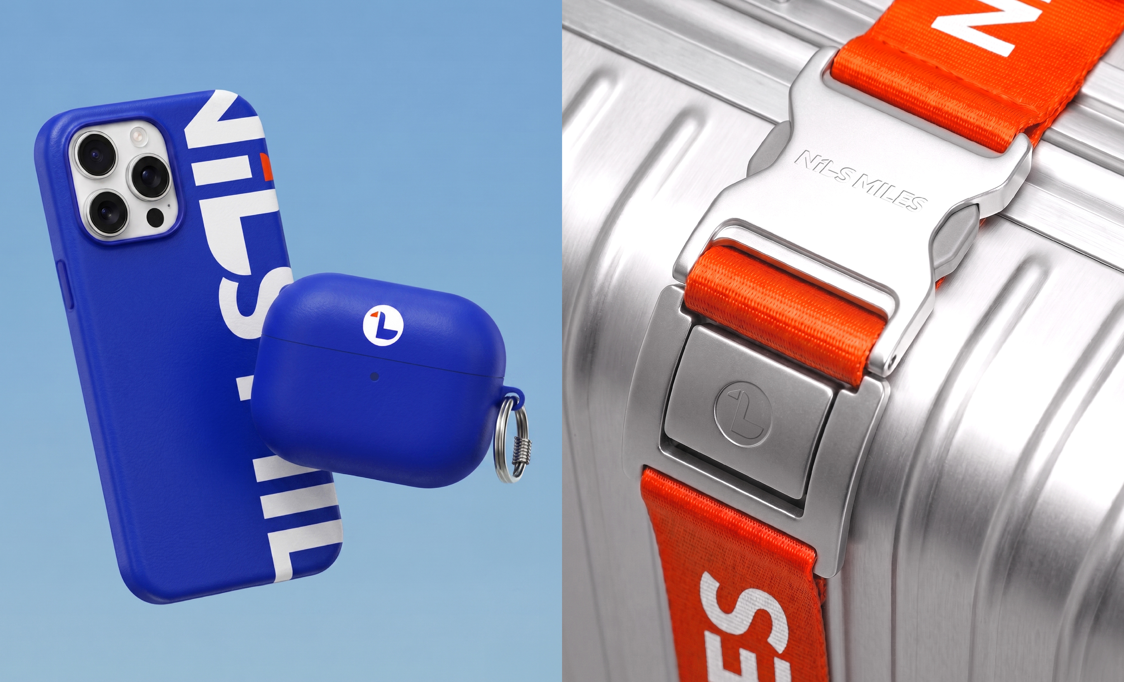
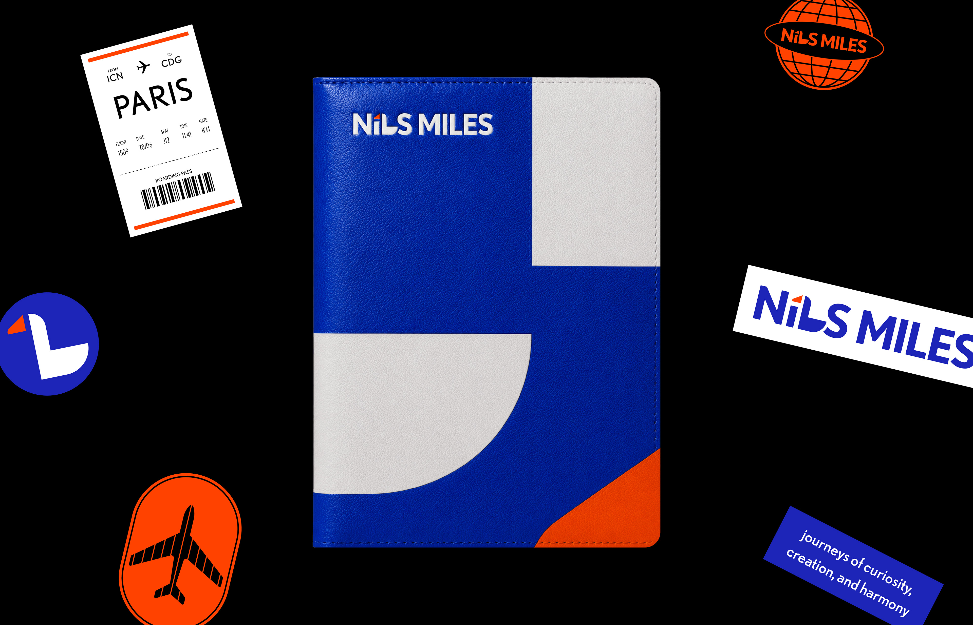
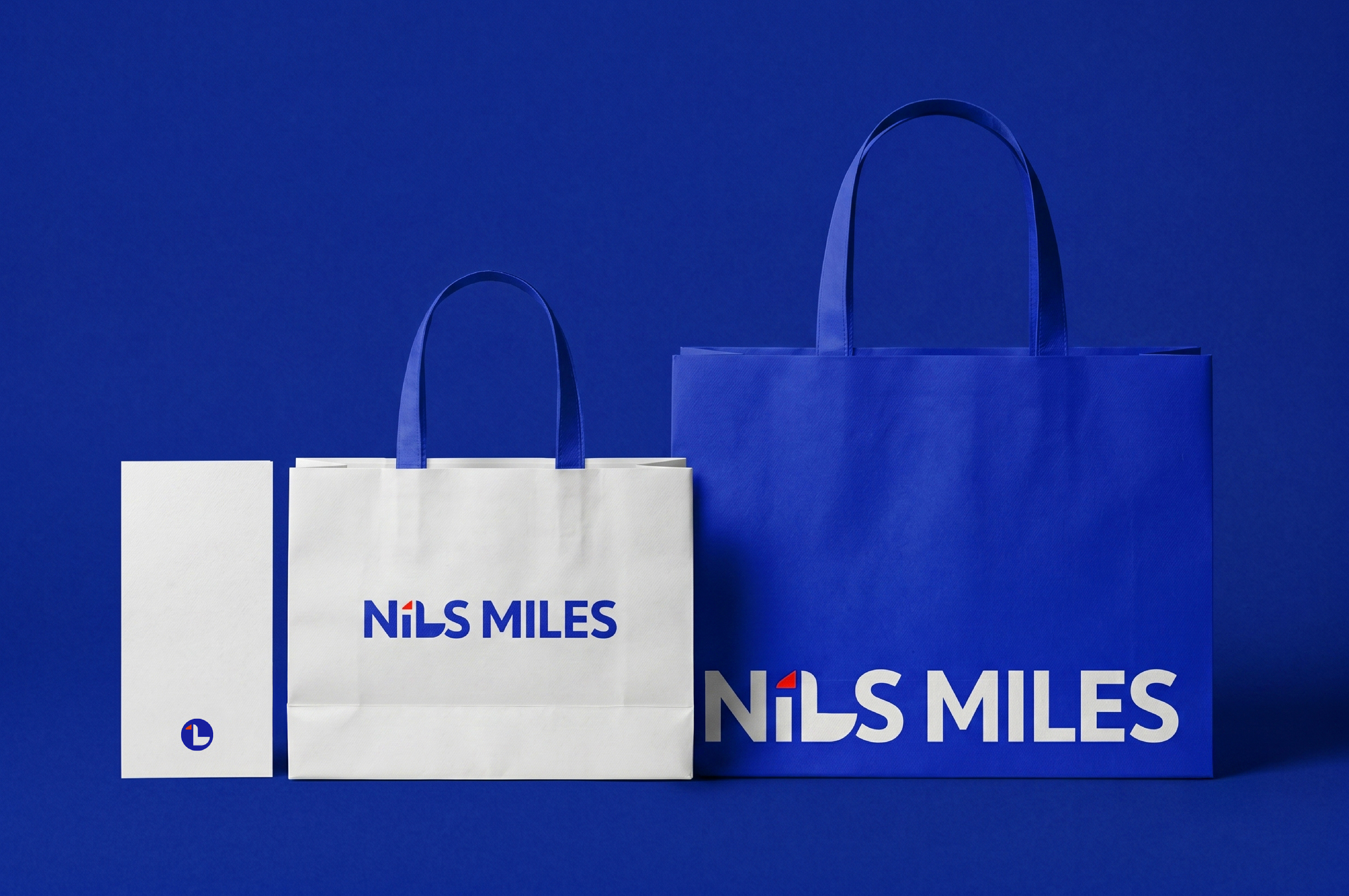
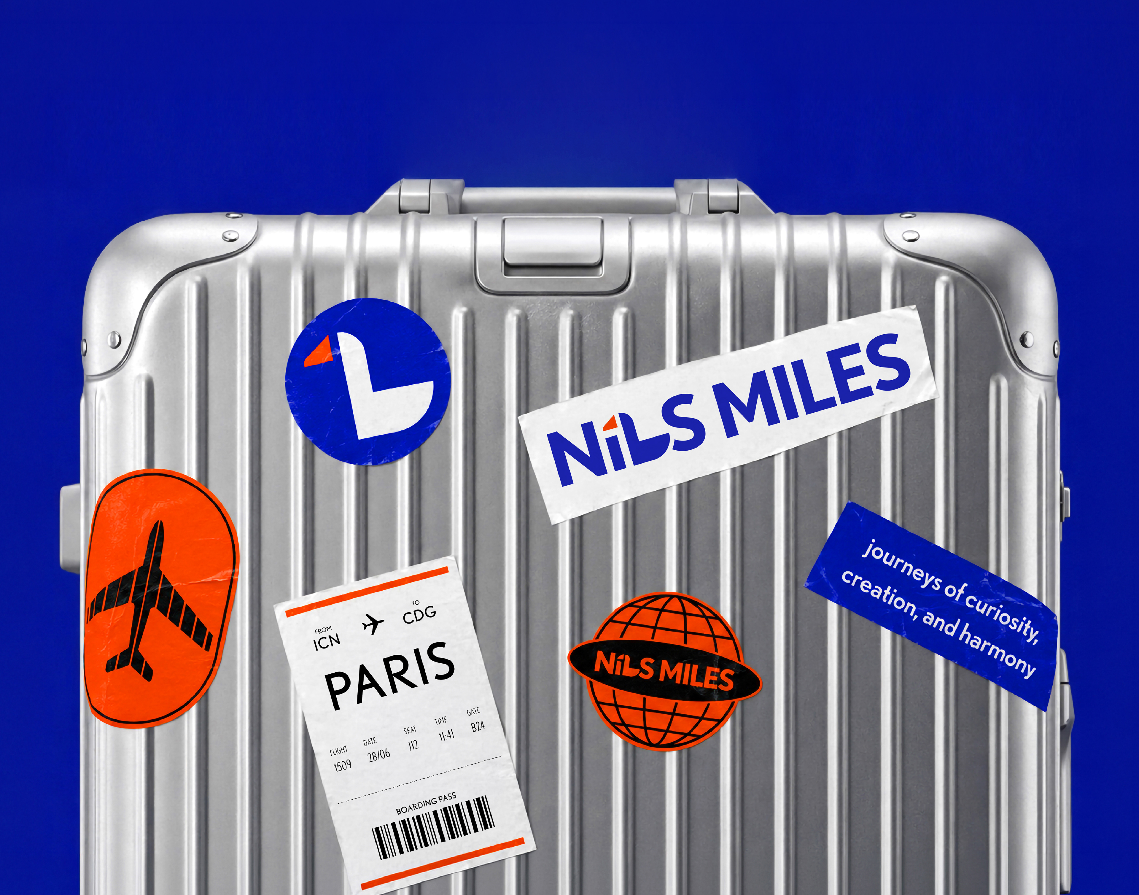
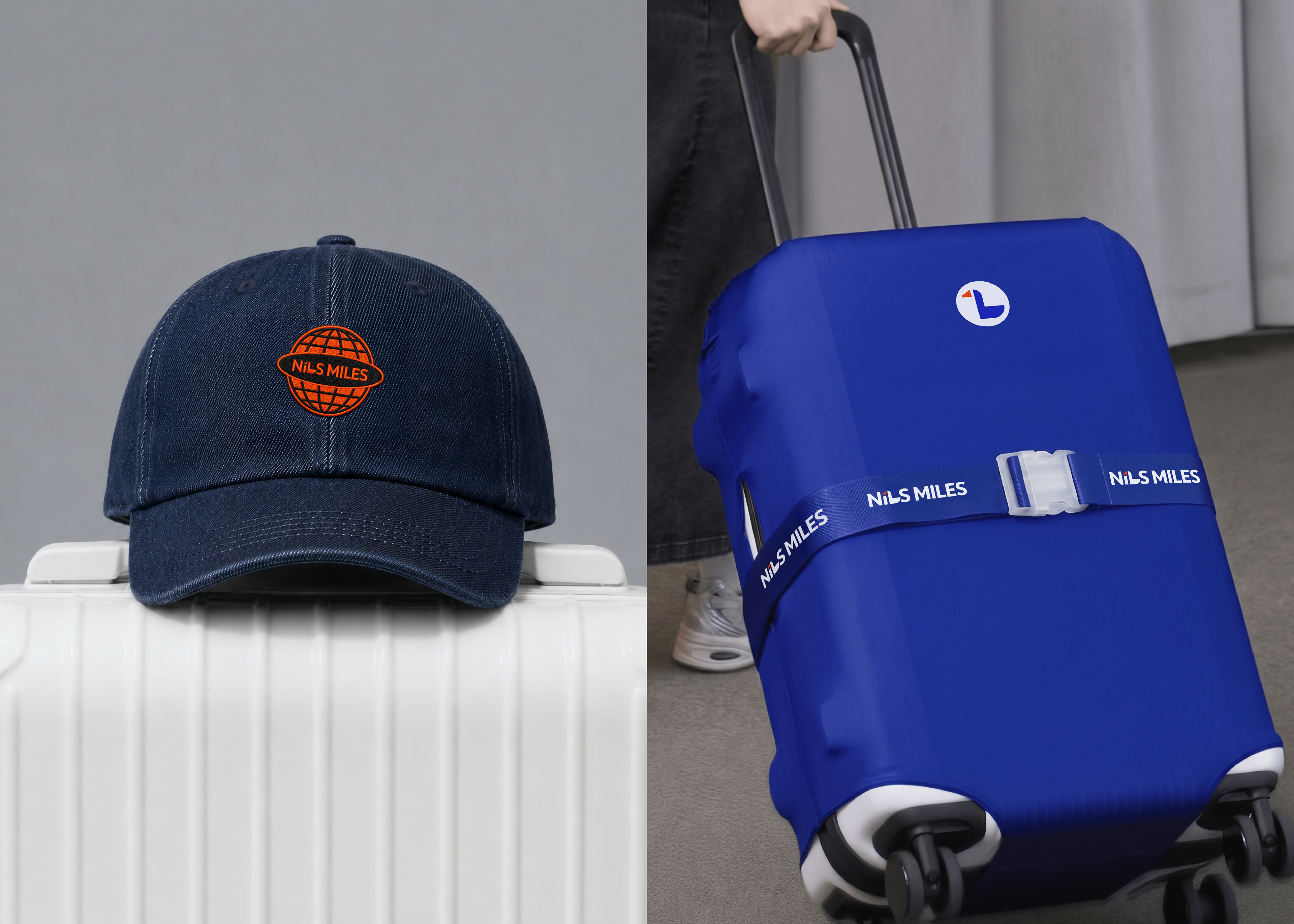
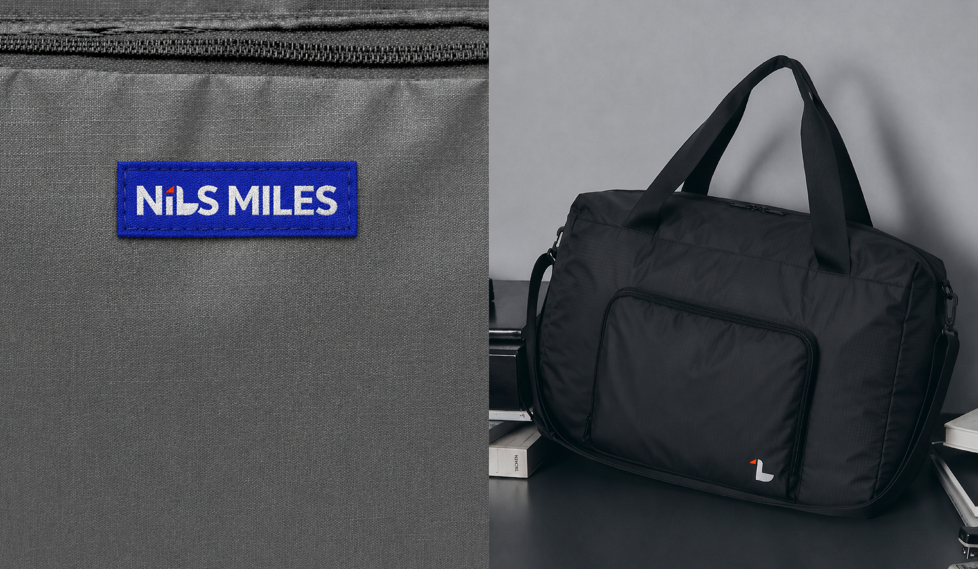
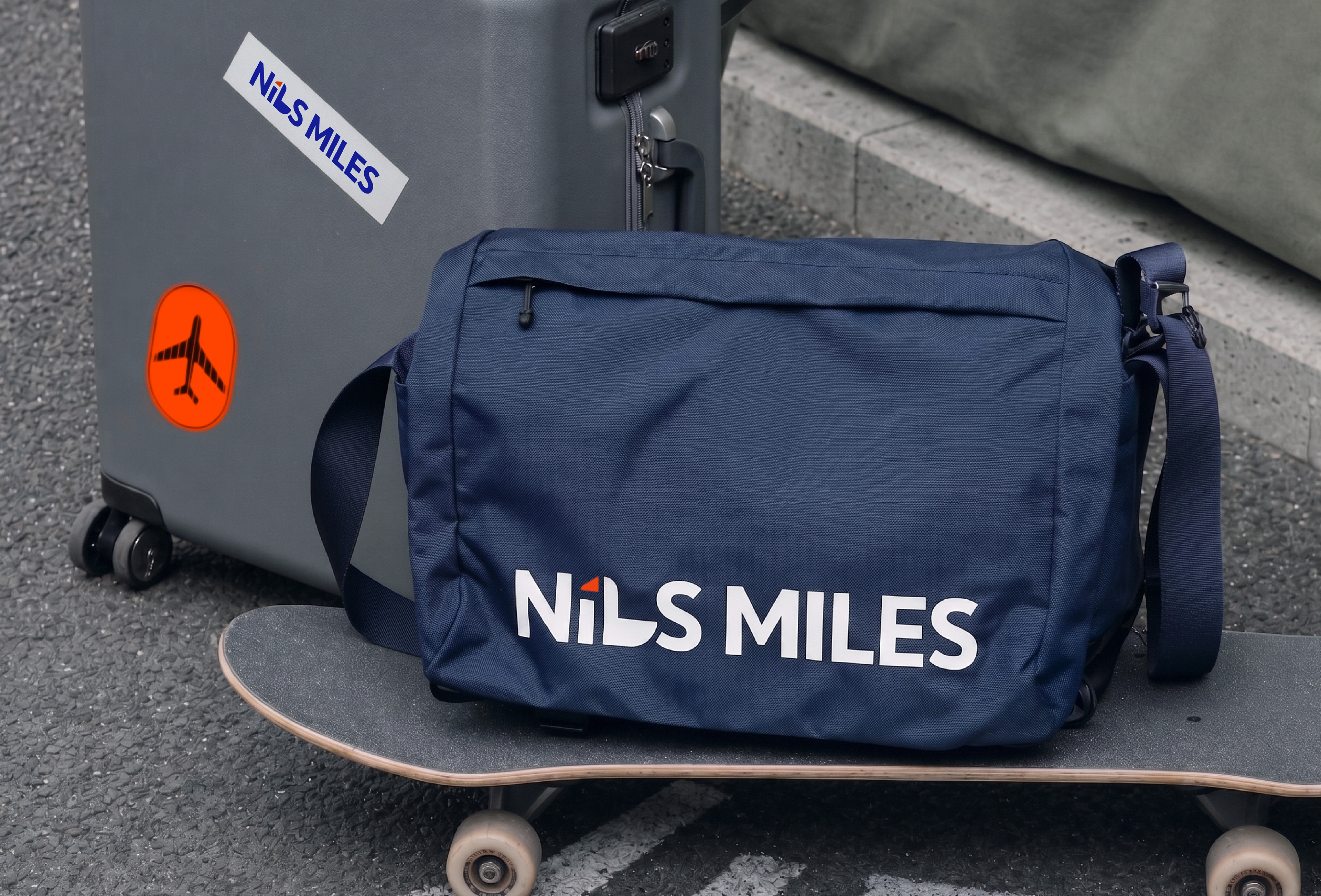
Studio Tangible developed the launch branding project for NiLS MILES, a travel luggage brand inspired by the lifestyle of the urban nomad — a way of living that embraces both movement and everyday life as forms of travel within the city.
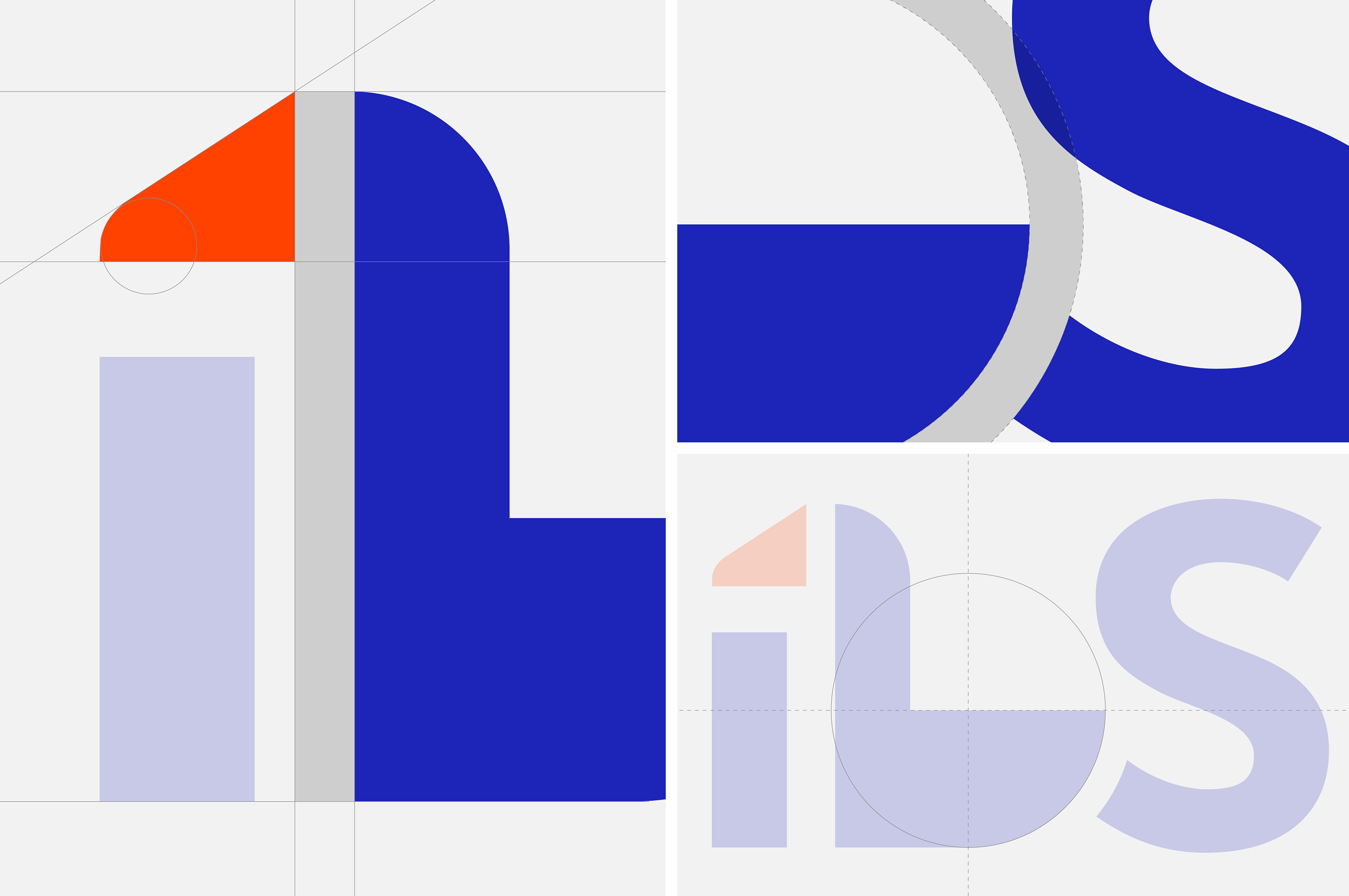
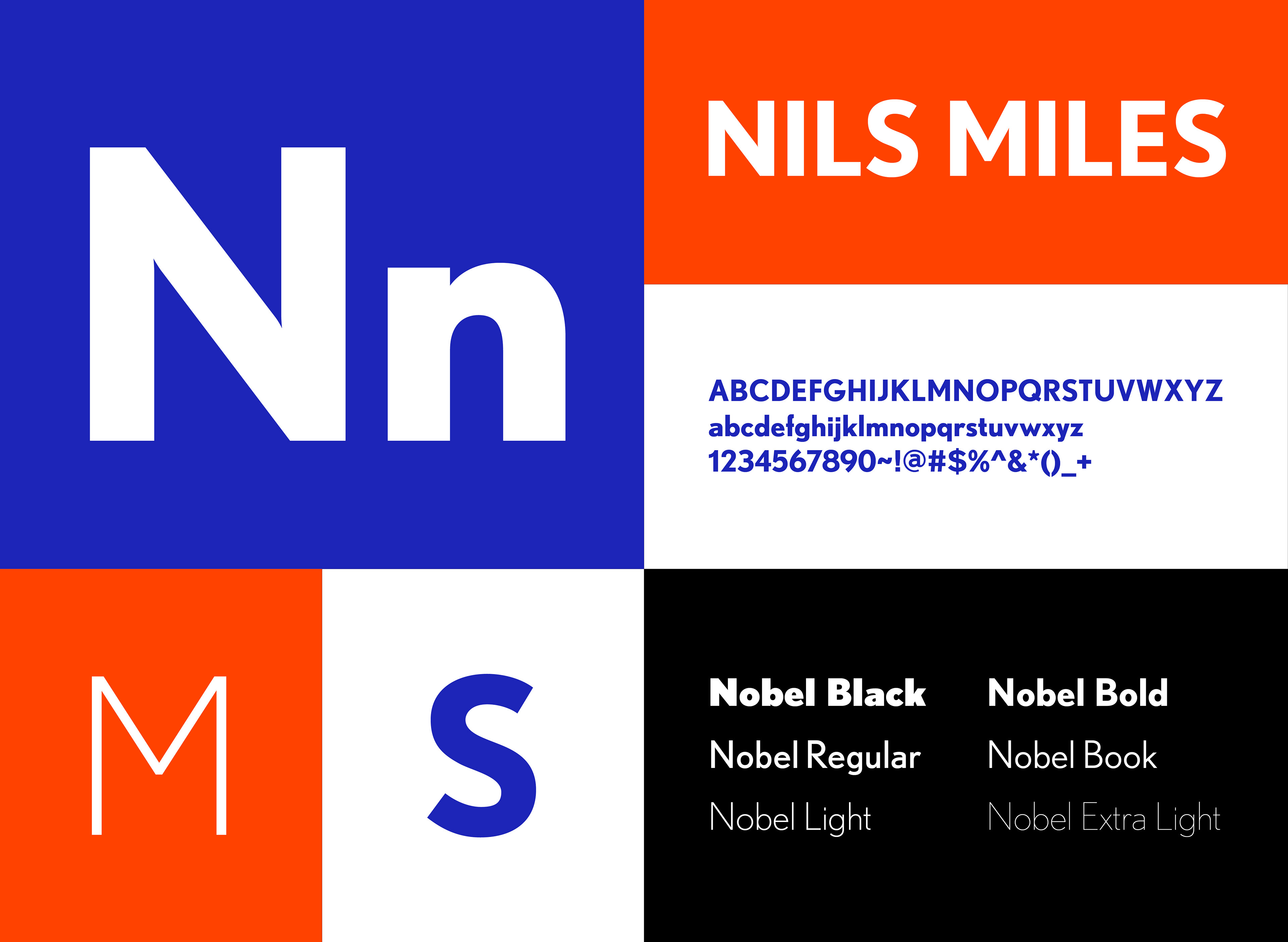
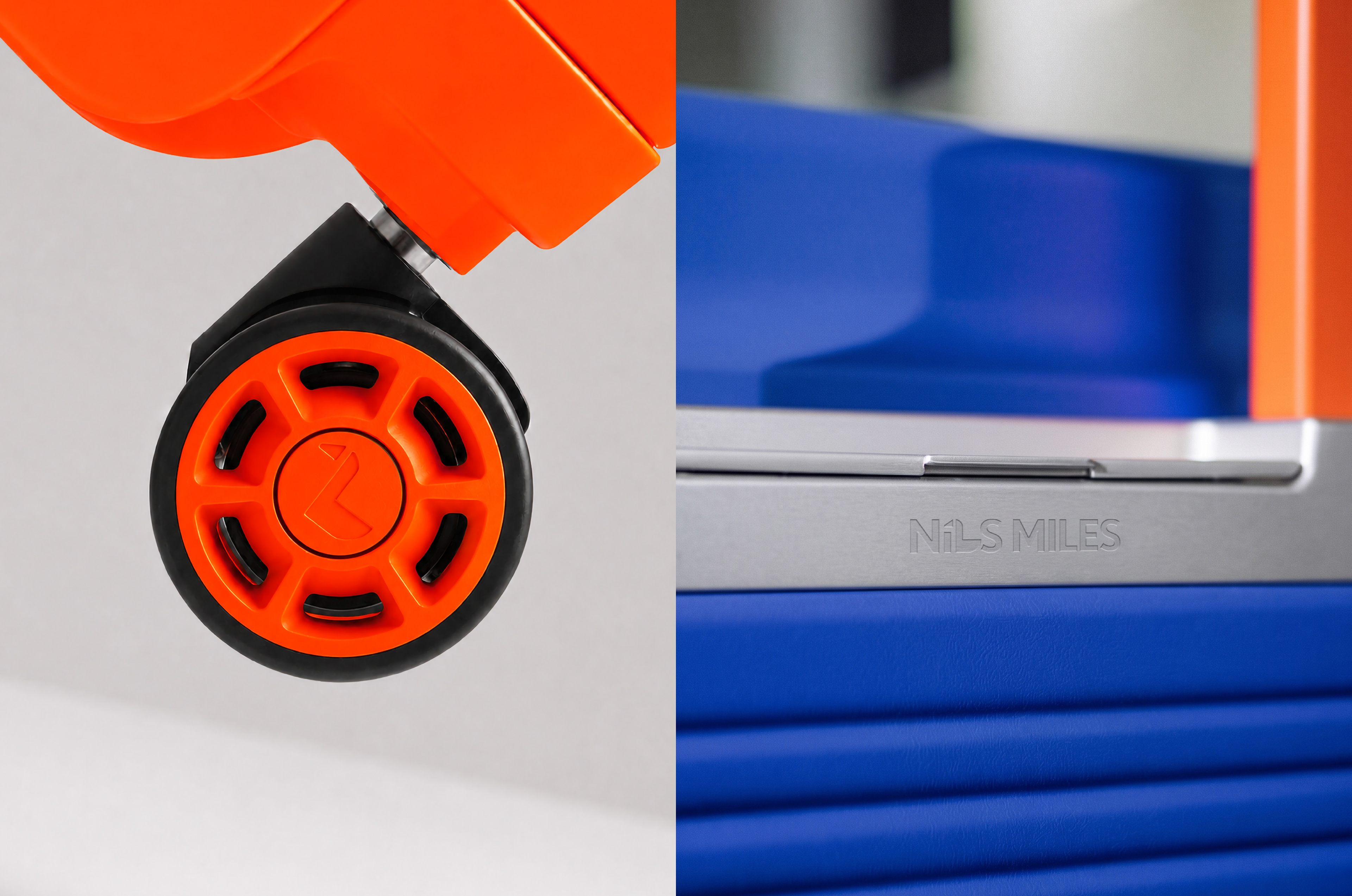
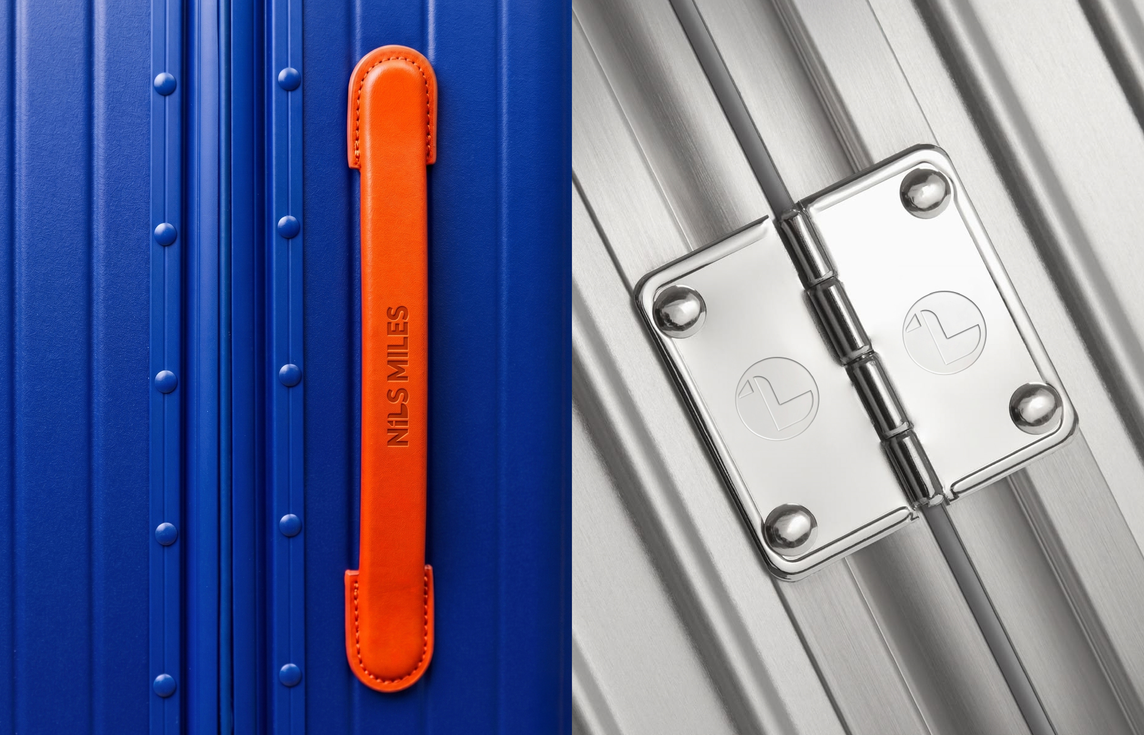
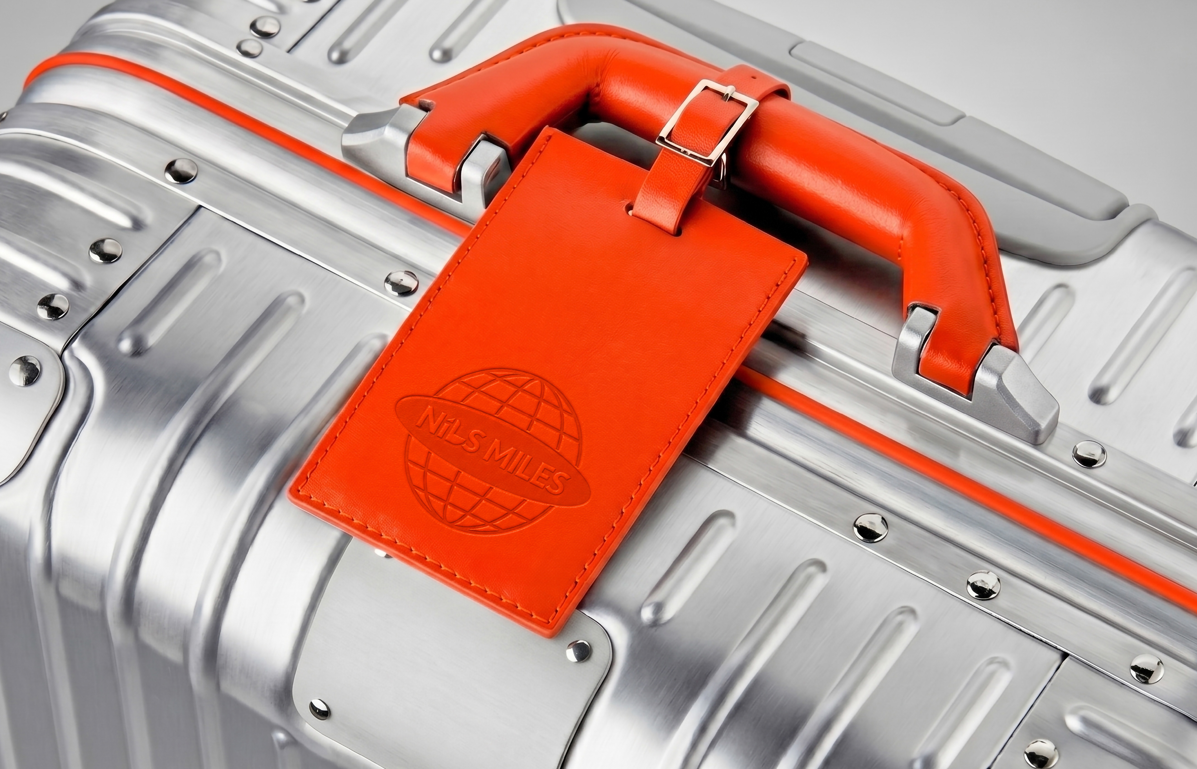
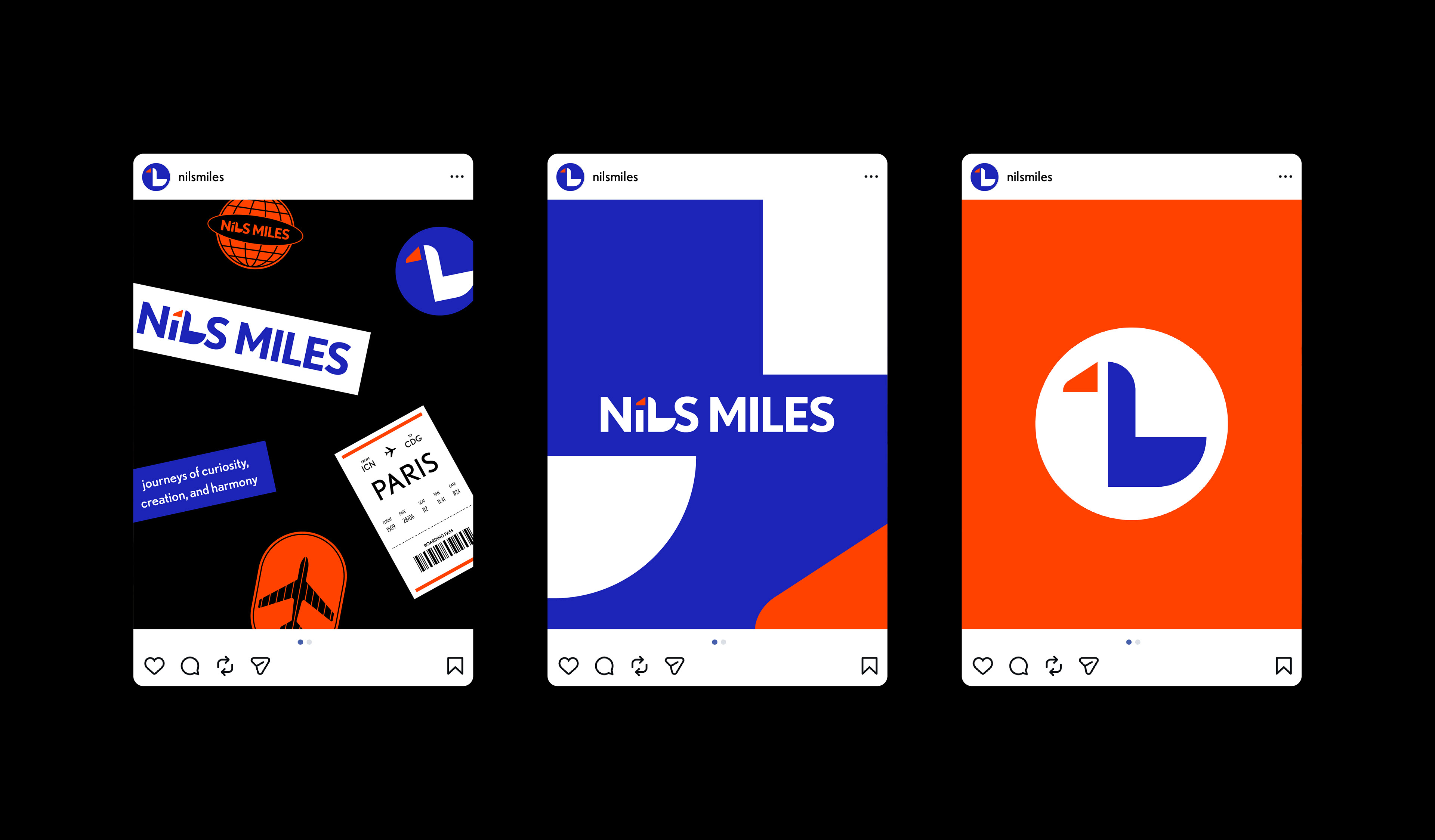
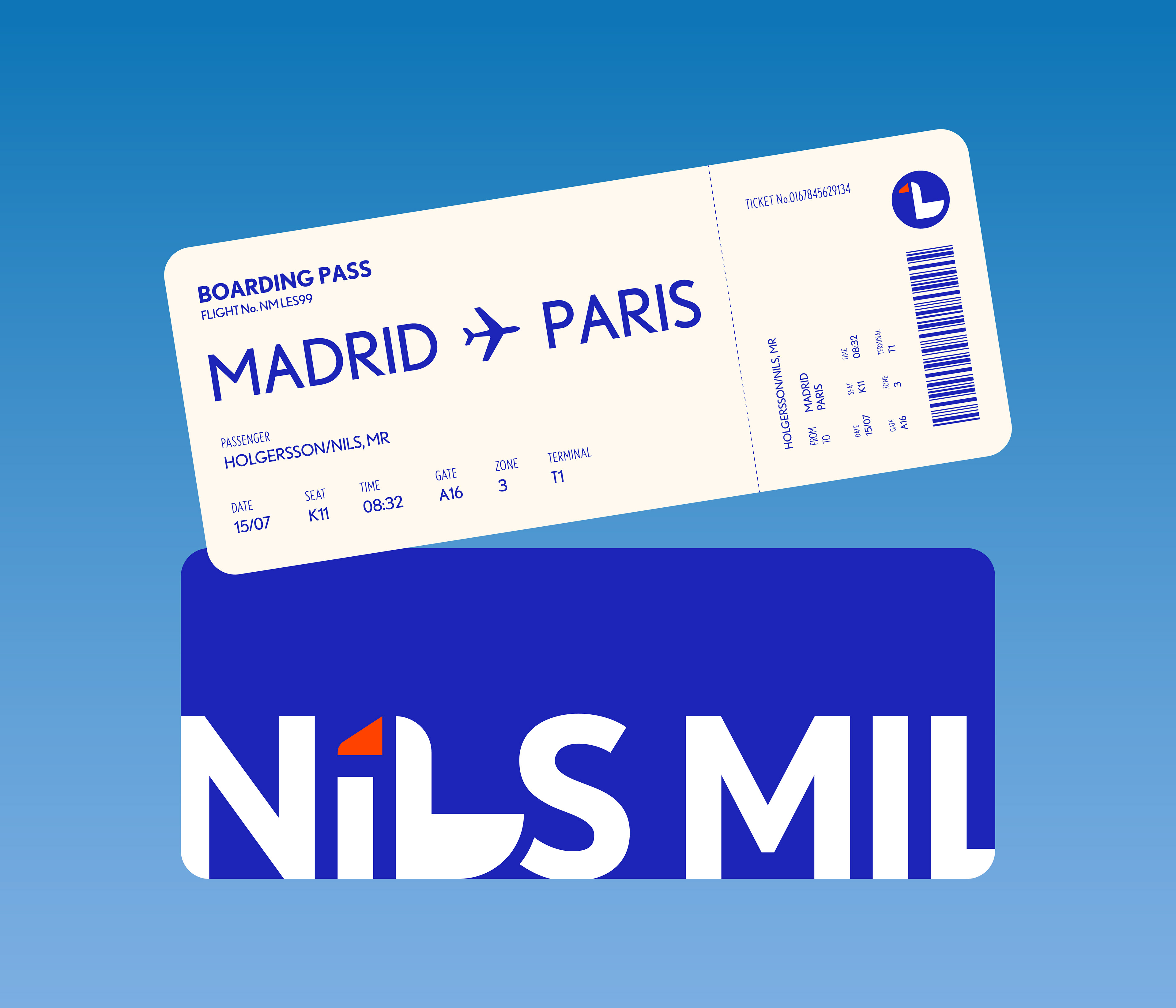
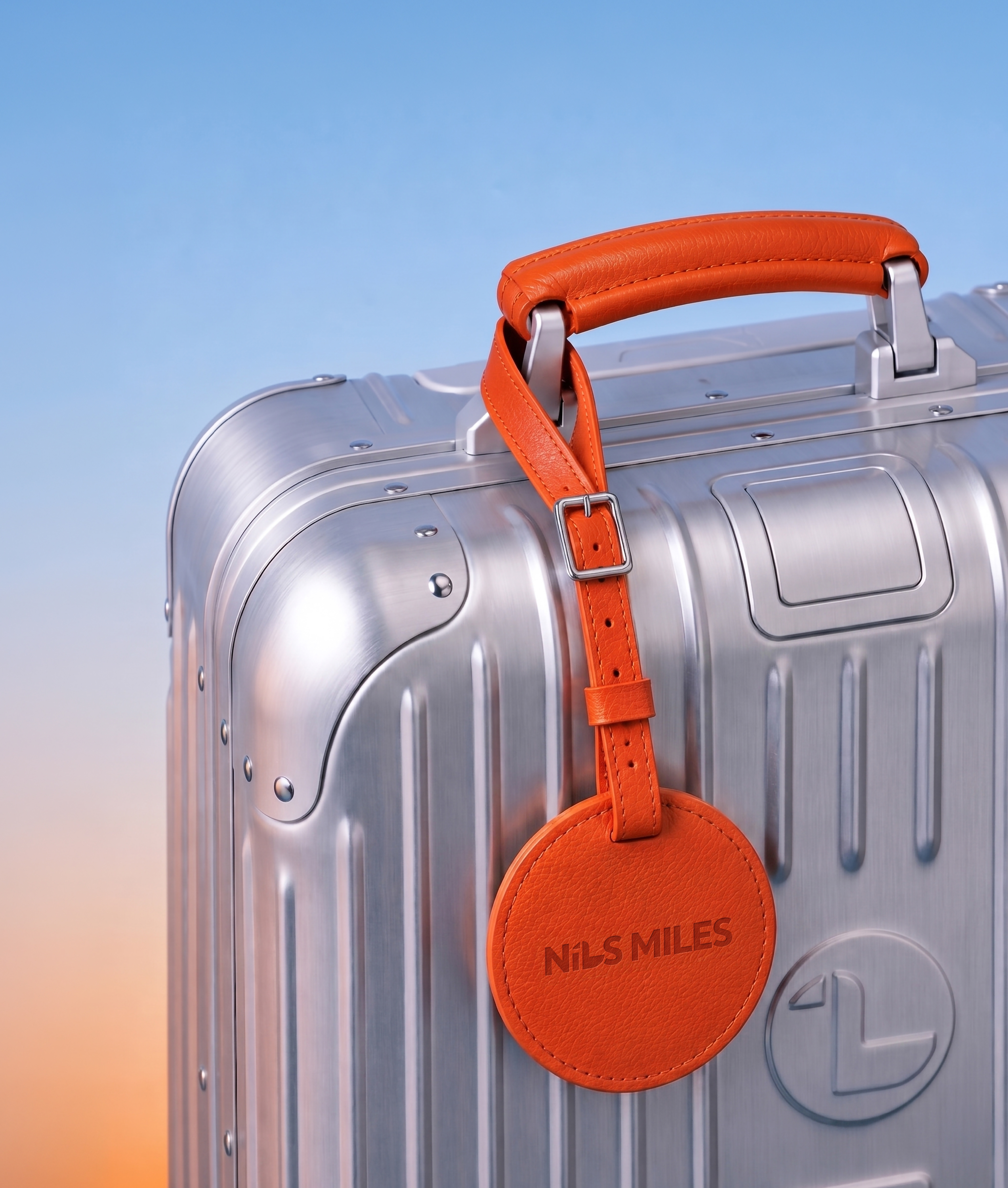
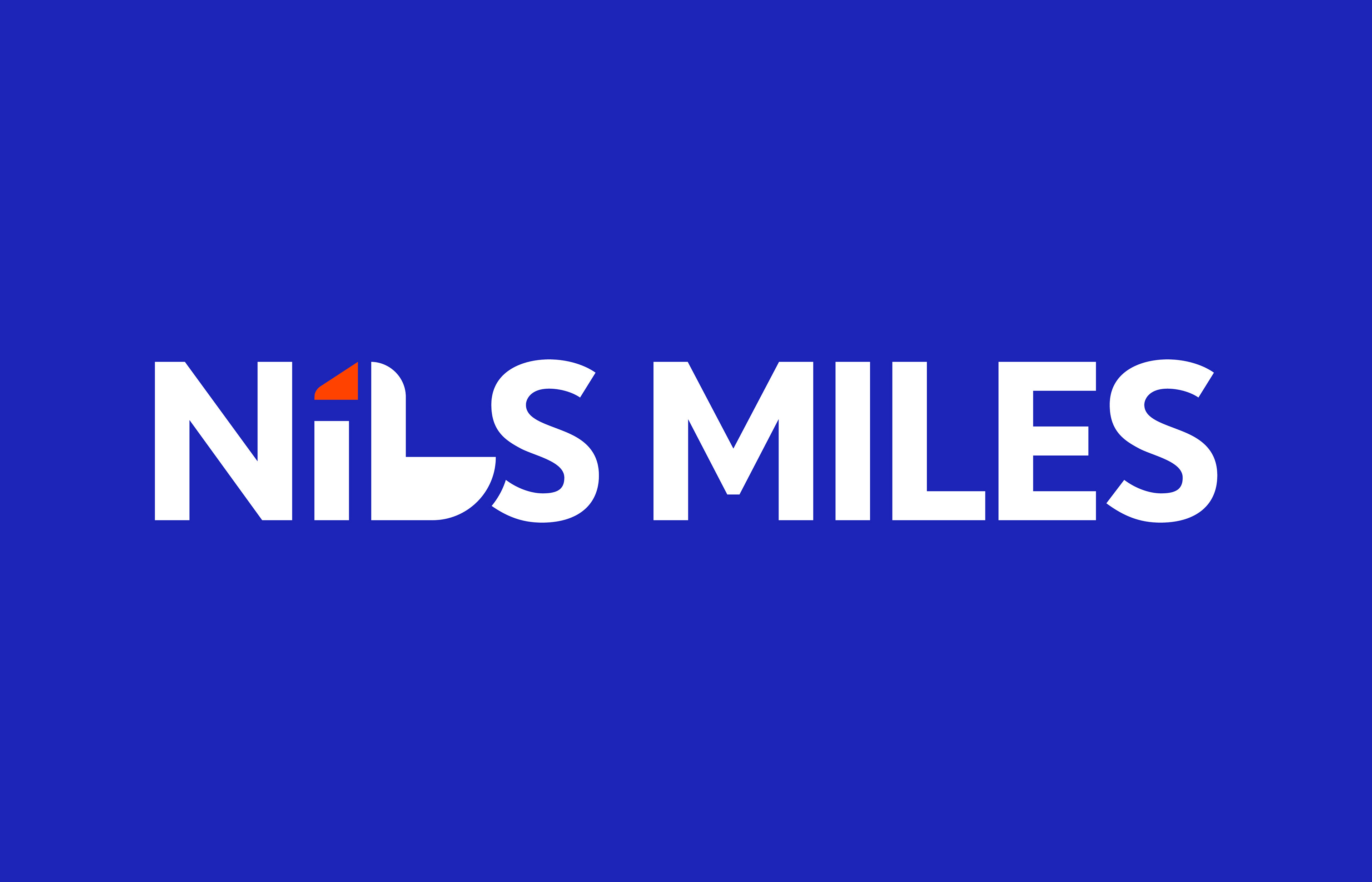
Inspired by The Wonderful Adventures of Nils, the brand visually and conceptually represents modern urban explorers. The name NiLS MILES combines “Nils” and “Miles,” symbolizing distance and movement, while the goose motif formed by the letters “i” and “L” serves as the brand’s iconic symbol.
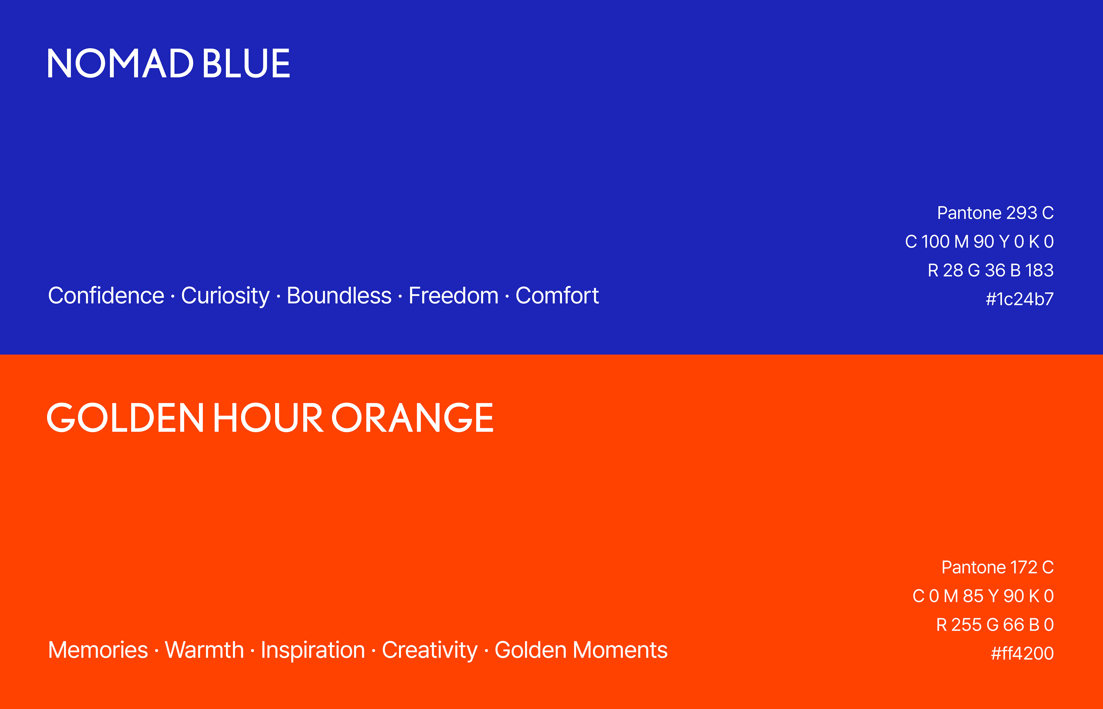
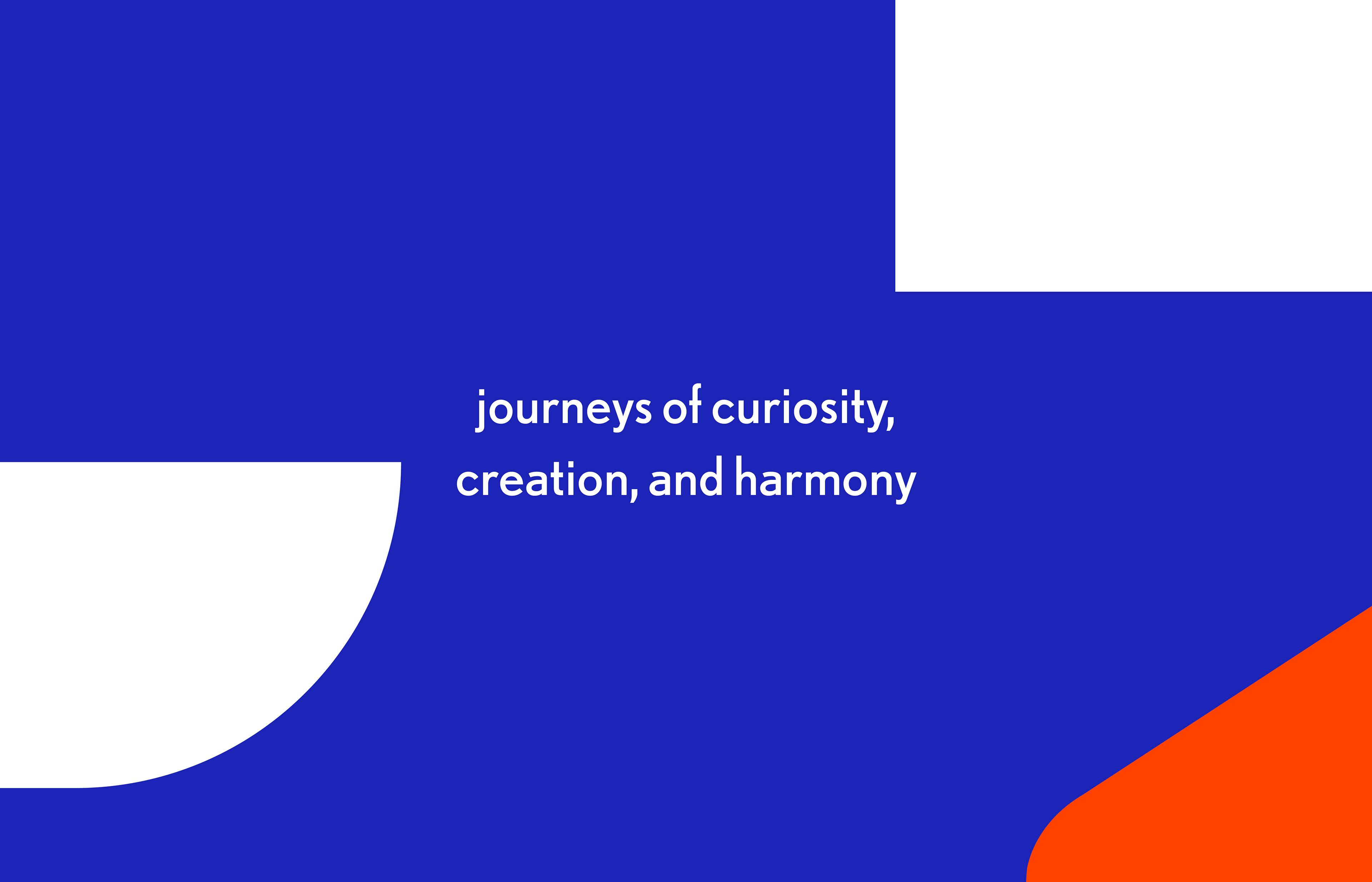
Nomad Blue represents the vast horizon and spirit of exploration, while Golden Hour Orange reflects the joy and energy of travel. Together, the complementary colors express both stability and vitality, embodying the suitcase as a reliable companion for everyday journeys.
As a sustainability-driven brand, NiLS MILES connects nature and the city, encouraging a more conscious and sustainable travel lifestyle.
_
스튜디오 텐저블은 어반 노마드 라이프스타일을 지향하는 여행용 캐리어 브랜드의 신규 런칭 프로젝트를 진행한 바 있다. 어반 노마드는 일반적으로 생각하는 여행 개념에 국한되지 않고, 도시의 인프라를 누리며 이동과 일상의 영위를 모두 여행으로 받아들이는 라이프스타일이라 할 수 있다. 텐저블은 모험을 찾아 떠나는 거위새와 소년의 이야기인 ‘닐스의 이상한 여행’에서 영감을 받아 세상을 탐험하는 도시의 여행가를 언어적, 시각적으로 표현하고자 했다. 닐스와 거리 및 이동을 나타내는 단어 Mile의 합성어인 브랜드 네임 NiLS MILES를 로고타입 형태로 표현하였다. 여기서 i와 L로 조합된 거위새는 도시의 탐험가를 표현하는 상징적인 요소이다. 도시적이고 선명한 노마드 블루 색상은 닐스가 비행하고 우리가 탐험할 드넓은 지평선을 의미한다. 골든 아워 오렌지는 여행자의 즐거움과 활동성을 나타내는 색상으로, 전체적인 비주얼에서 포인트를 주는 역할을 한다. 이러한 보색 대비의 조합은 안정감과 활력을 동시에 드러내며, 여행 시 편안함과 에너지를 주는 동반자인 캐리어를 상징하는 색상이기도 하다. 또한 닐스마일스는 지속가능성을 추구하는 브랜드로서 아름다운 자연을 여행하는 닐스처럼 자연과 도시 두 세계를 연결하는 브랜드이다. 이동 중 환경과 연결되는 감각을 제공함으로써 보다 지속 가능한 일상 속 여행을 함께해 나갈 것이다.