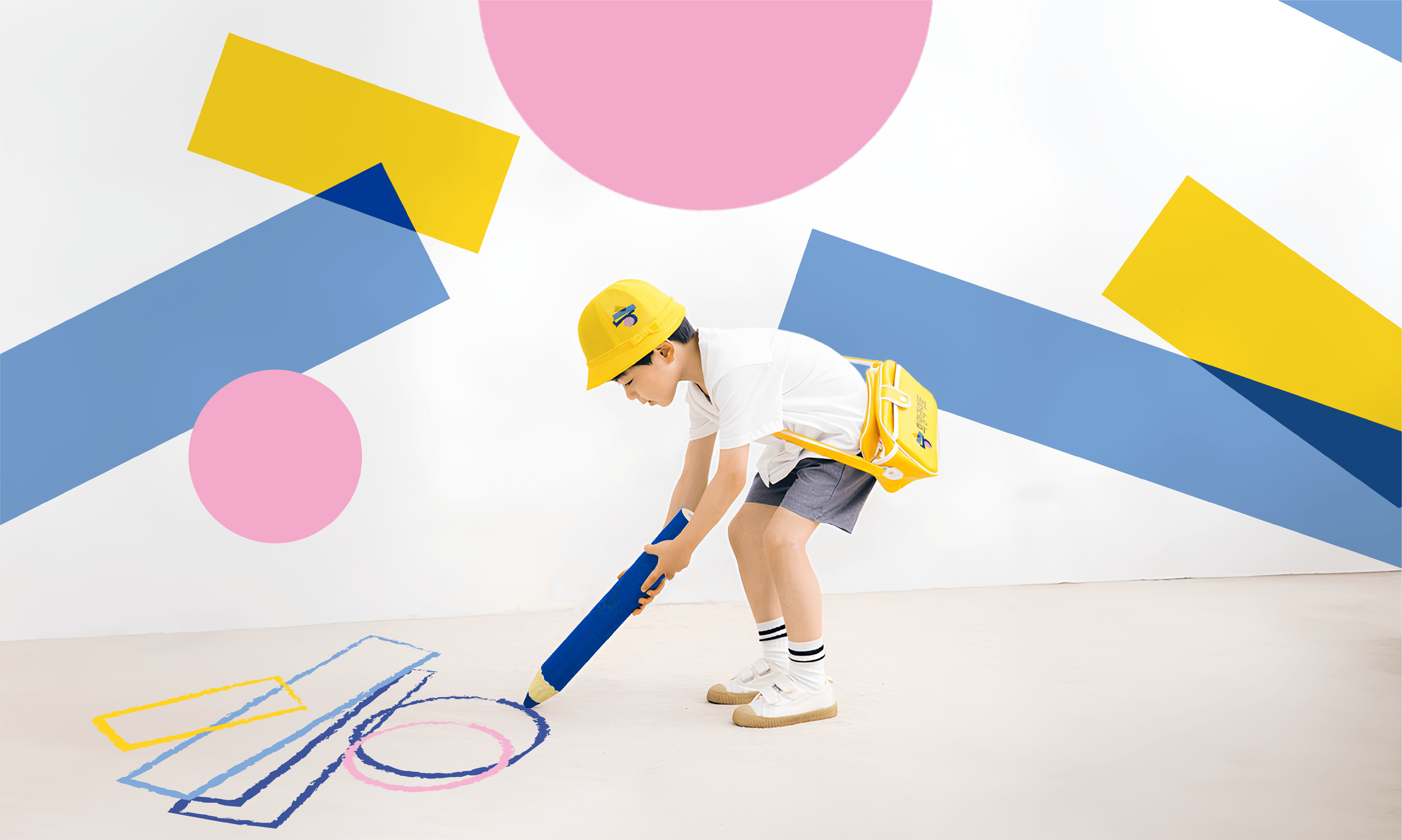
Light of Hope (희망라이트)
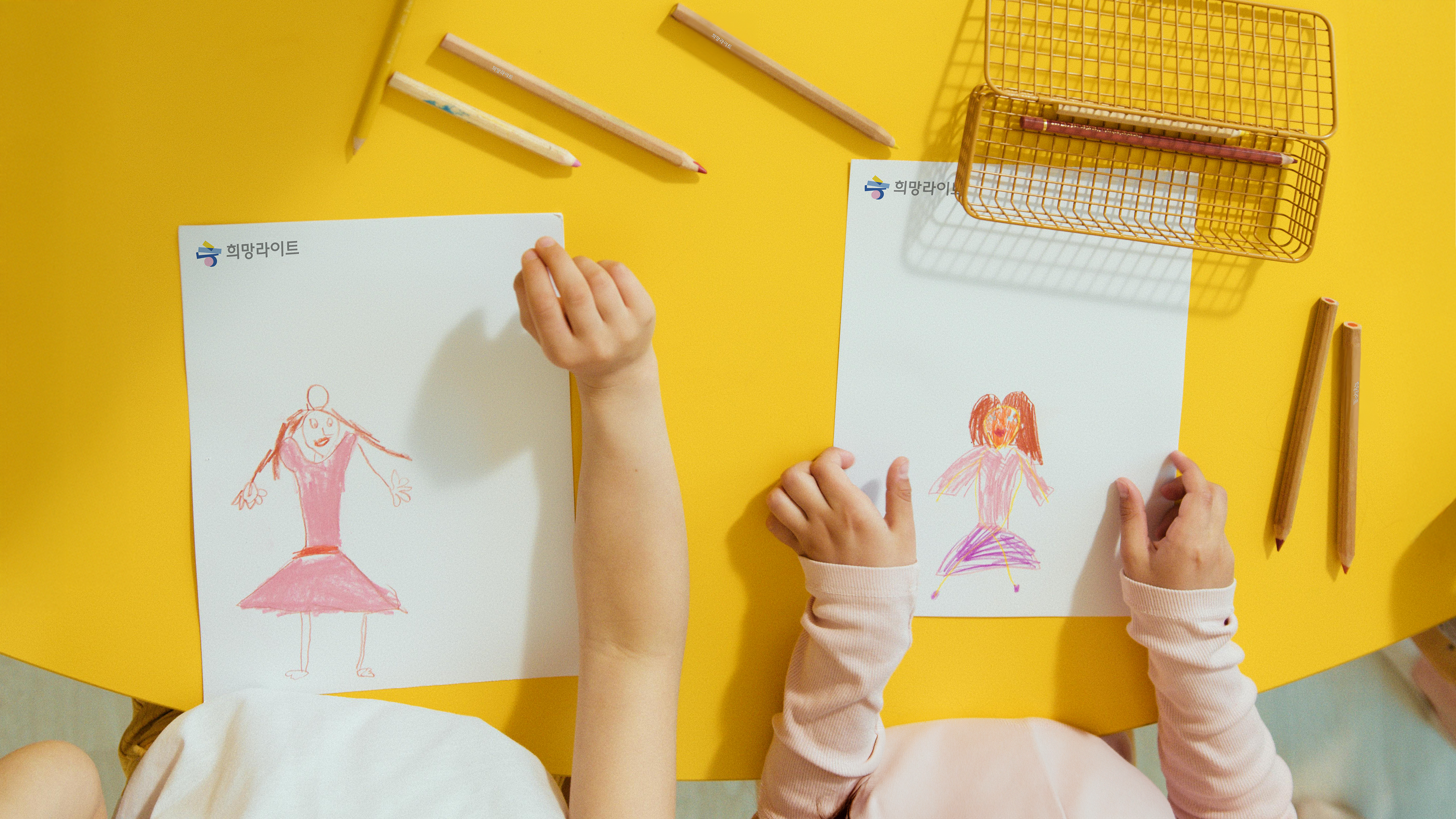
Studio tanGiBle carried out a comprehensive branding project for Heemang Light (translated as Light of Hope), a non-profit organization dedicated to supporting children in Korea. The project covered the development of the brand name, story, and identity. Heemang Light highlights the diverse backgrounds and dreams of children while striving to improve the living conditions of underprivileged communities through nationwide sponsorship.
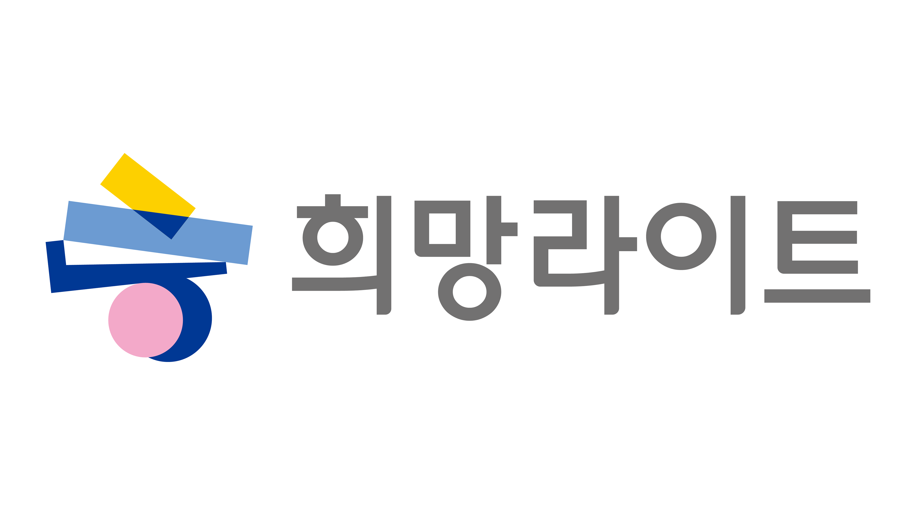
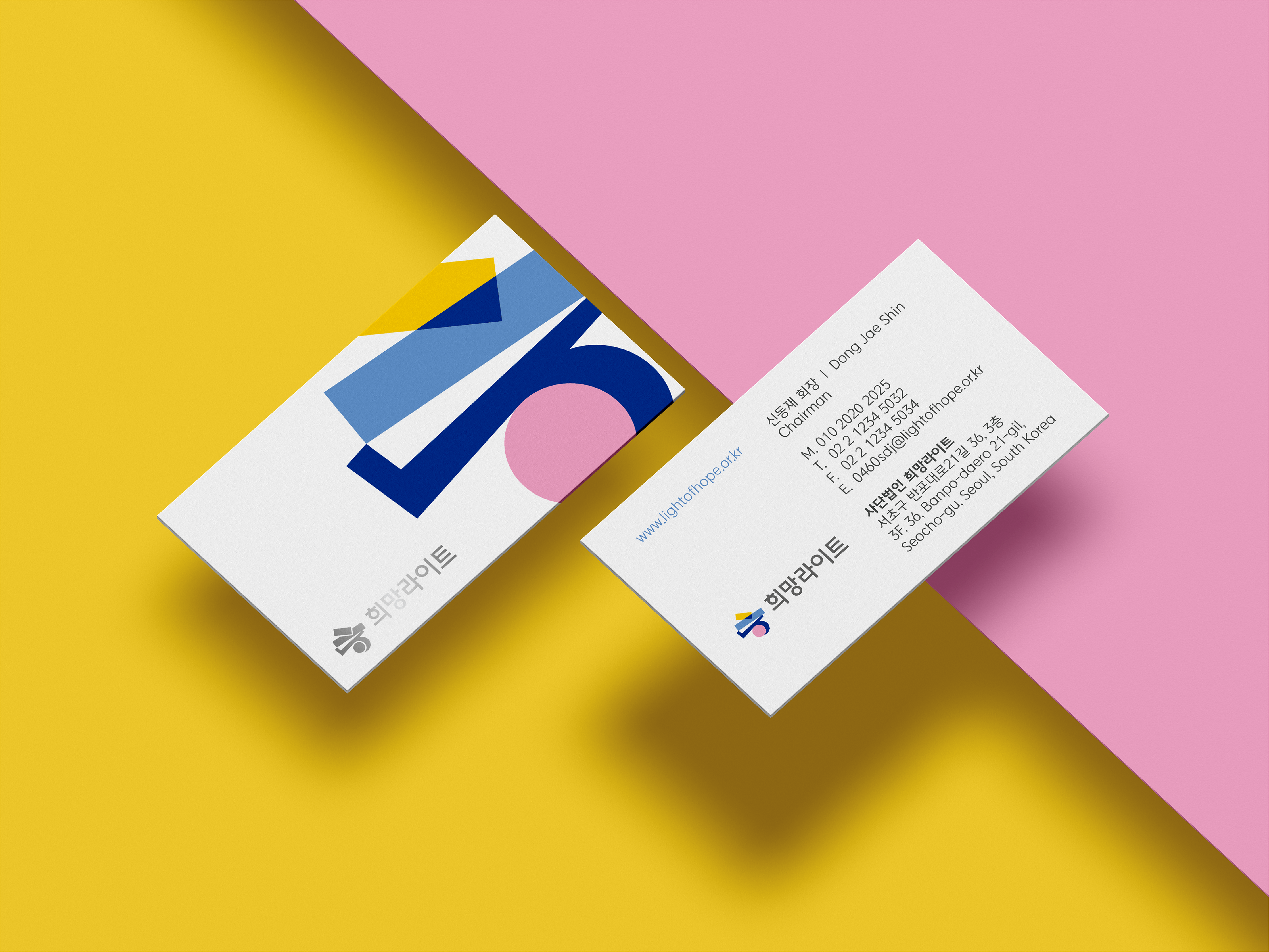
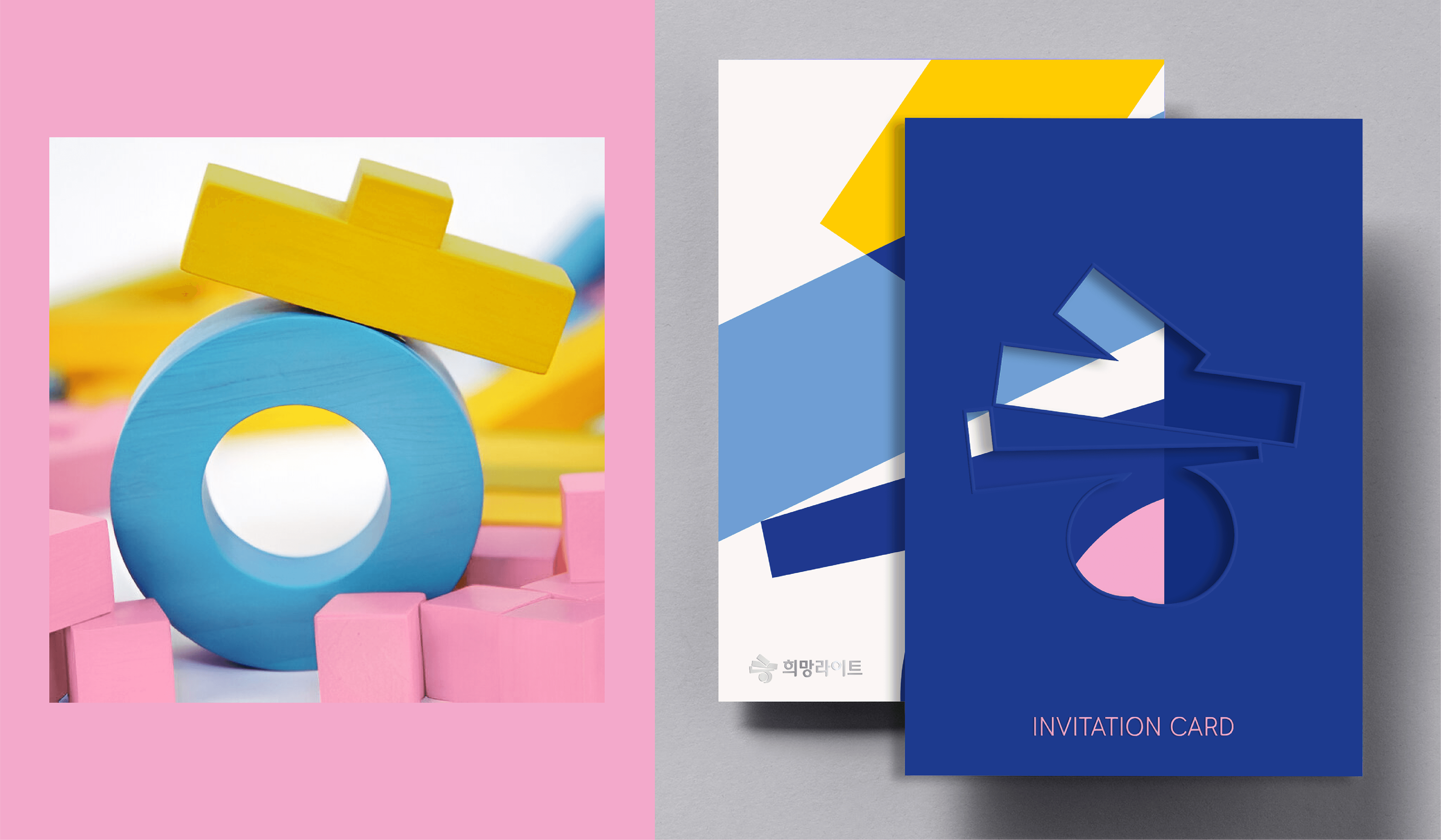
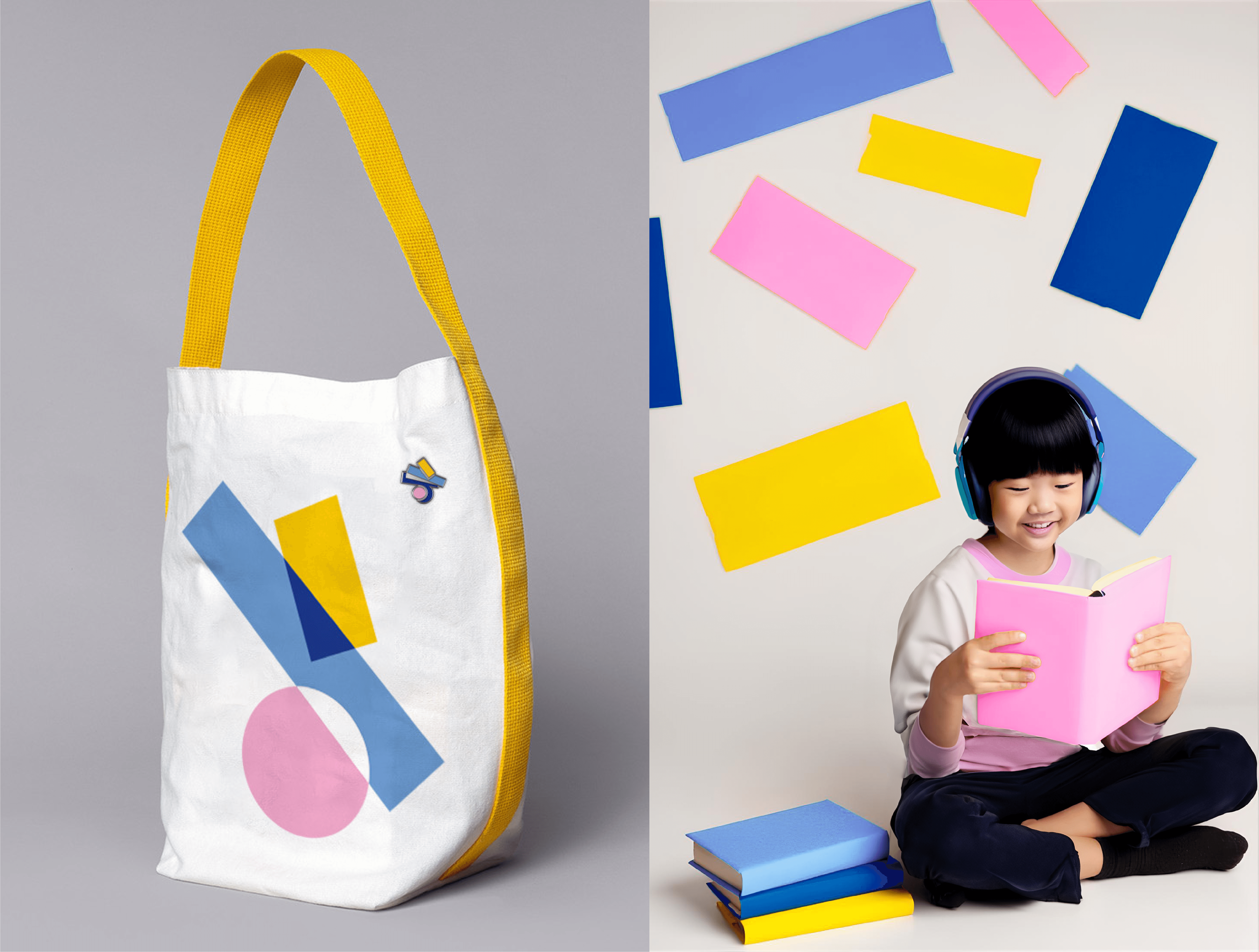
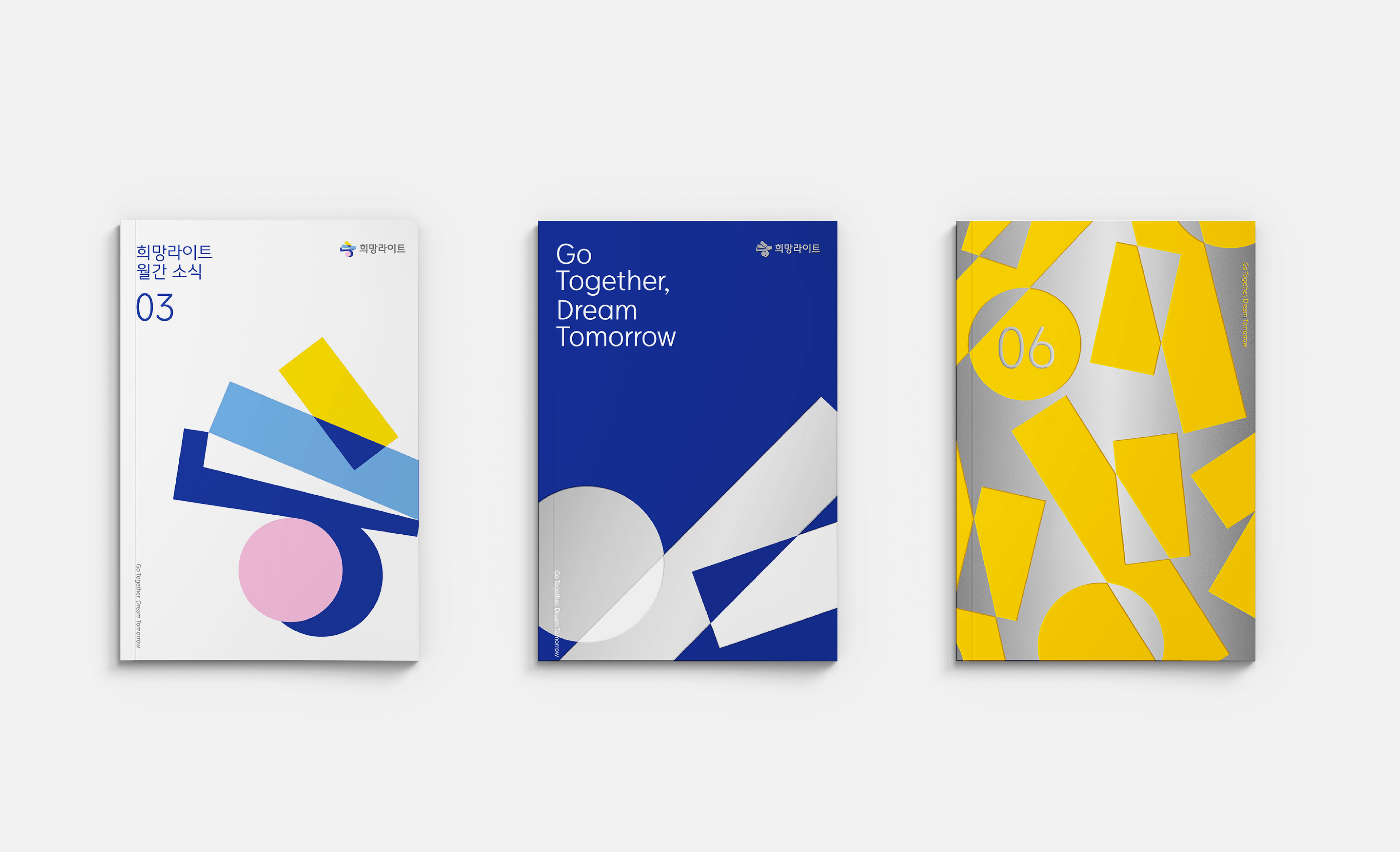
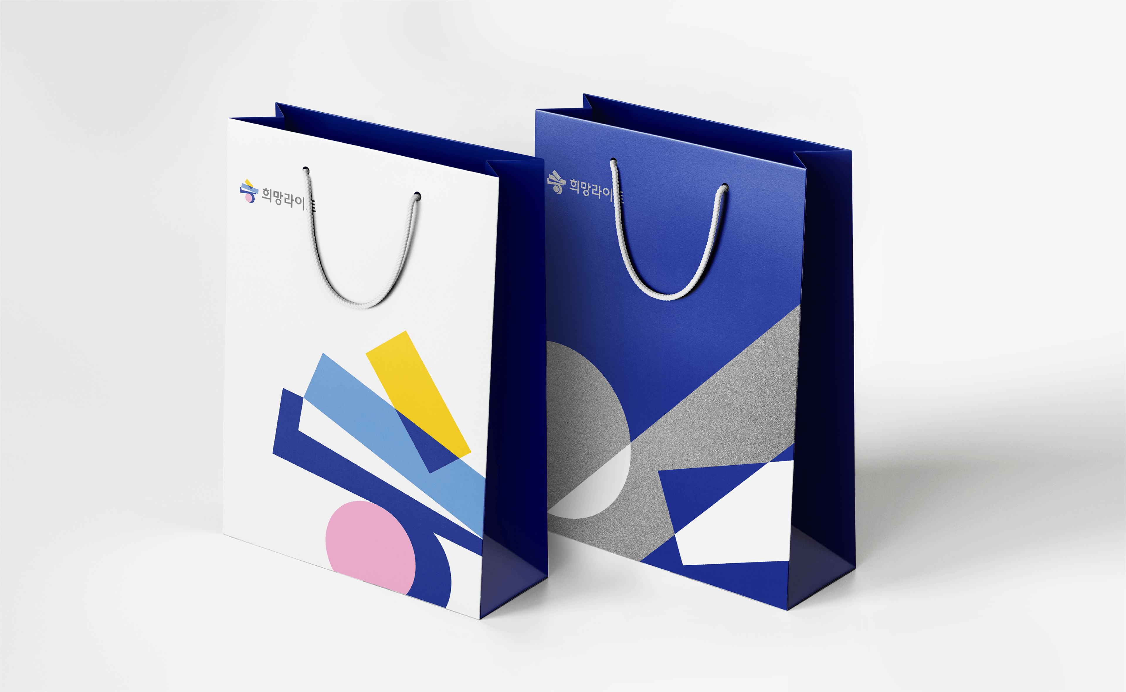
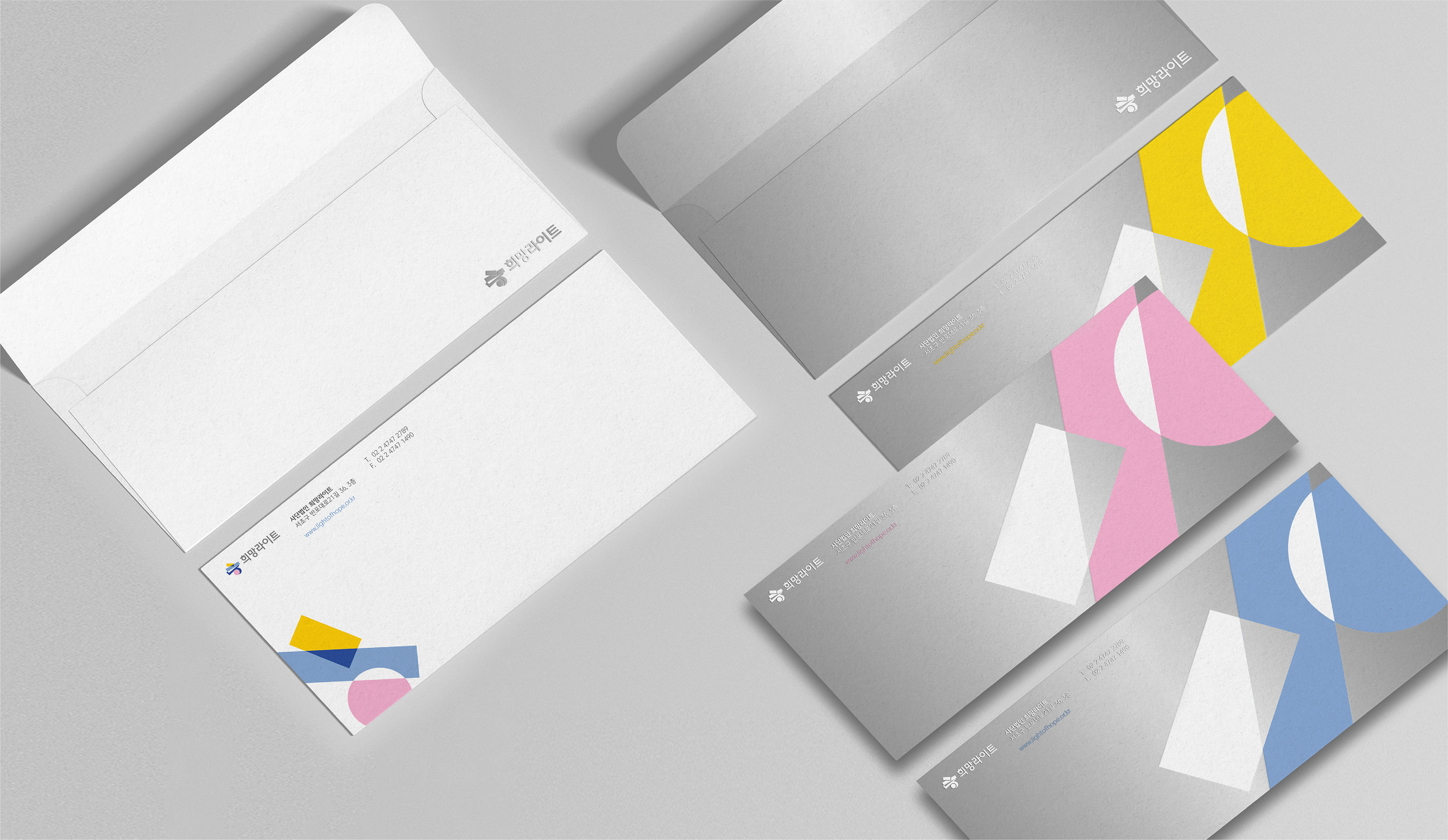
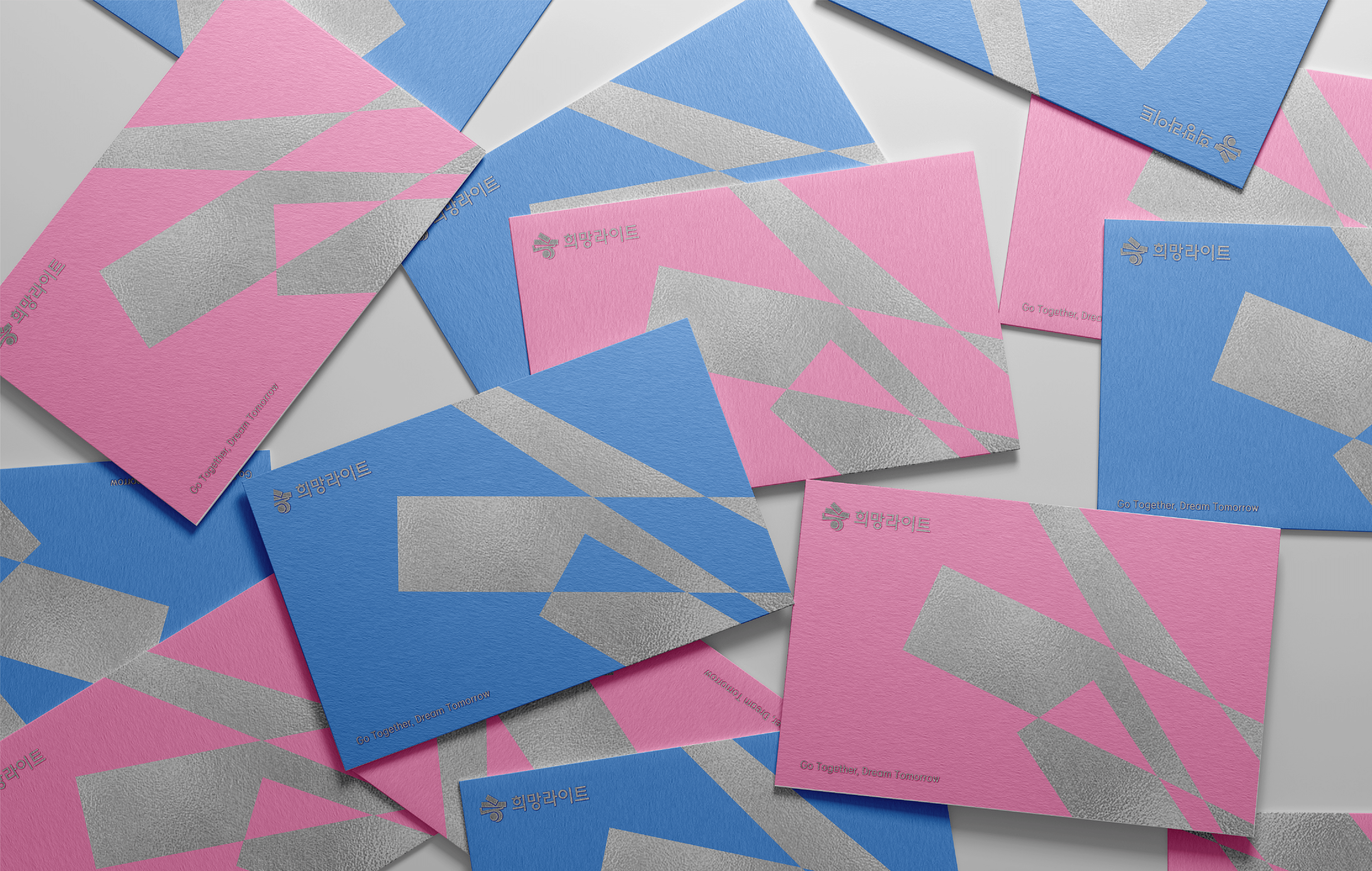
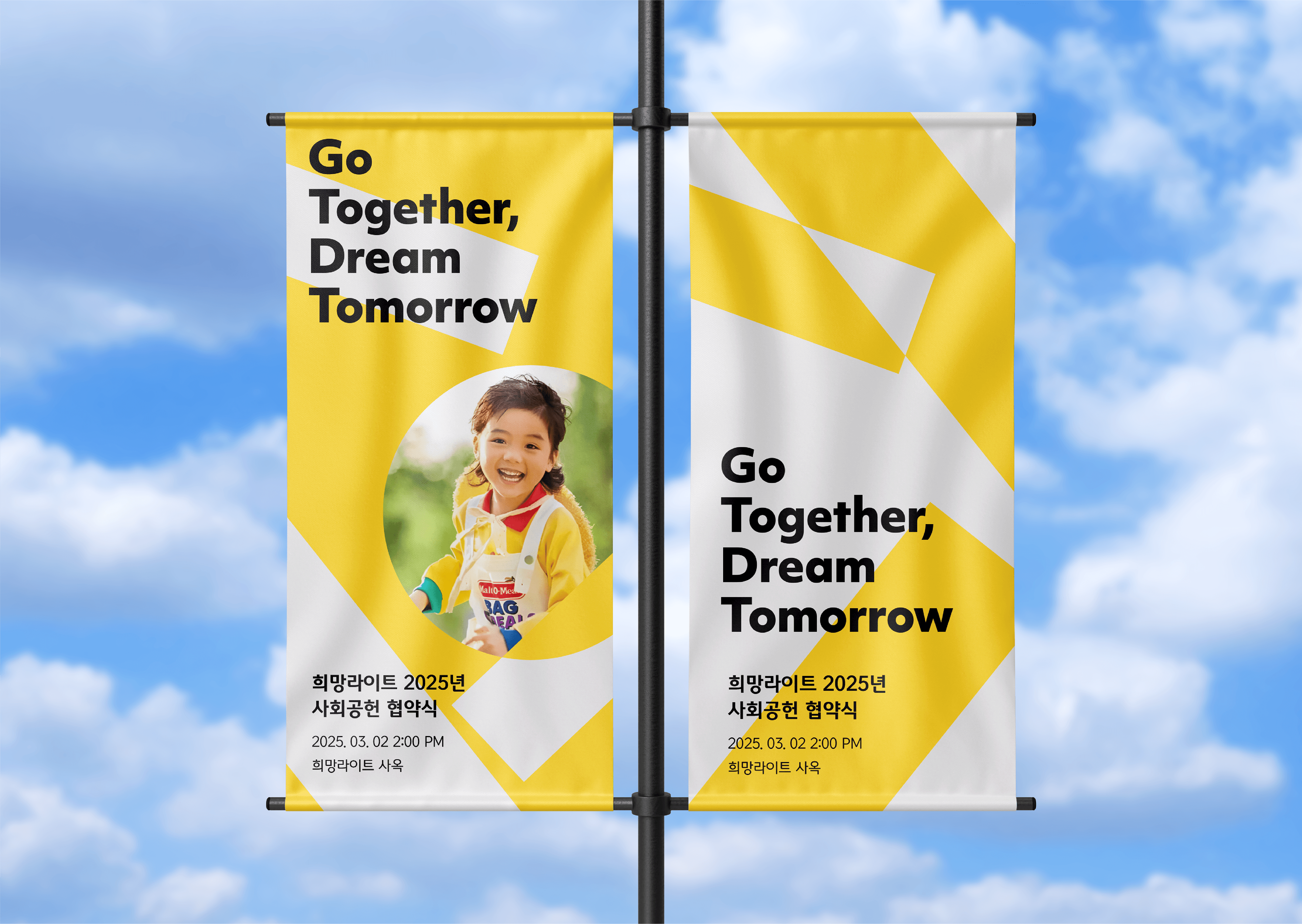
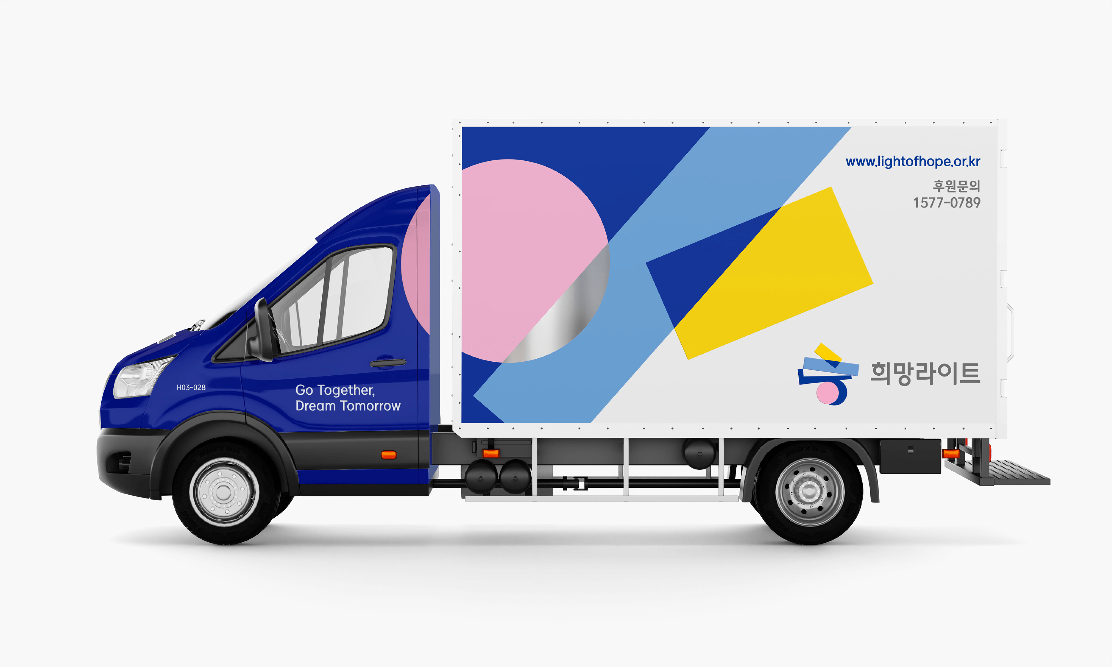
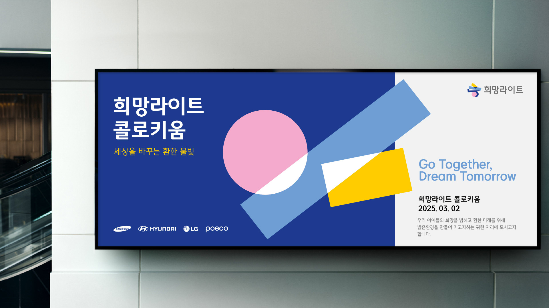
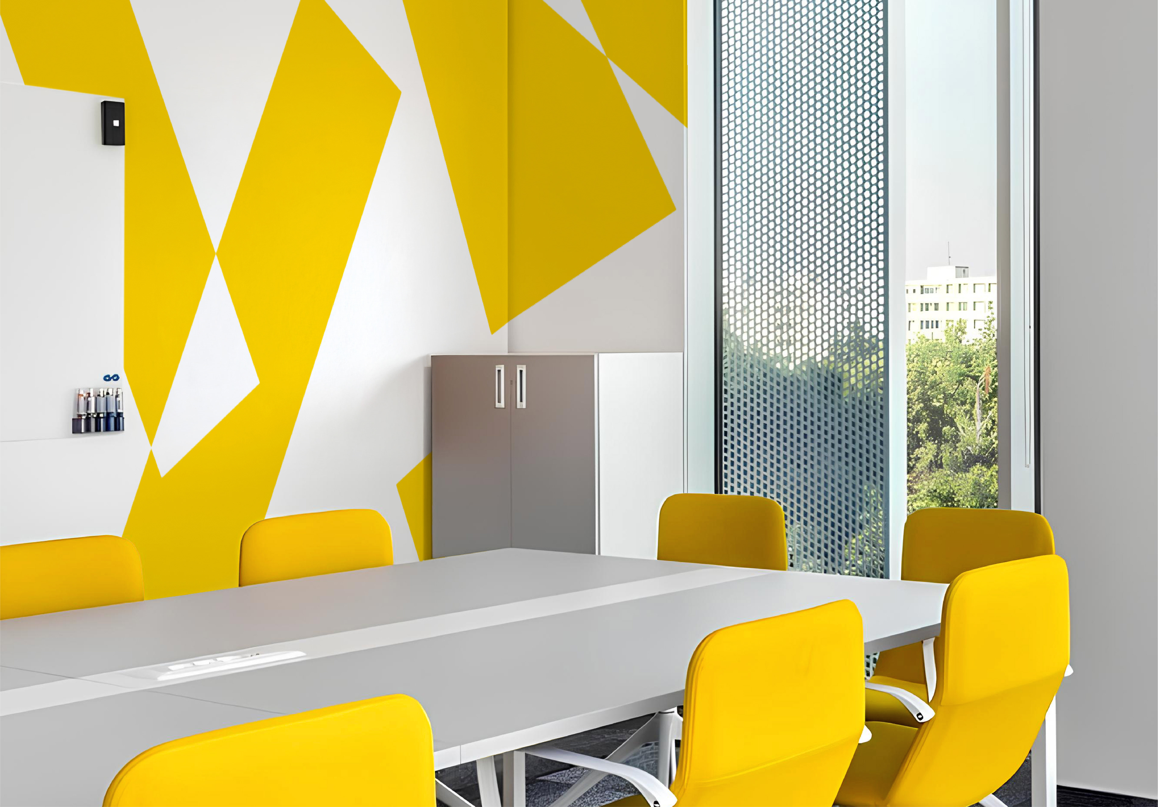
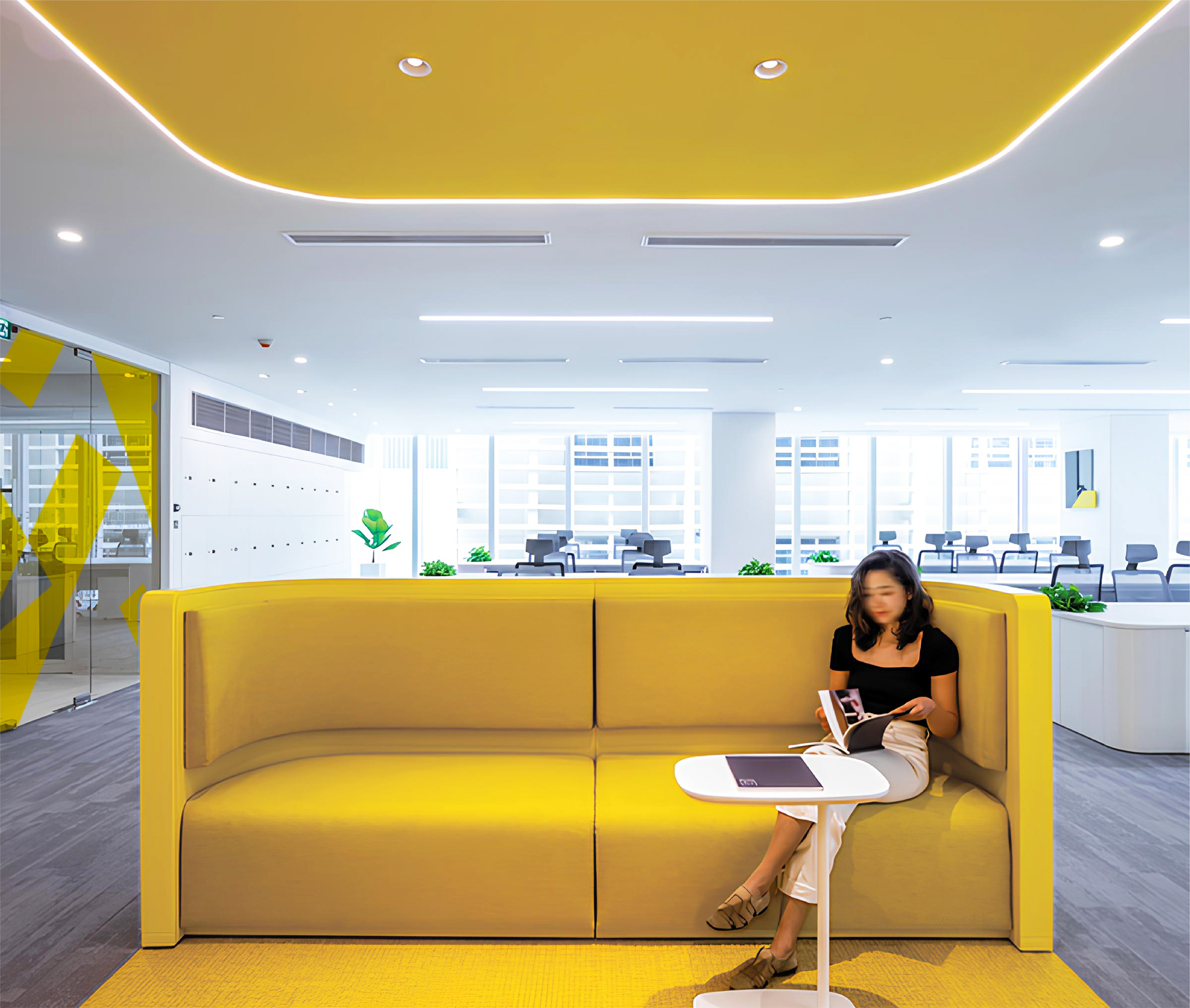
The overlapping initial "ㅎ" in various colors symbolizes the brand as a community where many come together. The geometric shapes—circle, square, and triangle—derived from the symbol represent children's limitless potential and are arranged in flexible variations. Additionally, the four brand colors, representing the light of hope, reflect the bright future that children and sponsors will create together. By embracing an energetic and vibrant image, the brand aims to convey the experience of joyful giving and position itself as a leader in fostering a new culture of sharing.
-
스튜디오텐저블은 국내 아동 지원을 최우선으로 하는 비영리 기관 희망라이트를 위한 브랜드 네임과 스토리, 아이덴티티까지 총체적인 브랜딩 프로젝트를 진행했습니다. 희망라이트는 아이들의 다양한 환경과 꿈에 주목하고, 전국 각지의 후원자들을 통해 취약 계층의 환경 개선에 목표를 두고 있는 기관입니다.
여러 가지 빛깔로 중첩된 이니셜 ㅎ은 다수가 참여하는 커뮤니티로서의 희망라이트를 상징합니다. 심볼에서 추출한 원형, 사각형, 삼각형의 기본적인 도형 형태는 아이들의 무한한 가능성을 나타내며, 다양하게 조합되는 변주를 통해 유연성 있게 전개됩니다.
또한 희망의 빛을 상징하는 네 가지 브랜드 컬러는 아이들과 후원자들이 함께 비추어나갈 미래를 나타냅니다. 경쾌하고 생동감 있는 이미지를 통해 ‘즐거운 기부’라는 브랜드 경험을 표현함으로써, 새로운 나눔문화를 만들어가는 브랜드로 포지셔닝하고자 했습니다.
또한 희망의 빛을 상징하는 네 가지 브랜드 컬러는 아이들과 후원자들이 함께 비추어나갈 미래를 나타냅니다. 경쾌하고 생동감 있는 이미지를 통해 ‘즐거운 기부’라는 브랜드 경험을 표현함으로써, 새로운 나눔문화를 만들어가는 브랜드로 포지셔닝하고자 했습니다.

tangiblebd.com