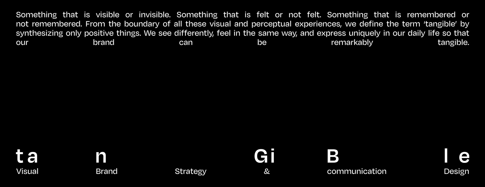
Studio tanGiBle
Design Studio Branding
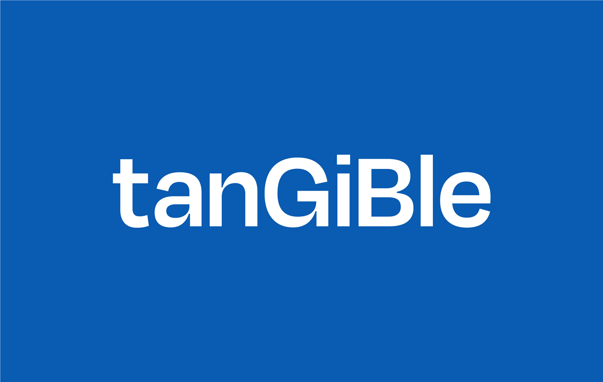
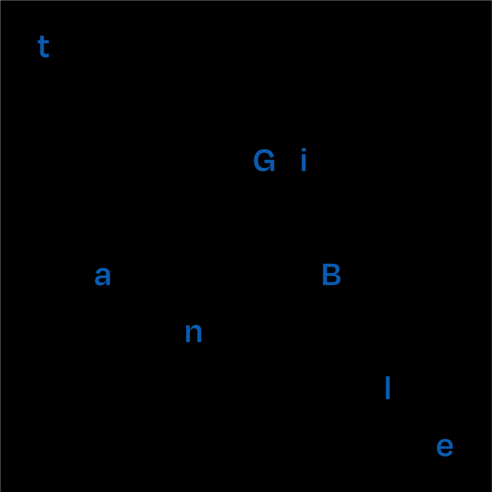
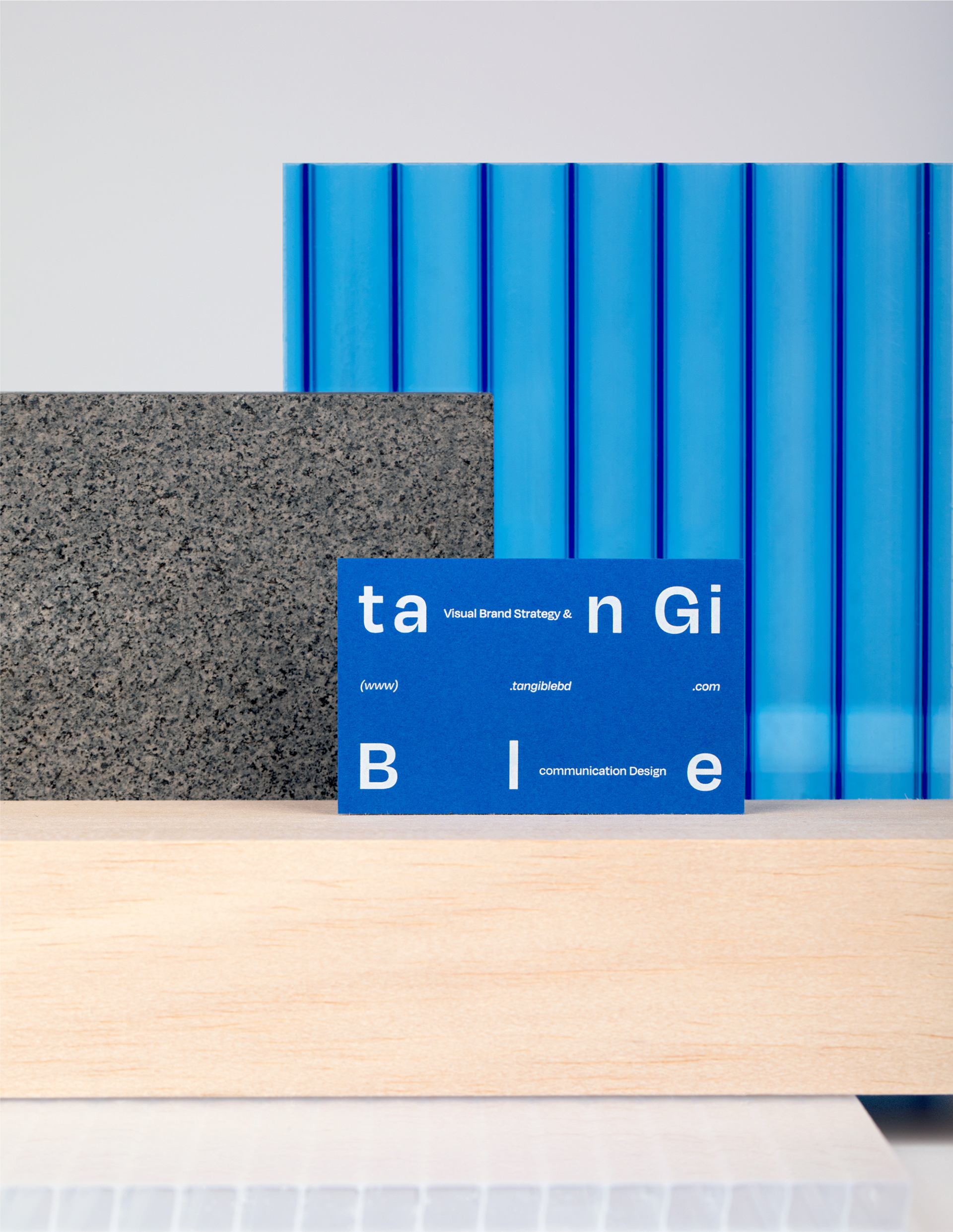
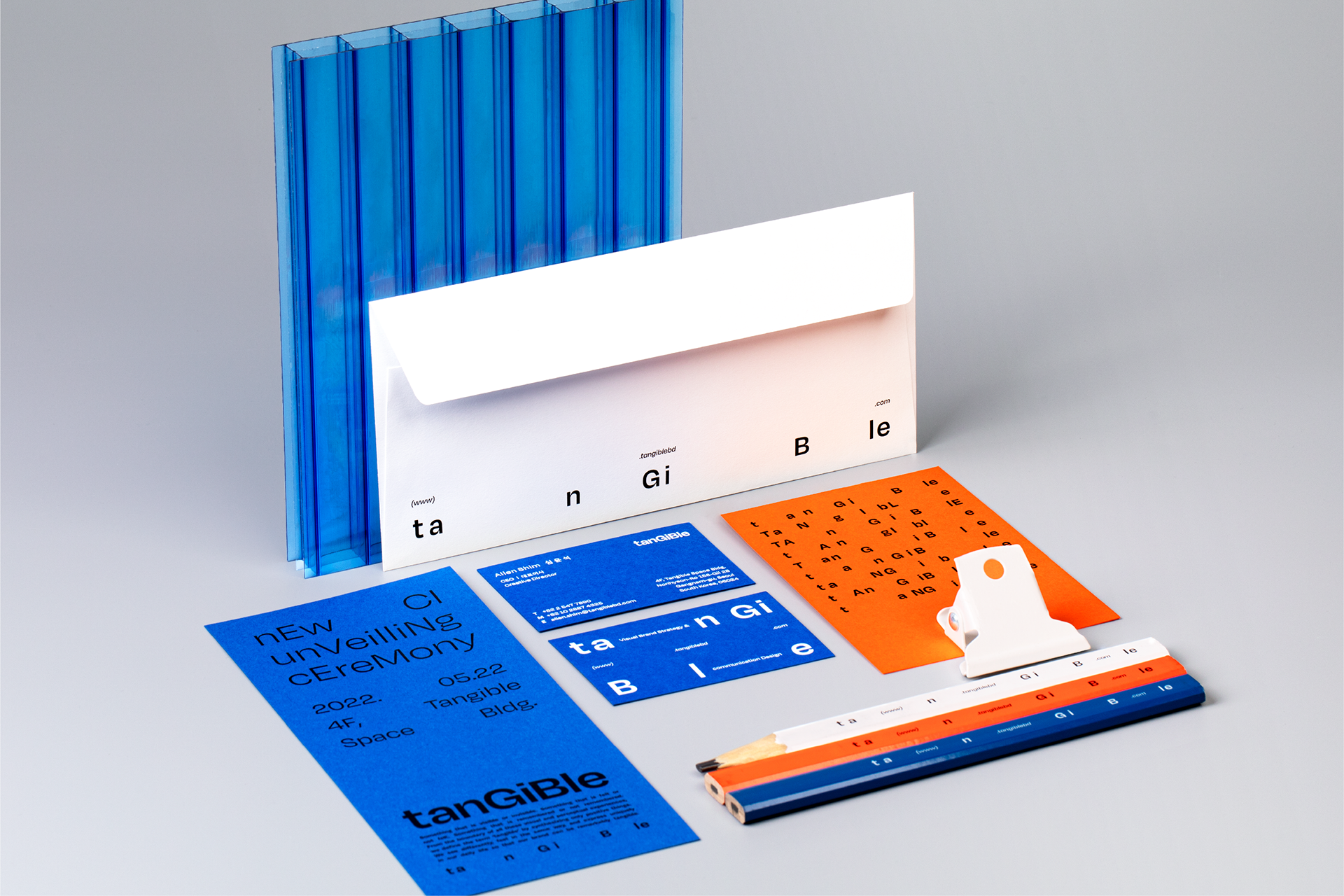
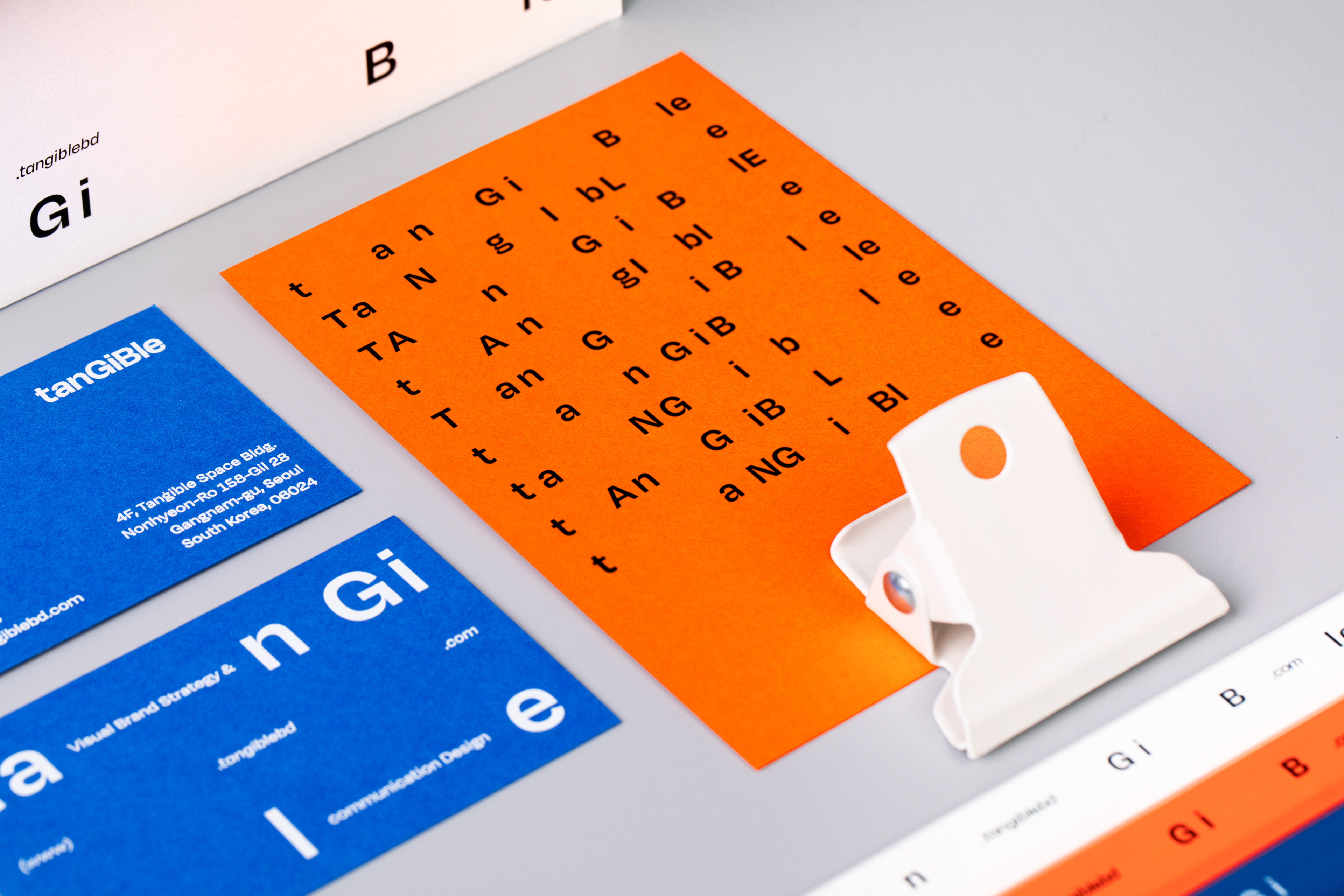
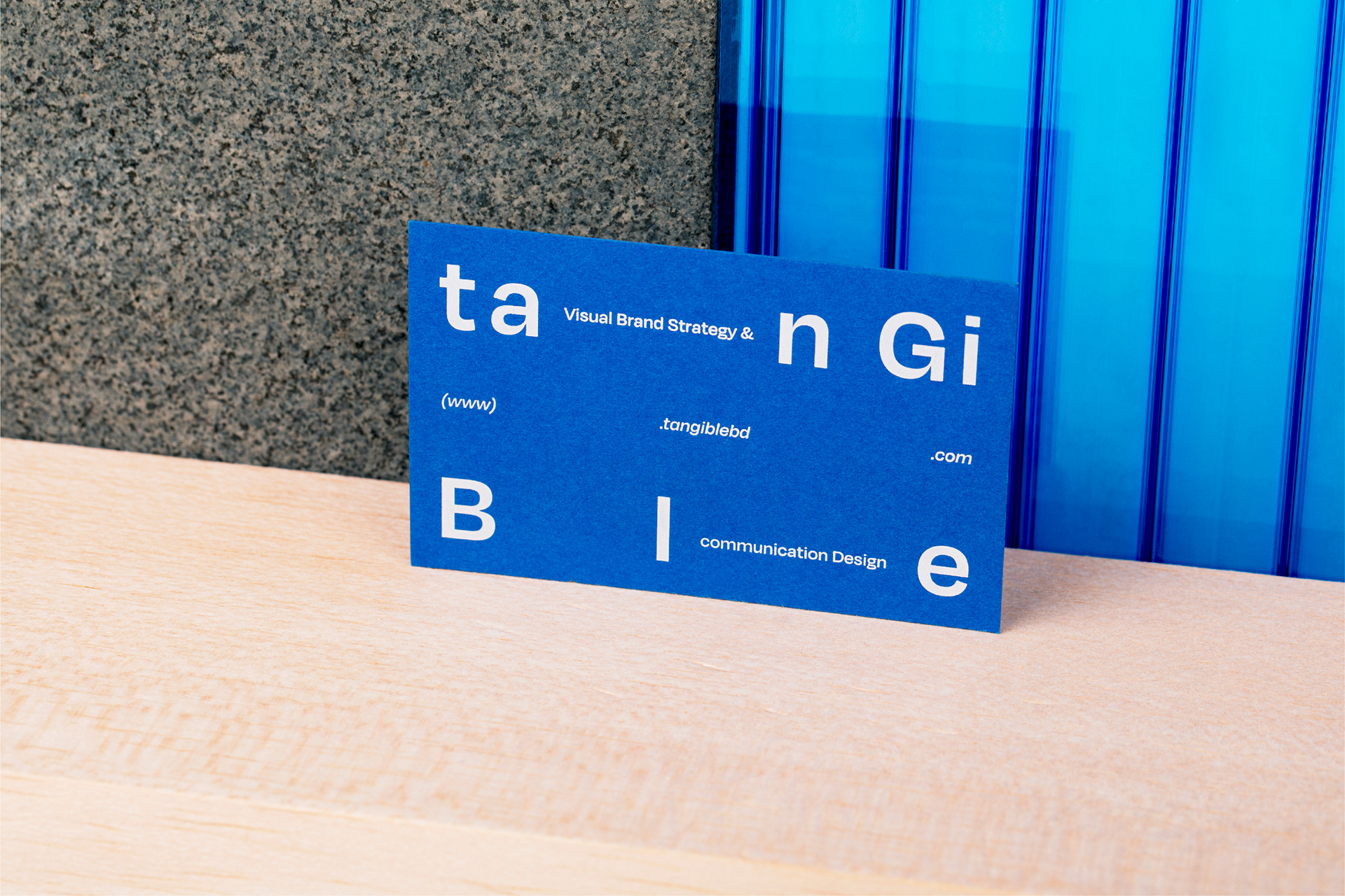
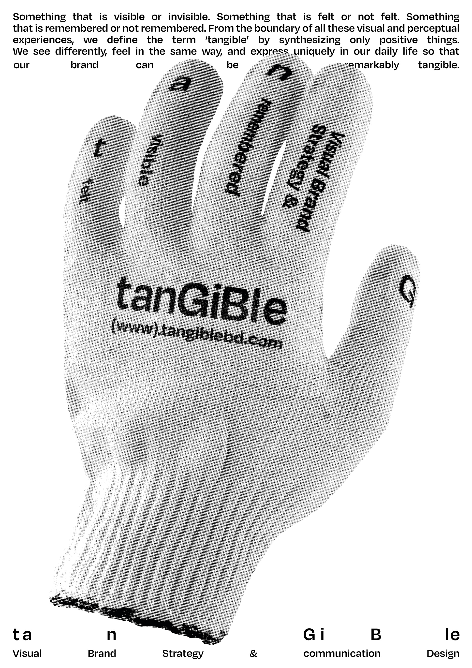
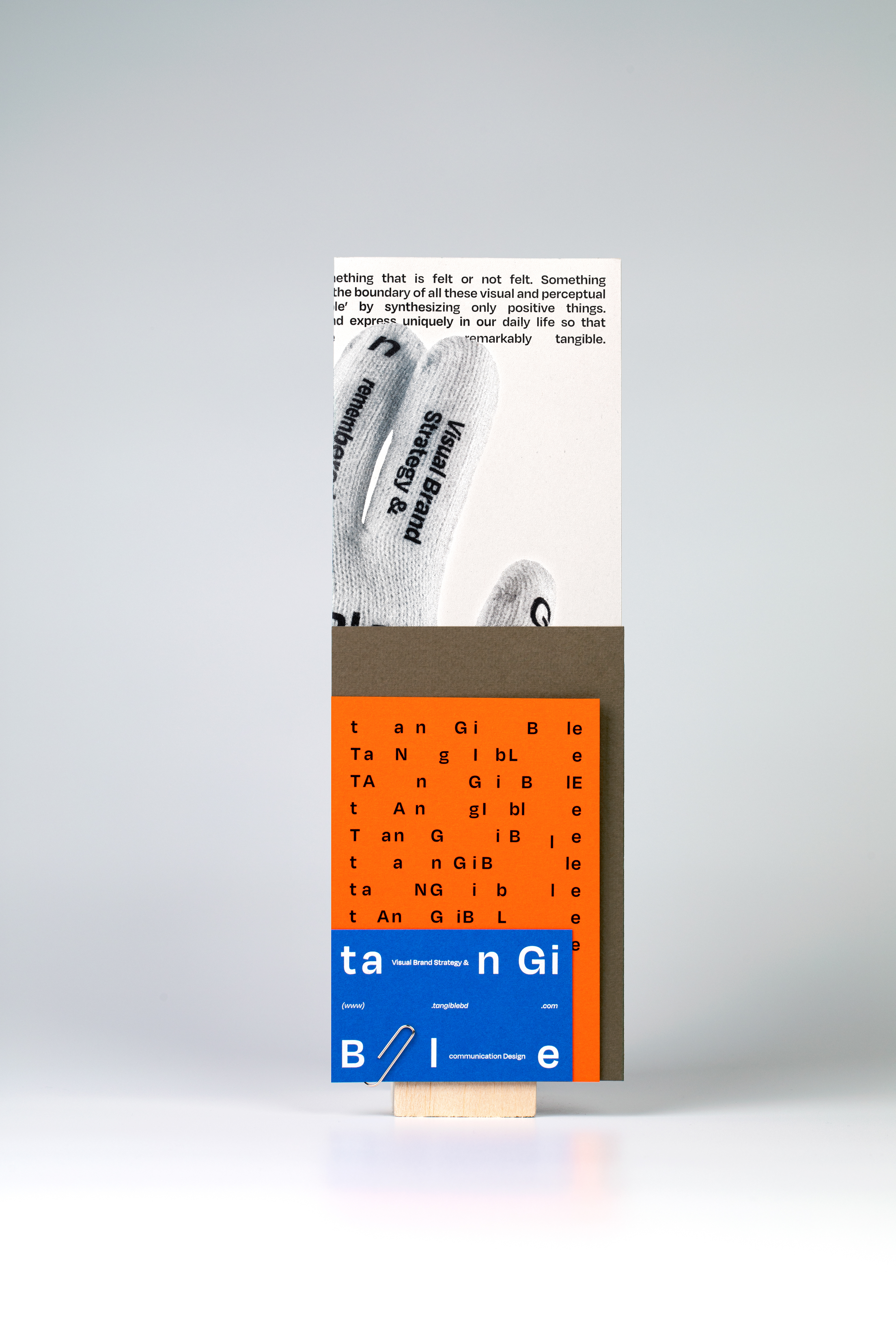
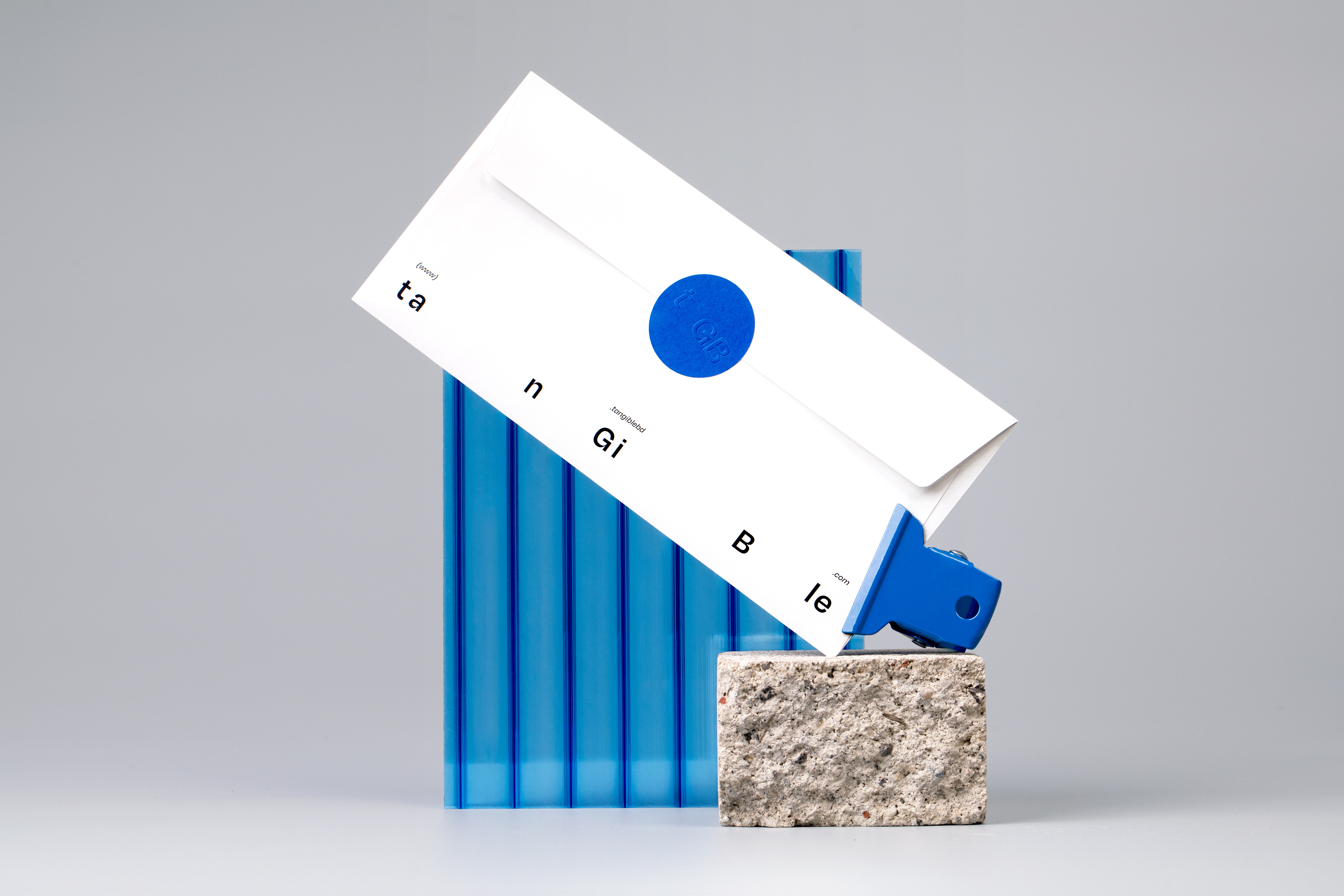
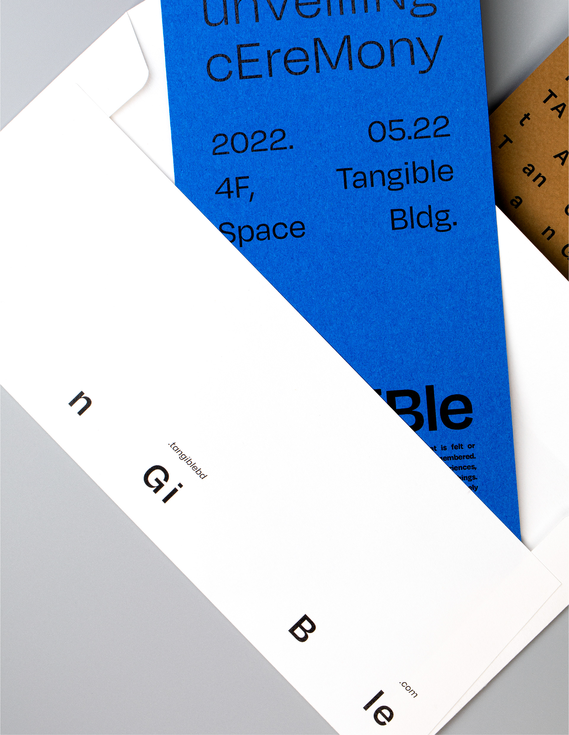
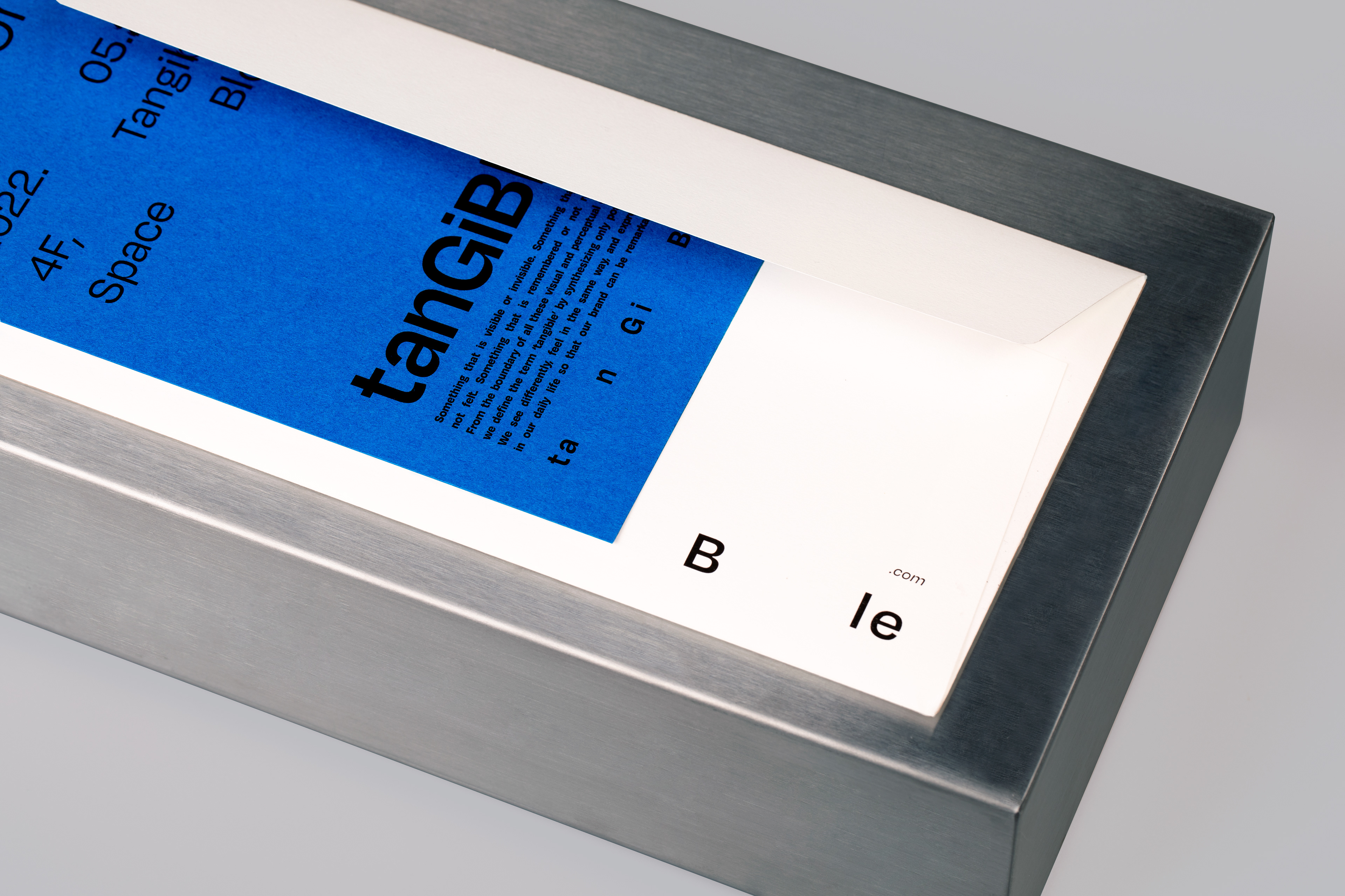
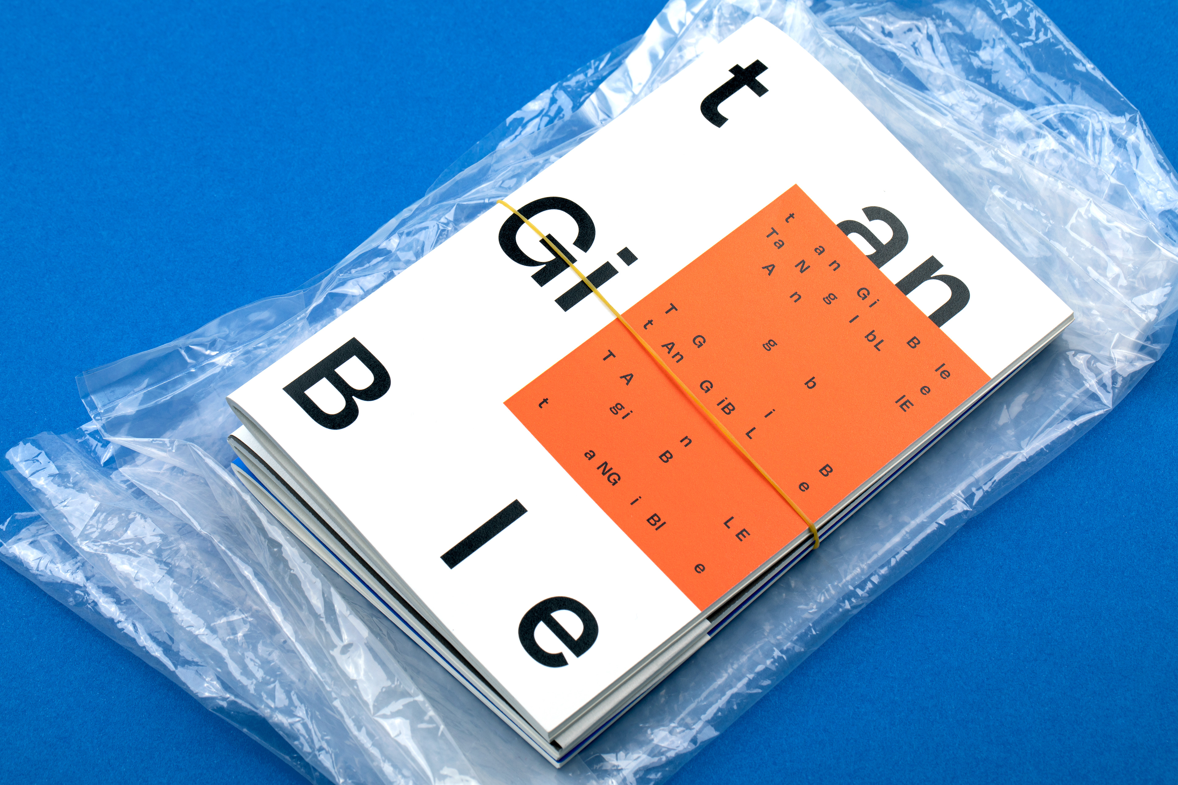
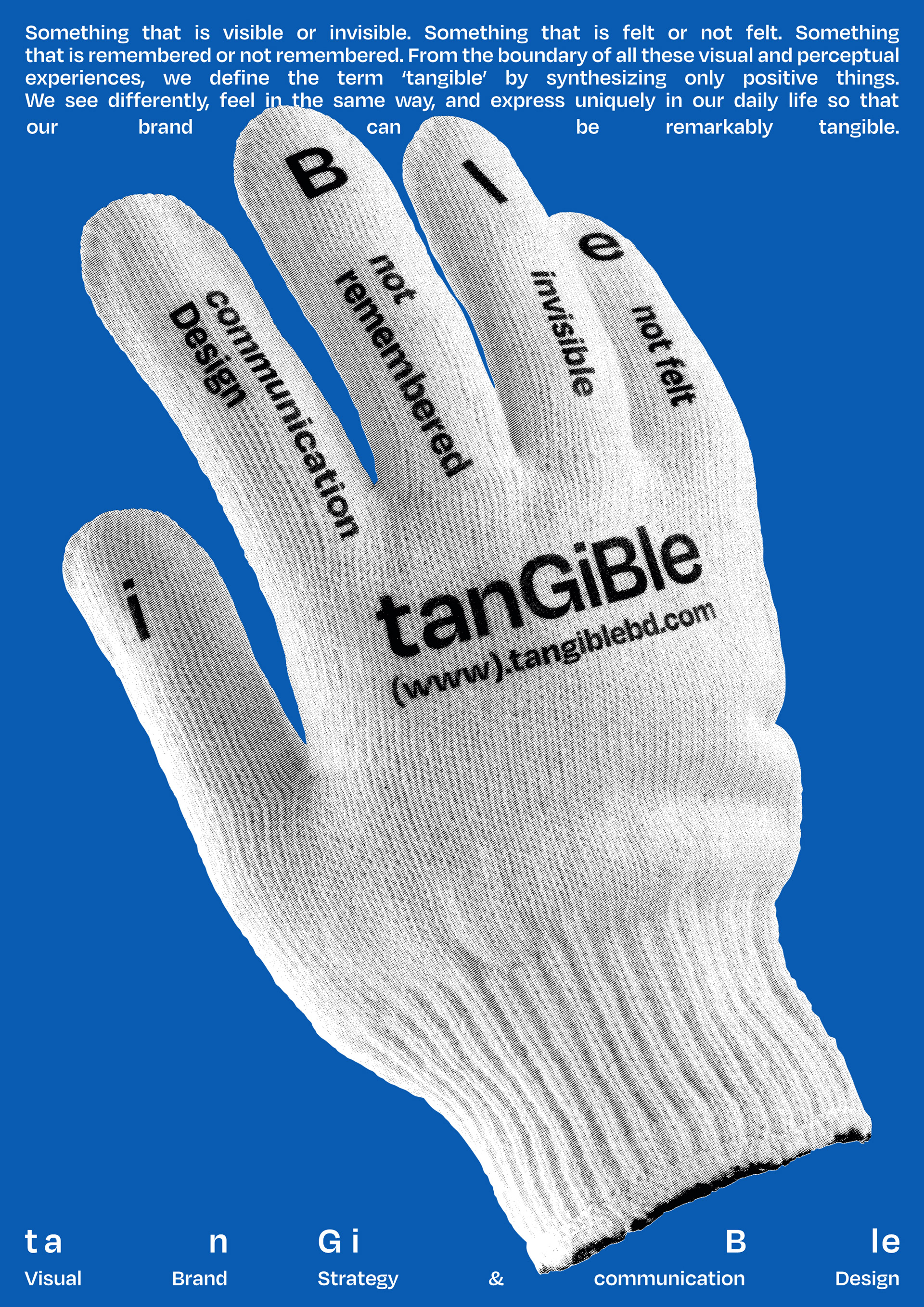
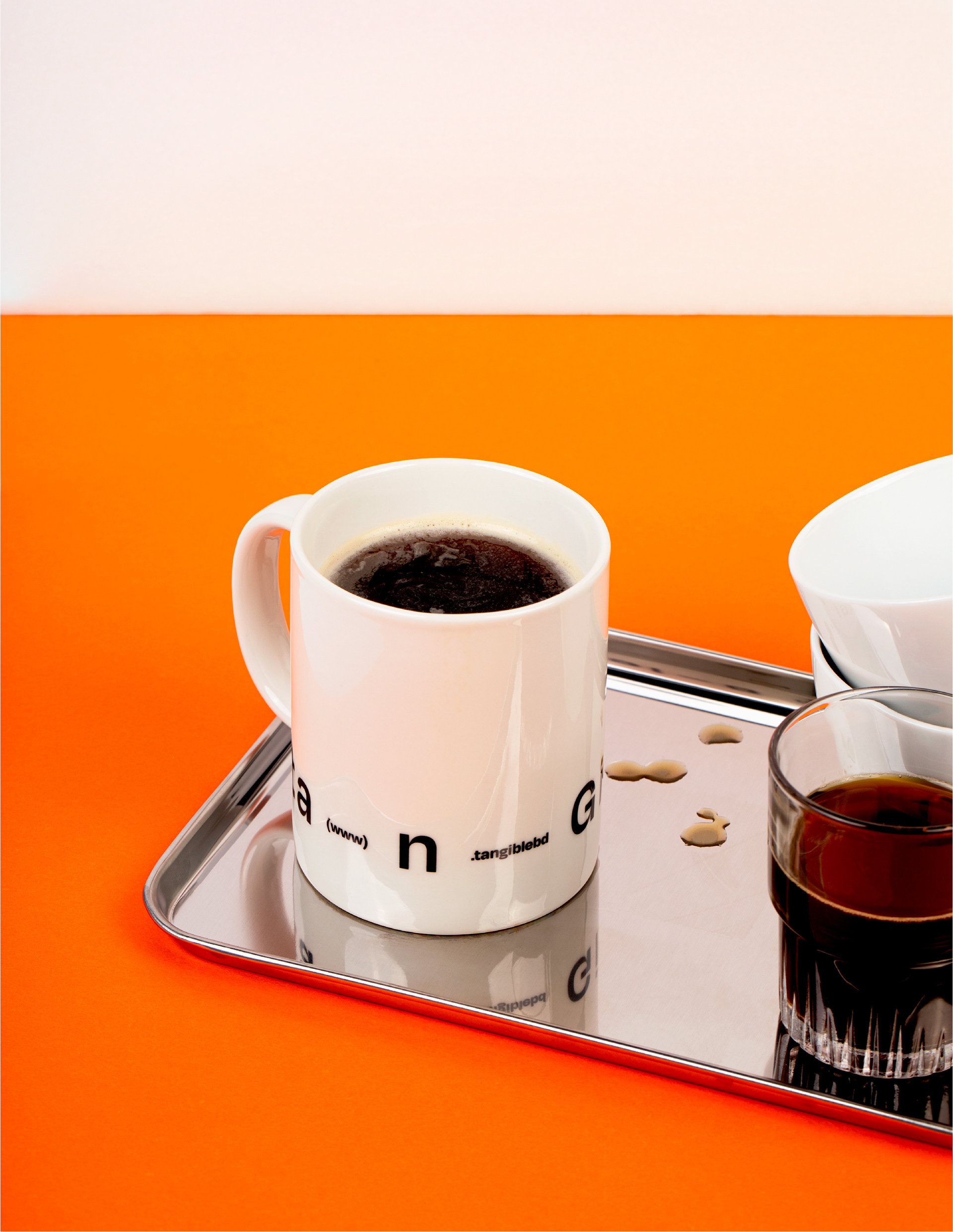
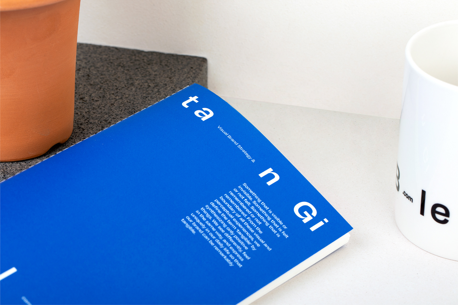
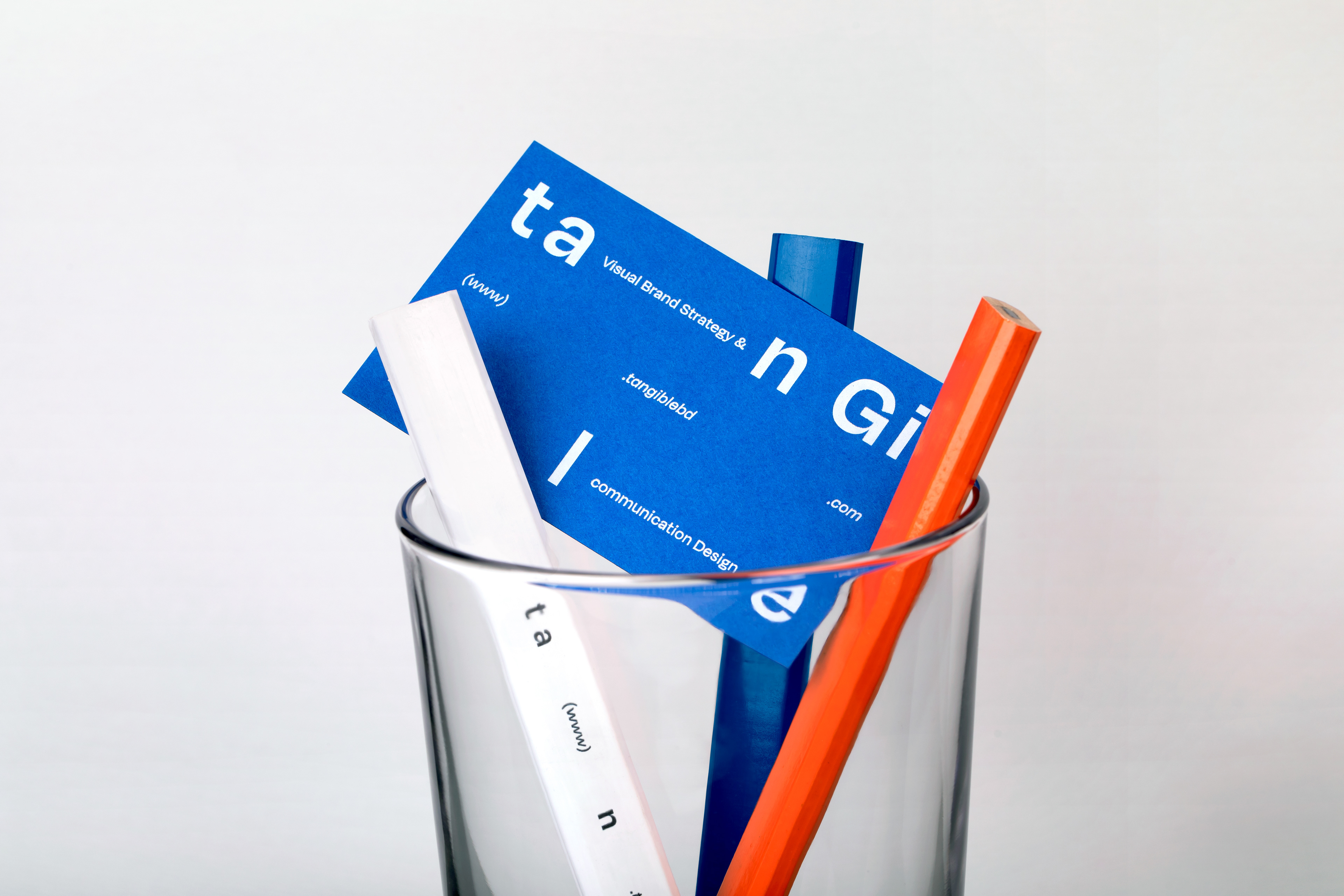
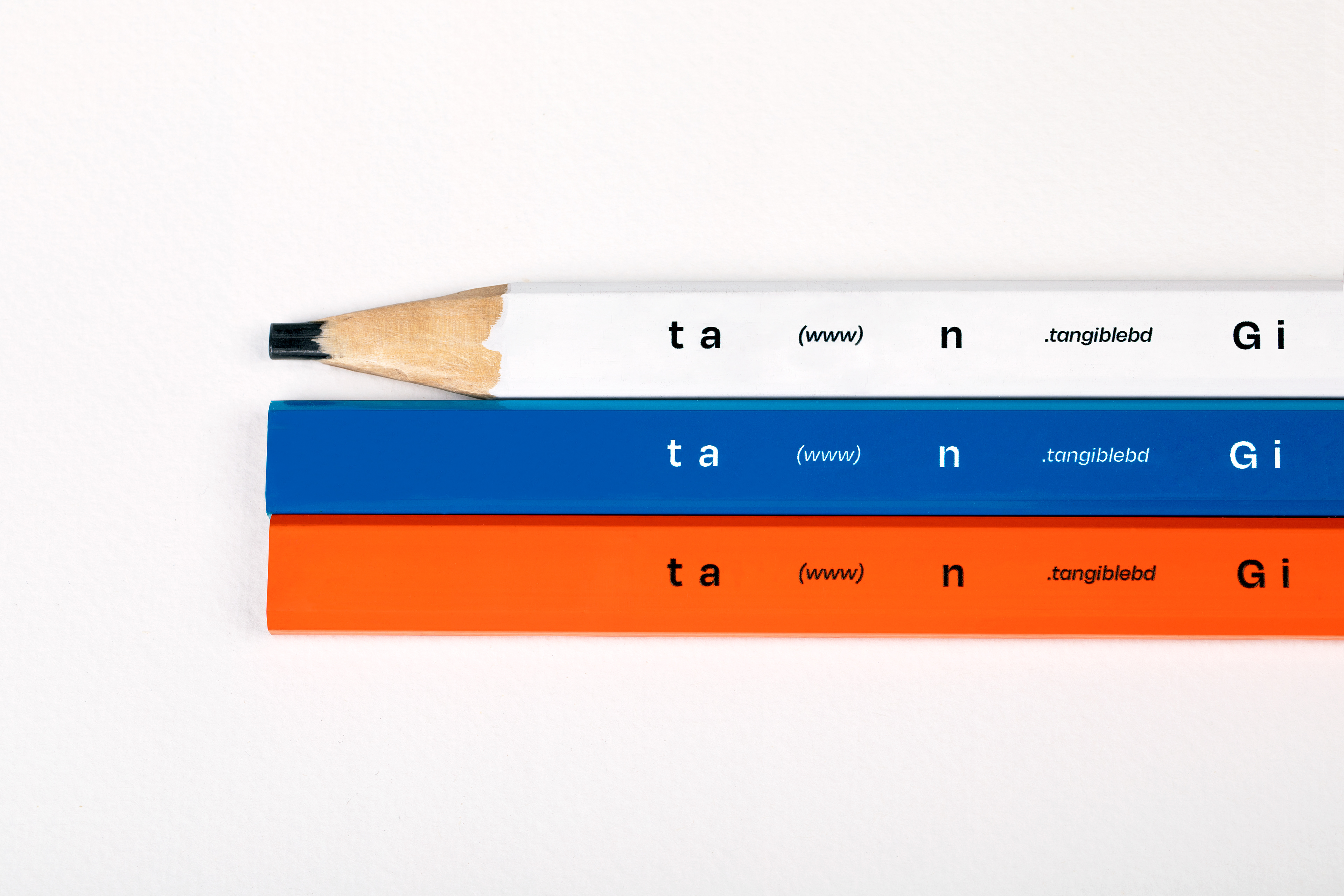
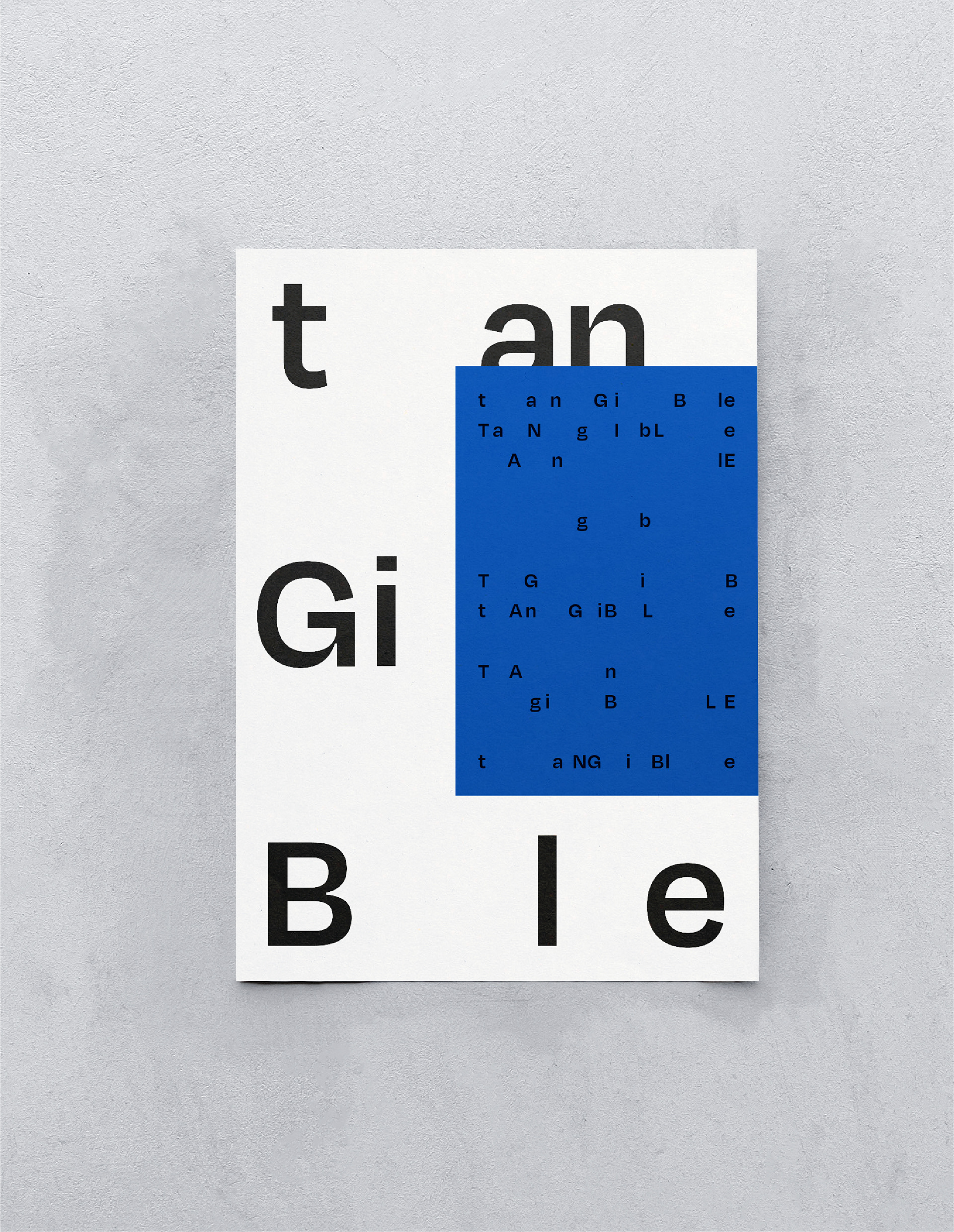
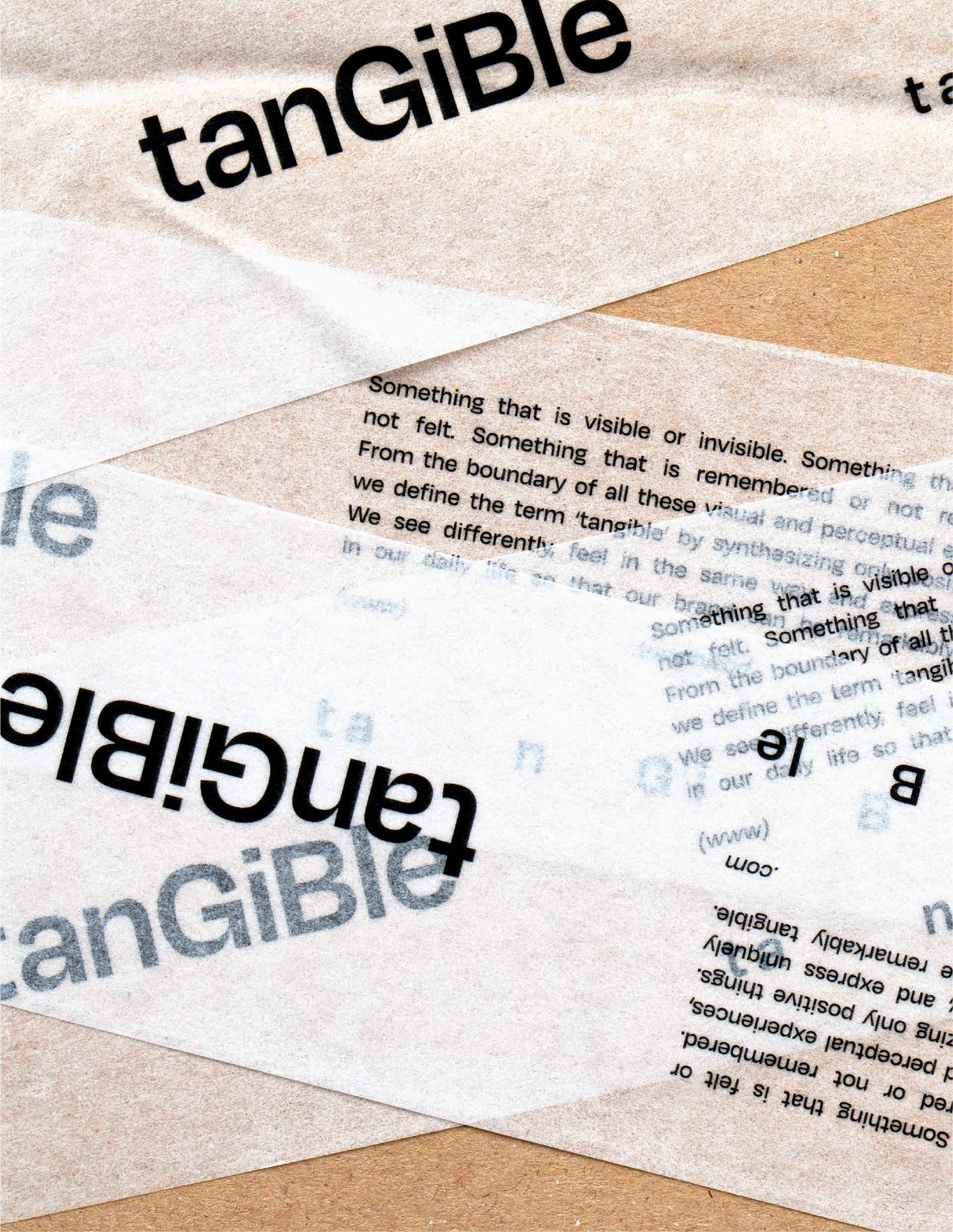
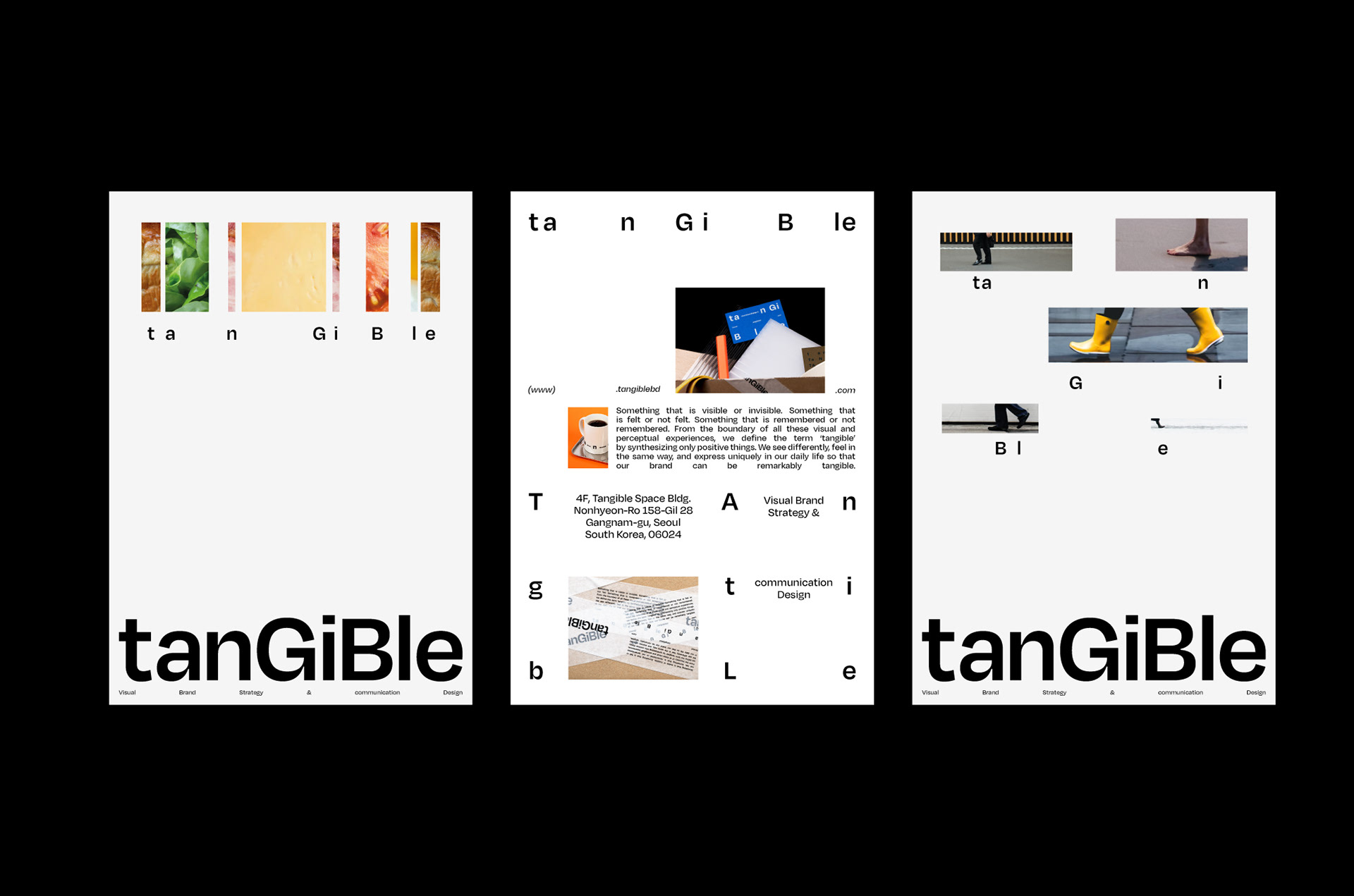
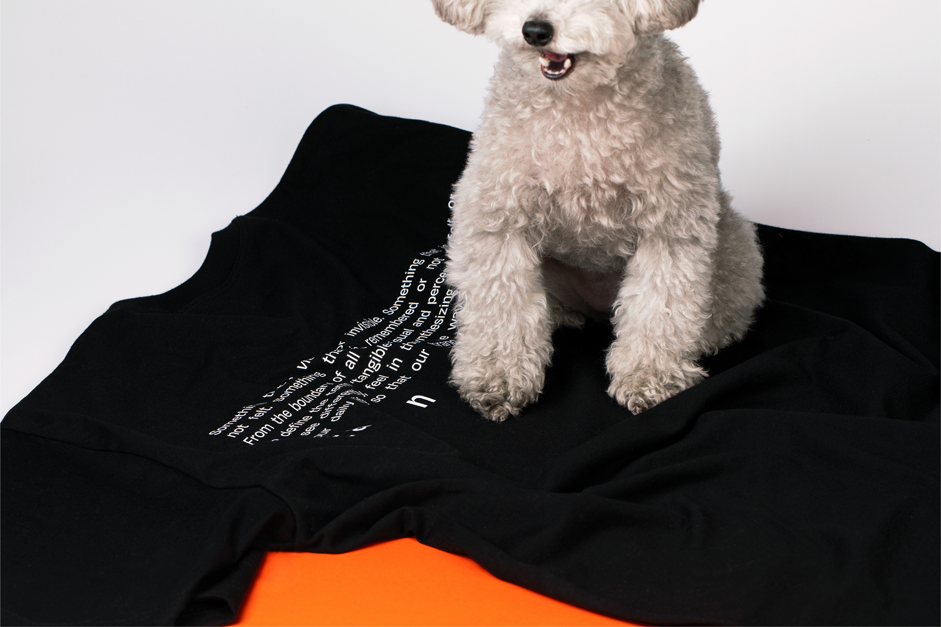
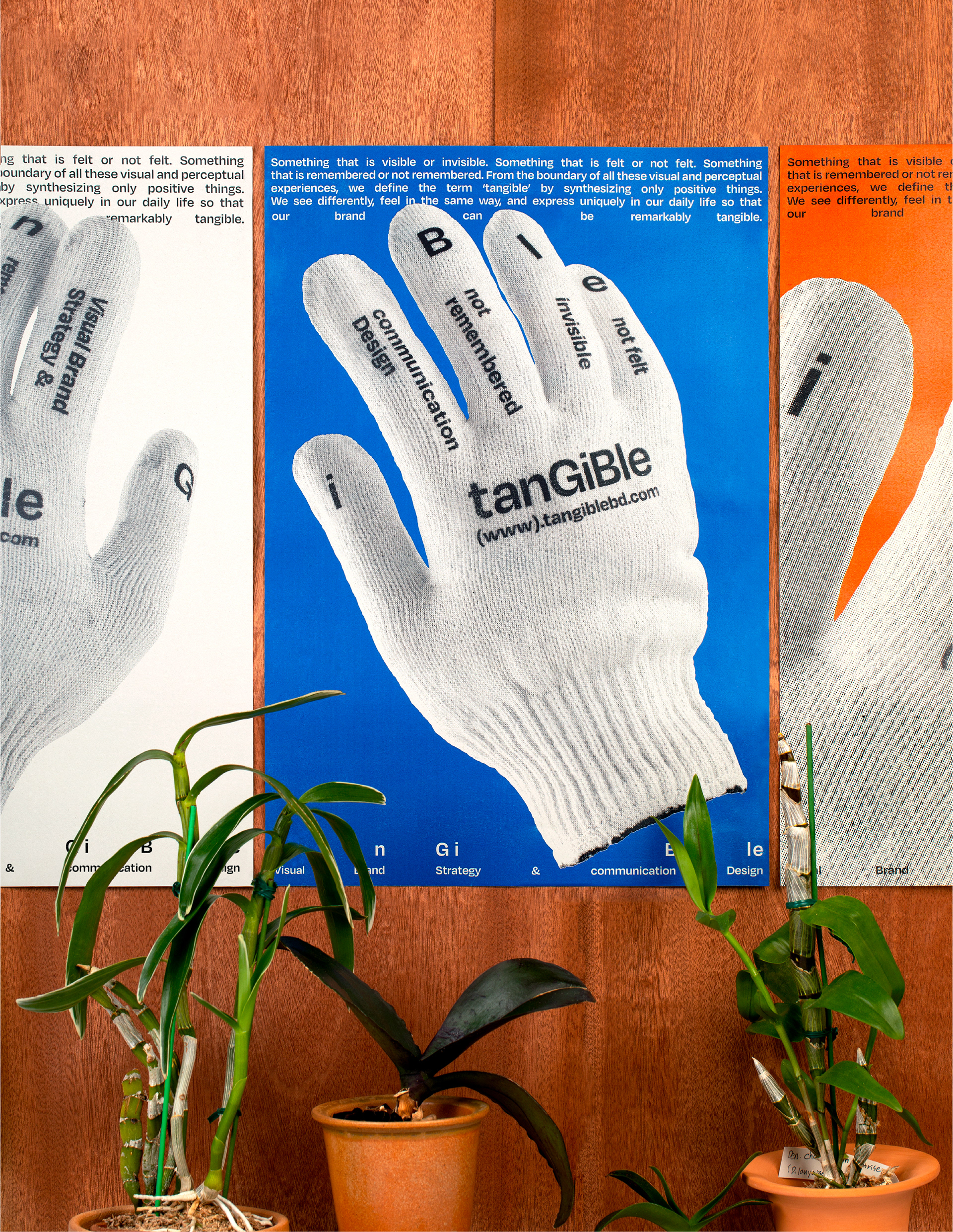
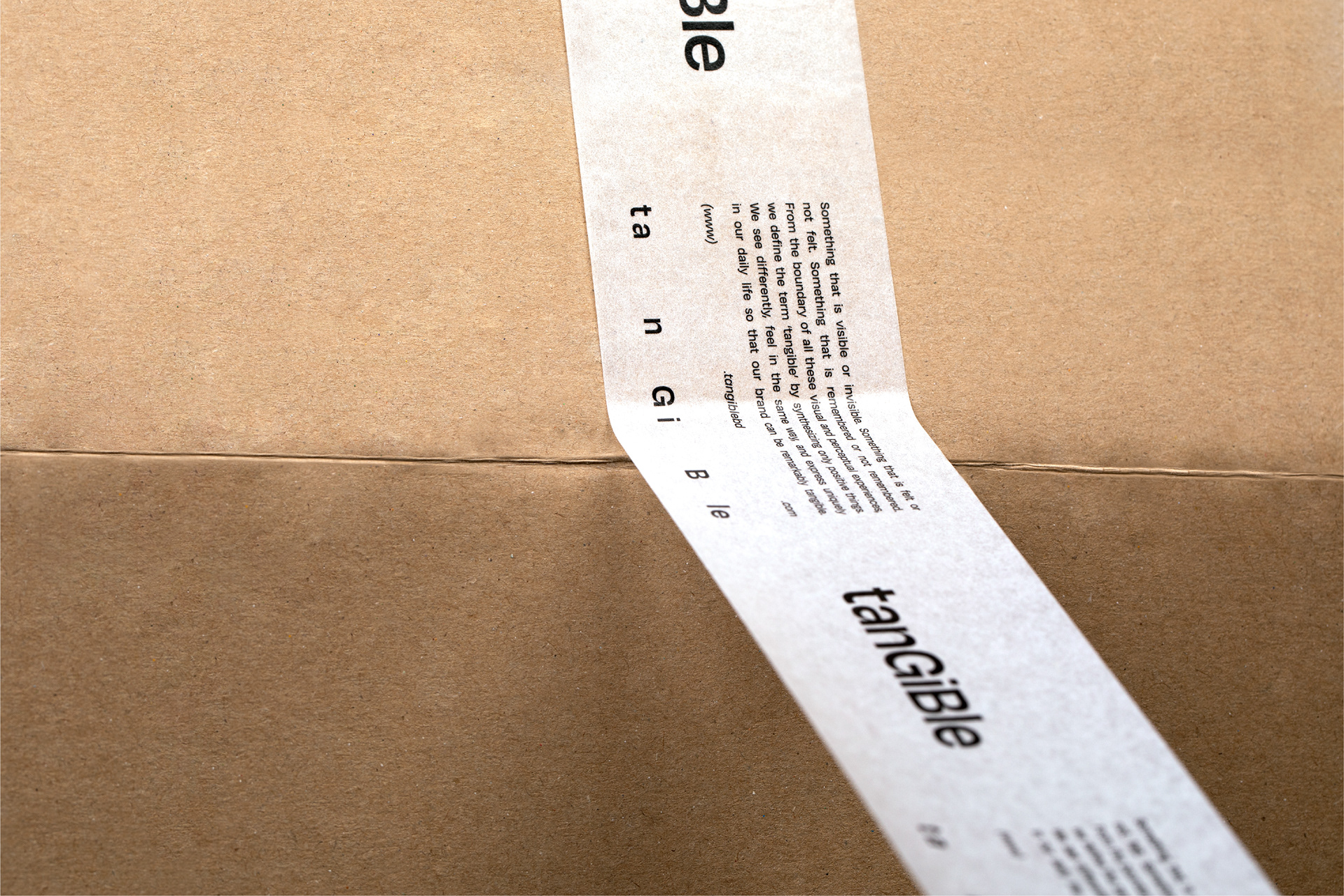
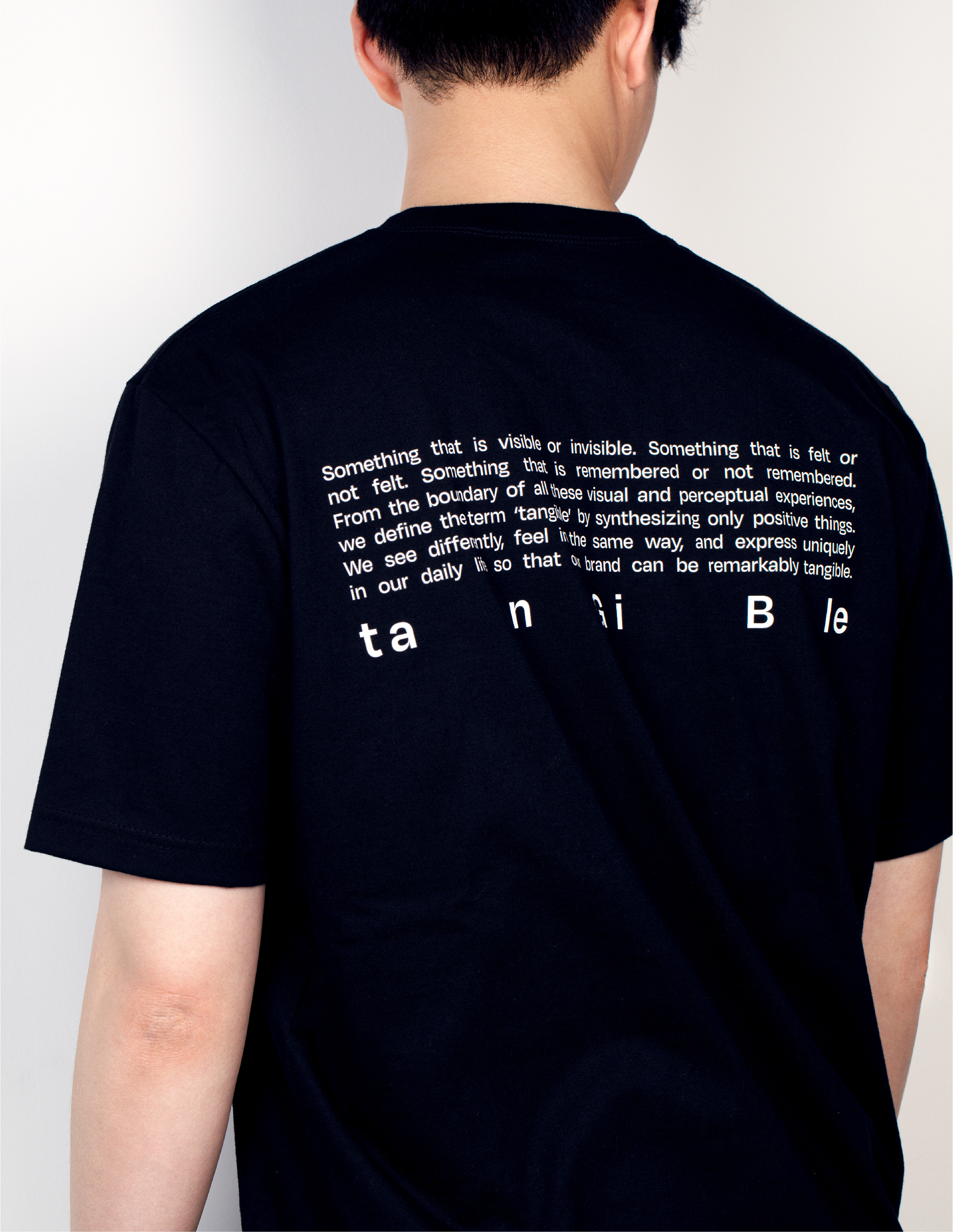
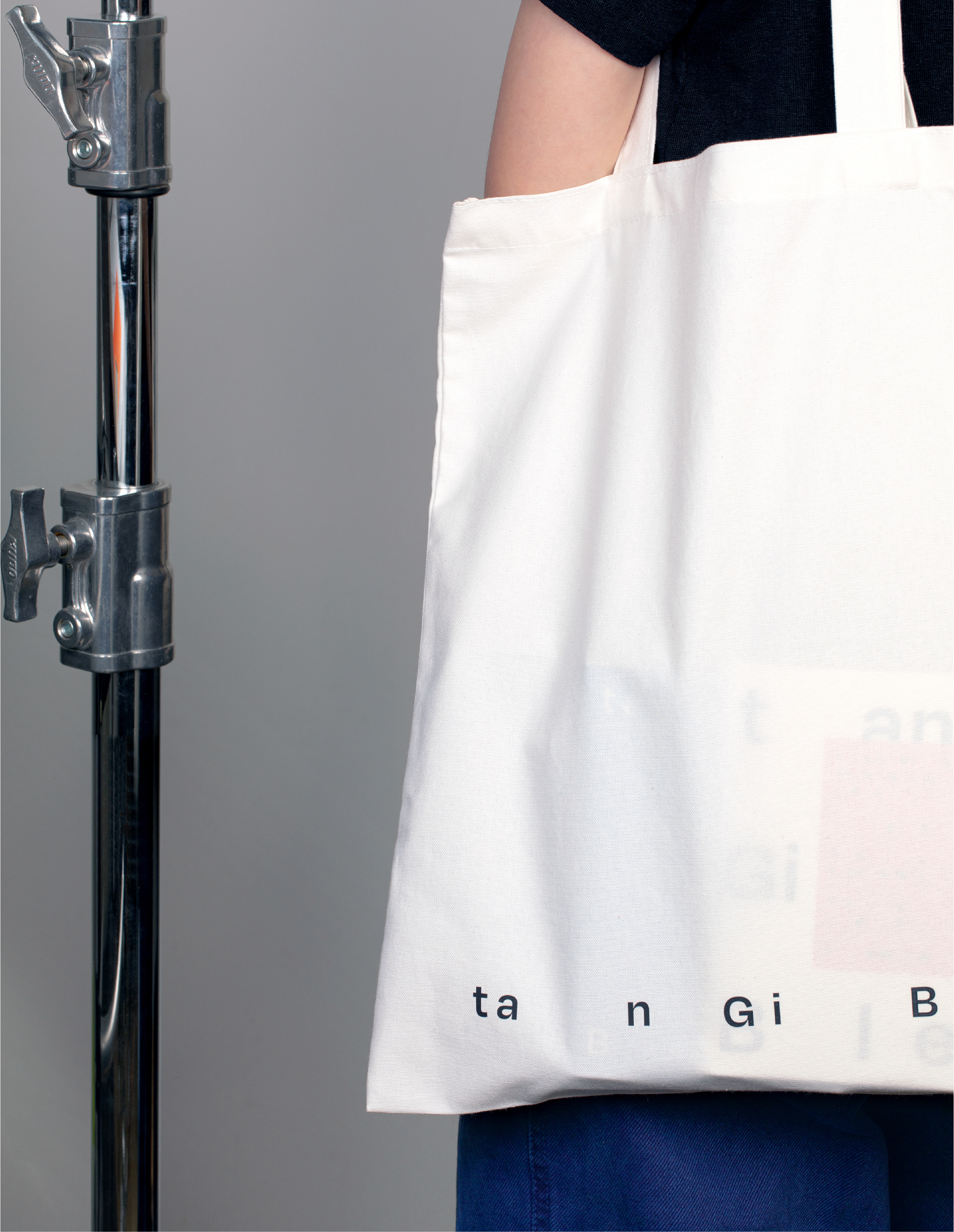
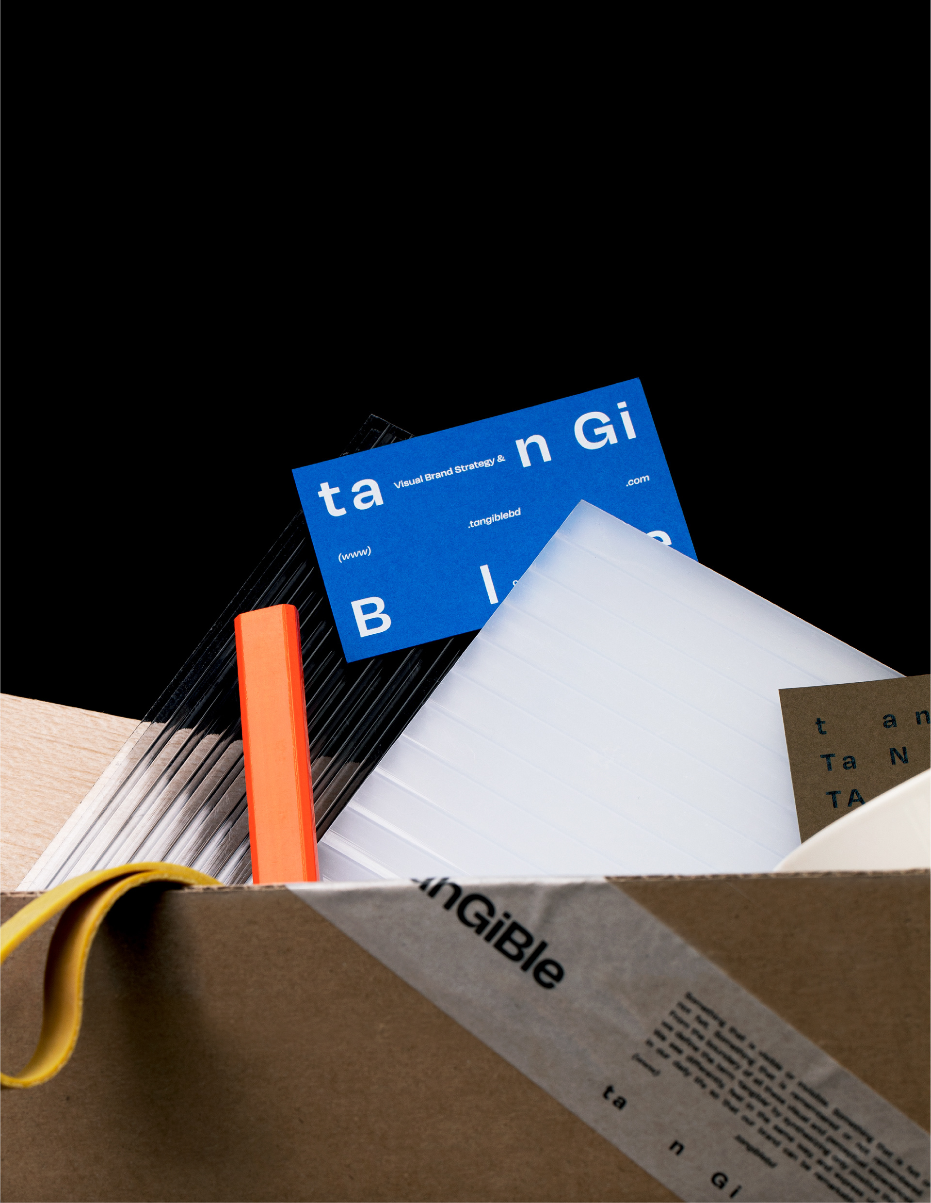
Tangible’s new BI system is freely mixed with upper case and lower case, so that overall length can be stretched and
shortened flexibly. This flexibility shows the Tangible to create stories and designs optimized for various brands without
limit on categories, the way of expression, and target. BI represents the Tangible’s boundless visual perception through
countless figures, frames, and images that align creatively. The main color, blue symbolizes nature and cutting edge
at the same time. It also expresses openness that can accommodate various perspectives. The sub-color orange
represents adventure and positivity through constant exploration with Tangible aims.
_
텐저블의 새로운 BI 시스템은 대소문자가 자유롭게 혼재하고, 전체적인 길이 또한 유연성있게 늘어나고 줄어든다. 이러한 시스템은 카테고리, 표현 방법,
타겟에 제한없이 다양한 브랜드에 최적화된 스토리와 디자인을 창출하는 텐저블의 지향점을 표현한다. BI는 무수한 형태의 프레임, 이미지 속에서 창의적으로
얼라인됨으로써 텐저블이 창출할 시지각적 무한대를 나타낸다. 메인 컬러인 블루는 자연과 첨단을 동시에 상징하는 양면성을 가진 색으로, 다양한 시각을
수용할 수 있는 개방성을 상징한다. 서브컬러인 오렌지 컬러 역시 텐저블이 지향하는 끊임없는 탐색을 통한 모험과 긍정을 나타낸다.