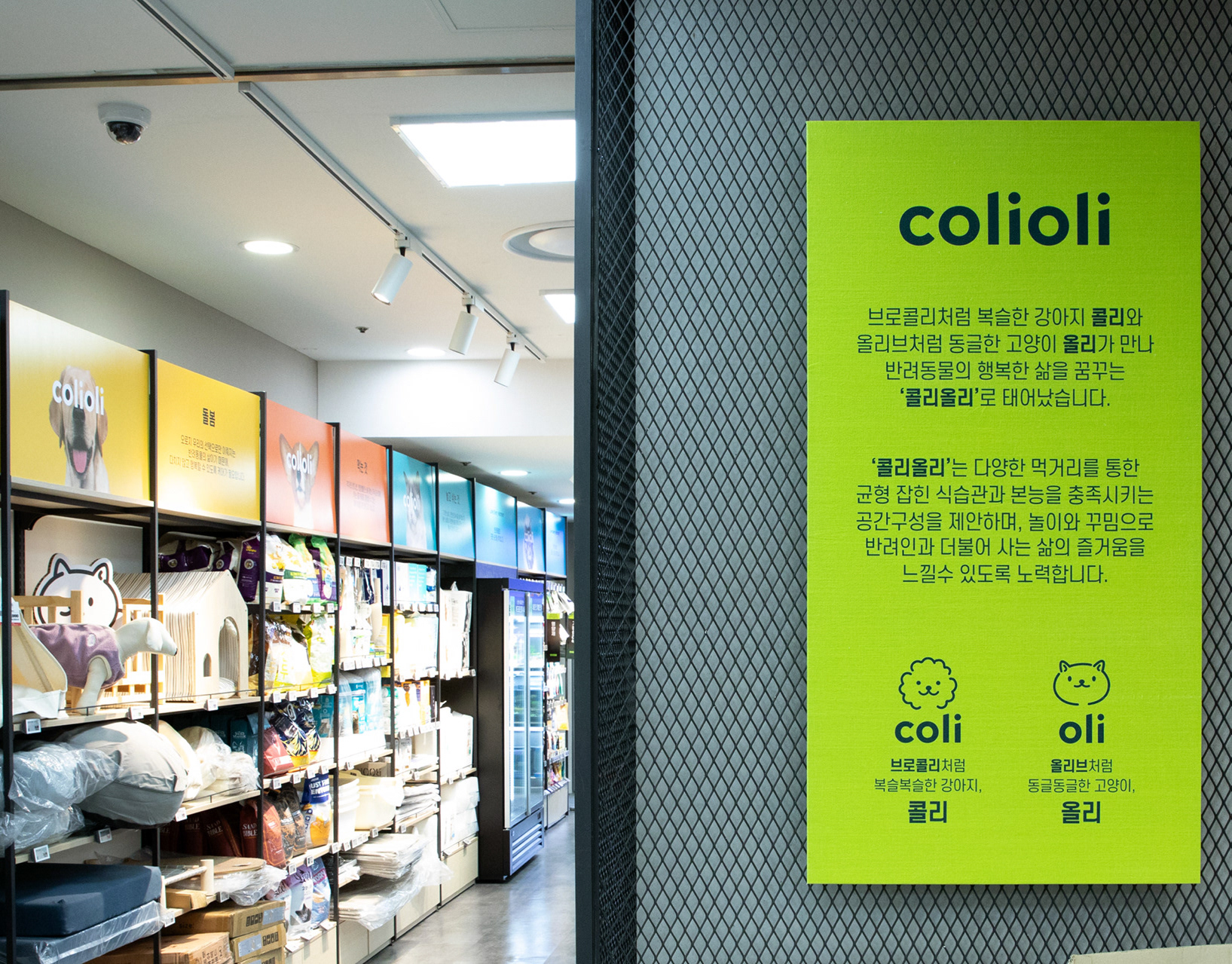
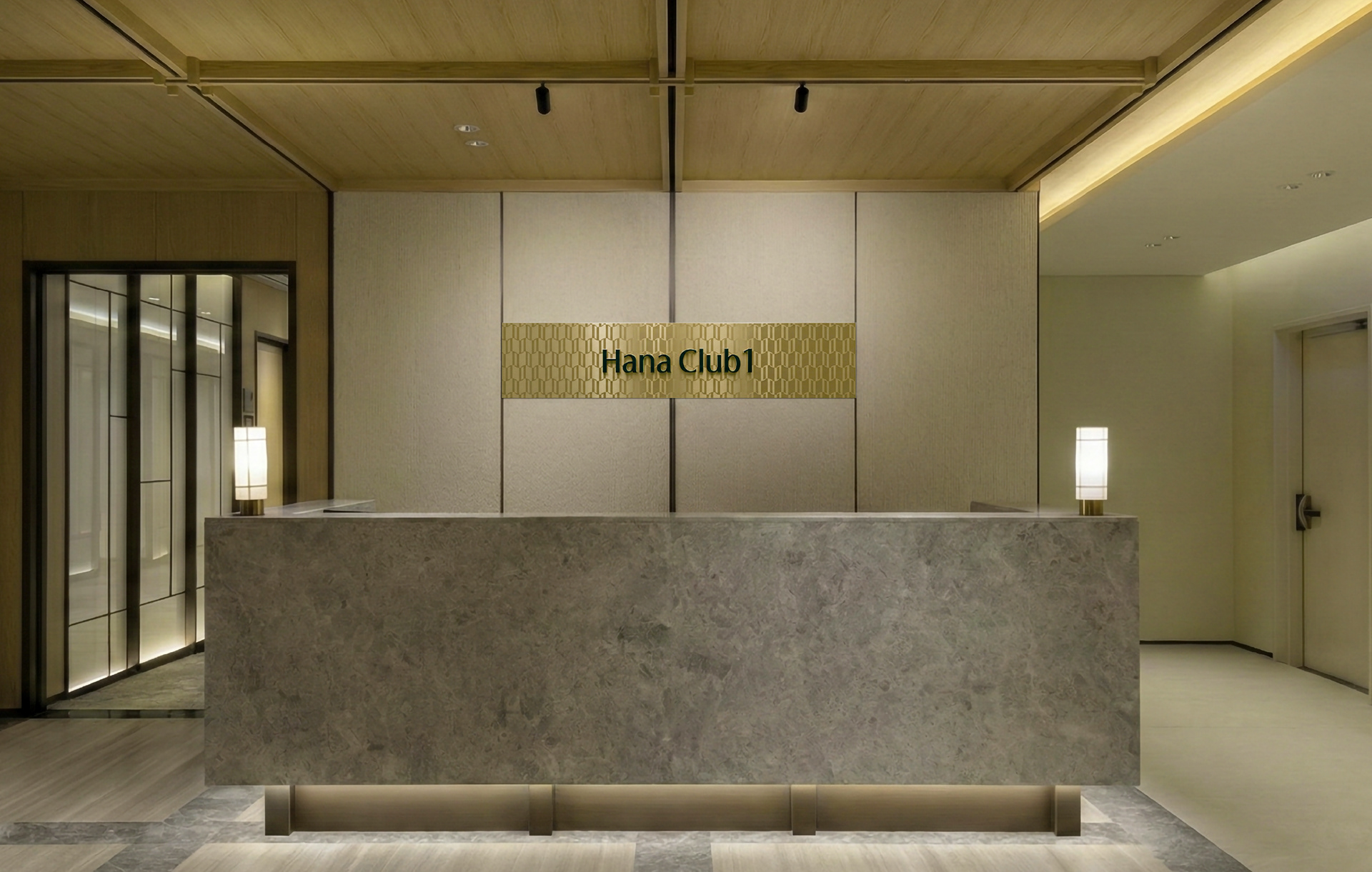
Hana Club 1
Branding
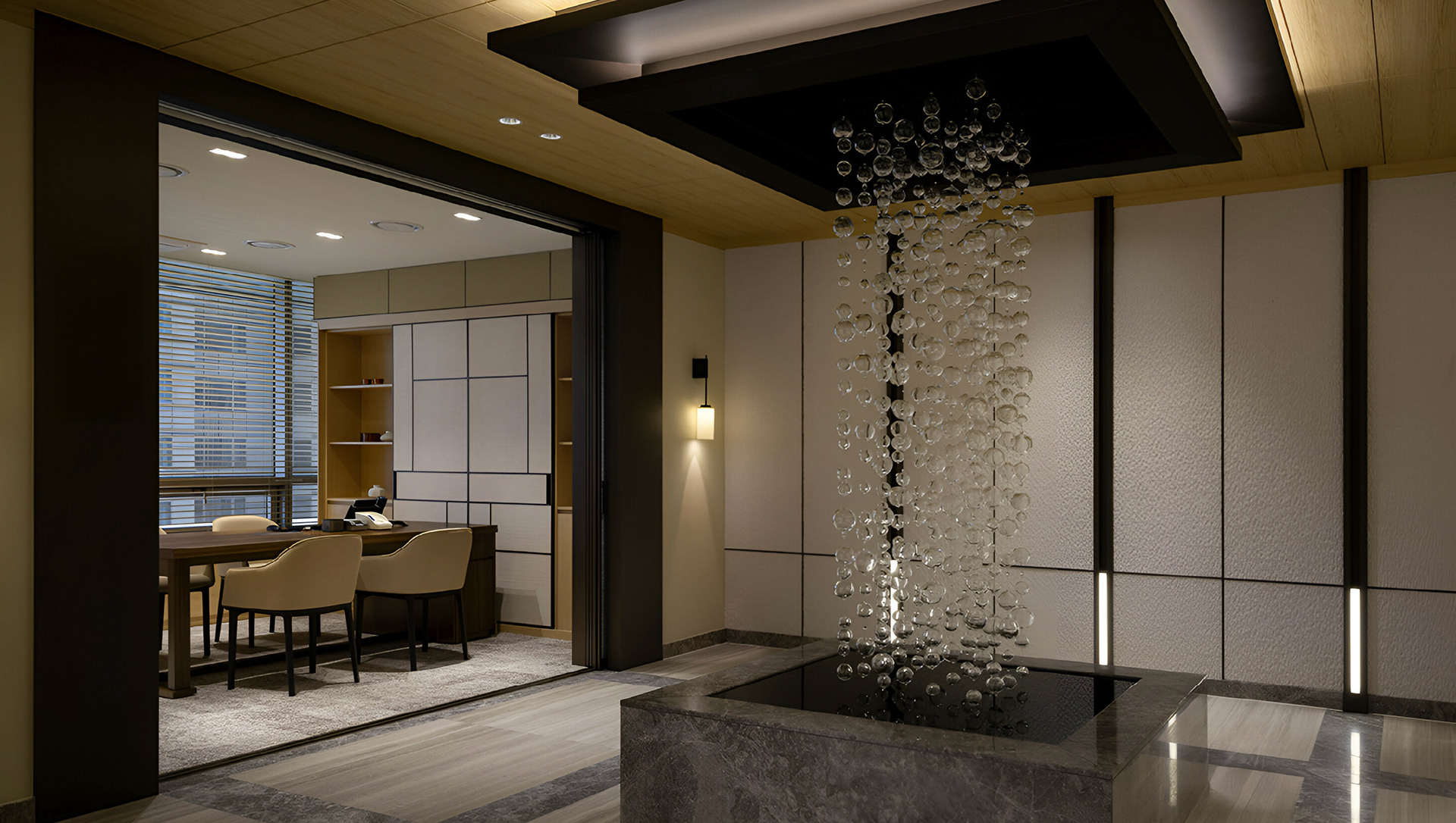
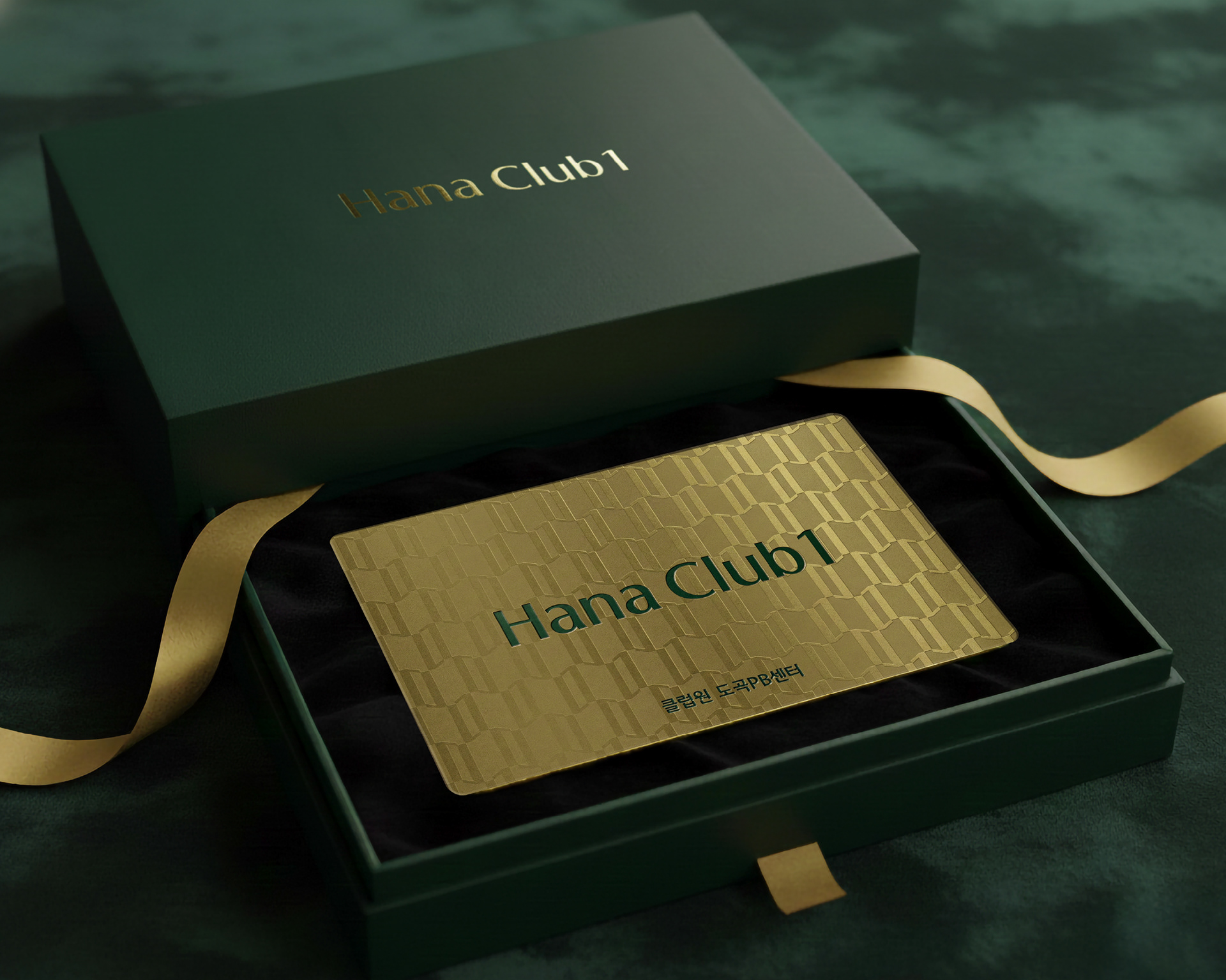
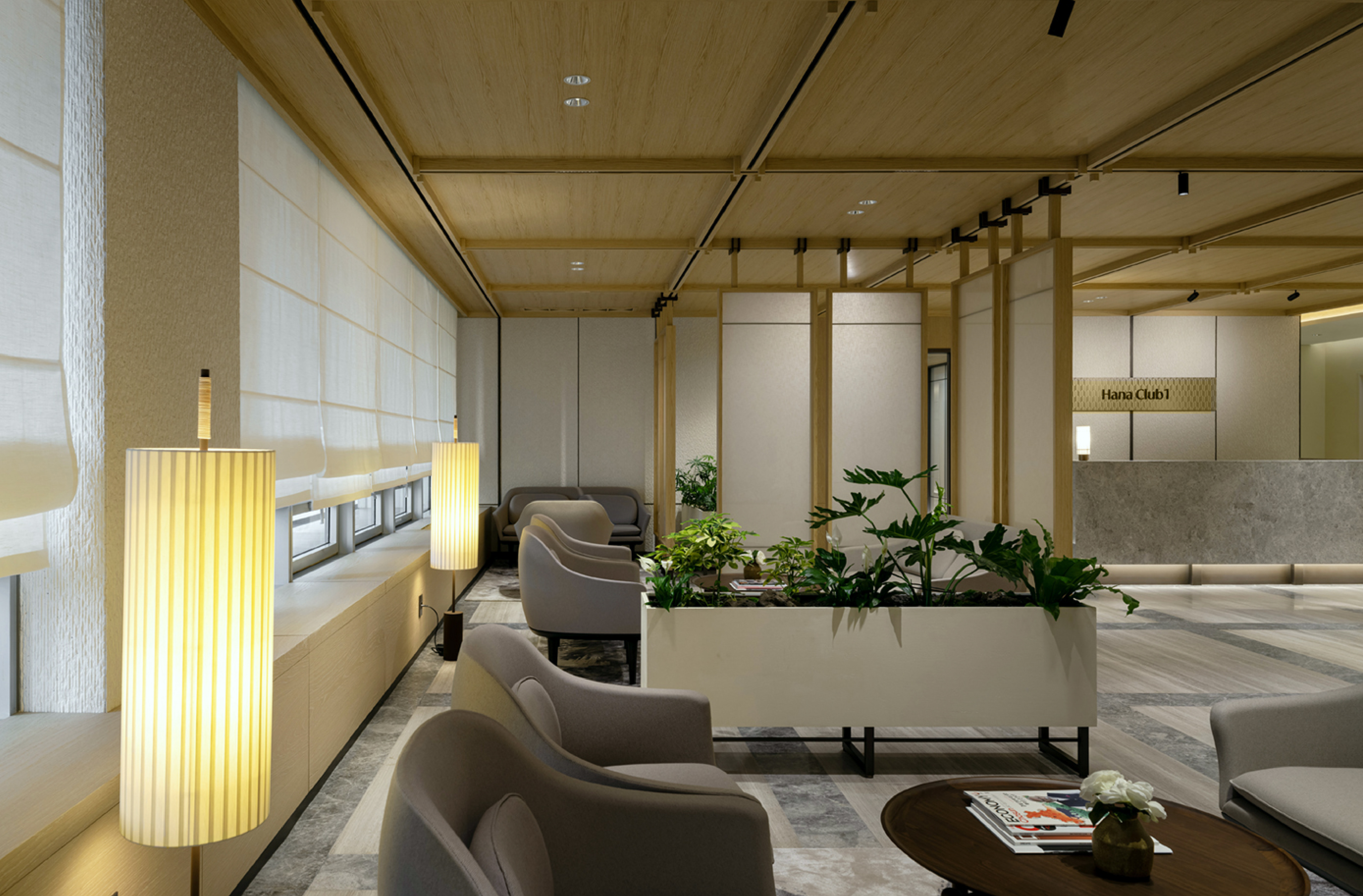
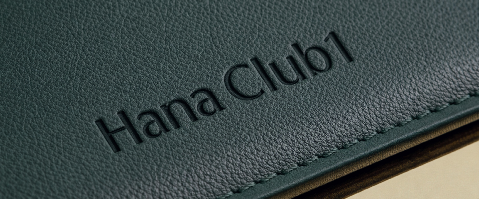
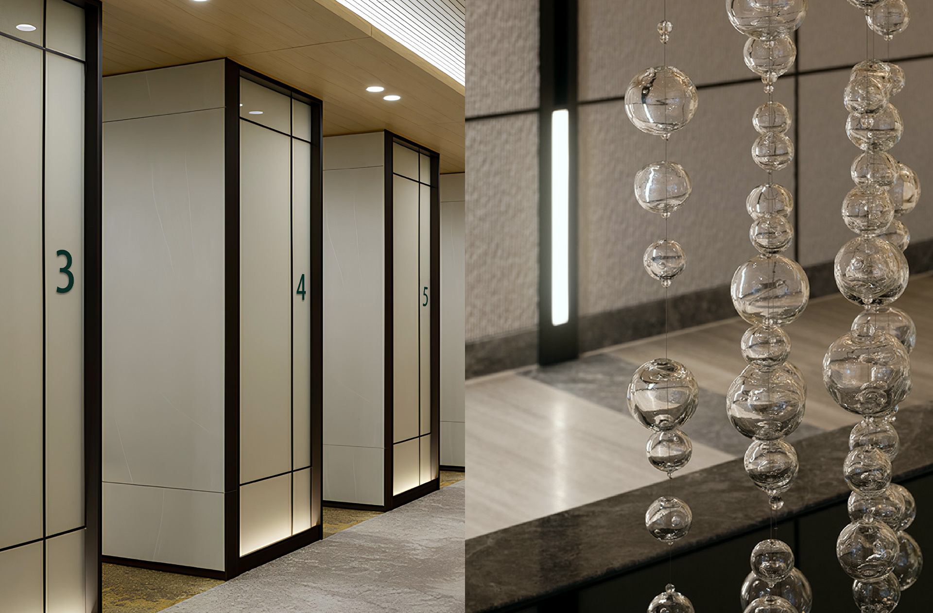
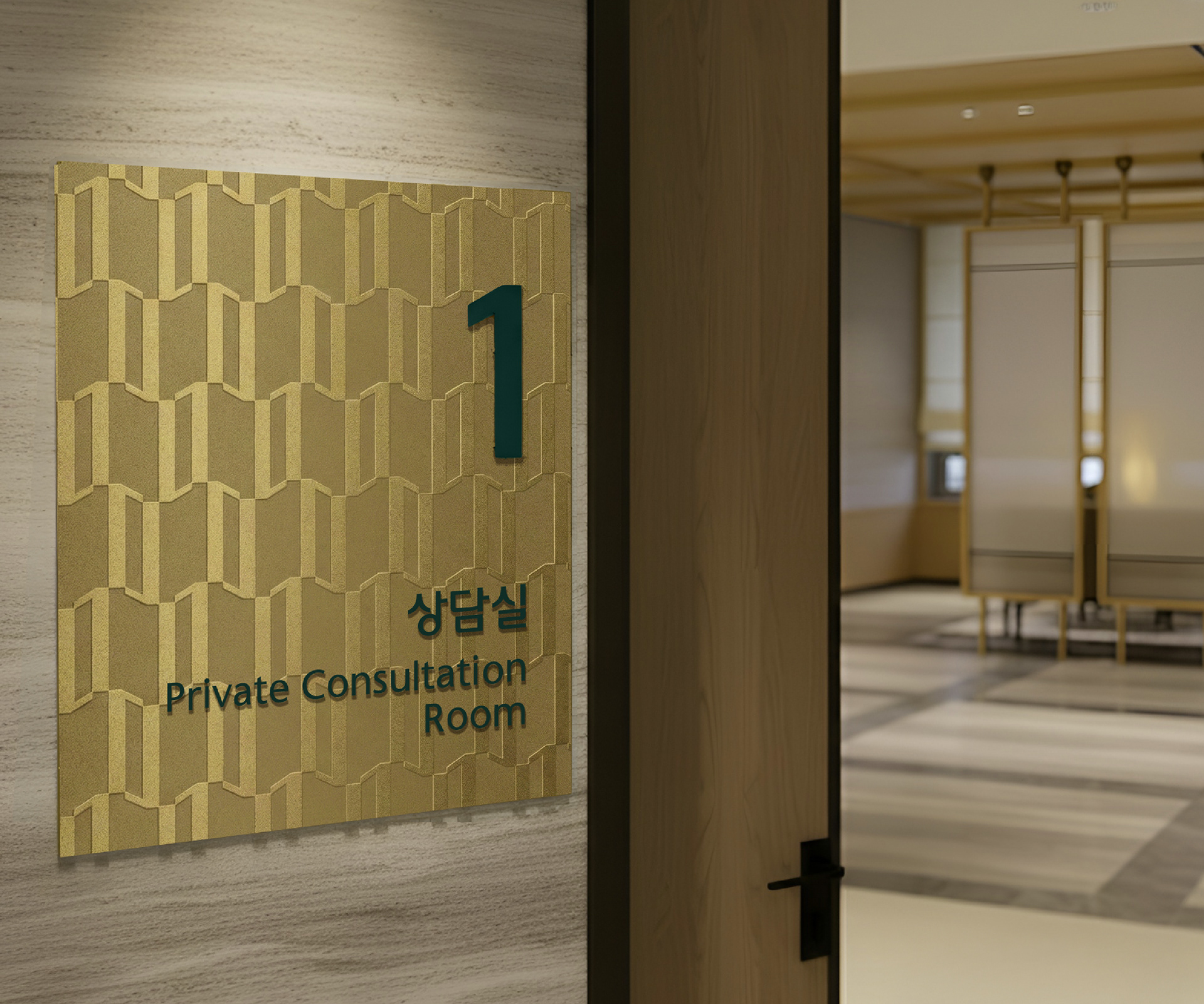
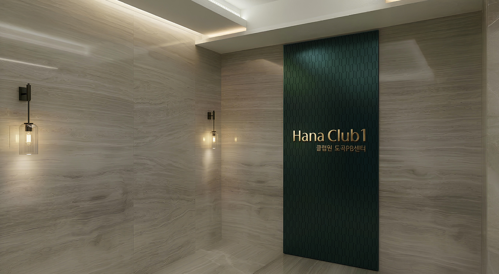
Studio Tangible led the brand renewal project for Hana Club 1, the highest-tier private banking brand of Hana Bank. The goal was to clearly differentiate it from other banks’ PB brands as well as Hana Gold Club, reinforcing its position as a high-end brand. The overall graphic and signage system for Hana Club 1 branches was designed to allow ultra-high-net-worth clients to experience the brand visually and spatially, similar to the atmosphere of global luxury boutiques.
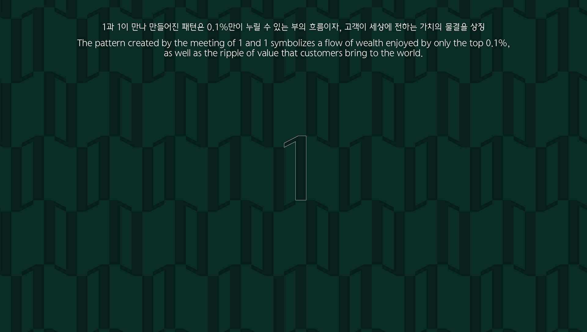
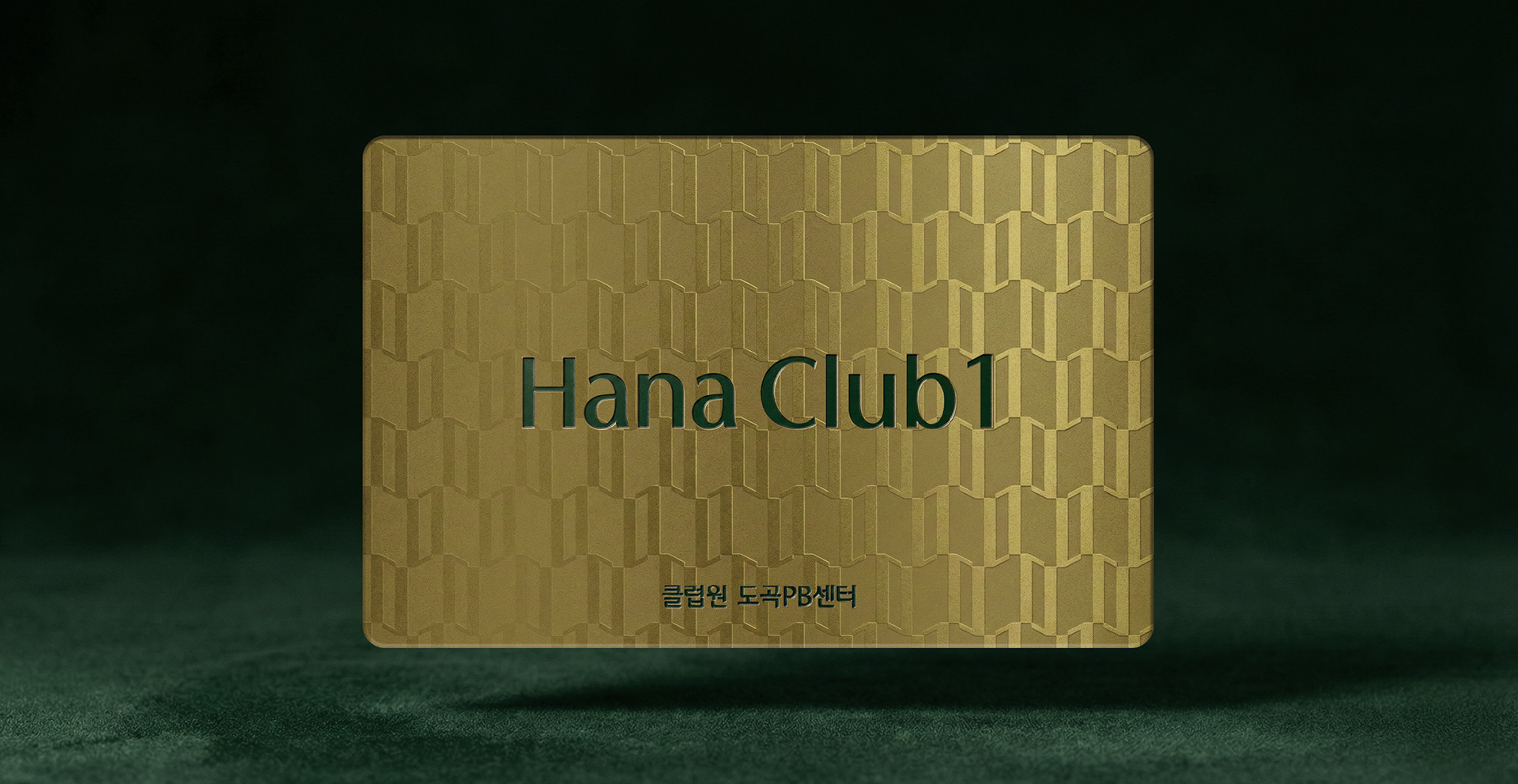
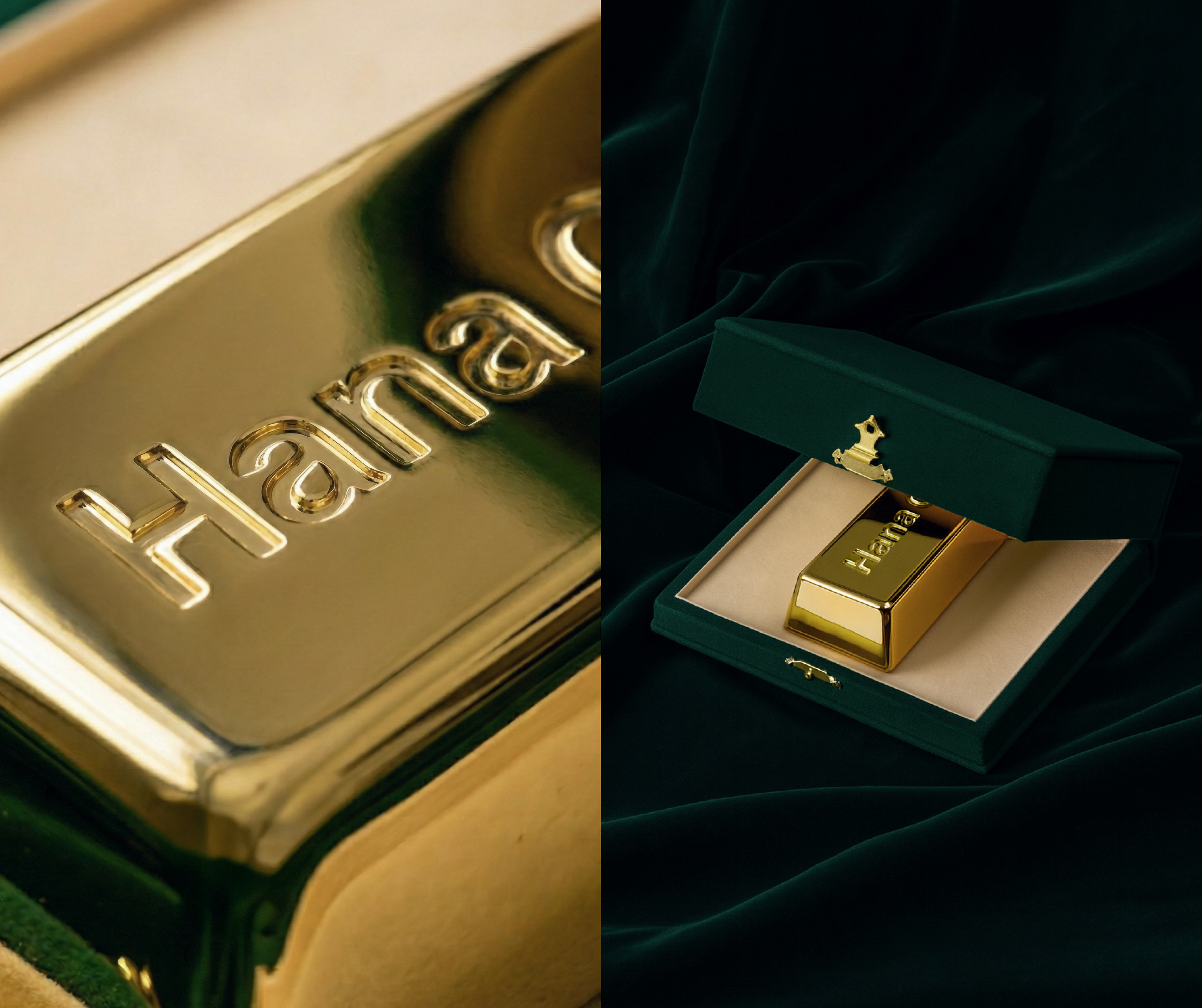
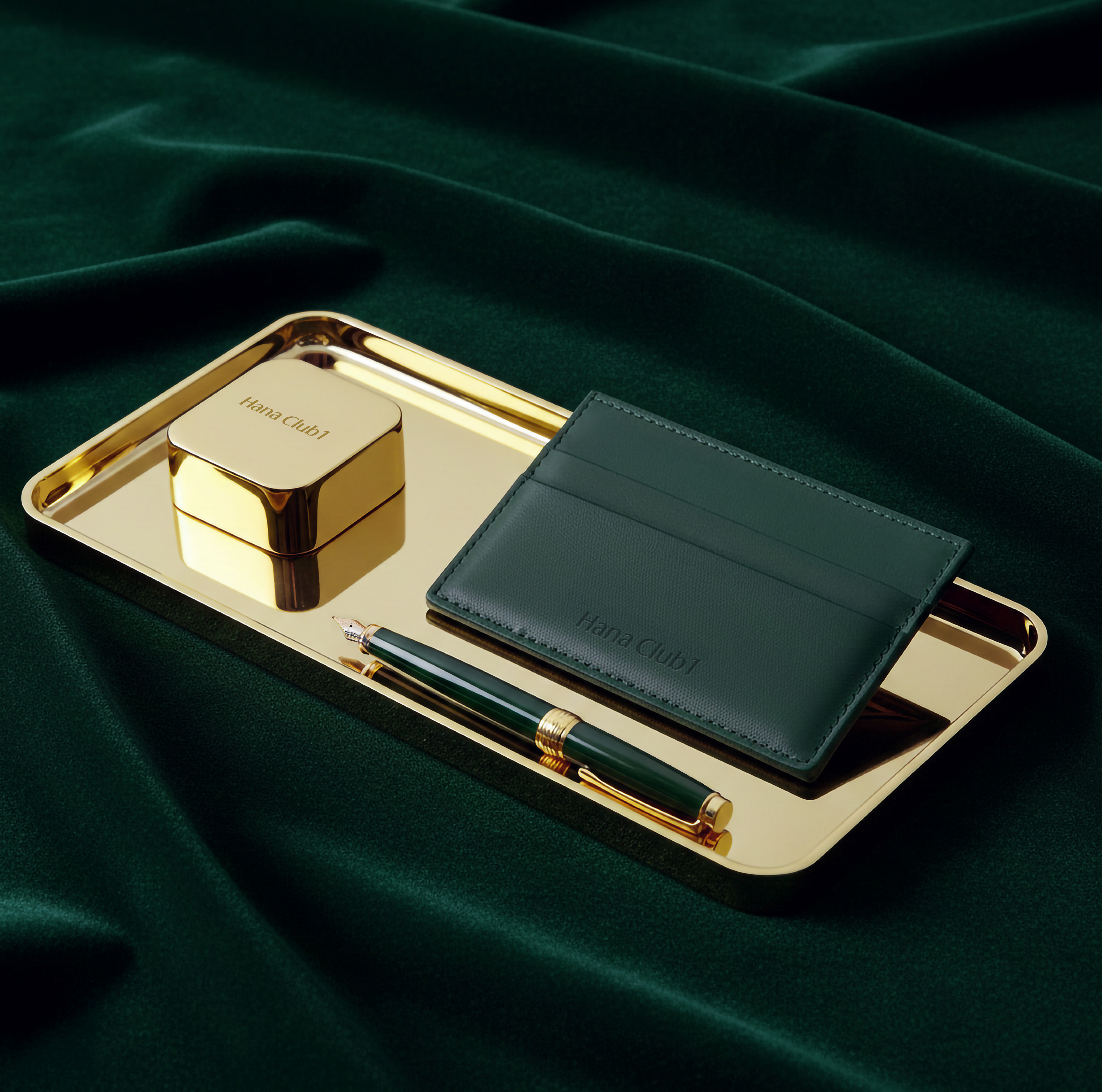
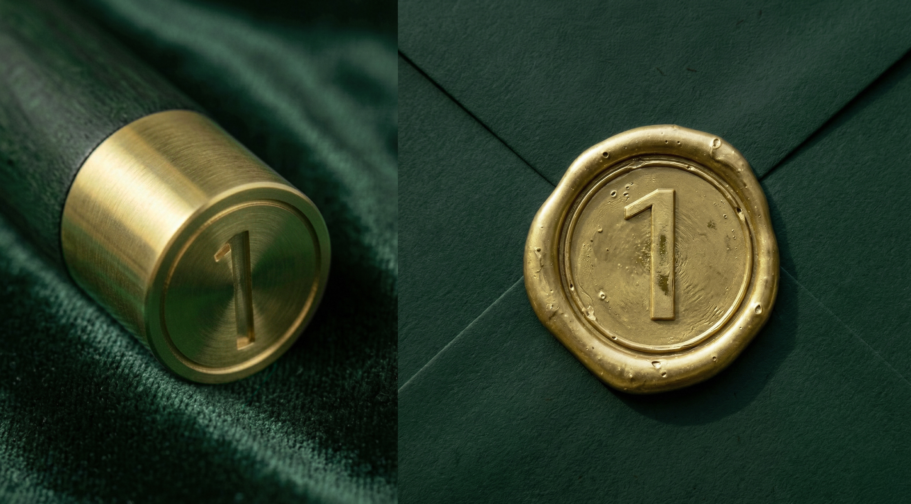
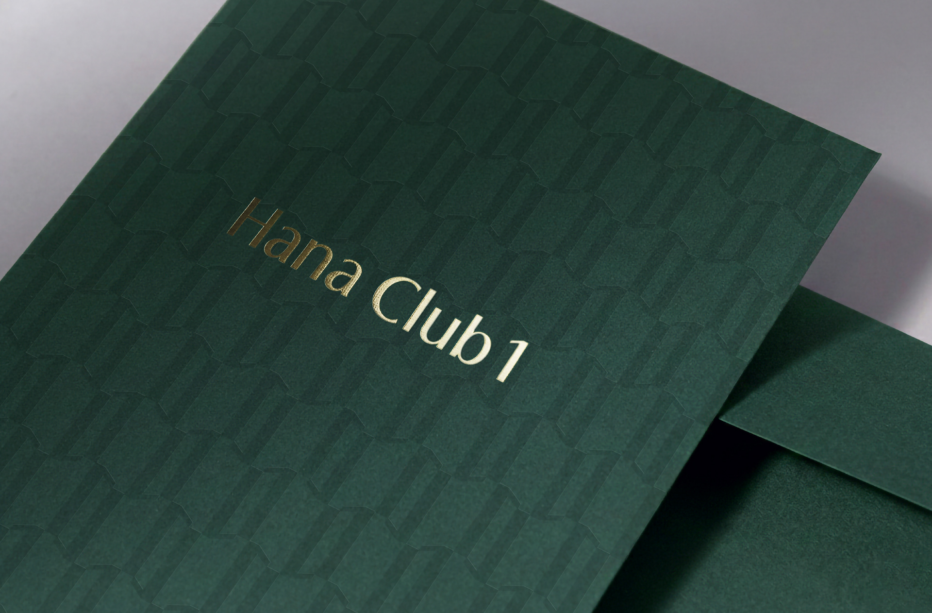
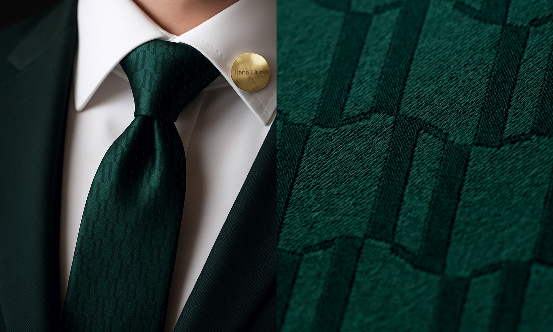
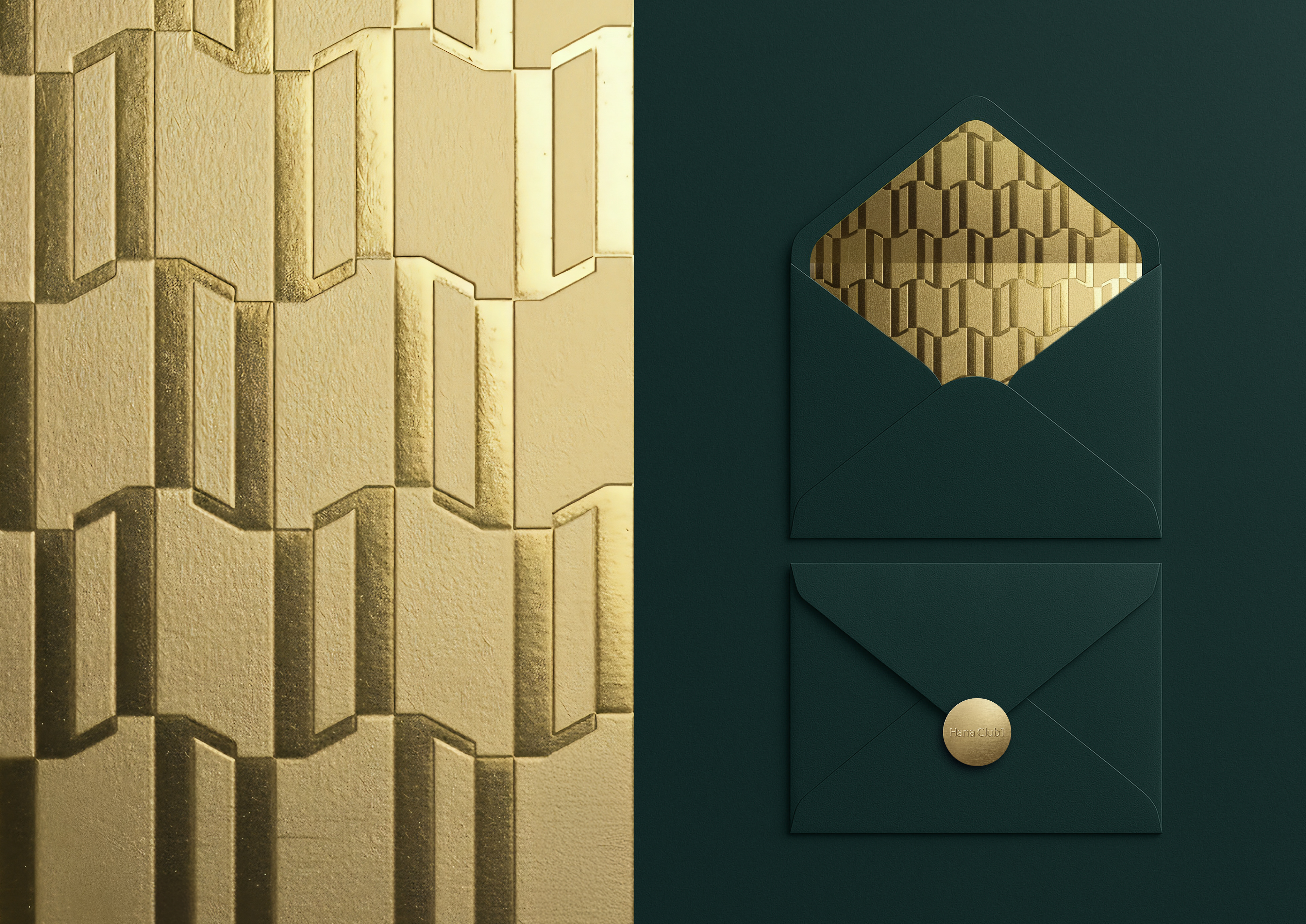
Inspired by luxury retail environments, we developed a distinctive pattern and color system. The pattern, created by repeatedly applying the number 1, symbolizes ultra-high-net-worth individuals and forms a flowing rhythm reminiscent of waves of wealth—representing the value created when Hana Club 1 and its clients come together.
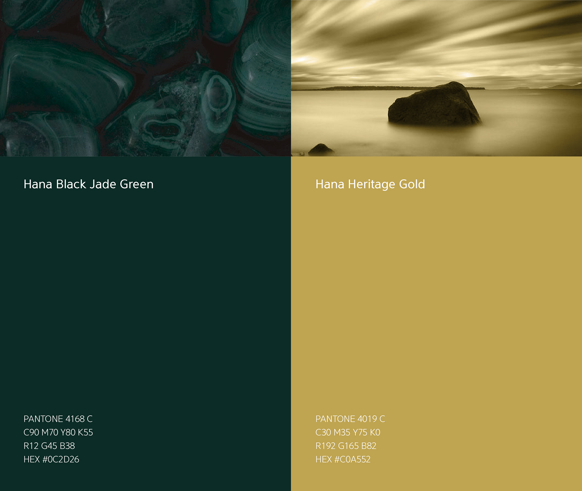
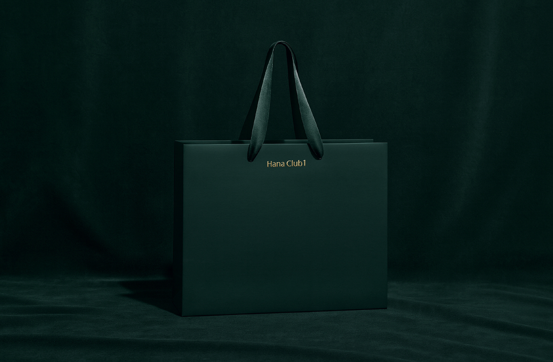
The brand color palette, Black Jade Green & Gold, harmonizes with the Hana Financial Group CI while differentiating Hana Club 1 from other VIP services. The deep Black Jade Green conveys authority, rarity, and timeless elegance, while gold represents wealth and prestige, together expressing a refined high-end identity.
_
스튜디오텐저블은 하나은행의 최상위 PB 브랜드인 하나클럽1의 브랜드 리뉴얼 프로젝트를 진행하였습니다. 하나은행은 타행 대비 PB 브랜드를 세분화하여 운영하고 있어 크게 두 가지 점에서 차별화가 필요했습니다. 프로젝트의 목표는 타행의 PB 브랜드들, 그리고 하나골드클럽과의 차별화를 통해 하이엔드 브랜드로서의 포지셔닝을 공고히 하는 것입니다. 이를 위해 하나클럽1 지점의 그래픽과 사이니지를 통해 타겟인 초고액 자산가들이 시각적, 공간적으로 명품 브랜드를 경험하는 것처럼 브랜드를 경험할 수 있도록 디자인 시스템 전반을 설계했습니다.
글로벌 명품 브랜드 매장의 사례를 통해 프리미엄 이미지를 구축하는 데 핵심적으로 작용하는 ’패턴과 컬러’ 요소를 개발하고자 했습니다. 초고액 자산가를 상징하는 숫자 1을 반복적으로 적용한 패턴은 마치 ‘부의 물결’과도 같은 일련의 흐름을 보여줍니다. 기본적으로 1과 1이 무한히 결합된 형태로서, 하나클럽1과 고객이 만나 세상에 전하는 가치의 물결을 상징하기도 합니다.
또한, 컬러 측면에서는 하나 VIP클럽과는 차별화하고, 하나금융 CI와 조화롭게 사용할 수 있는 ‘블랙 제이드 그린&골드’컬러를 사용했습니다. 톤 다운된 깊이감 있는 블랙 제이드 그린은 권위와 희귀함, 시간이 지나도 변하지 않는 아름다움을 상징하는 색상으로, 부와 존중을 뜻하는 골드 색상과 조화를 이루며 하이엔드 이미지를 표현합니다.
간결하고 직관적인 로고, 공간 디자인과 조화롭게 디자인된 그래픽 및 사이니지는 하나클럽1의 프리미엄 이미지를 극대화하는데 기여하고 있습니다.